Subtotal
$0
U.S. Shipping
FREE
Saved for Later
Shop Art
Original Paintings
Textured Replicas
Canvas Prints
16x20 Paper Prints
Gift Shop
Portfolio
Browse All
Available Paintings
List of Subjects
Petite Paintings
Large Paintings
Customer Favorites
Contact Us
View Portfolio
Available Originals
Textured Replicas
Canvas Prints
16x20 Paper Prints
Gift Shop
Learn More >
About The Artist
Erin Hanson Biography
About Open Impressionism
Watch Videos
Press Pickups
Blog
Visit
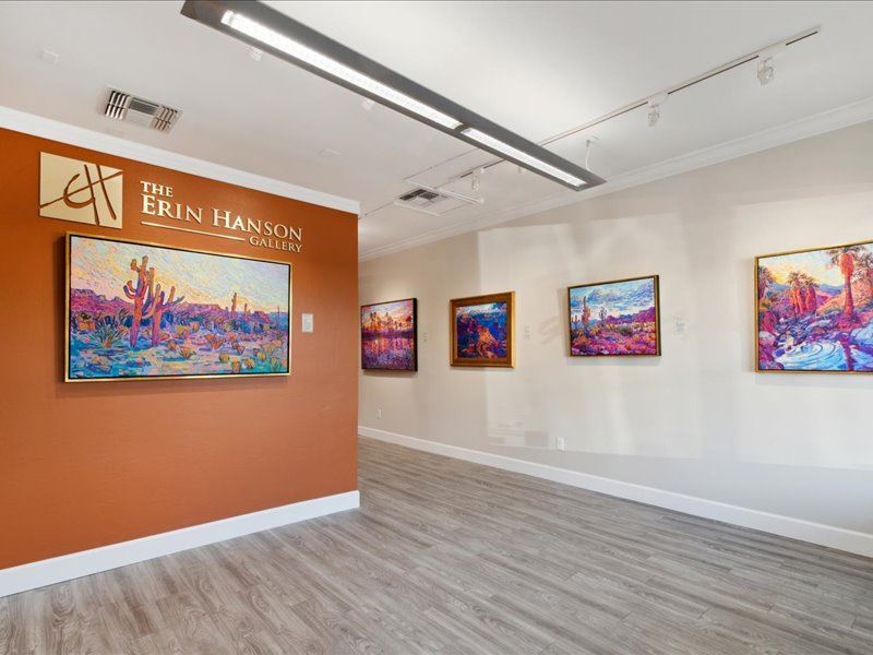
The Erin Hanson Gallery
Exhibition Schedule
Museum Shows
Visit Erin's Studio
For Collectors
Available Paintings
What Are Textured Replicas?
Collector Testimonials
How to Commission Artwork
Notify Me of New Works
For Artists
Open Impressionism Workshop
Artist Mentorship Program
Follow in Erin's Footsteps
Artist Q & A
Erin's Blog
Questions?
Shopping Cart
Subtotal
$0
U.S. Shipping
FREE
Promo codes and taxes are added at checkout.
Saved for Later
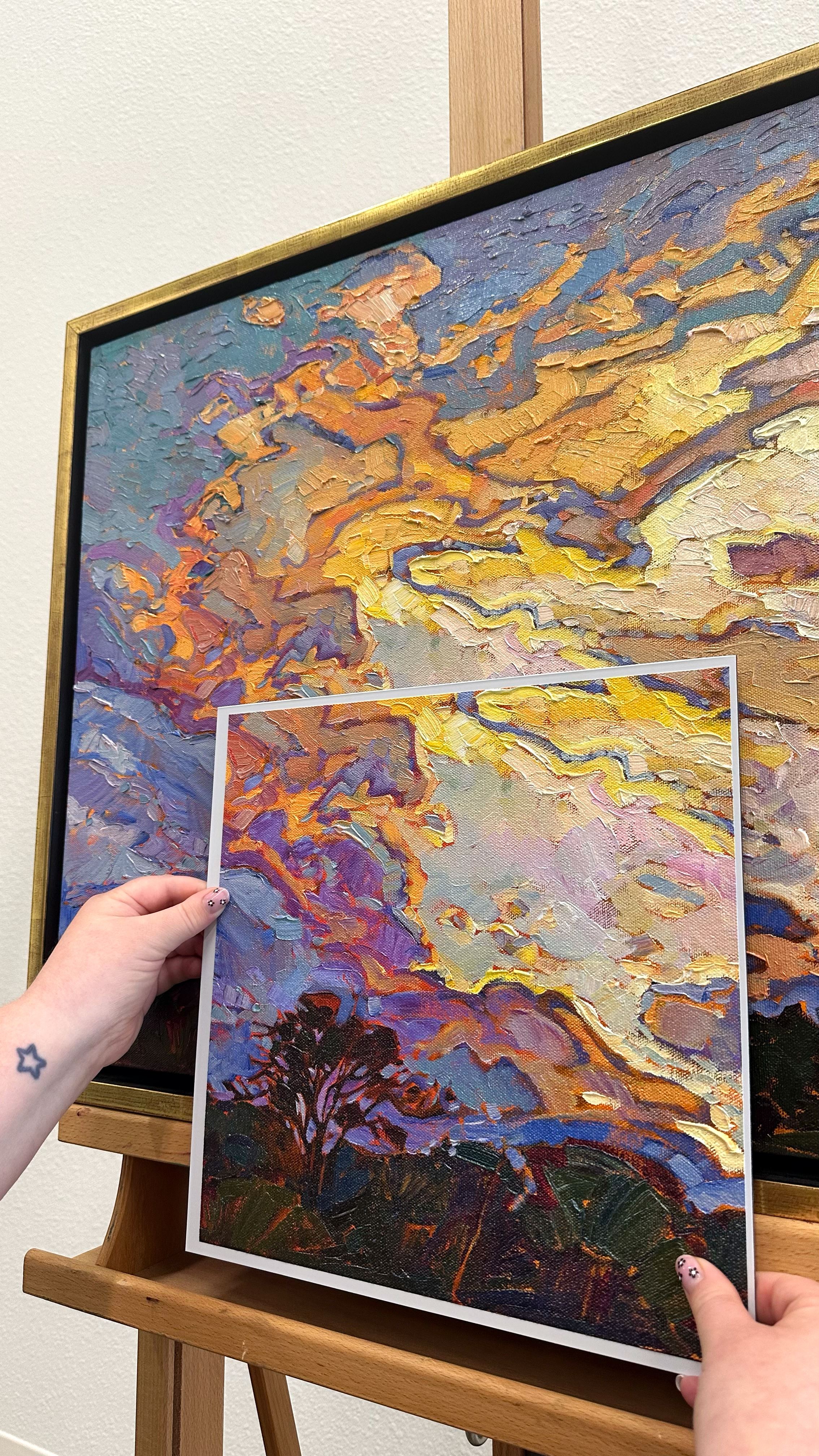
I first heard about 3D scanning applied to fine art reproduction about ten years ago. A university in the Netherlands collaborated with the Van Gogh Museum in Amsterdam to create 3-dimensional scans of van Gogh’s original paintings. The process was time-intensive and laborious, and involved stitching together thousands of individual photographs taken under strict lighting conditions.
So, I wasn’t totally unprepared when the German scanning company I was working with told me they could make 3D scans of my artwork.
The Search for the Perfect Scanner
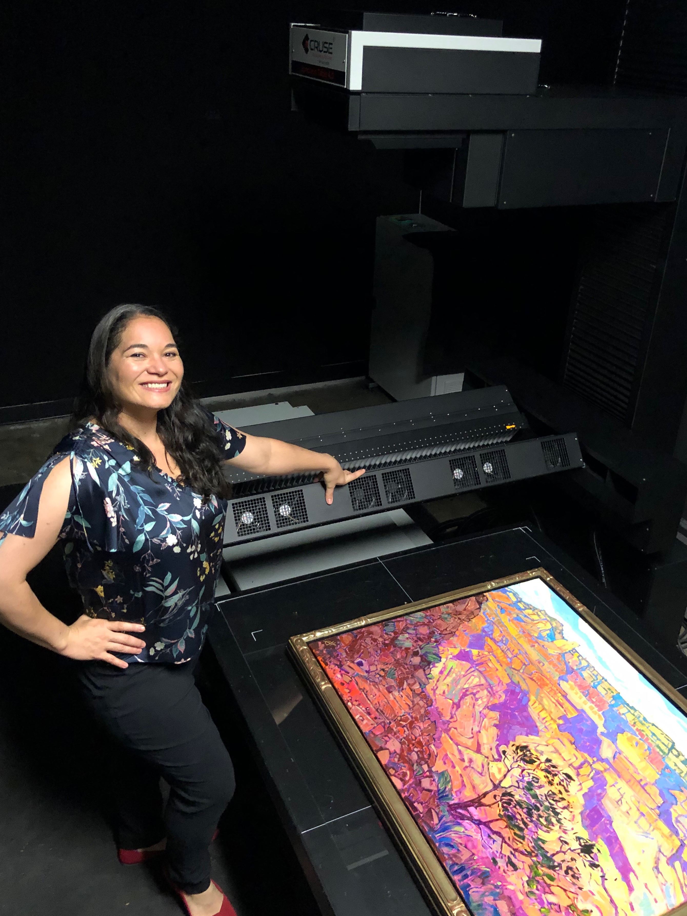
I had been searching for a scanner that could photograph wet oil paintings to create high-resolution images of my work without waiting eight weeks for the painting to dry. I couldn’t use a traditional scanner, which required the artwork to be placed face down--I needed the scanner to light the paintings from above, creating little shadows from the texture of the brushstrokes and giving the illusion of texture to my prints.
My Cruse scanner was the perfect solution to creating beautiful, 2-dimensional reproductions of my paintings with the illusion of texture. But I was about to discover the magic of 3-D scanning and creating real texture in my reproductions that you could actually touch.
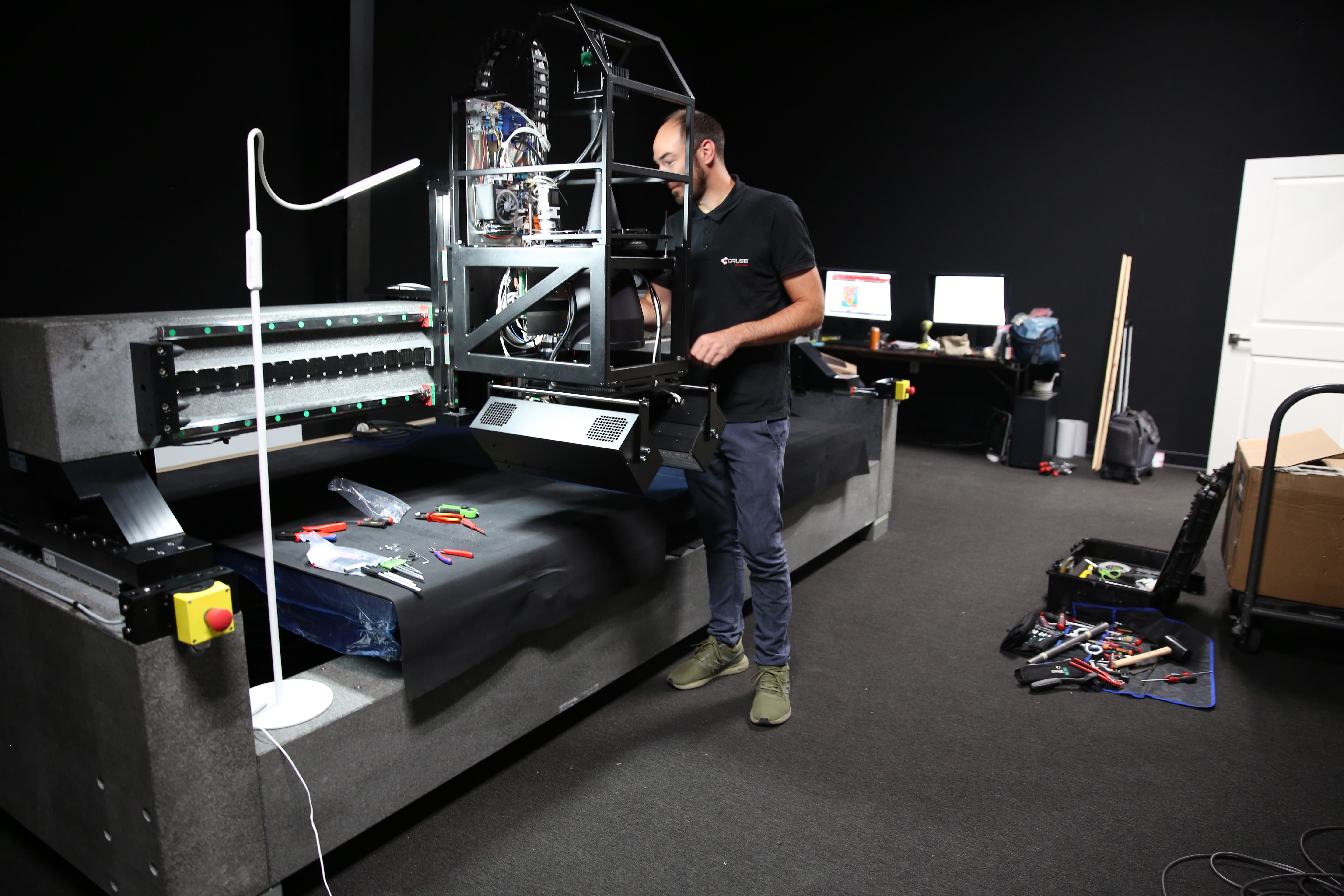
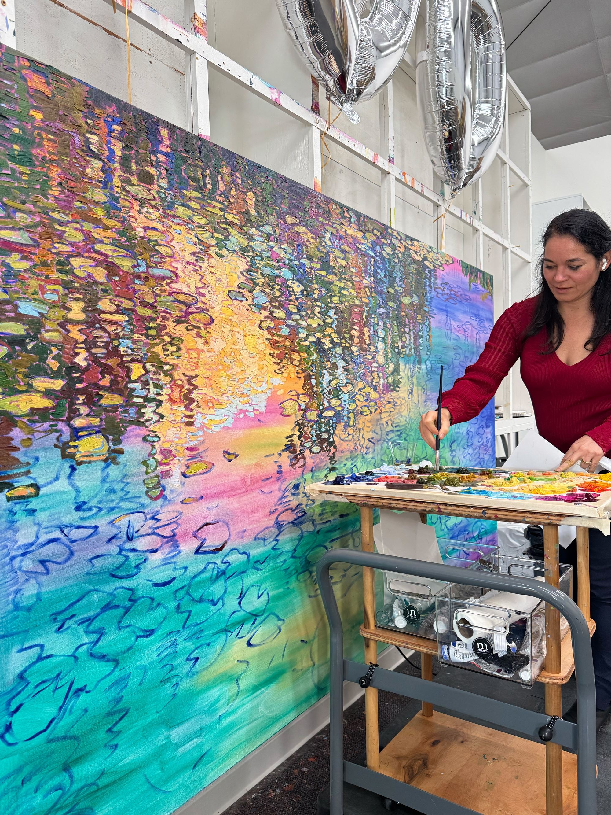
German technicians install Erin’s new Cruse scanner. This 2nd-generation scanner is bigger than Erin’s first scanner, weighs 13,000 lbs, and allows her to scan colossal-sized artwork.
Before my Cruse scanner, I created digital images of my work with flash photography, bouncing the light off huge reflecting walls. The setup was touchy and hard to get exactly right, and it was difficult to get an entire large painting in focus.
Earlier than this, I was photographing my artwork outside. After years of trial and error, I had developed this system of photographing my work: first, I would wait for a sunny day with the sun low on the horizon (early morning was best, since the light was clearer in the morning). Next, I would have someone hold up a 6-foot-wide metal frame with a thin mesh stretched inside. This was called an “f-stop screen,” a photographer’s trick for decreasing the amount of light coming through to the subject. I turned the painting so that the sunlight came from the side and cast little shadows across the artwork. Finally, I used a professional Canon SLR camera fitted with a circular polarizing lens, which cut out any reflective glare caused by the sunlight.
Using a camera worked well to get relatively high-resolution images—any of my paintings you see online that were created before 2019 were captured using these photography techniques.
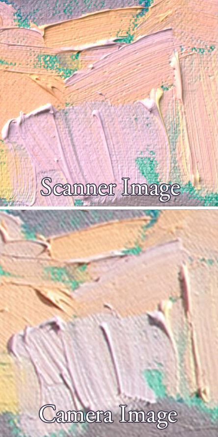
You can see the higher resolution captured by the Cruse scanner compared to my old Canon camera.
Trying to Capture Early Works
When I first started painting in my Open Impressionism technique back in 2008, I only had a small point-and-shoot camera and no lighting control. It is too bad that most of my early works were photographed so poorly that I can’t share them online or print them in books. These early classics will never be made available for prints since the images are out of focus, too low-res, or have too much glare.
Of course, I never imagined I would need to archive my works for future generations, but now every time we get a classic painting back to varnish or re-frame, we jump at the chance to properly scan it in full 3D magnificence.
With over 3,000 paintings completed and a growing recognition of my Open Impressionism style, it is crucial to have a proper catalogue raisonné, which comes from the French phrase “explained catalog” and is used to establish the value of an artist’s work at auction. A catalogue raisonné is a list of every single piece of artwork created by an artist, including dimensions, descriptions, owner and exhibition history, copies and forgeries, duplicate painting names, etc. (Did you know when I was first painting, I didn’t bother to name all my paintings? I didn’t have the robust system I have in place now to ensure that I never use the same painting name more than once. So, many of my classic early works are either unnamed or have the same name as a more recent painting.)
Using 3D Scanning Technology to Capture Texture
I am glad to have finally discovered a refined way of preserving and archiving my artwork, in more dimensions and detail than any artist before me. Honestly, I think I could teach that university in Amsterdam a thing or two about how to really capture the essence of an original Van Gogh.
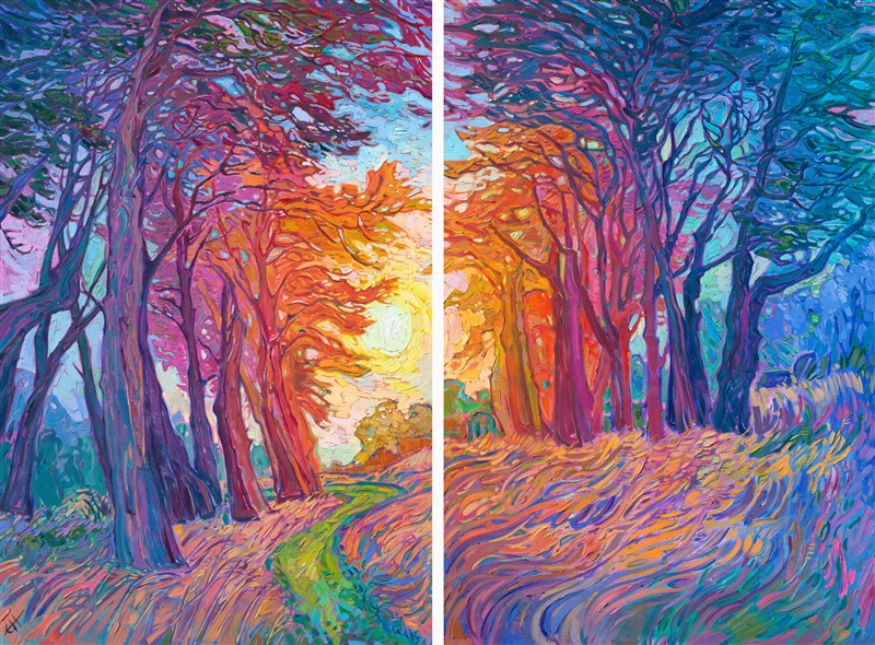
With 3D printing technology, I can also recreate prints with the exact brushstroke texture of the original oil painting. My “3D Textured Replicas” are beautifully vibrant and richly textured, almost indistinguishable from the original from a few feet away.
Texture is such a big part of how I see the world, how I interpret landscapes, and how I communicate color. Texture is the rhythm of my work.
As the first artist to use a Cruse scanner and pioneer textured replicas, I hope to pave the way for future artists to preserve their work in all three dimensions and set a new standard for archiving paintings.
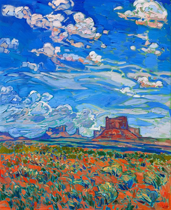
Exploring Erin Hanson Classic Works as 3D Textured Replicas
You can find all paintings that have been scanned using the Cruse Scanner by selecting the category “3D Textured Replicas” on my portfolio page here on the website. Here are just a few classics that are currently available as textured replicas.
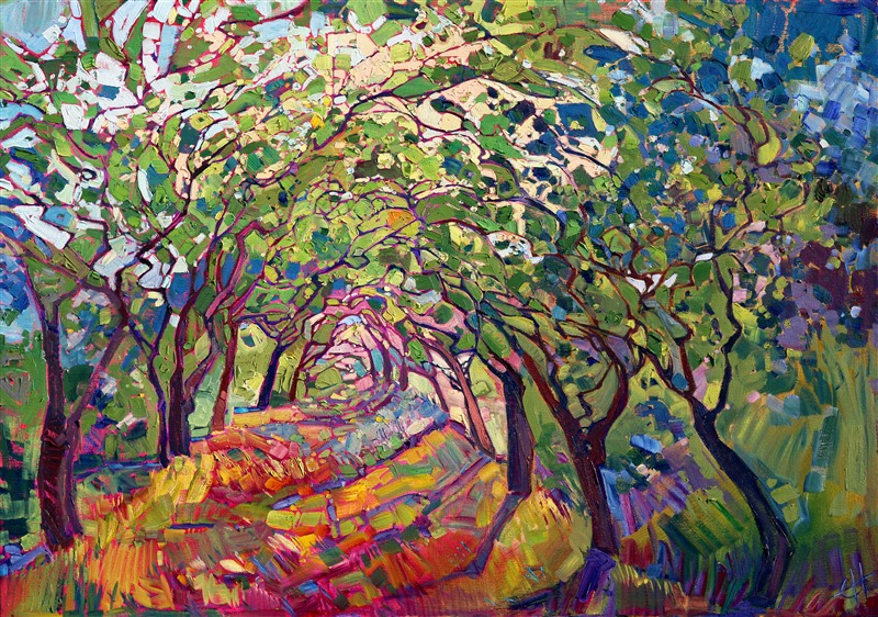
The Path by Erin Hanson
The Path is one of Erin’s iconic classic paintings that will forever be preserved in three dimensions.
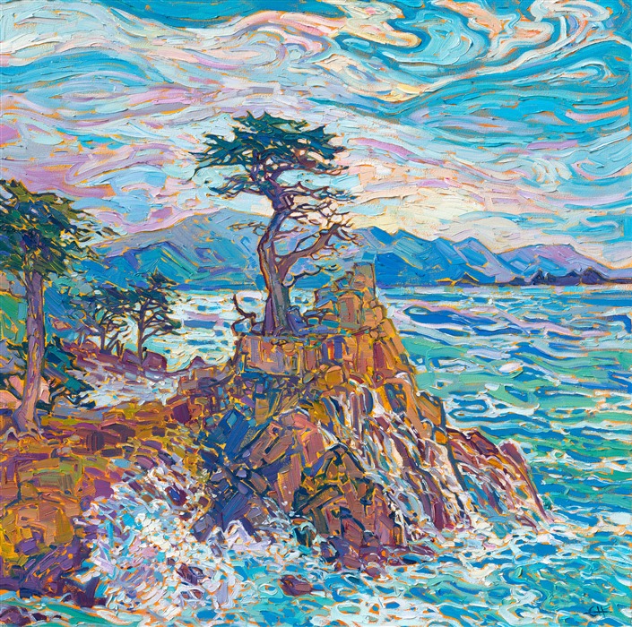
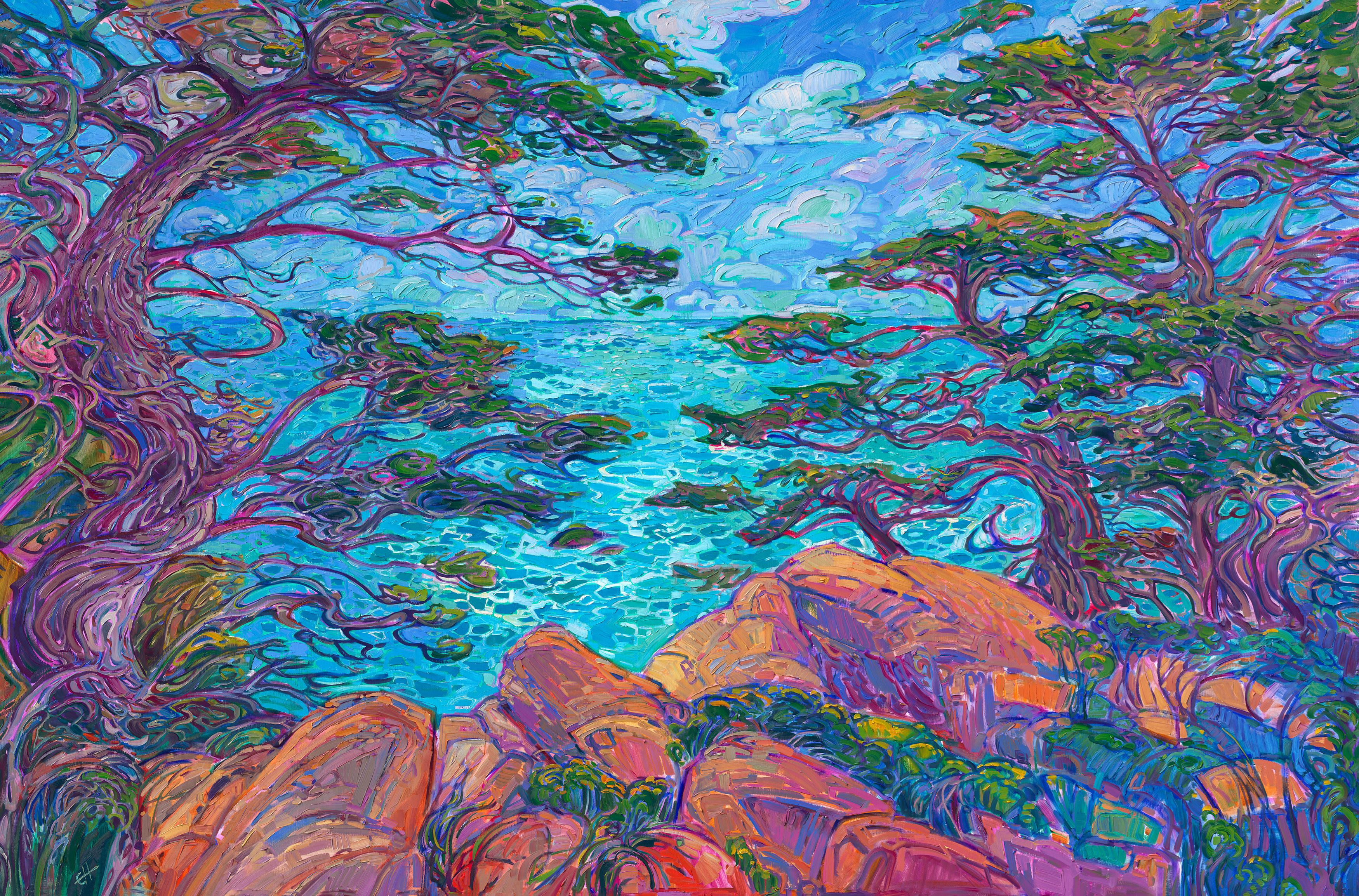
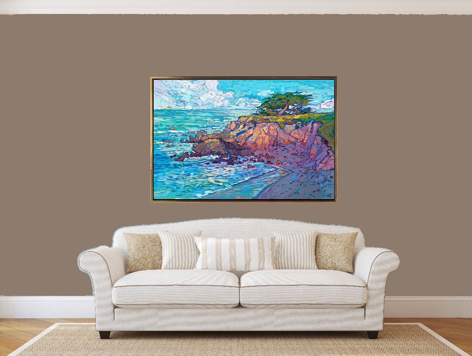
Cypress Water by Erin Hanson
Cypress Water is a classic water painting that captures the movement and colorful reflections of Lone Cypress in Pebble Beach, California.
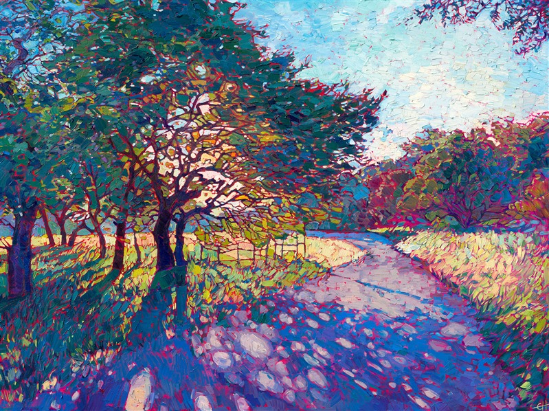
Crystal Path by Erin Hanson
Crystal Path, part of the Crystal Light Collection, has been preserved in three dimensions, allowing viewers to enjoy the play of light and shadow featured in this piece and in that quintessential collection.
These classic works are forever preserved in perfect three dimensions and are available as limited edition 3D Textured Replicas. Explore more by clicking here.
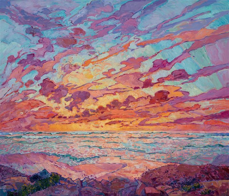
Discover the artist at the forefront of modern impressionism.
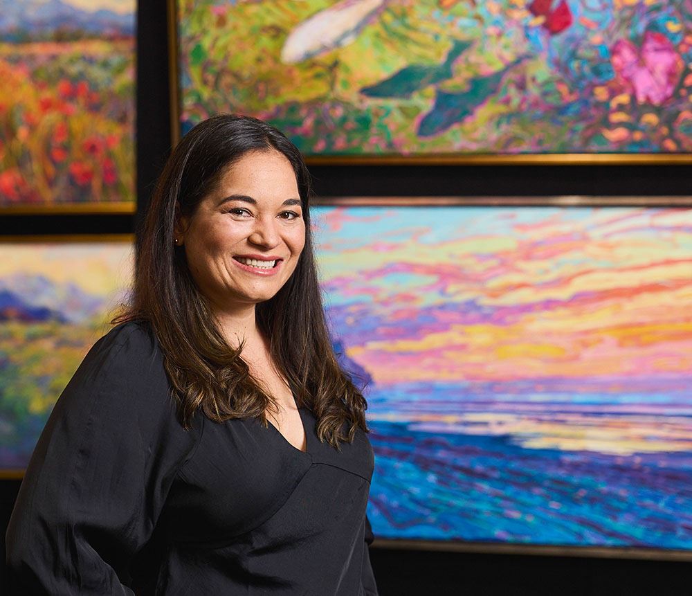
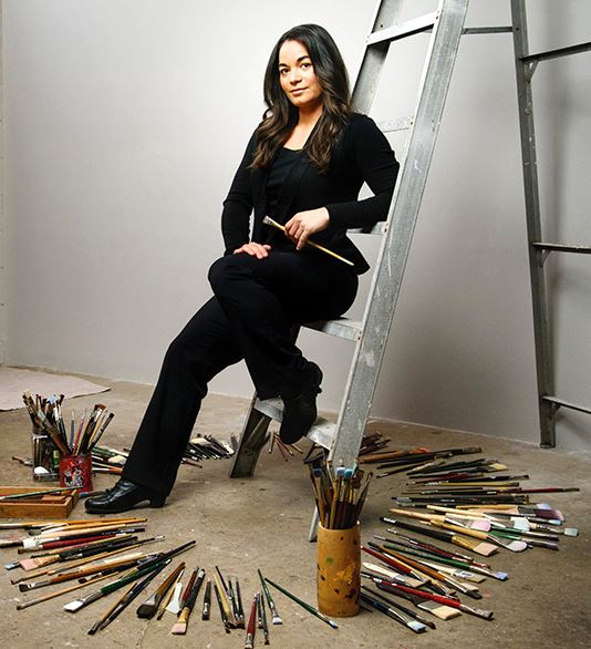
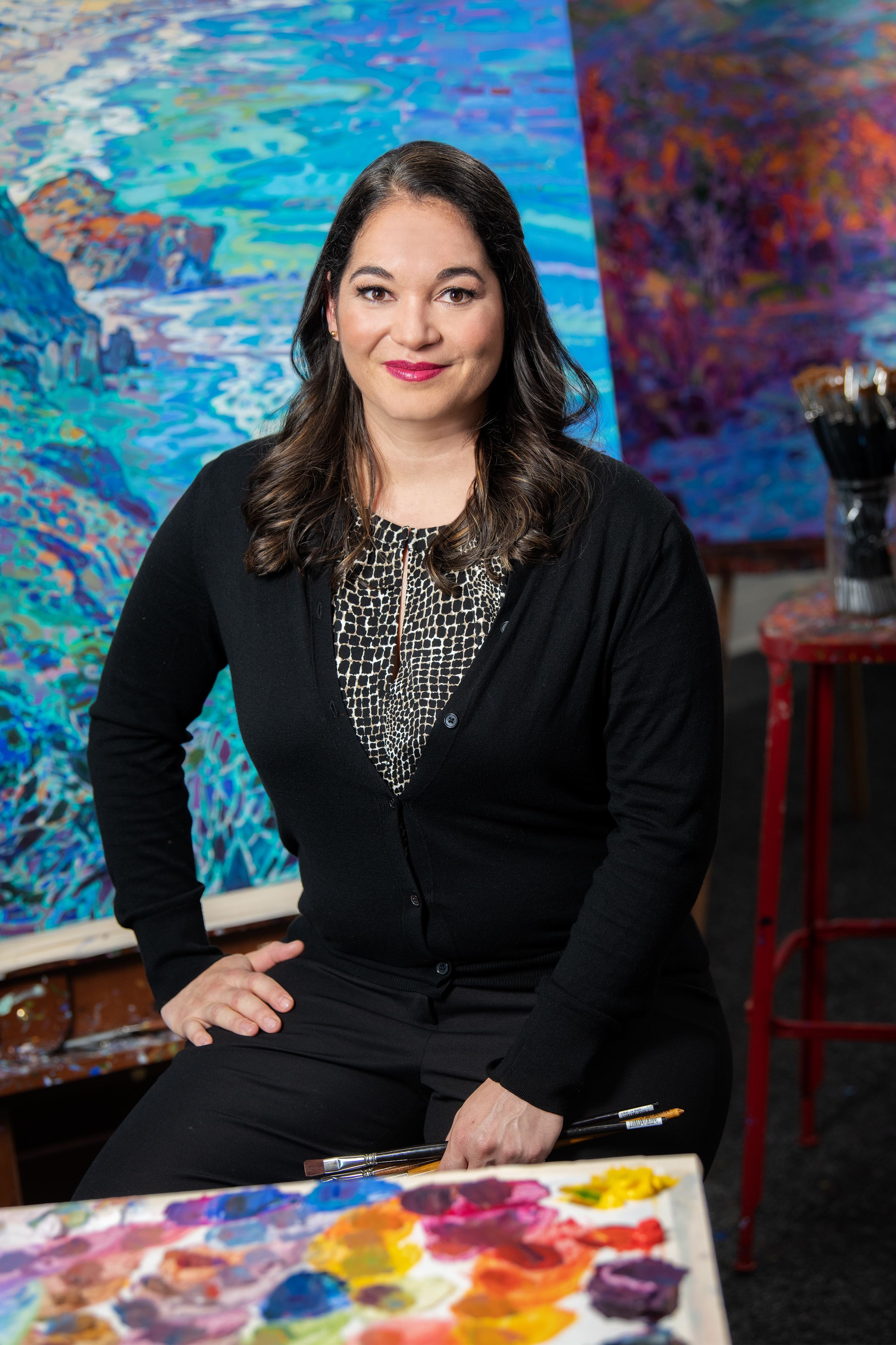
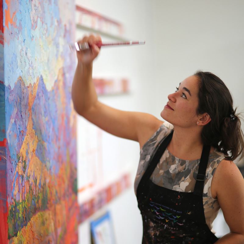
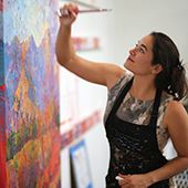
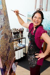
About Erin
ERIN HANSON has been painting in oils since she was 8 years old. As a teenager, she apprenticed at a mural studio where she worked on 40-foot-long paintings while selling art commissions on the side. After being told it was too hard to make a living as an artist, she got her degree in Bioengineering from UC Berkeley. Afterward, Erin became a rock climber at Red Rock Canyon, Nevada. Inspired by the colorful scenery she was climbing, she decided to return to her love of painting and create one new painting every week.
She has stuck to that decision, becoming one of the most prolific artists in history, with over 3,000 oil paintings sold to eager collectors. Erin Hanson’s style is known as "Open Impressionism" and is taught in art schools worldwide. With millions of followers, Hanson has become an iconic, driving force in the rebirth of impressionism, inspiring thousands of other artists to pick up the brush.
|
Painting at Colossal ScaleA Look at Erin's Trajectory as an ArtistThursday, May 1, 2025Stepping back in time, we look at Erin Hanson's career from apprentice mural painter to renowned international impressionist. During this journey, Erin provides insights into what inspired her upcoming Colossal Collection. Read More → |
|
|
|
Painting at Colossal Scale A Look at Erin's Trajectory as an Artist Thursday, May 1, 2025 Stepping back in time, we look at Erin Hanson's career from apprentice mural painter to renowned international impressionist. During this journey, Erin provides insights into what inspired her upcoming Colossal Collection. Read More → |
.jpeg)
|
The Magic of ImpastoCreating Movement with PaintTuesday, April 1, 2025I’ve spent years refining my approach to impasto, developing a method that captures the raw beauty of the outdoors. When I paint, I want my collectors to feel as if they’re outdoors…standing in the middle of a golden field at sunset or beneath a vast, cloud-streaked sky. Impasto helps me achieve that sensation by adding physical depth and dimension to each brushstroke, creating a painting that feels as much sculpted as painted. Read More → |
|
|
|
The Magic of Impasto Creating Movement with Paint Tuesday, April 1, 2025 I’ve spent years refining my approach to impasto, developing a method that captures the raw beauty of the outdoors. When I paint, I want my collectors to feel as if they’re outdoors…standing in the middle of a golden field at sunset or beneath a vast, cloud-streaked sky. Impasto helps me achieve that sensation by adding physical depth and dimension to each brushstroke, creating a painting that feels as much sculpted as painted. Read More → |
|
Retracing van Gogh’s Steps - France and BeyondJoin Erin Hanson in the NetherlandsSaturday, March 15, 2025Explore the Netherlands with Erin Hanson as she follows in van Gogh's footsteps. Enjoy a cruise down the Rhine in fall of 2026. Read More → |
|
|
|
Retracing van Gogh’s Steps - France and Beyond Join Erin Hanson in the Netherlands Saturday, March 15, 2025 Explore the Netherlands with Erin Hanson as she follows in van Gogh's footsteps. Enjoy a cruise down the Rhine in fall of 2026. Read More → |

|
Seven Years of Art FestivalsErin Hanson shares how selling at art festivals was a transformative experience for her and open impressionismSaturday, March 1, 2025My first seven years of selling at art festivals were transformative. I realized I could paint for a living, and the rising demand for my paintings allowed me to paint more and more, giving me the opportunity to hone my skills and develop the tenets of Open Impressionism. Read More → |
|
|
|
Seven Years of Art Festivals Erin Hanson shares how selling at art festivals was a transformative experience for her and open impressionism Saturday, March 1, 2025 My first seven years of selling at art festivals were transformative. I realized I could paint for a living, and the rising demand for my paintings allowed me to paint more and more, giving me the opportunity to hone my skills and develop the tenets of Open Impressionism. Read More → |
|
Things to Do in Oregon Wine CountryMcMinnville Local Area Visitors GuideFriday, February 28, 2025The Erin Hanson Gallery is nestled in the heart of Willamette Valley Wine Country and surrounded by 200 top-of-the-line wineries. The area is a hot destination renowned for its Pinot Noir, stunning vistas, delectable culinary adventures, and luxurious resorts and spas. Read More → |
|
|
|
Things to Do in Oregon Wine Country McMinnville Local Area Visitors Guide Friday, February 28, 2025 The Erin Hanson Gallery is nestled in the heart of Willamette Valley Wine Country and surrounded by 200 top-of-the-line wineries. The area is a hot destination renowned for its Pinot Noir, stunning vistas, delectable culinary adventures, and luxurious resorts and spas. Read More → |
|
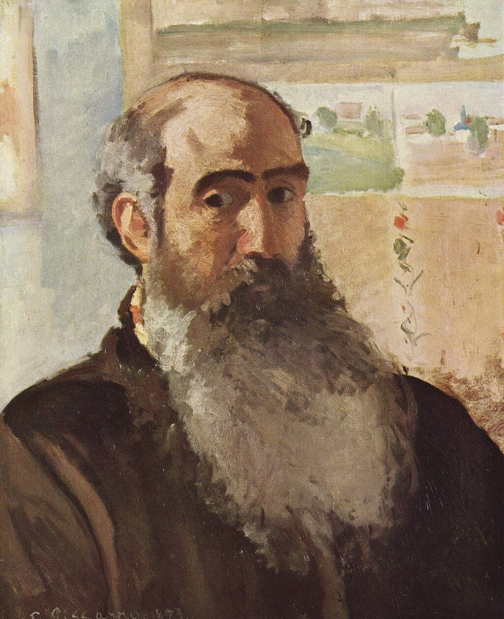
Camille Pissarro: Blessed Are Those Who See BeautyGuest article written by Mary C. KennellyMonday, February 17, 2025Find out about the life of one of the original impressionists, Camille Pissarro. His work and life were defined by controversy and adversity, yet he continued demonstrating kindness as he painted diverse subjects in his colorful, impressionist style. Read More → |
|
|
|
Camille Pissarro: Blessed Are Those Who See Beauty Guest article written by Mary C. Kennelly Monday, February 17, 2025 Find out about the life of one of the original impressionists, Camille Pissarro. His work and life were defined by controversy and adversity, yet he continued demonstrating kindness as he painted diverse subjects in his colorful, impressionist style. Read More → |
|
How to See ColorCapturing the essence of Nature’s beauty.Saturday, February 1, 2025I am often asked how I see the colors I see when I am painting. This question has been on my mind lately, and I thought you might enjoy hearing about how I approach color in each new painting I begin. Read More → |
|
|
|
How to See Color Capturing the essence of Nature’s beauty. Saturday, February 1, 2025 I am often asked how I see the colors I see when I am painting. This question has been on my mind lately, and I thought you might enjoy hearing about how I approach color in each new painting I begin. Read More → |
|
How Open Impressionism BeganSharing the origins of Erin Hanson's iconic painting styleWednesday, January 1, 2025Erin Hanson shares how her painting style, open impressionism, came to by and why she chooses to paint natural spaces. Read More → |
|
|
|
How Open Impressionism Began Sharing the origins of Erin Hanson's iconic painting style Wednesday, January 1, 2025 Erin Hanson shares how her painting style, open impressionism, came to by and why she chooses to paint natural spaces. Read More → |
|
How to Find InspirationHow one Professional Artist Finds InspirationSunday, December 1, 2024I am often asked how I stay inspired. My answer is to point to a 2-foot-tall stack of photos and say, “These are the paintings I wish I could start right now!” While I never run out of things to paint, I thought you’d find it interesting to hear about how I keep myself inspired. Read More → |
|
|
|
How to Find Inspiration How one Professional Artist Finds Inspiration Sunday, December 1, 2024 I am often asked how I stay inspired. My answer is to point to a 2-foot-tall stack of photos and say, “These are the paintings I wish I could start right now!” While I never run out of things to paint, I thought you’d find it interesting to hear about how I keep myself inspired. Read More → |
|
Creating Petite CompositionsHow Erin Hanson Paints Small WorksFriday, November 1, 2024Erin Hanson shares how and why she began painting her small studies or - as she calls them her "Petite Paintings." Read More → |
|
|
|
Creating Petite Compositions How Erin Hanson Paints Small Works Friday, November 1, 2024 Erin Hanson shares how and why she began painting her small studies or - as she calls them her "Petite Paintings." Read More → |
|
Bringing Art to Life: A Curated Collection on the Samsung Frame TVMonday, October 21, 2024In the ever-evolving world of art and technology, the Samsung Frame TV stands out as a revolutionary medium, transforming the traditional television experience into a dynamic art gallery. For art enthusiasts and collectors, this innovative display offers a unique way to showcase and enjoy a diverse array of artworks. Today, we’re delving into a captivating selection of pieces currently available on the Samsung Frame TV, including timeless classics and contemporary masterpieces. Read More → |
|
|
|
Bringing Art to Life: A Curated Collection on the Samsung Frame TV Monday, October 21, 2024 In the ever-evolving world of art and technology, the Samsung Frame TV stands out as a revolutionary medium, transforming the traditional television experience into a dynamic art gallery. For art enthusiasts and collectors, this innovative display offers a unique way to showcase and enjoy a diverse array of artworks. Today, we’re delving into a captivating selection of pieces currently available on the Samsung Frame TV, including timeless classics and contemporary masterpieces. Read More → |
|
Painting Monet's Water LiliesHonoring an artistic legacySunday, September 1, 2024I recently came back from France where I gathered inspiration from many of the same locations as the original Impressionists. This includes Monet's garden and his famous water lily pond. Find out more about the trip here. Read More → |
|
|
|
Painting Monet's Water Lilies Honoring an artistic legacy Sunday, September 1, 2024 I recently came back from France where I gathered inspiration from many of the same locations as the original Impressionists. This includes Monet's garden and his famous water lily pond. Find out more about the trip here. Read More → |
|
1874 to 2024 Impressionism Then and NowA look toward the future of impressionismThursday, August 22, 2024Erin Hanson recently returned from a whirlwind adventure across France, following in the footsteps of Monet and van Gogh. She stood in many of the exact locations they stood and painted, seeing the French landscape from their point of view, finding inspiration from the same beautiful light and colors that inspired these two artistic pioneers. Read More → |
|
|
|
1874 to 2024 Impressionism Then and Now A look toward the future of impressionism Thursday, August 22, 2024 Erin Hanson recently returned from a whirlwind adventure across France, following in the footsteps of Monet and van Gogh. She stood in many of the exact locations they stood and painted, seeing the French landscape from their point of view, finding inspiration from the same beautiful light and colors that inspired these two artistic pioneers. Read More → |
|
Erin Hanson's Artistic Pilgrimage through FranceRetracing the Steps of van Gogh and MonetThursday, August 15, 2024Renowned artist Erin Hanson embarked on a transformative journey through France, following in the footsteps of two pioneering painters whose works have profoundly influenced Erin’s love of art and impressionism for decades: Monet and van Gogh. As a result of this inspiring journey, Erin has created a new collection titled “Reflections of the Seine: Inspirations from France” as a love letter to the artists who first inspired her in her formative years. Read More → |
|
|
|
Erin Hanson's Artistic Pilgrimage through France Retracing the Steps of van Gogh and Monet Thursday, August 15, 2024 Renowned artist Erin Hanson embarked on a transformative journey through France, following in the footsteps of two pioneering painters whose works have profoundly influenced Erin’s love of art and impressionism for decades: Monet and van Gogh. As a result of this inspiring journey, Erin has created a new collection titled “Reflections of the Seine: Inspirations from France” as a love letter to the artists who first inspired her in her formative years. Read More → |
|
Introducing: Monet's Water LiliesImmersive InspirationSaturday, July 27, 2024Erin Hanson recently embarked on an artistic pilgrimage through the heart of Monet's artistic universe. Since then, she has returned to her studio put brush to canvas. We invite you to enjoy her newest large-scale painting, "Monet's Lilies." Read More → |
|
|
|
Introducing: Monet's Water Lilies Immersive Inspiration Saturday, July 27, 2024 Erin Hanson recently embarked on an artistic pilgrimage through the heart of Monet's artistic universe. Since then, she has returned to her studio put brush to canvas. We invite you to enjoy her newest large-scale painting, "Monet's Lilies." Read More → |
|
Erin Hanson’s Big Birthday BashYou're Invited to Erin's Birthday Party on July 13thMonday, July 8, 2024The Erin Hanson Gallery will be hosting a big birthday bash for Erin Hanson on Saturday, July 13th, 2024 - and you are invited to join us! This is going to be a joyful, fun party filled with gorgeous art, delightful treats, and local wines. If you can make it, we certainly hope you will join in the celebration! In advance of her party, we pulled the guest of honor aside to talk about a few of her favorite things, along with her plans for the future. Read the entire interview here. Read More → |
|
|
|
Erin Hanson’s Big Birthday Bash You're Invited to Erin's Birthday Party on July 13th Monday, July 8, 2024 The Erin Hanson Gallery will be hosting a big birthday bash for Erin Hanson on Saturday, July 13th, 2024 - and you are invited to join us! This is going to be a joyful, fun party filled with gorgeous art, delightful treats, and local wines. If you can make it, we certainly hope you will join in the celebration! In advance of her party, we pulled the guest of honor aside to talk about a few of her favorite things, along with her plans for the future. Read the entire interview here. Read More → |
|
Erin Hanson’s Water ArtExplore impressionist water artworkSaturday, June 15, 2024Erin Hanson has created over two hundred coastal landscapes, a collection of water lily paintings, and innumerable works featuring rivers and lakes. Water, its motion, reflections, and beauty have all been featured in many of her paintings. Read More → |
|
|
|
Erin Hanson’s Water Art Explore impressionist water artwork Saturday, June 15, 2024 Erin Hanson has created over two hundred coastal landscapes, a collection of water lily paintings, and innumerable works featuring rivers and lakes. Water, its motion, reflections, and beauty have all been featured in many of her paintings. Read More → |
|
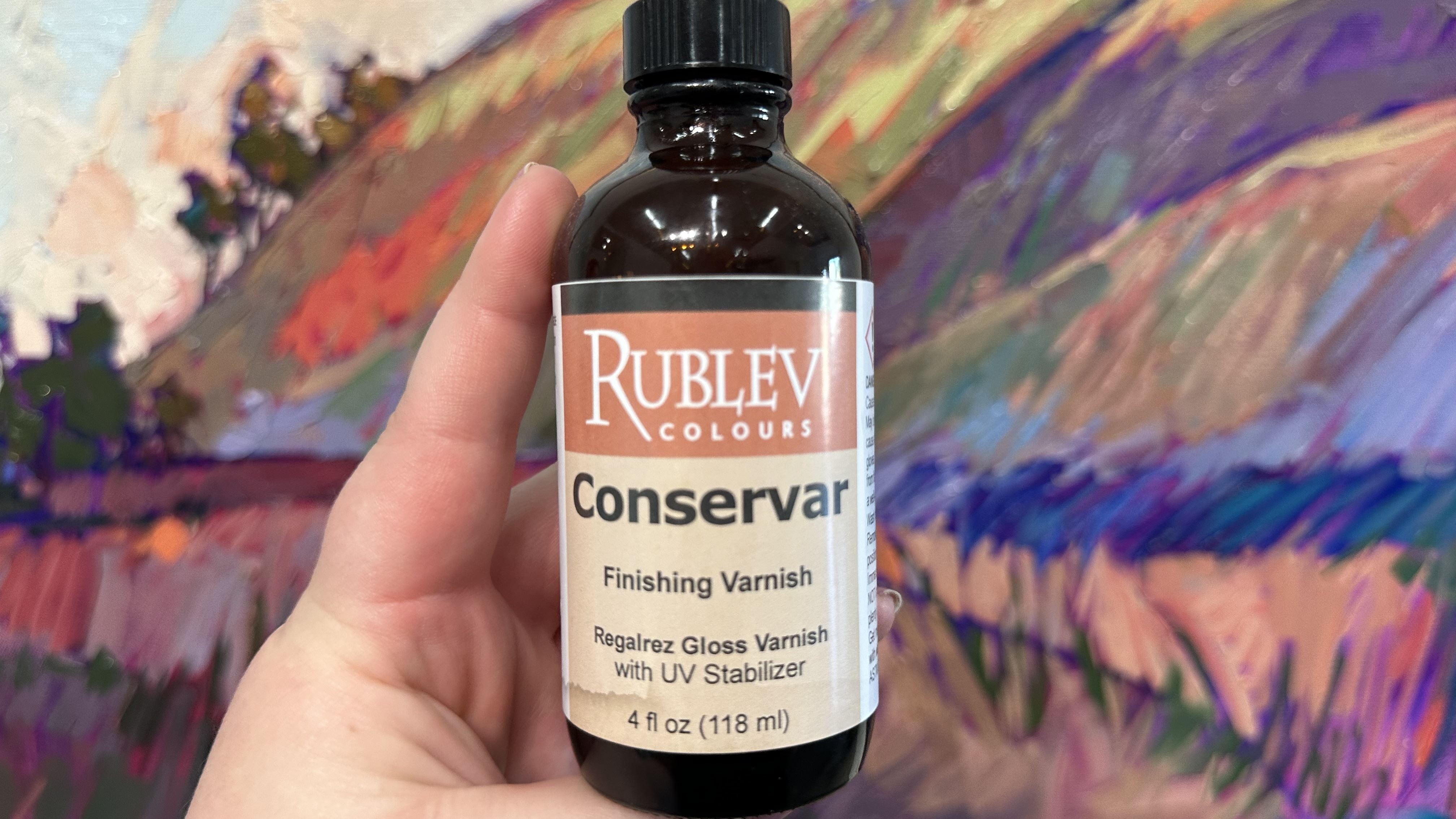
How to Conserve Your Art CollectionSimple Ways to Varnish Your Originals to Improve Their LongevityFriday, May 3, 2024Now that I have been creating oil paintings for almost two decades, I have become more interested in art conservation. My team and I have extensively researched how art museums conserve their oil paintings and prevent them from fading. I want to share my knowledge with you. Read More → |
|
|
|
How to Conserve Your Art Collection Simple Ways to Varnish Your Originals to Improve Their Longevity Friday, May 3, 2024 Now that I have been creating oil paintings for almost two decades, I have become more interested in art conservation. My team and I have extensively researched how art museums conserve their oil paintings and prevent them from fading. I want to share my knowledge with you. Read More → |
|
Erin Hanson Answers School Children's QuestionsSchool children often reach out to Erin with art questions. Here are some answers.Thursday, May 2, 2024Recently, two sets of school students reached out to Erin to ask her questions about her work and to share their own thoughts and comments as well. The questions and comments were very astute and wonderful, so we thought we would share the Q&A here on the blog. Read More → |
|
|
|
Erin Hanson Answers School Children's Questions School children often reach out to Erin with art questions. Here are some answers. Thursday, May 2, 2024 Recently, two sets of school students reached out to Erin to ask her questions about her work and to share their own thoughts and comments as well. The questions and comments were very astute and wonderful, so we thought we would share the Q&A here on the blog. Read More → |
|
Erin Hanson’s Sakura AdventureErin visited the cherry blossoms in her recent Japan tripWednesday, May 1, 2024Erin just returned from her second trip to Japan. Her goal for this trip was to find inspiration among the blossoming cherry trees known in Japan as "sakura." Read More → |
|
|
|
Erin Hanson’s Sakura Adventure Erin visited the cherry blossoms in her recent Japan trip Wednesday, May 1, 2024 Erin just returned from her second trip to Japan. Her goal for this trip was to find inspiration among the blossoming cherry trees known in Japan as "sakura." Read More → |
|
What Art is Best for Color Blind People?Colorblind men and women still deserve to experience beautiful art. Here's how they can do it.Sunday, March 31, 2024Colorblind men and women deserve to see and enjoy art, but this can be tricky because of how they see and experience color. There are seven different forms of colorblindness. In six of those forms, color shows up differently than normal color vision, and in one of those forms, the individual cannot see color at all. Discover how colorblind individuals can still appreciate the beauty of artwork. Read More → |
|
|
|
What Art is Best for Color Blind People? Colorblind men and women still deserve to experience beautiful art. Here's how they can do it. Sunday, March 31, 2024 Colorblind men and women deserve to see and enjoy art, but this can be tricky because of how they see and experience color. There are seven different forms of colorblindness. In six of those forms, color shows up differently than normal color vision, and in one of those forms, the individual cannot see color at all. Discover how colorblind individuals can still appreciate the beauty of artwork. Read More → |
|
The Secret Meaning of Cypress Trees in ArtCypress trees have held symbolism in cultures across the planetWednesday, January 31, 2024Did you know cypress trees have particular symbolism in art, mythology, and religion? For centuries, Middle Eastern and European cultures have revered the cypress as a symbol of the transition between life and death, with cypresses symbolizing the uplifting of the human spirit and the possibilities of eternal life. Read More → |
|
|
|
The Secret Meaning of Cypress Trees in Art Cypress trees have held symbolism in cultures across the planet Wednesday, January 31, 2024 Did you know cypress trees have particular symbolism in art, mythology, and religion? For centuries, Middle Eastern and European cultures have revered the cypress as a symbol of the transition between life and death, with cypresses symbolizing the uplifting of the human spirit and the possibilities of eternal life. Read More → |
|
Why Wine Country?Erin Hanson delves into why she loves to paint wine countryMonday, January 1, 2024Erin Hanson explains why she chose pastoral landscapes in wine country as a subject for her open impressionist oil paintings. Read More → |
|
|
|
Why Wine Country? Erin Hanson delves into why she loves to paint wine country Monday, January 1, 2024 Erin Hanson explains why she chose pastoral landscapes in wine country as a subject for her open impressionist oil paintings. Read More → |
|
Preservation through Art: California DesertEnjoy the vibrancy within every desert-scapeSunday, December 31, 2023Erin Hanson has been painting California desert scenes for well over two decades. As a California native who grew up both in the Southwest and Pacific Northwest, deserts have been her lifelong companion. Erin Hanson has been painting California desert scenes for well over two decades. As an Oregon native who transplanted to the California desert at a young age, deserts acted as a childhood companion. However, unless one is actively immersed in a desert town like Palm Springs, La Quinta, or Indian Wells, one must seek out the dusty expanses that cover California's desert region. These desolate areas strike one as stark and monotonous. However, if one has Erin's eye, a desert dweller can see the vibrancy blossoming within. Read More → |
|
|
|
Preservation through Art: California Desert Enjoy the vibrancy within every desert-scape Sunday, December 31, 2023 Erin Hanson has been painting California desert scenes for well over two decades. As a California native who grew up both in the Southwest and Pacific Northwest, deserts have been her lifelong companion. Erin Hanson has been painting California desert scenes for well over two decades. As an Oregon native who transplanted to the California desert at a young age, deserts acted as a childhood companion. However, unless one is actively immersed in a desert town like Palm Springs, La Quinta, or Indian Wells, one must seek out the dusty expanses that cover California's desert region. These desolate areas strike one as stark and monotonous. However, if one has Erin's eye, a desert dweller can see the vibrancy blossoming within. Read More → |
|
Painting the Blue Ridge MountainsArt of AppalachiaTuesday, December 12, 2023In the 1800s, oil painter William Louis Sonntag put brush to board and created a lovely painting called The Blue Ridge Mountains. Since then, many artists have depicted the Blue Ridge Mountains in paint, and those artists include Erin Hanson. Read More → |
|
|
|
Painting the Blue Ridge Mountains Art of Appalachia Tuesday, December 12, 2023 In the 1800s, oil painter William Louis Sonntag put brush to board and created a lovely painting called The Blue Ridge Mountains. Since then, many artists have depicted the Blue Ridge Mountains in paint, and those artists include Erin Hanson. Read More → |
|
Erin Hanson: Alchemist of Color ExhibitionArt Exhibition at the Channel Islands Maritime MuseumThursday, November 2, 2023Join art enthusiasts of every kind at the Channel Islands Maritime Museum in Oxnard California for the latest exhibition: Erin Hanson: Alchemist of Color. Read More → |
|
|
|
Erin Hanson: Alchemist of Color Exhibition Art Exhibition at the Channel Islands Maritime Museum Thursday, November 2, 2023 Join art enthusiasts of every kind at the Channel Islands Maritime Museum in Oxnard California for the latest exhibition: Erin Hanson: Alchemist of Color. Read More → |
|
An Interview with Erin Hanson, Alchemist of ColorHow Erin Hanson became an artist, in her own wordsWednesday, November 1, 2023I’ve spent over 10,000 hours just mixing paint and this has given me a lot of opportunities to explore what color can do. Now I can color match anything. I can color match any photograph, any paint color or fabric swatch – any object. I spend an hour or two every day mixing color for my paintings. In fact, color is such an important part of how I compose my paintings that I premix my entire palette before I ever pick up a brush to begin painting. Read More → |
|
|
|
An Interview with Erin Hanson, Alchemist of Color How Erin Hanson became an artist, in her own words Wednesday, November 1, 2023 I’ve spent over 10,000 hours just mixing paint and this has given me a lot of opportunities to explore what color can do. Now I can color match anything. I can color match any photograph, any paint color or fabric swatch – any object. I spend an hour or two every day mixing color for my paintings. In fact, color is such an important part of how I compose my paintings that I premix my entire palette before I ever pick up a brush to begin painting. Read More → |
|
Painting Small WorksErin Hanson's Petite PaintingsWednesday, November 1, 2023I began creating “petite” paintings as little studies to reference when painting a larger piece. I now find particular joy in creating them and use them to push myself as a painter. Read More → |
|
|
|
Painting Small Works Erin Hanson's Petite Paintings Wednesday, November 1, 2023 I began creating “petite” paintings as little studies to reference when painting a larger piece. I now find particular joy in creating them and use them to push myself as a painter. Read More → |
|
Follow In Erin Hanson's Footsteps: Explore the Grand Canyon Like an ArtistFollow in Erin Hanson's FootstepsTuesday, October 31, 2023If you are interested in Erin Hanson's work, this article will allow you to virtually follow in her footsteps around the canyon. You can also use it as a resource when visiting the Grand Canyon National Park. Using this guide, you can see the views Hanson portrays and watch as the park changes throughout the seasons. Read More → |
|
|
|
Follow In Erin Hanson's Footsteps: Explore the Grand Canyon Like an Artist Follow in Erin Hanson's Footsteps Tuesday, October 31, 2023 If you are interested in Erin Hanson's work, this article will allow you to virtually follow in her footsteps around the canyon. You can also use it as a resource when visiting the Grand Canyon National Park. Using this guide, you can see the views Hanson portrays and watch as the park changes throughout the seasons. Read More → |
|
How to Decorate Around Your Art CollectionIncorporate your art into your home design schemeSunday, October 1, 2023This article will show you how you can buy the artwork you love and adjust the room around it, making it look like the painting was designed especially for that room. Read More → |
|
|
|
How to Decorate Around Your Art Collection Incorporate your art into your home design scheme Sunday, October 1, 2023 This article will show you how you can buy the artwork you love and adjust the room around it, making it look like the painting was designed especially for that room. Read More → |
|
What are Floater Frames?Find out what it means when someone offers "floater frames" or "floating frames" in the art worldThursday, September 21, 2023One question that gets asked here at the Erin Hanson Gallery is "What is a floater frame?" or "What is a floating frame?" We are here to answer that question—and provide you with an overview of the various framing styles we use when presenting Erin Hanson's oil paintings, canvas prints, and 3D textured replicas at the gallery. Read More → |
|
|
|
What are Floater Frames? Find out what it means when someone offers "floater frames" or "floating frames" in the art world Thursday, September 21, 2023 One question that gets asked here at the Erin Hanson Gallery is "What is a floater frame?" or "What is a floating frame?" We are here to answer that question—and provide you with an overview of the various framing styles we use when presenting Erin Hanson's oil paintings, canvas prints, and 3D textured replicas at the gallery. Read More → |
|
How to Properly Conserve & UV Protect Your Oil PaintingA step-by-step guide for properly conserving and UV protecting your oil painting.Wednesday, September 20, 2023It has been two years or more since you purchased your oil painting. You want to protect it from UV rays and other damage, but you aren’t quite sure how to properly conserve your artwork. Does this sound like you? If so, you are in luck! Erin Hanson has created a step-by-step guide for properly conserving and UV protecting your oil painting. Read More → |
|
|
|
How to Properly Conserve & UV Protect Your Oil Painting A step-by-step guide for properly conserving and UV protecting your oil painting. Wednesday, September 20, 2023 It has been two years or more since you purchased your oil painting. You want to protect it from UV rays and other damage, but you aren’t quite sure how to properly conserve your artwork. Does this sound like you? If so, you are in luck! Erin Hanson has created a step-by-step guide for properly conserving and UV protecting your oil painting. Read More → |
|
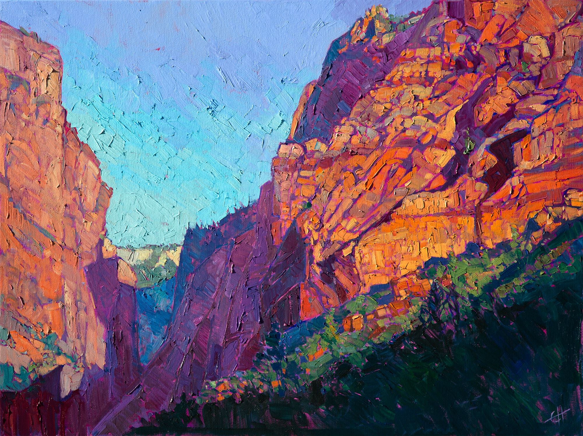
Follow In Erin Hanson's Footsteps: Explore Zion National Park Like an ArtistWhere should artists go to paint in Zion?Friday, September 15, 2023Erin Hanson has painted the red rock cliffs and diverse ecosystem found in Zion National Park for over a decade. Explore Zion through Hanson's open impressionist paintings. Where should artists go to Zion to paint? Read More → |
|
|
|
Follow In Erin Hanson's Footsteps: Explore Zion National Park Like an Artist Where should artists go to paint in Zion? Friday, September 15, 2023 Erin Hanson has painted the red rock cliffs and diverse ecosystem found in Zion National Park for over a decade. Explore Zion through Hanson's open impressionist paintings. Where should artists go to Zion to paint? Read More → |
|
Nebraska Public Media Interview with Erin HansonFriday LIVE: Extra: Bone Creek Museum of Agrarian ArtThursday, July 27, 2023Erin Hanson was recently interviewed by Genevieve Randall of Nebraska Public Media's show "Friday Live." They discussed Hanson's exhibition Erin Hanson: Color on the Vine at Bone Creek Museum of Agrarian Art and her upcoming artist's reception at the museum on July 29th, from 5 to 7 PM. Read More → |
|
|
|
Nebraska Public Media Interview with Erin Hanson Friday LIVE: Extra: Bone Creek Museum of Agrarian Art Thursday, July 27, 2023 Erin Hanson was recently interviewed by Genevieve Randall of Nebraska Public Media's show "Friday Live." They discussed Hanson's exhibition Erin Hanson: Color on the Vine at Bone Creek Museum of Agrarian Art and her upcoming artist's reception at the museum on July 29th, from 5 to 7 PM. Read More → |
|
Following in the Footsteps of the ImpressionistsImpressionists are painters of lightWednesday, July 26, 2023The Impressionists have been called the “painters of light.” Anyone who has stood in front of a Monet water lily painting knows what this means. The waving lines of color look loose and abstract up close, but when you step back, the whole painting comes into focus, and you see where each ripple in the water changes color, reflecting the light from the sky or the rich colors of the surrounding trees. Read More → |
|
|
|
Following in the Footsteps of the Impressionists Impressionists are painters of light Wednesday, July 26, 2023 The Impressionists have been called the “painters of light.” Anyone who has stood in front of a Monet water lily painting knows what this means. The waving lines of color look loose and abstract up close, but when you step back, the whole painting comes into focus, and you see where each ripple in the water changes color, reflecting the light from the sky or the rich colors of the surrounding trees. Read More → |
|
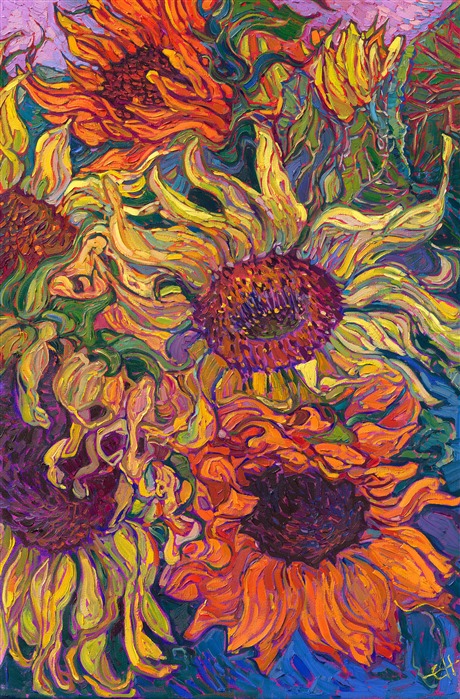
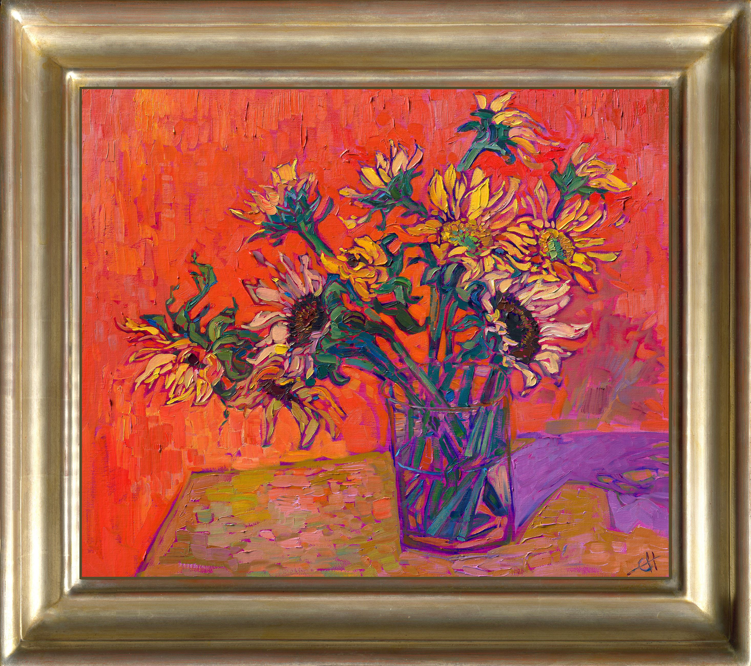
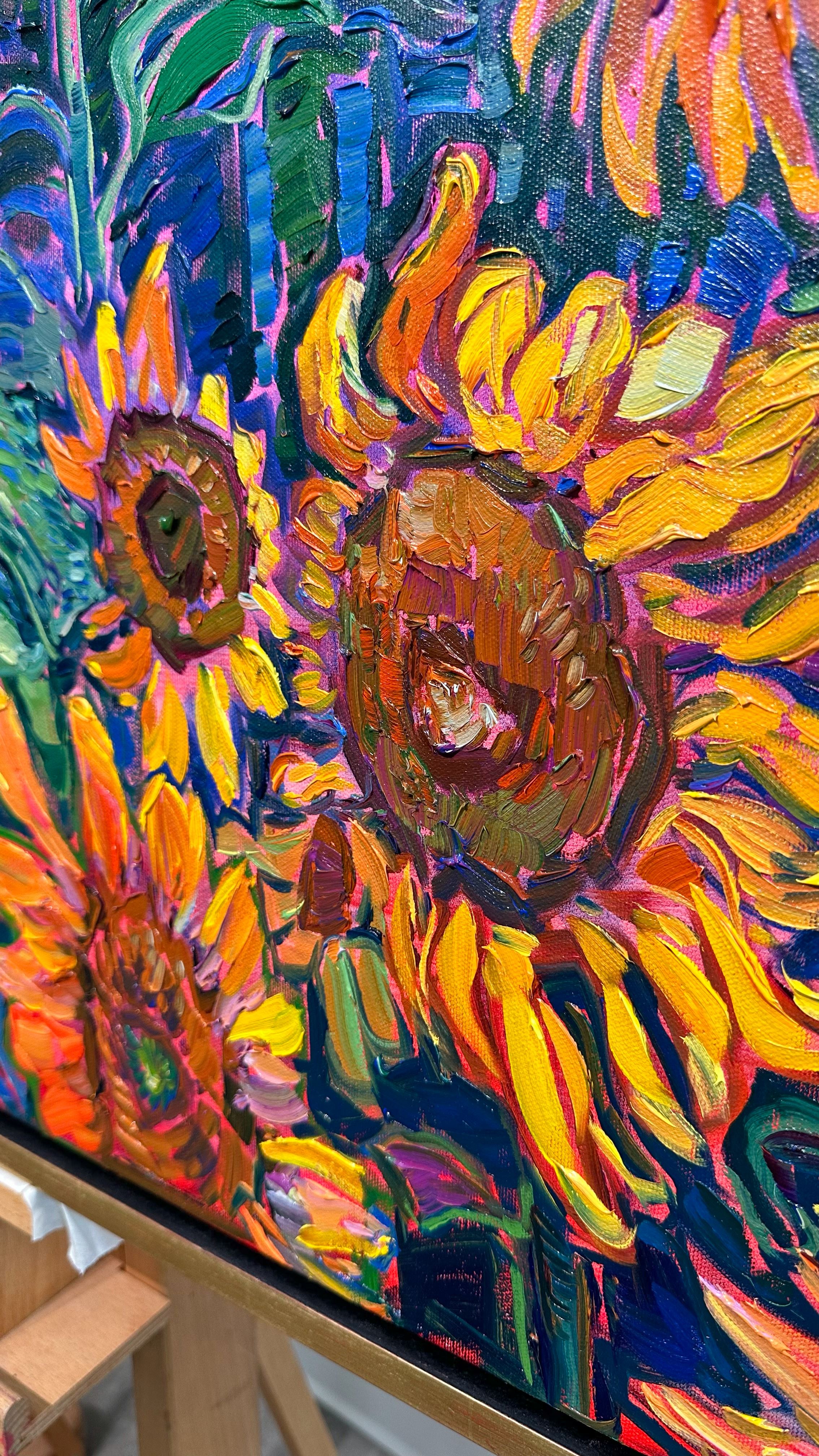
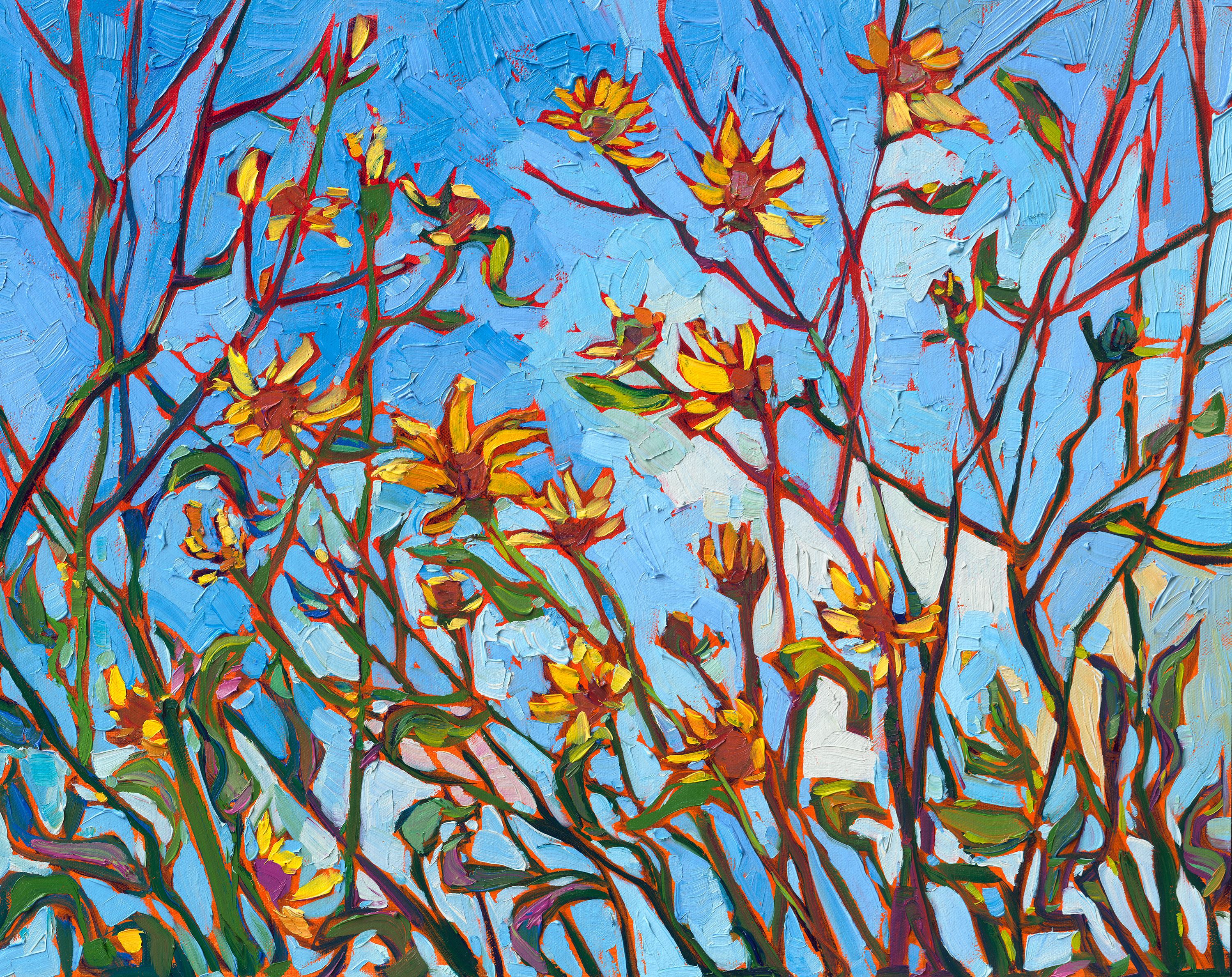
Ode to SunflowersImpressionist Paintings of SunflowersTuesday, July 25, 2023While I had always admired the colorful sunflower paintings by van Gogh, it never occurred to me to try painting them myself until, one day, I saw a vase of sunflowers that had been allowed to dry out without any water for two months. When I looked at the drooping, dried-out petals curving around the large heads, I knew instantly I had to paint them. Here was abstract color, bold contrast, classic theme... everything needed for the perfect painting. I have been painting sunflowers ever since. Read More → |
|
|
|
Ode to Sunflowers Impressionist Paintings of Sunflowers Tuesday, July 25, 2023 While I had always admired the colorful sunflower paintings by van Gogh, it never occurred to me to try painting them myself until, one day, I saw a vase of sunflowers that had been allowed to dry out without any water for two months. When I looked at the drooping, dried-out petals curving around the large heads, I knew instantly I had to paint them. Here was abstract color, bold contrast, classic theme... everything needed for the perfect painting. I have been painting sunflowers ever since. Read More → |
|
|
Following in the Footsteps of Early California PaintersThe long tradition of California ImpressionistsSaturday, July 15, 2023I have loved every painting I have ever seen of Edgar Payne, and his works make me want to jump in my van and head back out to the Colorado Plateau to explore Arches, Monument Valley, and Canyon de Chelly just one more time. When I first saw with my own eyes the twisted cypress trees and aquamarine waters of Monterey and Carmel, I understood why the Early California painters loved this landscape so much. Read More → |
|
|
|
Following in the Footsteps of Early California Painters The long tradition of California Impressionists Saturday, July 15, 2023 I have loved every painting I have ever seen of Edgar Payne, and his works make me want to jump in my van and head back out to the Colorado Plateau to explore Arches, Monument Valley, and Canyon de Chelly just one more time. When I first saw with my own eyes the twisted cypress trees and aquamarine waters of Monterey and Carmel, I understood why the Early California painters loved this landscape so much. Read More → |
|
|
Art: Beauty Inspired by NatureInterview with the ArtistMonday, July 3, 2023In a recent interview, Erin Hanson spoke with Turkish interviewer Yazı Cansu Karakuş for a piece in L'Officiel Türkiye. Below is a translated version of the article that was published. Read More → |
|
|
|
Art: Beauty Inspired by Nature Interview with the Artist Monday, July 3, 2023 In a recent interview, Erin Hanson spoke with Turkish interviewer Yazı Cansu Karakuş for a piece in L'Officiel Türkiye. Below is a translated version of the article that was published. Read More → |
|
The Future of Art ReproductionThe making of 3D textured replicasSaturday, July 1, 2023Learn how Erin Hanson went from giclee prints to creating 3D replicas of her original oil paintings. Read More → |
|
|
|
The Future of Art Reproduction The making of 3D textured replicas Saturday, July 1, 2023 Learn how Erin Hanson went from giclee prints to creating 3D replicas of her original oil paintings. Read More → |
|
How Has Impasto Painting Been Used Throughout History?Examine the history of impasto art with The Erin Hanson GalleryWednesday, June 28, 2023Erin Hanson and many other contemporary painters use impasto painting techniques in their art. This article shares where the impasto technique comes from and how it rose to prominence in the past centuries. Read More → |
|
|
|
How Has Impasto Painting Been Used Throughout History? Examine the history of impasto art with The Erin Hanson Gallery Wednesday, June 28, 2023 Erin Hanson and many other contemporary painters use impasto painting techniques in their art. This article shares where the impasto technique comes from and how it rose to prominence in the past centuries. Read More → |
|
Five Reasons Art Collectors Love 3D Textured ReplicasExplore affordable art replicas that look like the original paintingThursday, June 1, 2023Erin Hanson is one of the few artists worldwide to offer 3D textured replicas of her original paintings. While the 2D prints produced in The Erin Hanson Gallery workshop are so beautiful that they often get mistaken as original, Hanson wanted to offer collectors something more...something that replicates an original but is more affordable. Enter 3D textured replicas. Read More → |
|
|
|
Five Reasons Art Collectors Love 3D Textured Replicas Explore affordable art replicas that look like the original painting Thursday, June 1, 2023 Erin Hanson is one of the few artists worldwide to offer 3D textured replicas of her original paintings. While the 2D prints produced in The Erin Hanson Gallery workshop are so beautiful that they often get mistaken as original, Hanson wanted to offer collectors something more...something that replicates an original but is more affordable. Enter 3D textured replicas. Read More → |
|
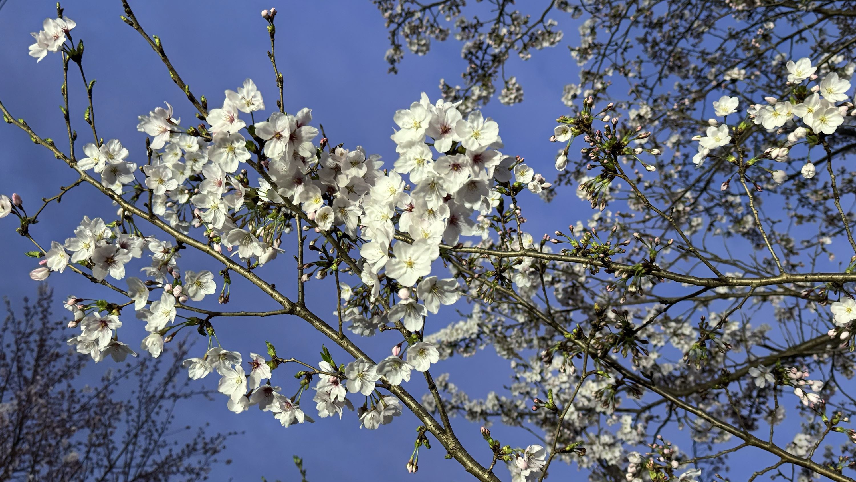
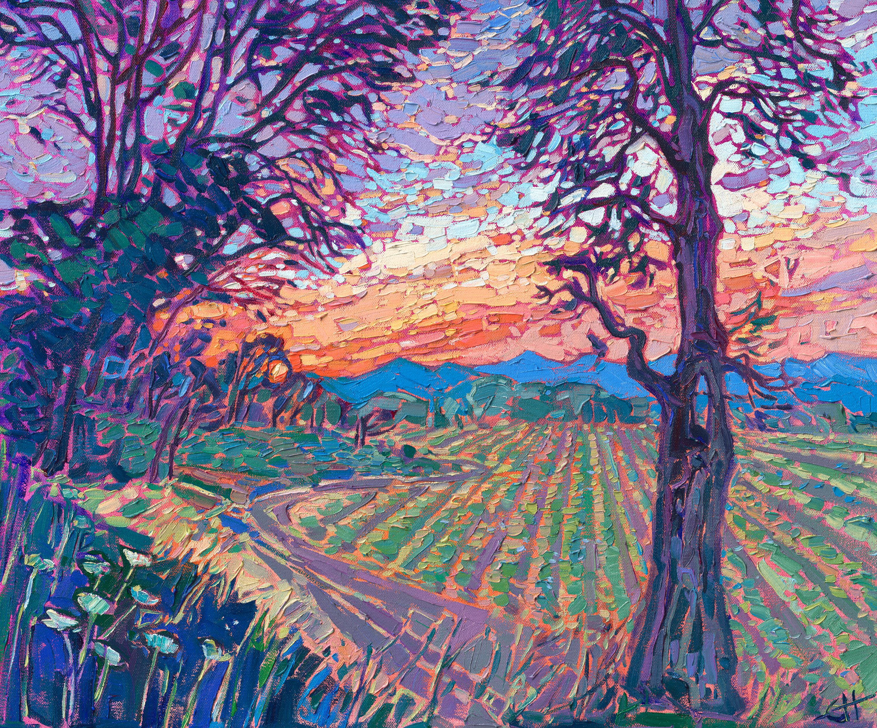
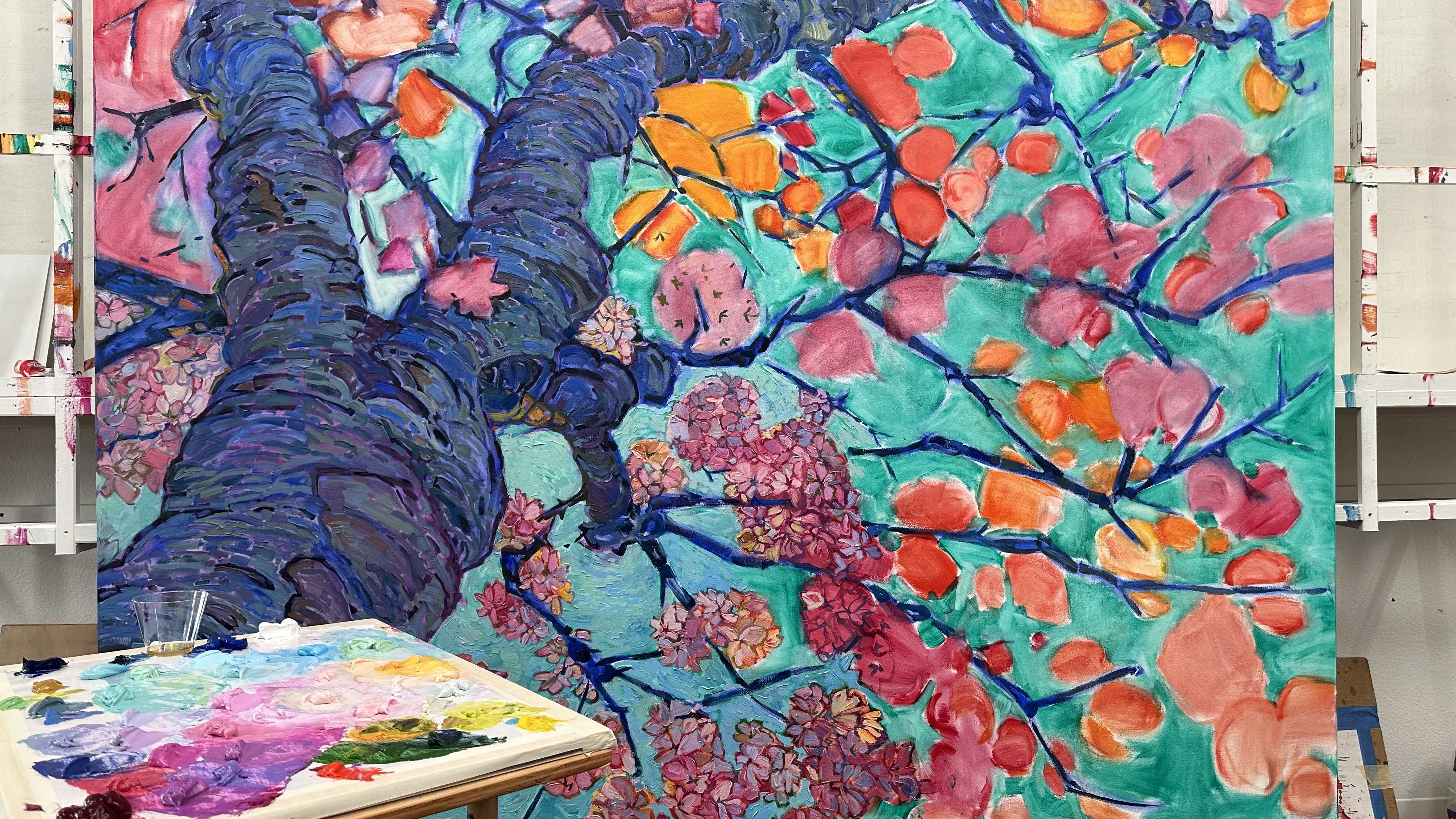
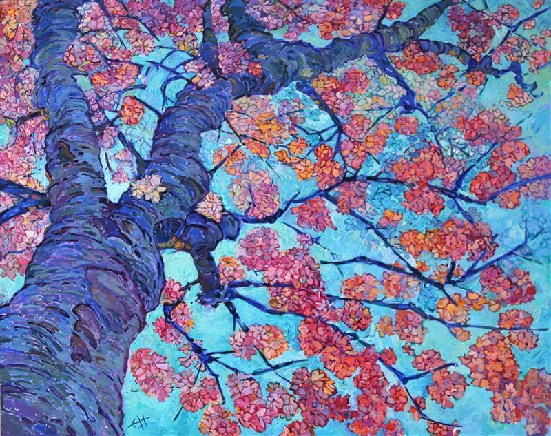
Behind-the-Art: Cherry in BloomThe Feeling of SpringThursday, June 1, 2023This piece is inspired by a local Oregon scene Hanson spotted not too far from her wine country estate. Cherry blossoms typically last for about a week, and then as quickly as they graced us, their petals fall like snow, and the wait starts for their next bloom. Read More → |
|
|
|
Behind-the-Art: Cherry in Bloom The Feeling of Spring Thursday, June 1, 2023 This piece is inspired by a local Oregon scene Hanson spotted not too far from her wine country estate. Cherry blossoms typically last for about a week, and then as quickly as they graced us, their petals fall like snow, and the wait starts for their next bloom. Read More → |
|
Capturing the Colors of Wine CountryExpanding my repertoire from deserts to wine countryThursday, June 1, 2023Learn how Erin Hanson expanded her repertoire, painting primarily red rock and desert-scapes to wine country and more pastoral landscapes. Read More → |
|
|
|
Capturing the Colors of Wine Country Expanding my repertoire from deserts to wine country Thursday, June 1, 2023 Learn how Erin Hanson expanded her repertoire, painting primarily red rock and desert-scapes to wine country and more pastoral landscapes. Read More → |
|
|
Erin Hanson is Revolutionizing Art ReproductionTextured art reproduction is tricky.Saturday, May 13, 2023In a painting, the play of light over the texture of brushstrokes plays a vital role in how we interact with and enjoy a piece of art. This is why a paper art print looks flat compared to an original oil painting. Indeed, one can present a reproduction through a film, as is the case in the Van Gogh immersive experience, but such reproductions are an art in themselves, and you cannot take them home with you. So, how to solve the problem of capturing the light and motion as intended by the artist? This is where 3D scanning and printing comes in. In a recent interview, Erin Hanson shared how the process works. Read More → |
|
|
|
Erin Hanson is Revolutionizing Art Reproduction Textured art reproduction is tricky. Saturday, May 13, 2023 In a painting, the play of light over the texture of brushstrokes plays a vital role in how we interact with and enjoy a piece of art. This is why a paper art print looks flat compared to an original oil painting. Indeed, one can present a reproduction through a film, as is the case in the Van Gogh immersive experience, but such reproductions are an art in themselves, and you cannot take them home with you. So, how to solve the problem of capturing the light and motion as intended by the artist? This is where 3D scanning and printing comes in. In a recent interview, Erin Hanson shared how the process works. Read More → |
|
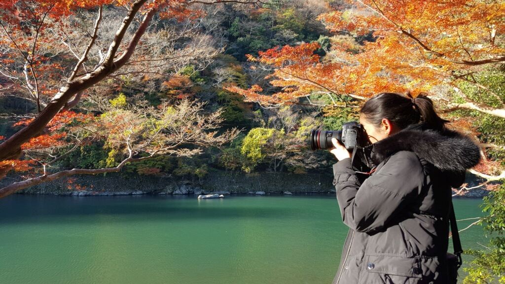
Iconic Scenes: Kyoto, JapanErin Hanson Explores the Majesty of KyotoSaturday, April 29, 2023Several years ago, Erin visited Kyoto, Japan for inspiration. This city is at the cultural and historical heart of Japan and is well known for classic views of cherry blossoms in spring and scarlet maple leaves in autumn. When Erin visited, she enjoyed the fall splendor found around the many Shinto shrines, temples, and scenic spaces like Arashiyama. Read More → |
|
|
|
Iconic Scenes: Kyoto, Japan Erin Hanson Explores the Majesty of Kyoto Saturday, April 29, 2023 Several years ago, Erin visited Kyoto, Japan for inspiration. This city is at the cultural and historical heart of Japan and is well known for classic views of cherry blossoms in spring and scarlet maple leaves in autumn. When Erin visited, she enjoyed the fall splendor found around the many Shinto shrines, temples, and scenic spaces like Arashiyama. Read More → |
|
Behind-the-Scenes at The Erin Hanson GalleryWednesday, April 5, 2023Get a virtual tour of The Erin Hanson Gallery, McMinnville. This tour includes the gallery, studio, print shop, and warehouse. Read More → |
|
|
|
Behind-the-Scenes at The Erin Hanson Gallery Wednesday, April 5, 2023 Get a virtual tour of The Erin Hanson Gallery, McMinnville. This tour includes the gallery, studio, print shop, and warehouse. Read More → |
|
How to Commission an Oil PaintingWhat to think about when considering commissioning a paintingSaturday, April 1, 2023If you have ever considered commissioning a painting, be sure to read this article! In it, Erin Hanson shares the in's and out's of the commissioning process. Read More → |
|
|
|
How to Commission an Oil Painting What to think about when considering commissioning a painting Saturday, April 1, 2023 If you have ever considered commissioning a painting, be sure to read this article! In it, Erin Hanson shares the in's and out's of the commissioning process. Read More → |
|
Limited Palette for Unlimited ColorArticle by Erin HansonFriday, March 24, 2023It seems counter-intuitive, but to create more colors in your painting, you need fewer colors on your palette. Here’s why... Read More → |
|
|
|
Limited Palette for Unlimited Color Article by Erin Hanson Friday, March 24, 2023 It seems counter-intuitive, but to create more colors in your painting, you need fewer colors on your palette. Here’s why... Read More → |
|
(For Artists) Commonly Asked Questions About Open ImpressionismA Look at Erin Hanson's Technique and Artist's ToolsTuesday, February 28, 2023Here are answers to commonly asked questions about Erin Hanson's painting style, Open Impressionism. Read More → |
|
|
|
(For Artists) Commonly Asked Questions About Open Impressionism A Look at Erin Hanson's Technique and Artist's Tools Tuesday, February 28, 2023 Here are answers to commonly asked questions about Erin Hanson's painting style, Open Impressionism. Read More → |
|
Bringing Sunset Color to CanvasSunset Paintings in OilThursday, February 23, 2023Read More → |
|
|
|
Bringing Sunset Color to Canvas Sunset Paintings in Oil Thursday, February 23, 2023 Read More → |
|
Winter Painting in ColorWinter through the Lens of ImpressionismThursday, February 9, 2023Have you ever thought about heading to a national park during winter? How about California wine country? Erin Hanson has spent years traveling across the country and internationally so that you can both enjoy lovely art and become inspired to visit treasured locations that you may not have considered off-season. Read More → |
|
|
|
Winter Painting in Color Winter through the Lens of Impressionism Thursday, February 9, 2023 Have you ever thought about heading to a national park during winter? How about California wine country? Erin Hanson has spent years traveling across the country and internationally so that you can both enjoy lovely art and become inspired to visit treasured locations that you may not have considered off-season. Read More → |
|
Adventures Turned into ArtArticle by Erin HansonWednesday, February 1, 2023My paintings all begin with outdoor hikes and explorations in nature. My goal when I paint is to re-capture that feeling of being out of doors and surrounded by natural beauty... Read More → |
|
|
|
Adventures Turned into Art Article by Erin Hanson Wednesday, February 1, 2023 My paintings all begin with outdoor hikes and explorations in nature. My goal when I paint is to re-capture that feeling of being out of doors and surrounded by natural beauty... Read More → |
|
What is a Painting Style?Article by Erin HansonSunday, January 1, 2023I started painting one painting a week about sixteen years ago. I had just moved to Las Vegas to rock climb at Red Rock Canyon, and I instantly fell in love with its red and orange sandstone cliffs. I decided I could paint nothing but landscapes for the rest of my life. Read More → |
|
|
|
What is a Painting Style? Article by Erin Hanson Sunday, January 1, 2023 I started painting one painting a week about sixteen years ago. I had just moved to Las Vegas to rock climb at Red Rock Canyon, and I instantly fell in love with its red and orange sandstone cliffs. I decided I could paint nothing but landscapes for the rest of my life. Read More → |
|
|
Erin Hanson: Amica’s 2022 Thanksgiving ArtistUnveiling "Maple Lights"Saturday, November 12, 2022Erin Hanson has been selected as Amica Mutual Insurance Company’s 2022 Thanksgiving card artist. Hanson’s piece, Maple Lights, was featured on a Thanksgiving-themed holiday card that was mailed to 800,000 subscribers. Amica also released a digital version of the card that features beautiful classical music paired with an autumnal poem by Margaret Melozzi. Read More → |
|
|
|
Erin Hanson: Amica’s 2022 Thanksgiving Artist Unveiling "Maple Lights" Saturday, November 12, 2022 Erin Hanson has been selected as Amica Mutual Insurance Company’s 2022 Thanksgiving card artist. Hanson’s piece, Maple Lights, was featured on a Thanksgiving-themed holiday card that was mailed to 800,000 subscribers. Amica also released a digital version of the card that features beautiful classical music paired with an autumnal poem by Margaret Melozzi. Read More → |
|
New Arizona Gallery will Focus on the Colors of the WestVisitors Can Expect a Visual Feast of Color and TextureThursday, October 13, 2022Each of my three galleries has a different focus, based on their respective surrounding landscapes. In my Oregon gallery, I focus on the rolling vineyards and epic fall colors of the Willamette wine country. In Carmel-by-the-Sea, I present my works of Monterey cypress trees and coastal views from Highway 1. In my new Scottsdale gallery, I will focus on the unique color palette and western landscapes of the Arizona desert and the Colorado Plateau. Read More → |
|
|
|
New Arizona Gallery will Focus on the Colors of the West Visitors Can Expect a Visual Feast of Color and Texture Thursday, October 13, 2022 Each of my three galleries has a different focus, based on their respective surrounding landscapes. In my Oregon gallery, I focus on the rolling vineyards and epic fall colors of the Willamette wine country. In Carmel-by-the-Sea, I present my works of Monterey cypress trees and coastal views from Highway 1. In my new Scottsdale gallery, I will focus on the unique color palette and western landscapes of the Arizona desert and the Colorado Plateau. Read More → |
|
Inside Erin Hanson's Petite Workssmall works, BIG IMPACTSaturday, October 8, 2022Impressionist painter Erin Hanson invites you to explore her collection of petite works. Hanson’s vibrant palette is rich with texture and light, a sumptuous feast for the senses. Her harmonious compositions celebrate the natural beauty of the great outdoors. Her oil paintings have garnered international critical acclaim and are in hundreds of museum and private collections worldwide. Read More → |
|
|
|
Inside Erin Hanson's Petite Works small works, BIG IMPACT Saturday, October 8, 2022 Impressionist painter Erin Hanson invites you to explore her collection of petite works. Hanson’s vibrant palette is rich with texture and light, a sumptuous feast for the senses. Her harmonious compositions celebrate the natural beauty of the great outdoors. Her oil paintings have garnered international critical acclaim and are in hundreds of museum and private collections worldwide. Read More → |
|
Erin Hanson on Her Petite Works"Petite paintings are the jewels of Open Impressionism". - Erin HansonSaturday, October 8, 2022I began creating “petite” paintings as little studies to reference when painting a larger piece. Oftentimes, I found I loved these little painting sketches better than the finished paintings. The sketches were looser and more confident than the finished paintings; I was able to capture an entire vast landscape with only a few dozen brushstrokes that seemed to magically fall in the exact correct position. After a few years of painting these sketches, I started painting these small works deliberately, and The Petite Collection was born. Read More → |
|
|
|
Erin Hanson on Her Petite Works "Petite paintings are the jewels of Open Impressionism". - Erin Hanson Saturday, October 8, 2022 I began creating “petite” paintings as little studies to reference when painting a larger piece. Oftentimes, I found I loved these little painting sketches better than the finished paintings. The sketches were looser and more confident than the finished paintings; I was able to capture an entire vast landscape with only a few dozen brushstrokes that seemed to magically fall in the exact correct position. After a few years of painting these sketches, I started painting these small works deliberately, and The Petite Collection was born. Read More → |
|
Warm Up Your Home with ArtworkUse color theory and colorful art to keep your home cozySaturday, October 1, 2022Autumn is right around the corner, which means cooler weather is also coming. This time of year always feels like a celebration as the world around us fills with buttery yellow sunflowers, multi-colored pumpkins, and tawny autumn leaves. Your home is likely no exception. If you love autumn, you are probably decorating your home with warm and welcoming decor. Read More → |
|
|
|
Warm Up Your Home with Artwork Use color theory and colorful art to keep your home cozy Saturday, October 1, 2022 Autumn is right around the corner, which means cooler weather is also coming. This time of year always feels like a celebration as the world around us fills with buttery yellow sunflowers, multi-colored pumpkins, and tawny autumn leaves. Your home is likely no exception. If you love autumn, you are probably decorating your home with warm and welcoming decor. Read More → |
|
|
A Profile of Prolific Artists Throughout History - Part OneArtists Who Created One Thousand or More PiecesThursday, September 29, 2022When we consider artists who produced many works, we often look at artists found through more modern history. Monet, for example, produced thousands of pieces in his lifetime. Picasso is the most prolific artist in history, having created over fifty thousand works. Erin Hanson has completed well over two thousand paintings, and she’s still painting and creating to this day. Who else is on the list of incredibly prolific artists? We cannot know which artists were prolific back in the time of the Pharaohs or even early cave dwellers. But we can seek out immensely productive artists throughout history and share their beautiful works as we consider how this collection of beauty has affected our everyday lives. That is what this series of articles attempts to do. Read More → |
|
|
|
A Profile of Prolific Artists Throughout History - Part One Artists Who Created One Thousand or More Pieces Thursday, September 29, 2022 When we consider artists who produced many works, we often look at artists found through more modern history. Monet, for example, produced thousands of pieces in his lifetime. Picasso is the most prolific artist in history, having created over fifty thousand works. Erin Hanson has completed well over two thousand paintings, and she’s still painting and creating to this day. Who else is on the list of incredibly prolific artists? We cannot know which artists were prolific back in the time of the Pharaohs or even early cave dwellers. But we can seek out immensely productive artists throughout history and share their beautiful works as we consider how this collection of beauty has affected our everyday lives. That is what this series of articles attempts to do. Read More → |
|
A Profile of Prolific Artists Throughout History - Part TwoArtists Who Created One Hundred or More PiecesThursday, September 29, 2022As we consider the works of renaissance painters, baroque sculptors, post-impressionists, and modern artists, we think about what is most important in each artist’s work. What are they trying to share with the world by creating powerful art? Are they hoping to move the viewer to tears? Do they wish the viewer to connect with a piece of history on a visceral level? Each of these intensely talented and hard-working artists was hoping to move you in some way. We hope this list helps you connect with an artist you may not have heard of or moves you in some way to connect more deeply with an artist you love. Read More → |
|
|
|
A Profile of Prolific Artists Throughout History - Part Two Artists Who Created One Hundred or More Pieces Thursday, September 29, 2022 As we consider the works of renaissance painters, baroque sculptors, post-impressionists, and modern artists, we think about what is most important in each artist’s work. What are they trying to share with the world by creating powerful art? Are they hoping to move the viewer to tears? Do they wish the viewer to connect with a piece of history on a visceral level? Each of these intensely talented and hard-working artists was hoping to move you in some way. We hope this list helps you connect with an artist you may not have heard of or moves you in some way to connect more deeply with an artist you love. Read More → |
|
Van Gogh: Beyond ImpressionismCredit: Article reproduced with permission from theartstory.orgFriday, July 15, 2022Vincent Van Gogh was born the second of six children into a religious Dutch Reformed Church family in the south of the Netherlands. His father, Theodorus Van Gogh, was a clergyman and his mother, Anna Cornelia Carbentus, was the daughter of a bookseller. Van Gogh exhibited unstable moods during his childhood, and showed no early inclination toward art-making, though he excelled at languages while attending two boarding schools. In 1868, he abandoned his studies and never successfully returned to formal schooling. Read More → |
|
|
|
Van Gogh: Beyond Impressionism Credit: Article reproduced with permission from theartstory.org Friday, July 15, 2022 Vincent Van Gogh was born the second of six children into a religious Dutch Reformed Church family in the south of the Netherlands. His father, Theodorus Van Gogh, was a clergyman and his mother, Anna Cornelia Carbentus, was the daughter of a bookseller. Van Gogh exhibited unstable moods during his childhood, and showed no early inclination toward art-making, though he excelled at languages while attending two boarding schools. In 1868, he abandoned his studies and never successfully returned to formal schooling. Read More → |
|
Erin Hanson: American Master Artistby James PeckTuesday, June 14, 2022I first encountered Erin Hanson’s art in New York City. Ken Ratner, a talented artist, curator, and writer, had invited me to his Manhattan apartment to look at his burgeoning art collection. It was a cozy apartment filled with art befitting a collector of modest means but large ambitions. As I worked my way through dozens of works of art, I noticed two things. First, Ratner had an unerring eye for quality. Second, his collection featured the most quintessential of American subjects, the land. Many of America’s finest artists, from Thomas Cole to Albert Bierstadt to Edgar Alwin Payne, had elevated the land to the highest art form. If the land was prominent within Ratner’s collection, then Erin Hanson was the star in the Western sky. I was immediately struck by her talent. Read More → |
|
|
|
Erin Hanson: American Master Artist by James Peck Tuesday, June 14, 2022 I first encountered Erin Hanson’s art in New York City. Ken Ratner, a talented artist, curator, and writer, had invited me to his Manhattan apartment to look at his burgeoning art collection. It was a cozy apartment filled with art befitting a collector of modest means but large ambitions. As I worked my way through dozens of works of art, I noticed two things. First, Ratner had an unerring eye for quality. Second, his collection featured the most quintessential of American subjects, the land. Many of America’s finest artists, from Thomas Cole to Albert Bierstadt to Edgar Alwin Payne, had elevated the land to the highest art form. If the land was prominent within Ratner’s collection, then Erin Hanson was the star in the Western sky. I was immediately struck by her talent. Read More → |
|
|
How Vibrant Colors Have Been Used in Art Throughout HistoryTuesday, June 7, 2022From the beginning of recorded history, artists have sought vibrant colors to use in their art. Cave paintings used a mixture of animal fats and saliva with charcoal, iron-rich soil, or chalk to create red, yellow, brown, black, and white. Ancient Egyptians used rich red, blue, green, brown, yellow, and black pigments to paint hieroglyphs and works of art. Renaissance artists went into debt sourcing lapis lazuli to create brilliant blue for their masterworks in oil. Read More → |
|
|
|
How Vibrant Colors Have Been Used in Art Throughout History Tuesday, June 7, 2022 From the beginning of recorded history, artists have sought vibrant colors to use in their art. Cave paintings used a mixture of animal fats and saliva with charcoal, iron-rich soil, or chalk to create red, yellow, brown, black, and white. Ancient Egyptians used rich red, blue, green, brown, yellow, and black pigments to paint hieroglyphs and works of art. Renaissance artists went into debt sourcing lapis lazuli to create brilliant blue for their masterworks in oil. Read More → |
|
A History of Sunflower ArtExplore the beauty and symbology of sunflowers in art and cultureTuesday, May 24, 2022Sunflowers have famously been depicted by impressionist and post-impressionist artists Vincent van Gogh and Paul Gauguin. While these two giants in the art world were European, the flower has a distinctly American origin. Read More → |
|
|
|
A History of Sunflower Art Explore the beauty and symbology of sunflowers in art and culture Tuesday, May 24, 2022 Sunflowers have famously been depicted by impressionist and post-impressionist artists Vincent van Gogh and Paul Gauguin. While these two giants in the art world were European, the flower has a distinctly American origin. Read More → |
![[Announcing] Erin Hanson: The Sunflower Collection](/Content/SiteImages/Screengrab Sunflower Logo.png)
|
[Announcing] Erin Hanson: The Sunflower CollectionSunflowers through the Lens of ImpressionismSaturday, May 14, 2022Oregon-based contemporary impressionist Erin Hanson is poised to release a brand-new painting collection focused on the ever-luminous bloom, the sunflower. "The Sunflower Collection" is an ode to the impressionists who came before her, including Monet and van Gogh, who celebrated the beauty of sunflowers in their iconic paintings. Read More → |
|
|
|
[Announcing] Erin Hanson: The Sunflower Collection Sunflowers through the Lens of Impressionism Saturday, May 14, 2022 Oregon-based contemporary impressionist Erin Hanson is poised to release a brand-new painting collection focused on the ever-luminous bloom, the sunflower. "The Sunflower Collection" is an ode to the impressionists who came before her, including Monet and van Gogh, who celebrated the beauty of sunflowers in their iconic paintings. Read More → |
|
When to Stop PaintingA Note from Erin HansonFriday, January 14, 2022How do you know when a painting is done? How do you stop a painting from becoming overworked and muddy? Learn about how impressionist artist Erin Hanson knows when to stop painting. Read More → |
|
|
|
When to Stop Painting A Note from Erin Hanson Friday, January 14, 2022 How do you know when a painting is done? How do you stop a painting from becoming overworked and muddy? Learn about how impressionist artist Erin Hanson knows when to stop painting. Read More → |
|
Surrounding Yourself with BeautyInterview with Gallerist Amy JensenFriday, December 31, 2021Do you find that new collectors are intimidated by original art? Many of our original paintings sell to first-time collectors. I have noticed that people who are really passionate about impressionists like Monet and van Gogh also fall in love with Erin’s paintings. We make it easy to start collecting original work, like taking videos of the piece if they can’t see it in person, and we offer layaways or financing options through Art Money. Read More → |
|
|
|
Surrounding Yourself with Beauty Interview with Gallerist Amy Jensen Friday, December 31, 2021 Do you find that new collectors are intimidated by original art? Many of our original paintings sell to first-time collectors. I have noticed that people who are really passionate about impressionists like Monet and van Gogh also fall in love with Erin’s paintings. We make it easy to start collecting original work, like taking videos of the piece if they can’t see it in person, and we offer layaways or financing options through Art Money. Read More → |
|
Designing with Your Art CollectionAn Interview with Evan Millard of Modern RemainsThursday, December 30, 2021Have you ever designed an entire home around a client’s art collection? Yes! A few years ago, we designed a cocktail lounge around a black and white photography collection, with one of the photographs being of Tupac. This design featured layers of lush velvets, jewel-toned lacquer finishes, vintage furniture, and of course that photo of Tupac! Read More → |
|
|
|
Designing with Your Art Collection An Interview with Evan Millard of Modern Remains Thursday, December 30, 2021 Have you ever designed an entire home around a client’s art collection? Yes! A few years ago, we designed a cocktail lounge around a black and white photography collection, with one of the photographs being of Tupac. This design featured layers of lush velvets, jewel-toned lacquer finishes, vintage furniture, and of course that photo of Tupac! Read More → |
|
A Modern-Day Look at Impressionism Versus ExpressionismHow two distinct painting movements mergeWednesday, December 22, 2021The term “impressionism” often conjures up images of van Gogh’s sunflowers, Monet’s waterlilies, and luncheons with Renoir. These paintings are beautiful, rich in color, and depict everyday scenes from the period. On the other hand, the first painting most people think about when hearing “expressionism” is The Scream by Edvard Munch. Other classic expressionist paintings like Der Blaue Reiter by Kandinsky and Large Blue Horses by Marc showcase expressive movement and brilliant color. These expressionist works and many others use movement, color, and style to evoke emotion in both painter and viewer. Both styles of painting are evocative, rich with imagery and color, and completely fascinating. Read More → |
|
|
|
A Modern-Day Look at Impressionism Versus Expressionism How two distinct painting movements merge Wednesday, December 22, 2021 The term “impressionism” often conjures up images of van Gogh’s sunflowers, Monet’s waterlilies, and luncheons with Renoir. These paintings are beautiful, rich in color, and depict everyday scenes from the period. On the other hand, the first painting most people think about when hearing “expressionism” is The Scream by Edvard Munch. Other classic expressionist paintings like Der Blaue Reiter by Kandinsky and Large Blue Horses by Marc showcase expressive movement and brilliant color. These expressionist works and many others use movement, color, and style to evoke emotion in both painter and viewer. Both styles of painting are evocative, rich with imagery and color, and completely fascinating. Read More → |
![Go Leaf Peeping in the Northeast with Erin Hanson [Part 1]](/Content/SiteImages/Erin_Hanson_Enchanted_Forest.jpg)
|
Go Leaf Peeping in the Northeast with Erin Hanson [Part 1]Leaf Peeping in New EnglandMonday, October 25, 2021Have you ever gone leaf peeping? Seeking out the most vibrant autumnal colors among local or far-flung trees and forests can be immensely satisfying. There is something about turning a corner to find a shock of gold and red against green or stopping at a lookout to view a patchwork of fall hues. The vibrant, seasonal colors found in trees around the world can bring a feeling of renewed energy and peace to those who go looking. Read More → |
|
|
|
Go Leaf Peeping in the Northeast with Erin Hanson [Part 1] Leaf Peeping in New England Monday, October 25, 2021 Have you ever gone leaf peeping? Seeking out the most vibrant autumnal colors among local or far-flung trees and forests can be immensely satisfying. There is something about turning a corner to find a shock of gold and red against green or stopping at a lookout to view a patchwork of fall hues. The vibrant, seasonal colors found in trees around the world can bring a feeling of renewed energy and peace to those who go looking. Read More → |
![Go Leaf-Peeping on Paths Less Traveled with Erin Hanson [Part 2]](/Content/SiteImages/Erin-Hanson-Aspen-Light.jpg)
|
Go Leaf-Peeping on Paths Less Traveled with Erin Hanson [Part 2]Go Leaf Peeping with Erin Hanson Throughout the United StatesMonday, October 25, 2021Come on a journey with Erin as she explores the leaf-peeping paths less traveled around the United States. Read More → |
|
|
|
Go Leaf-Peeping on Paths Less Traveled with Erin Hanson [Part 2] Go Leaf Peeping with Erin Hanson Throughout the United States Monday, October 25, 2021 Come on a journey with Erin as she explores the leaf-peeping paths less traveled around the United States. Read More → |
|
An Ode to Water LiliesTuesday, September 14, 2021In honor of Erin Hanson's new, expansive water lilies painting, we wanted to take a moment to look back at the rich and colorful history of these luminous blooms. Read More → |
|
|
|
An Ode to Water Lilies Tuesday, September 14, 2021 In honor of Erin Hanson's new, expansive water lilies painting, we wanted to take a moment to look back at the rich and colorful history of these luminous blooms. Read More → |
|
The Group of Seven, Canada’s Impressionist MovementHow Impressionism helped a Country Find its Artistic VoiceFriday, August 27, 2021The Group of Seven gained inspiration from classic impressionism, the Canadian landscape, and their own views on modern art. While most of the painters in The Group chose landscapes and pastoral subjects for their later works, they did not all begin painting in nature. Many of the painters chose to depict local slums, harbors, soldiers, the Great War, and the industrialization of their city. Read More → |
|
|
|
The Group of Seven, Canada’s Impressionist Movement How Impressionism helped a Country Find its Artistic Voice Friday, August 27, 2021 The Group of Seven gained inspiration from classic impressionism, the Canadian landscape, and their own views on modern art. While most of the painters in The Group chose landscapes and pastoral subjects for their later works, they did not all begin painting in nature. Many of the painters chose to depict local slums, harbors, soldiers, the Great War, and the industrialization of their city. Read More → |
|
Now Open! The Erin Hanson Gallery in McMinnville OregonSaturday, August 14, 2021All locals and tourists are welcome to visit the new McMinnville Gallery during walk-in hours and see Erin Hanson’s latest “open impressionism” landscape paintings. Each painting blends modern expressionism and classic impressionism to capture the movement and beauty of natural spaces. Read More → |
|
|
|
Now Open! The Erin Hanson Gallery in McMinnville Oregon Saturday, August 14, 2021 All locals and tourists are welcome to visit the new McMinnville Gallery during walk-in hours and see Erin Hanson’s latest “open impressionism” landscape paintings. Each painting blends modern expressionism and classic impressionism to capture the movement and beauty of natural spaces. Read More → |
|
The Group of Seven, Canada’s Impressionist MovementHow Impressionism helped a New Country Find its VoiceThursday, July 15, 2021Back in the early 1900s, the Canadian landscape was called “unpaintable” by skeptics. A lot was going on in Canada at the time; the Industrial Revolution was in full swing, non-native settlers were forging an incredibly wild and inhospitable countryside, and World War I was brewing. Perhaps, with so many settlers struggling to carve out lives in such uncertain terrain, the natural lands of Canada were considered too hostile for anyone to depict it with beauty. The rugged land was one to be tamed, not celebrated. Fortunately, a group of Canadian artists did not see it that way. Read More → |
|
|
|
The Group of Seven, Canada’s Impressionist Movement How Impressionism helped a New Country Find its Voice Thursday, July 15, 2021 Back in the early 1900s, the Canadian landscape was called “unpaintable” by skeptics. A lot was going on in Canada at the time; the Industrial Revolution was in full swing, non-native settlers were forging an incredibly wild and inhospitable countryside, and World War I was brewing. Perhaps, with so many settlers struggling to carve out lives in such uncertain terrain, the natural lands of Canada were considered too hostile for anyone to depict it with beauty. The rugged land was one to be tamed, not celebrated. Fortunately, a group of Canadian artists did not see it that way. Read More → |

|
Erin on the Front-Page of Yamhill County's News-Register"Successful California artist moved her home base to McMinnville"Friday, March 26, 2021"People don’t just like Erin Hanson’s color-saturated landscapes. They love them, snapping them up before the oils are dry and keeping Hanson busy planning, mixing colors and painting". - Starla Pointer, Yamhill County's News-Register Read More → |
|
|
|
Erin on the Front-Page of Yamhill County's News-Register "Successful California artist moved her home base to McMinnville" Friday, March 26, 2021 "People don’t just like Erin Hanson’s color-saturated landscapes. They love them, snapping them up before the oils are dry and keeping Hanson busy planning, mixing colors and painting". - Starla Pointer, Yamhill County's News-Register Read More → |
|
How Does Color Influence Your Mood?Wednesday, March 3, 2021Erin Hanson, like many artists over the years, creates artwork in a varied palette. Each Hanson piece focuses on a particular landscape, viewed at a specific time of day. Often, these paintings focus on the play of light and shadow in natural spaces. The work can be as stark as the backlit oaks in her Crystal Light series or softer, as in a view of central California on a summer’s day Read More → |
|
|
|
How Does Color Influence Your Mood? Wednesday, March 3, 2021 Erin Hanson, like many artists over the years, creates artwork in a varied palette. Each Hanson piece focuses on a particular landscape, viewed at a specific time of day. Often, these paintings focus on the play of light and shadow in natural spaces. The work can be as stark as the backlit oaks in her Crystal Light series or softer, as in a view of central California on a summer’s day Read More → |
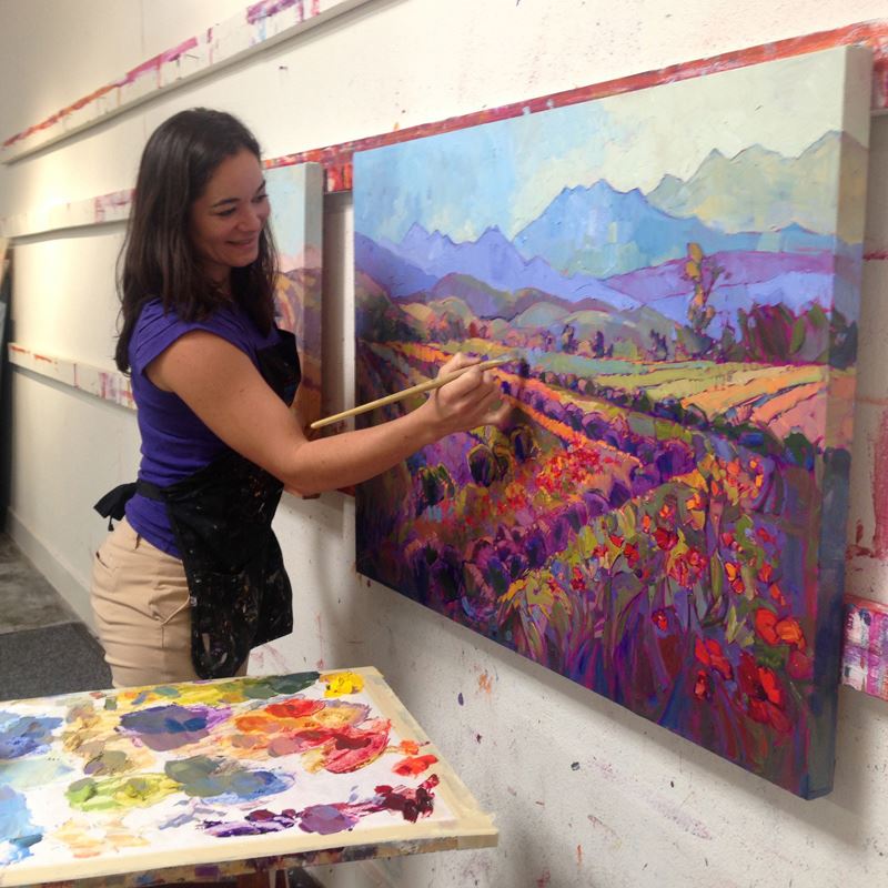
|
Epiphanies in ImpressionismAmerican Lifestyle Magazine Interviews Erin HansonWednesday, March 3, 2021Erin Hanson was interviewed by Shelley Goldstein of American Lifestyle Magazine. Since that interview, we have heard from scores of individuals who encountered Erin's work in the magazine for the first time. Read More → |
|
|
|
Epiphanies in Impressionism American Lifestyle Magazine Interviews Erin Hanson Wednesday, March 3, 2021 Erin Hanson was interviewed by Shelley Goldstein of American Lifestyle Magazine. Since that interview, we have heard from scores of individuals who encountered Erin's work in the magazine for the first time. Read More → |

|
Patone's Color of the Year (Yellow!) in ArtTuesday, March 2, 2021Pantone has long been known for their ability to detect and influence color trends that impact every facet of our visual day-to-day lives. Every year Pantone selects two "Colors of the Year," which help furniture, textile, fashion, makeup and technology designers decide on which colors to use in their products. This year the colors are Ultimate Gray and Illuminating Yellow. These choosen colors are a culmination of years of aesthetic fires and misfires and long experience with color creating various emotions, whether pleasant, jarring, soothing or joyful. Read More → |
|
|
|
Patone's Color of the Year (Yellow!) in Art Tuesday, March 2, 2021 Pantone has long been known for their ability to detect and influence color trends that impact every facet of our visual day-to-day lives. Every year Pantone selects two "Colors of the Year," which help furniture, textile, fashion, makeup and technology designers decide on which colors to use in their products. This year the colors are Ultimate Gray and Illuminating Yellow. These choosen colors are a culmination of years of aesthetic fires and misfires and long experience with color creating various emotions, whether pleasant, jarring, soothing or joyful. Read More → |
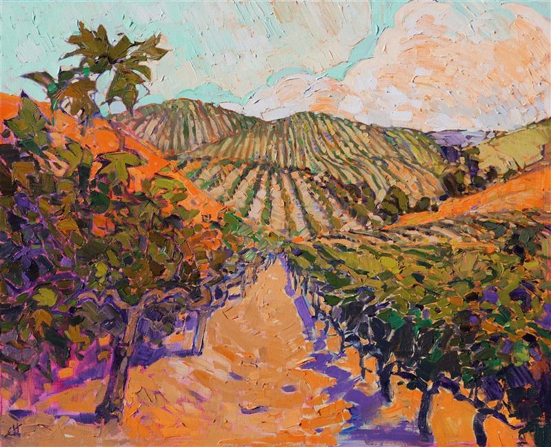
|
Emotions and ArtSunday, February 28, 2021Great art evokes an emotional response. Some have said that this is art’s purpose. Others have stated an elevation of man’s essential being is art’s fundamental purpose. Bob Dylan said it best when he said “The highest purpose of art is to inspire. What else can you do? What else can you do for anyone but inspire them?” This idea brings the relevance of art in our world to a much greater level than the simple evocation of emotion. Many things, besides art, can evoke emotion. An argument at the dinner table, a positive pregnancy test, or even a deep breath and a cup of tea. There is nothing inherently artistic in these actions, beyond the fact that they require some kind of intentionality and creation to make them happen Read More → |
|
|
|
Emotions and Art Sunday, February 28, 2021 Great art evokes an emotional response. Some have said that this is art’s purpose. Others have stated an elevation of man’s essential being is art’s fundamental purpose. Bob Dylan said it best when he said “The highest purpose of art is to inspire. What else can you do? What else can you do for anyone but inspire them?” This idea brings the relevance of art in our world to a much greater level than the simple evocation of emotion. Many things, besides art, can evoke emotion. An argument at the dinner table, a positive pregnancy test, or even a deep breath and a cup of tea. There is nothing inherently artistic in these actions, beyond the fact that they require some kind of intentionality and creation to make them happen Read More → |
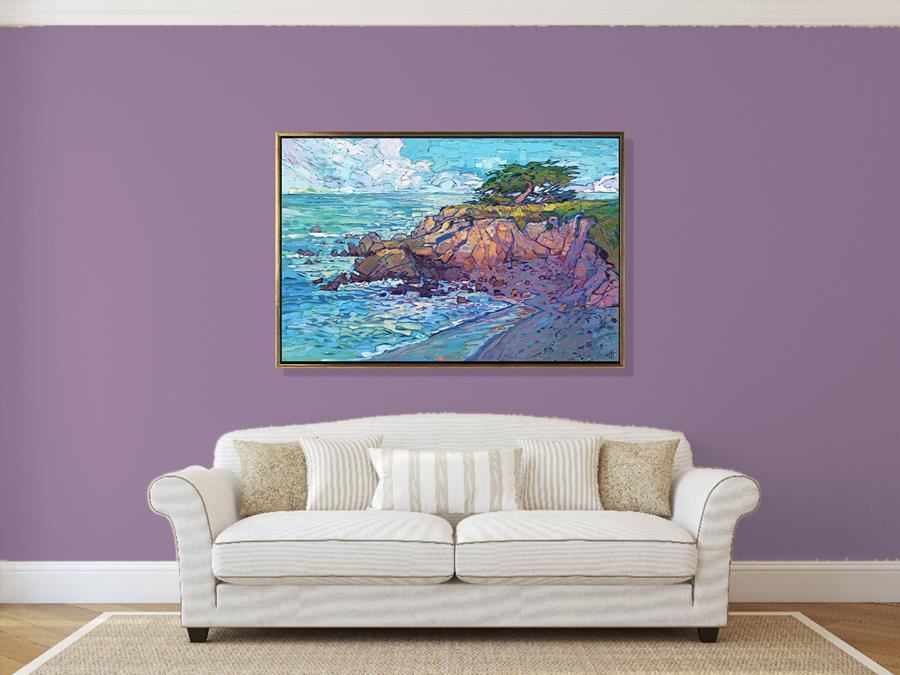
|
What Color Wall Looks Best with My Painting?Design ideas and tools that anyone can use.Thursday, January 14, 2021I recently discovered an amazing tool that helps homeowners and home designers to find out the perfect color for their accent walls. This tool can be used to accent art, making the wall a true statement. Read on to find out more! Read More → |
|
|
|
What Color Wall Looks Best with My Painting? Design ideas and tools that anyone can use. Thursday, January 14, 2021 I recently discovered an amazing tool that helps homeowners and home designers to find out the perfect color for their accent walls. This tool can be used to accent art, making the wall a true statement. Read on to find out more! Read More → |
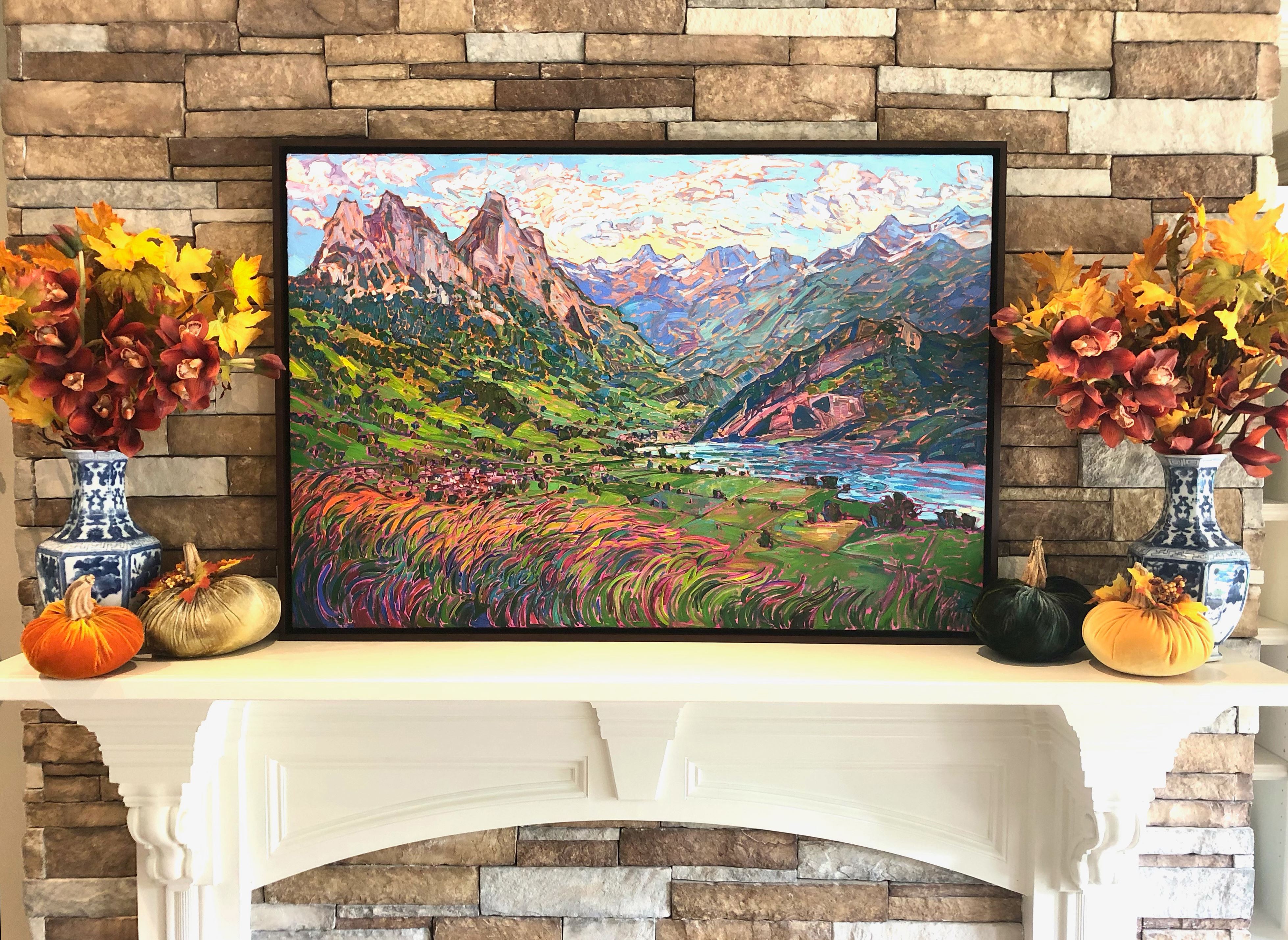
|
A Commission Steeped in Family HistoryTuesday, November 10, 2020As a teenager, my family was stationed overseas in Europe. We were able to trace our roots back to a small village in Switzerland named Steinen. We located our family crest carved into the posts of the town’s courthouse indicating our ancestors as one of the original founding families of the village many centuries earlier. Fifty years later, my wife and I traveled back to Switzerland in order for her to also experience the area and its intrinsic beauty. Read More → |
|
|
|
A Commission Steeped in Family History Tuesday, November 10, 2020 As a teenager, my family was stationed overseas in Europe. We were able to trace our roots back to a small village in Switzerland named Steinen. We located our family crest carved into the posts of the town’s courthouse indicating our ancestors as one of the original founding families of the village many centuries earlier. Fifty years later, my wife and I traveled back to Switzerland in order for her to also experience the area and its intrinsic beauty. Read More → |
.png)
|
Welcome to the World of 3D Art ReproductionAn Inside Look at the Technical Specifications and Details of 3D Art ReplicationWednesday, September 30, 2020This incredible fine art printing technology is Erin’s high-tech answer to the growing demand for textured art prints. Each replica faithfully duplicates every brushstroke's color and feel, using cutting-edge, three-dimensional scanning technology and multi-layered printing to capture every aspect of the original painting. While previous articles have discussed the replicas themselves, we wanted to take this opportunity to share the technical details of Erin’s state-of-the-art reproductions. Read More → |
|
|
|
Welcome to the World of 3D Art Reproduction An Inside Look at the Technical Specifications and Details of 3D Art Replication Wednesday, September 30, 2020 This incredible fine art printing technology is Erin’s high-tech answer to the growing demand for textured art prints. Each replica faithfully duplicates every brushstroke's color and feel, using cutting-edge, three-dimensional scanning technology and multi-layered printing to capture every aspect of the original painting. While previous articles have discussed the replicas themselves, we wanted to take this opportunity to share the technical details of Erin’s state-of-the-art reproductions. Read More → |
.png)
|
How Erin Hanson’s 3D Textured Replicas Are MadeBehind the ScenesThursday, September 24, 2020Erin Hanson has brought the latest in 3D printing to her custom, limited edition offerings. This new print is a textured replica created using micro-layered 3D modeling and 48-bit color to make the most realistic painting reproductions available today. How is this done? Read More → |
|
|
|
How Erin Hanson’s 3D Textured Replicas Are Made Behind the Scenes Thursday, September 24, 2020 Erin Hanson has brought the latest in 3D printing to her custom, limited edition offerings. This new print is a textured replica created using micro-layered 3D modeling and 48-bit color to make the most realistic painting reproductions available today. How is this done? Read More → |
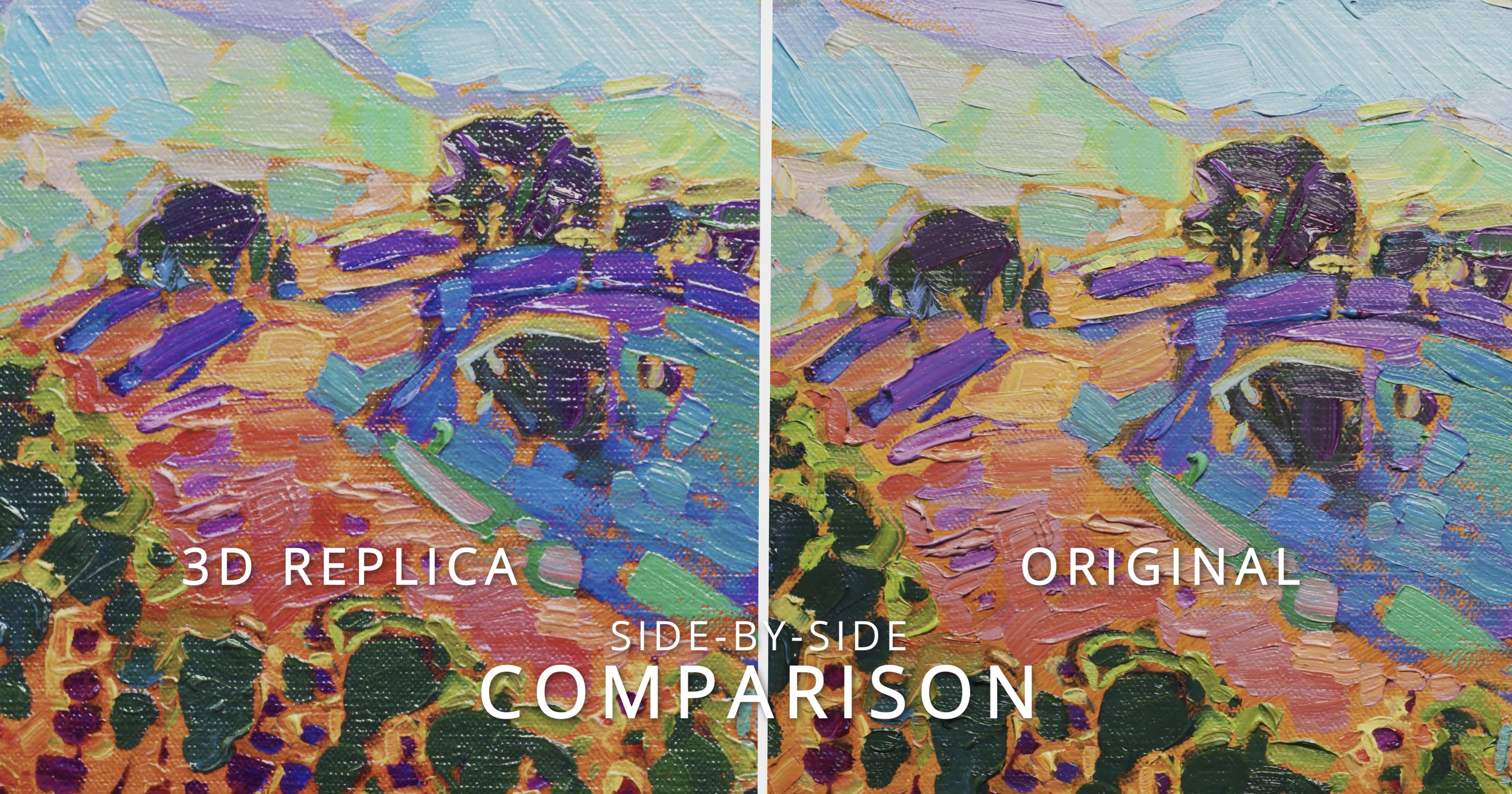
|
Announcing: A Revolutionary New Fine Art Print, the 3D Textured ReplicaFind Out About Erin Hanson's Development of 3D Textured ReplicasMonday, September 21, 2020In response to a growing demand for textured prints, we are proud to announce a new product that faithfully reproduces the texture of Erin's original oil paintings. “Erin Hanson 3D Textured Replicas” are created using cutting-edge, 3-dimensional scanning technology and multi-layered printing to capture the actual brush strokes and texture of the original. Read More → |
|
|
|
Announcing: A Revolutionary New Fine Art Print, the 3D Textured Replica Find Out About Erin Hanson's Development of 3D Textured Replicas Monday, September 21, 2020 In response to a growing demand for textured prints, we are proud to announce a new product that faithfully reproduces the texture of Erin's original oil paintings. “Erin Hanson 3D Textured Replicas” are created using cutting-edge, 3-dimensional scanning technology and multi-layered printing to capture the actual brush strokes and texture of the original. Read More → |
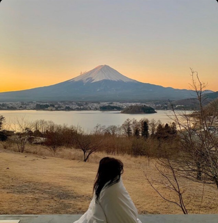
|
A Memorable Birthday GiftMonday, September 14, 2020"It was such an incredible moment! She had no idea, and was completely overwhelmed with the beauty of your painting, Erin! It was so amazing to watch the hues of the painting change as the afternoon light faded into the evening and night. Erin, you really captured that moment perfectly, and we’ll treasure it forever." Read More → |
|
|
|
A Memorable Birthday Gift Monday, September 14, 2020 "It was such an incredible moment! She had no idea, and was completely overwhelmed with the beauty of your painting, Erin! It was so amazing to watch the hues of the painting change as the afternoon light faded into the evening and night. Erin, you really captured that moment perfectly, and we’ll treasure it forever." Read More → |
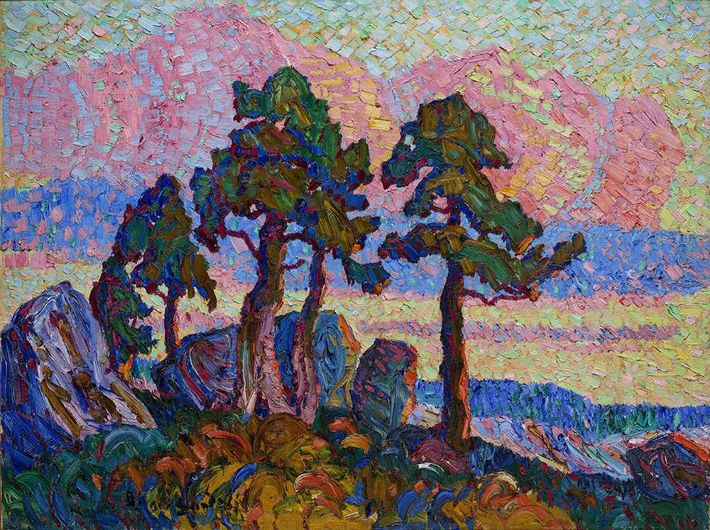
|
Birger Sandzén: Van Gogh of the WestThursday, July 16, 2020Swedish-born painter Birger Sandzen has become widely known for his for his oil paintings, which continue to rise in value as an increasing number of collectors and museums scramble to purchase one of the 2,600 oil paintings he created in his lifetime. Popularly known as the “Van Gogh of the West,” Sandzen paints the red rock cliffs and western landscapes of the United States with the curving brush strokes, thickly applied paint, and impassioned color that one usually associates with a Van Gogh painting. Read More → |
|
|
|
Birger Sandzén: Van Gogh of the West Thursday, July 16, 2020 Swedish-born painter Birger Sandzen has become widely known for his for his oil paintings, which continue to rise in value as an increasing number of collectors and museums scramble to purchase one of the 2,600 oil paintings he created in his lifetime. Popularly known as the “Van Gogh of the West,” Sandzen paints the red rock cliffs and western landscapes of the United States with the curving brush strokes, thickly applied paint, and impassioned color that one usually associates with a Van Gogh painting. Read More → |
|
Four Friends: The Foundation of ImpressionismThe story of Claude Monet, Jean Frederic Bazille, Pierre Renoir, and Alfred SisleyThursday, July 16, 2020In 1862, four young men came together in Paris to study painting. They were Claude Monet, Pierre Renoir, Alfred Sisley, and Frederic Bazille. In the course of their studies, they brought into being a completely new style of art called Impressionism. Their teacher was Charles Gleyre, who had taken on the school of Paul Delaroche, and was himself a working artist. Although he himself never achieved the fame of some of his students, he was an excellent teacher. He taught them to paint “en plein air” (painting outdoors) in Paris and surrounding areas. Read More → |
|
|
|
Four Friends: The Foundation of Impressionism The story of Claude Monet, Jean Frederic Bazille, Pierre Renoir, and Alfred Sisley Thursday, July 16, 2020 In 1862, four young men came together in Paris to study painting. They were Claude Monet, Pierre Renoir, Alfred Sisley, and Frederic Bazille. In the course of their studies, they brought into being a completely new style of art called Impressionism. Their teacher was Charles Gleyre, who had taken on the school of Paul Delaroche, and was himself a working artist. Although he himself never achieved the fame of some of his students, he was an excellent teacher. He taught them to paint “en plein air” (painting outdoors) in Paris and surrounding areas. Read More → |
|
Erin Hanson Face MasksFeatured in Carmel Pine ConeThursday, June 11, 2020"We sold 300 masks the first day we released them and they have been selling steadily ever since," said Erin Hanson, who opened a gallery in November on San Carlos between Fifth and Sixth. Read More → |
|
|
|
Erin Hanson Face Masks Featured in Carmel Pine Cone Thursday, June 11, 2020 "We sold 300 masks the first day we released them and they have been selling steadily ever since," said Erin Hanson, who opened a gallery in November on San Carlos between Fifth and Sixth. Read More → |
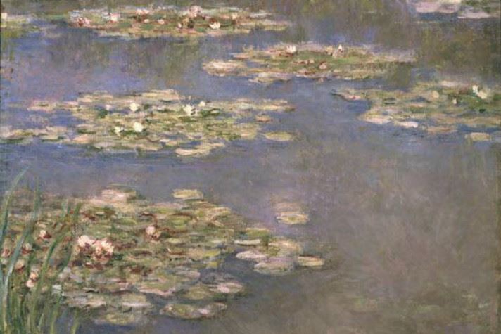
|
Mavericks Turned MastersImpressionists Have Long Dared to Paint Their Subjects Fearlessly and BoldlyWednesday, April 22, 2020Louis Leroy was outraged. And the popular Parisian playwright, who also dabbled at painting and printmaking, was determined to expose an upstart group of artists—who had banded together to show their works in a new exhibition—for what he thought they really were: imposters. Read More → |
|
|
|
Mavericks Turned Masters Impressionists Have Long Dared to Paint Their Subjects Fearlessly and Boldly Wednesday, April 22, 2020 Louis Leroy was outraged. And the popular Parisian playwright, who also dabbled at painting and printmaking, was determined to expose an upstart group of artists—who had banded together to show their works in a new exhibition—for what he thought they really were: imposters. Read More → |
|
Paul Durand-Ruel, the Godfather of ImpressionismTuesday, April 21, 2020Today, Impressionism is arguably the most well-loved and well-known art in the world. A little less known is the fact that Impressionism almost never came to be. The masters of the Impressionism era, who are so modernly cherished, might have been unknown to this day without the labors of one man: an art dealer by the name of Paul Durand-Ruel. Read More → |
|
|
|
Paul Durand-Ruel, the Godfather of Impressionism Tuesday, April 21, 2020 Today, Impressionism is arguably the most well-loved and well-known art in the world. A little less known is the fact that Impressionism almost never came to be. The masters of the Impressionism era, who are so modernly cherished, might have been unknown to this day without the labors of one man: an art dealer by the name of Paul Durand-Ruel. Read More → |
|
Erin Hanson on the Cover of the Saturday Evening PostMarch/April 2020 IssueTuesday, April 7, 2020Erin Hanson was featured on the cover of The Saturday Evening Post's March/April 2020 issue. Read More → |
|
|
|
Erin Hanson on the Cover of the Saturday Evening Post March/April 2020 Issue Tuesday, April 7, 2020 Erin Hanson was featured on the cover of The Saturday Evening Post's March/April 2020 issue. Read More → |
|
Dances with ColorsCalifornia painter Erin Hanson sees the natural world through a rainbow of vibrant huesMonday, March 16, 2020Reprinted from Southwest Art Magazine When she was 6 years old, Erin Hanson planted some iris bulbs with her mother in the garden of their home in Los Angeles’ Silver Lake neighborhood, “I already knew van Gogh’s painting of irises,” she says, recalling her excited anticipation of the flowers that would bloom. So, she was crestfallen when those bulbs finally blossomed. “The real irises looked nothing like the painting,” she remembers. But even at that tender age, she derived from her disappointment a lesson that continues to inform her pursuits today, as a successful artist who turns 38 this month: “I knew that art could be better, more real, than real life, and definitely more colorful.” Read More → |
|
|
|
Dances with Colors California painter Erin Hanson sees the natural world through a rainbow of vibrant hues Monday, March 16, 2020 Reprinted from Southwest Art Magazine When she was 6 years old, Erin Hanson planted some iris bulbs with her mother in the garden of their home in Los Angeles’ Silver Lake neighborhood, “I already knew van Gogh’s painting of irises,” she says, recalling her excited anticipation of the flowers that would bloom. So, she was crestfallen when those bulbs finally blossomed. “The real irises looked nothing like the painting,” she remembers. But even at that tender age, she derived from her disappointment a lesson that continues to inform her pursuits today, as a successful artist who turns 38 this month: “I knew that art could be better, more real, than real life, and definitely more colorful.” Read More → |
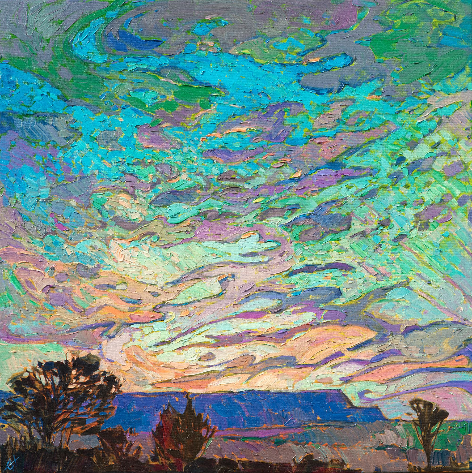
|
Desert in Color is Awarded Best in ShowCowgirl Up! Recognizes Erin Hanson’s WorkMonday, August 26, 2019Erin Hanson was proud to participate in the Desert Caballeros Western Museum’s Cowgirl Up! 2019 exhibition. Every year, this museum shines a light on the many incredible female artists working in the American West. Of the three paintings Erin Hanson submitted, Desert in Color was chosen by the judges at Cowgirl Up! for special recognition. This piece was awarded “Best in Show” for the intriguing use of continuous, flowing brushstrokes, layered and textured paint, and the vibrantly colored clouds. Read More → |
|
|
|
Desert in Color is Awarded Best in Show Cowgirl Up! Recognizes Erin Hanson’s Work Monday, August 26, 2019 Erin Hanson was proud to participate in the Desert Caballeros Western Museum’s Cowgirl Up! 2019 exhibition. Every year, this museum shines a light on the many incredible female artists working in the American West. Of the three paintings Erin Hanson submitted, Desert in Color was chosen by the judges at Cowgirl Up! for special recognition. This piece was awarded “Best in Show” for the intriguing use of continuous, flowing brushstrokes, layered and textured paint, and the vibrantly colored clouds. Read More → |
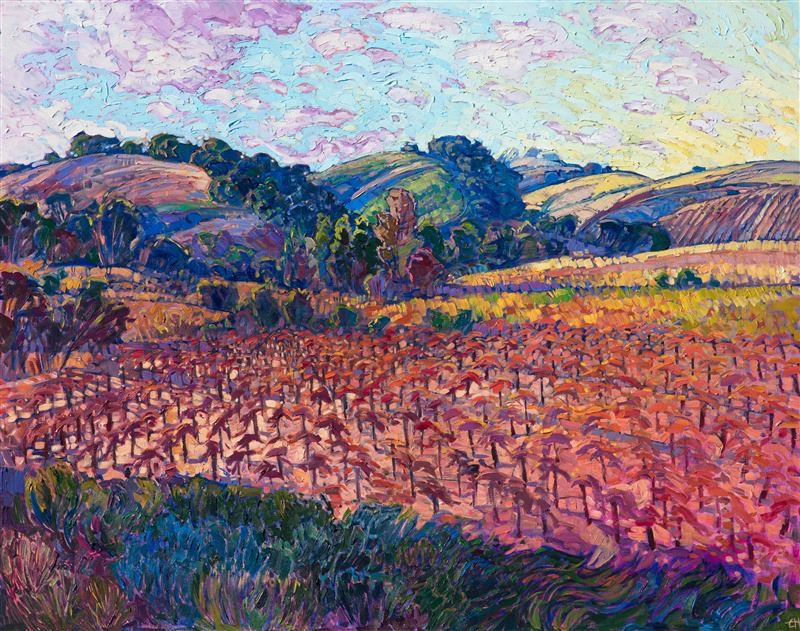
|
An in-depth look at the painting "Autumn Vineyards"Sunday, July 14, 2019I was inspired by a late afternoon drive through the vineyards in western Paso. Oak trees gather along the lines of the hills, catching the warm afternoon light. The golden vines glimmer in colorful autumn hues. The brushstrokes are thick and impressionistic, conveying a sense of movement within the painting. Read More → |
|
|
|
An in-depth look at the painting "Autumn Vineyards" Sunday, July 14, 2019 I was inspired by a late afternoon drive through the vineyards in western Paso. Oak trees gather along the lines of the hills, catching the warm afternoon light. The golden vines glimmer in colorful autumn hues. The brushstrokes are thick and impressionistic, conveying a sense of movement within the painting. Read More → |
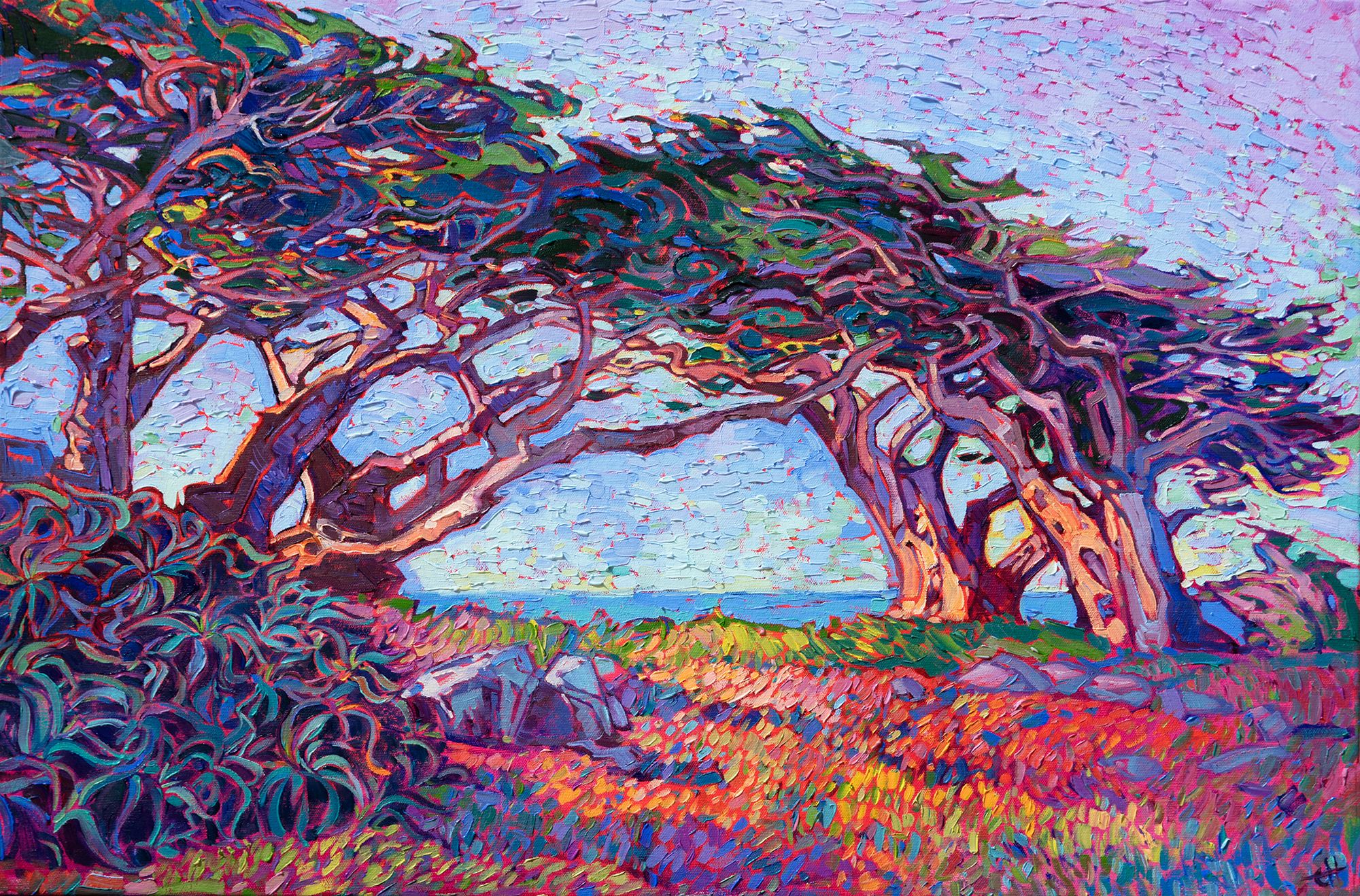
|
Cypress Lights: Behind the ArtWednesday, June 26, 2019We wanted to take a moment to look behind the scenes at one of Erin Hanson's newest paintings. Cypress Lights was painted in 2019 in her San Diego-based studio. We hope you enjoy this Erin Hanson interview about Cypress Lights. Read More → |
|
|
|
Cypress Lights: Behind the Art Wednesday, June 26, 2019 We wanted to take a moment to look behind the scenes at one of Erin Hanson's newest paintings. Cypress Lights was painted in 2019 in her San Diego-based studio. We hope you enjoy this Erin Hanson interview about Cypress Lights. Read More → |
|
How to Light Your Artwork at HomeSunday, March 17, 2019One question we often hear from collectors purchasing paintings here at The Erin Hanson Gallery is “What is the best lighting solution to highlight this piece?” This is a topic close to our hearts here at the gallery, as an Erin Hanson painting looks different depending on the type of lighting used. Because the lighting of a piece is so vital to one’s enjoyment of the artwork, we wanted to take a deep dive into the various lighting you can utilize in your home to display your painting. Read More → |
|
|
|
How to Light Your Artwork at Home Sunday, March 17, 2019 One question we often hear from collectors purchasing paintings here at The Erin Hanson Gallery is “What is the best lighting solution to highlight this piece?” This is a topic close to our hearts here at the gallery, as an Erin Hanson painting looks different depending on the type of lighting used. Because the lighting of a piece is so vital to one’s enjoyment of the artwork, we wanted to take a deep dive into the various lighting you can utilize in your home to display your painting. Read More → |
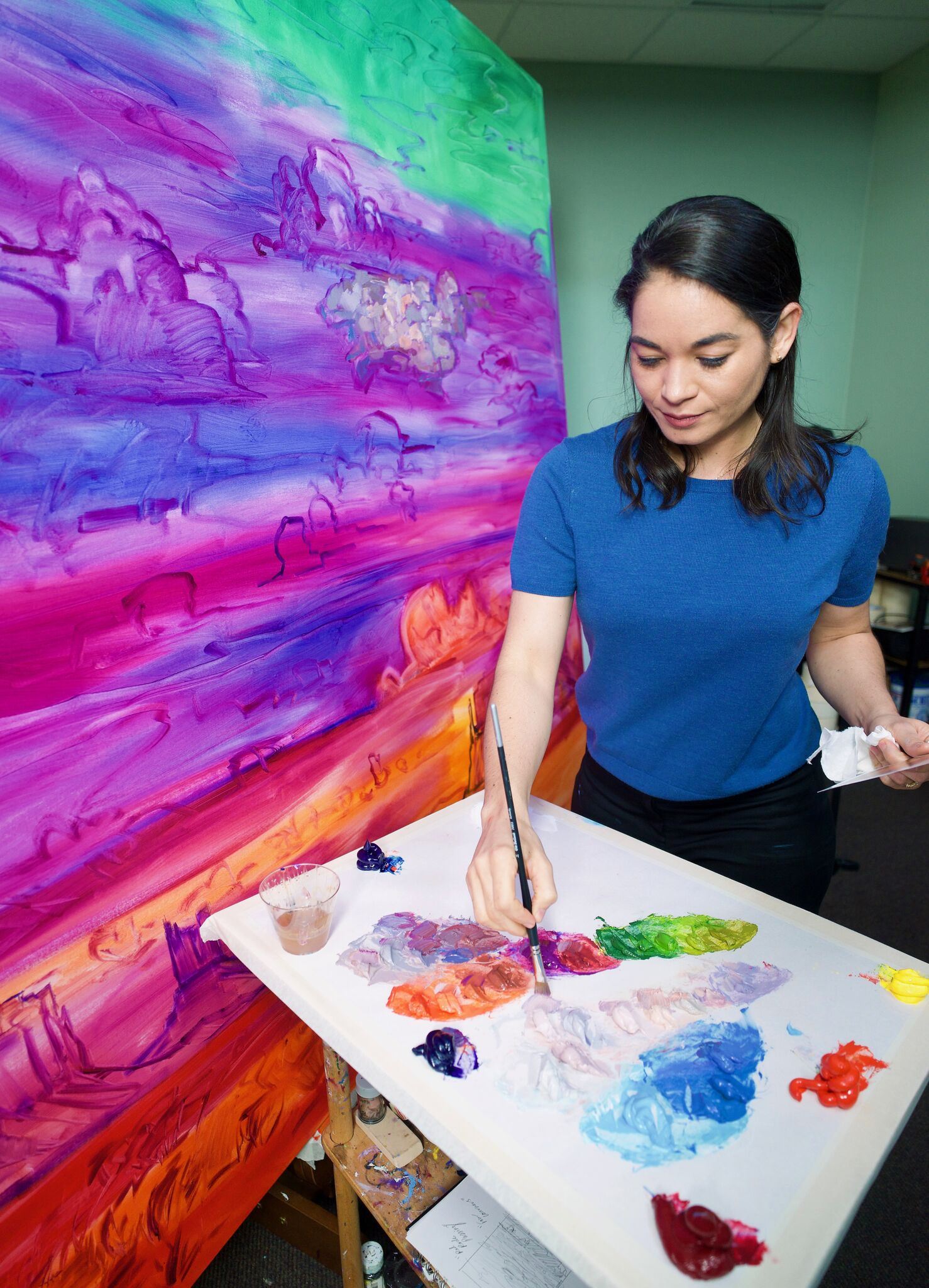
|
Artist ResourcesThursday, March 14, 2019I have put this collection of resources together as a way to inspire other artists to discover their own painting style and find their own niche in the art world. These resources will guide you on how to become a true master at your own style of painting, how to make a living as an artist, and see what the life of being an artist is really like. Read More → |
|
|
|
Artist Resources Thursday, March 14, 2019 I have put this collection of resources together as a way to inspire other artists to discover their own painting style and find their own niche in the art world. These resources will guide you on how to become a true master at your own style of painting, how to make a living as an artist, and see what the life of being an artist is really like. Read More → |
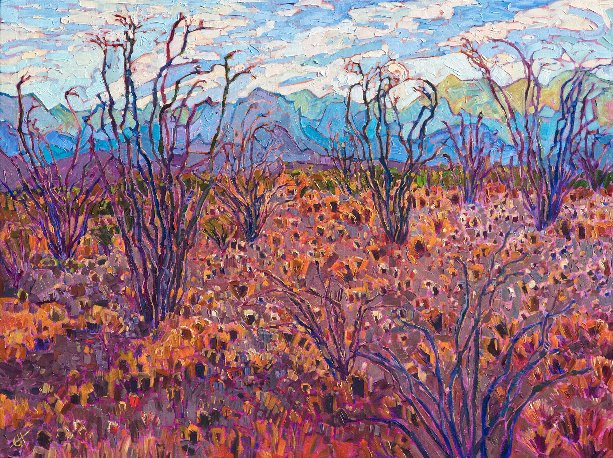
|
Erin Hanson’s Enigmatic Big Bend Show is a Huge SuccessA Look at Erin Hanson's Most Recent Museum CollectionWednesday, December 26, 2018In mid-September, there was a buzz around the Museum of the Big Bend in Alpine, TX. A new exhibition was going up, the artist was due to arrive for a presentation and lecture, and patrons were excited to meet her and enjoy the sixteen-piece collection. The series takes Hanson back to her western roots as she shares her time hiking in Texas’ Big Bend National Park through her vivid and colorful paintings. Read More → |
|
|
|
Erin Hanson’s Enigmatic Big Bend Show is a Huge Success A Look at Erin Hanson's Most Recent Museum Collection Wednesday, December 26, 2018 In mid-September, there was a buzz around the Museum of the Big Bend in Alpine, TX. A new exhibition was going up, the artist was due to arrive for a presentation and lecture, and patrons were excited to meet her and enjoy the sixteen-piece collection. The series takes Hanson back to her western roots as she shares her time hiking in Texas’ Big Bend National Park through her vivid and colorful paintings. Read More → |
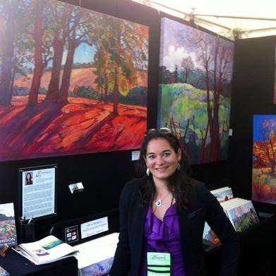
|
How Does Copyright Work for Artwork?Copyright helps an artist retain ownership for his or her work.Friday, December 14, 2018Copyright is essential protection for artists. The fact that a piece of art is unique makes it valuable, so safeguarding that one-of-a-kind piece is vital to any artist who wants to make a living. Read More → |
|
|
|
How Does Copyright Work for Artwork? Copyright helps an artist retain ownership for his or her work. Friday, December 14, 2018 Copyright is essential protection for artists. The fact that a piece of art is unique makes it valuable, so safeguarding that one-of-a-kind piece is vital to any artist who wants to make a living. Read More → |
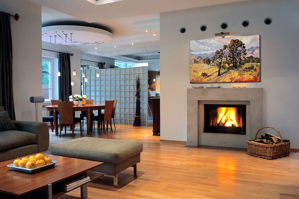
|
Purchasing PrintsWednesday, September 19, 2018Erin Hanson offers fine art prints directly to her fans and collectors, at www.erinhansonprints.com. Read More → |
|
|
|
Purchasing Prints Wednesday, September 19, 2018 Erin Hanson offers fine art prints directly to her fans and collectors, at www.erinhansonprints.com. Read More → |
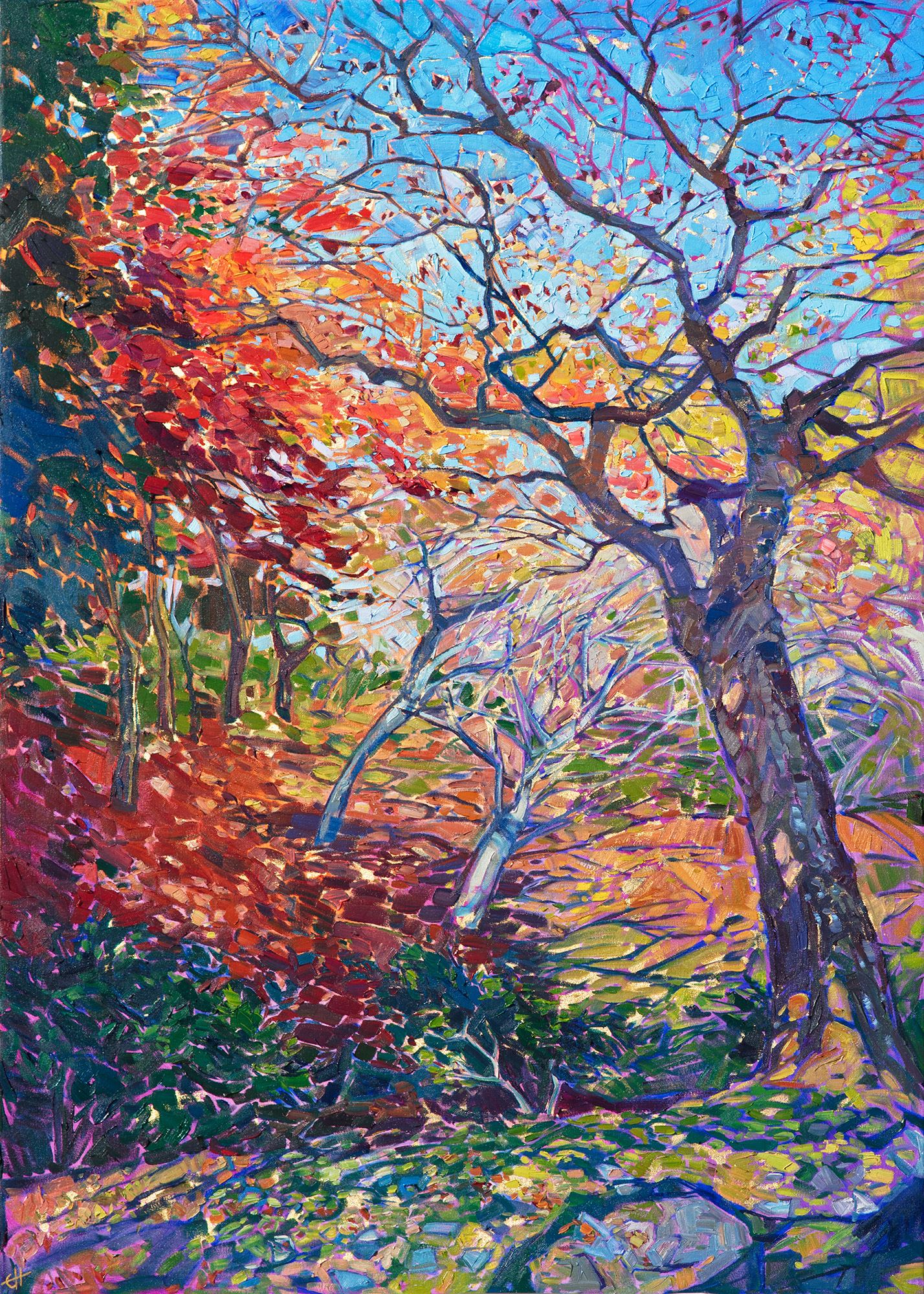
|
Collecting Erin Hanson OriginalsInformation for art collectorsWednesday, August 22, 2018Learn about collecting Erin Hanson original oil paintings. Read More → |
|
|
|
Collecting Erin Hanson Originals Information for art collectors Wednesday, August 22, 2018 Learn about collecting Erin Hanson original oil paintings. Read More → |
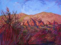
|
Erin Hanson’s Open Impressionism Is Heading Overseas!Erin Hanson participates in the Art in Embassies program for the second timeSaturday, July 14, 2018We are excited to announce that Erin Hanson will again be participating in the Art in Embassies program, bringing her open impressionism to the American embassy located in Moscow, Russia. In this upcoming exhibition, three of her classic paintings will be showcased over the course of three years, imbuing spaces that will be enjoyed by diplomats and visitors alike with vibrant color and beauty. Read More → |
|
|
|
Erin Hanson’s Open Impressionism Is Heading Overseas! Erin Hanson participates in the Art in Embassies program for the second time Saturday, July 14, 2018 We are excited to announce that Erin Hanson will again be participating in the Art in Embassies program, bringing her open impressionism to the American embassy located in Moscow, Russia. In this upcoming exhibition, three of her classic paintings will be showcased over the course of three years, imbuing spaces that will be enjoyed by diplomats and visitors alike with vibrant color and beauty. Read More → |
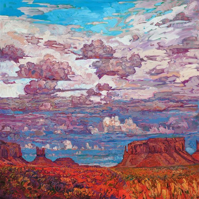
|
The Red Rock Collection ReleaseThe Erin Hanson Gallery presents The Red Rock ShowWednesday, July 4, 2018The Erin Hanson Gallery presented Hanson’s newest collection of vibrant paintings on June 16, 2018. Each piece in the Red Rock collection featured bright, bold colors inspired by the National Parks and monuments of Utah, Arizona, Nevada and Colorado. Read More → |
|
|
|
The Red Rock Collection Release The Erin Hanson Gallery presents The Red Rock Show Wednesday, July 4, 2018 The Erin Hanson Gallery presented Hanson’s newest collection of vibrant paintings on June 16, 2018. Each piece in the Red Rock collection featured bright, bold colors inspired by the National Parks and monuments of Utah, Arizona, Nevada and Colorado. Read More → |
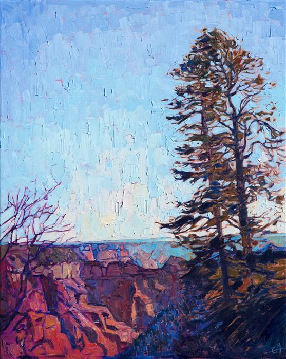
|
Cowgirl Up! Awards Erin Hanson Best in Painting"North Canyon" Wins First PlaceSaturday, April 14, 2018While every style is celebrated in the Cowgirl Up! exhibition and show, there are specific categories in which the various artists can be awarded special recognition. This year, we are honored to announce that Erin Hanson won “First Place Two Dimensional on Canvas” for her painting North Canyon. Read More → |
|
|
|
Cowgirl Up! Awards Erin Hanson Best in Painting "North Canyon" Wins First Place Saturday, April 14, 2018 While every style is celebrated in the Cowgirl Up! exhibition and show, there are specific categories in which the various artists can be awarded special recognition. This year, we are honored to announce that Erin Hanson won “First Place Two Dimensional on Canvas” for her painting North Canyon. Read More → |
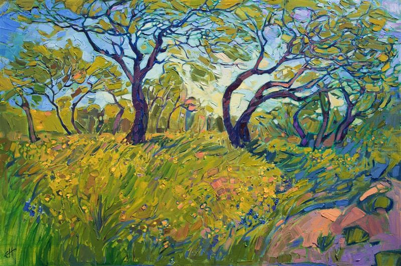
|
How to Find Amazing Art Pieces OnlineHow do I find the paintings that speak to me?Monday, April 9, 2018Art hitherto hidden in galleries across the world is now at your fingertips and can be discovered from the comfort of your own home. With this ease of access, a global renaissance of the arts is occurring. You can find art everywhere online, from Etsy to an artist’s website to a post on Instagram. Read More → |
|
|
|
How to Find Amazing Art Pieces Online How do I find the paintings that speak to me? Monday, April 9, 2018 Art hitherto hidden in galleries across the world is now at your fingertips and can be discovered from the comfort of your own home. With this ease of access, a global renaissance of the arts is occurring. You can find art everywhere online, from Etsy to an artist’s website to a post on Instagram. Read More → |
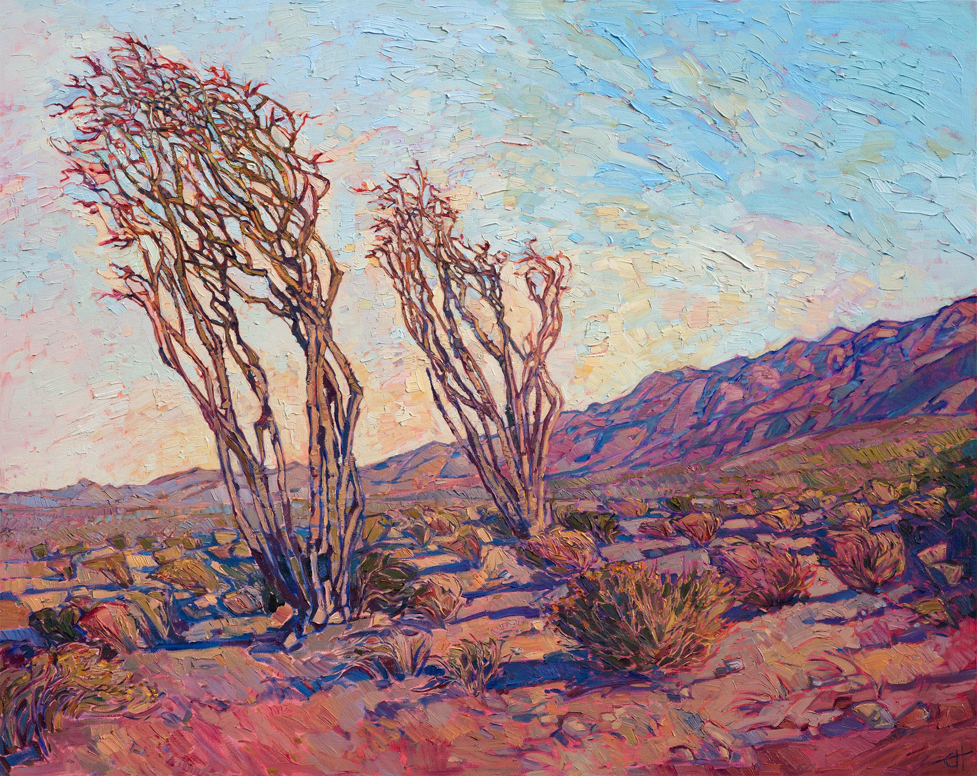
|
Ocotillo Light: An In-Depth LookSaturday, February 24, 2018The painting "Ocotillo Light" captures a scene from the southern edge of Borrego, where there are hundreds of ocotillo growing along the slopes leading up to the surrounding mountains. When the ocotillo bloom, their desert stalks turn from gray-brown to green, and the tips of their spider-like stalks bloom with bright red flowers that always remind me of birds of paradise. Read More → |
|
|
|
Ocotillo Light: An In-Depth Look Saturday, February 24, 2018 The painting "Ocotillo Light" captures a scene from the southern edge of Borrego, where there are hundreds of ocotillo growing along the slopes leading up to the surrounding mountains. When the ocotillo bloom, their desert stalks turn from gray-brown to green, and the tips of their spider-like stalks bloom with bright red flowers that always remind me of birds of paradise. Read More → |
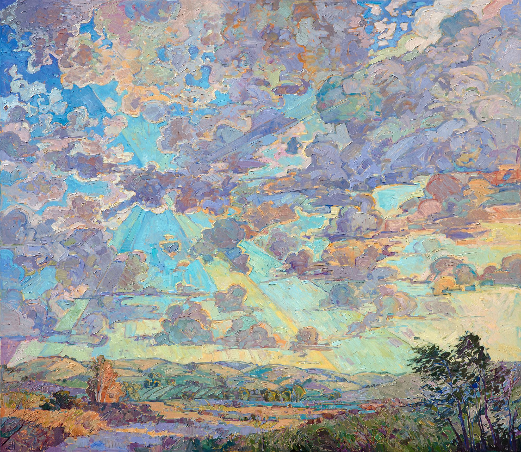
|
Open Skies: An In-Depth LookThursday, February 15, 2018I have been painting Paso Robles for 8 years now, and it is still one of my favorite places to find inspiration. Although I have spent most of my life in California, growing up in Los Angeles and attending school at Berkeley in northern California, I never drove through the coastal wine country regions of central California until many years after I graduated college. I had seen the film "Sideways" and the wine tasting adventure looked like so much fun I just had to experience it for myself. So I ventured for the first time into the idyllic landscapes of Paso Robles. Read More → |
|
|
|
Open Skies: An In-Depth Look Thursday, February 15, 2018 I have been painting Paso Robles for 8 years now, and it is still one of my favorite places to find inspiration. Although I have spent most of my life in California, growing up in Los Angeles and attending school at Berkeley in northern California, I never drove through the coastal wine country regions of central California until many years after I graduated college. I had seen the film "Sideways" and the wine tasting adventure looked like so much fun I just had to experience it for myself. So I ventured for the first time into the idyllic landscapes of Paso Robles. Read More → |
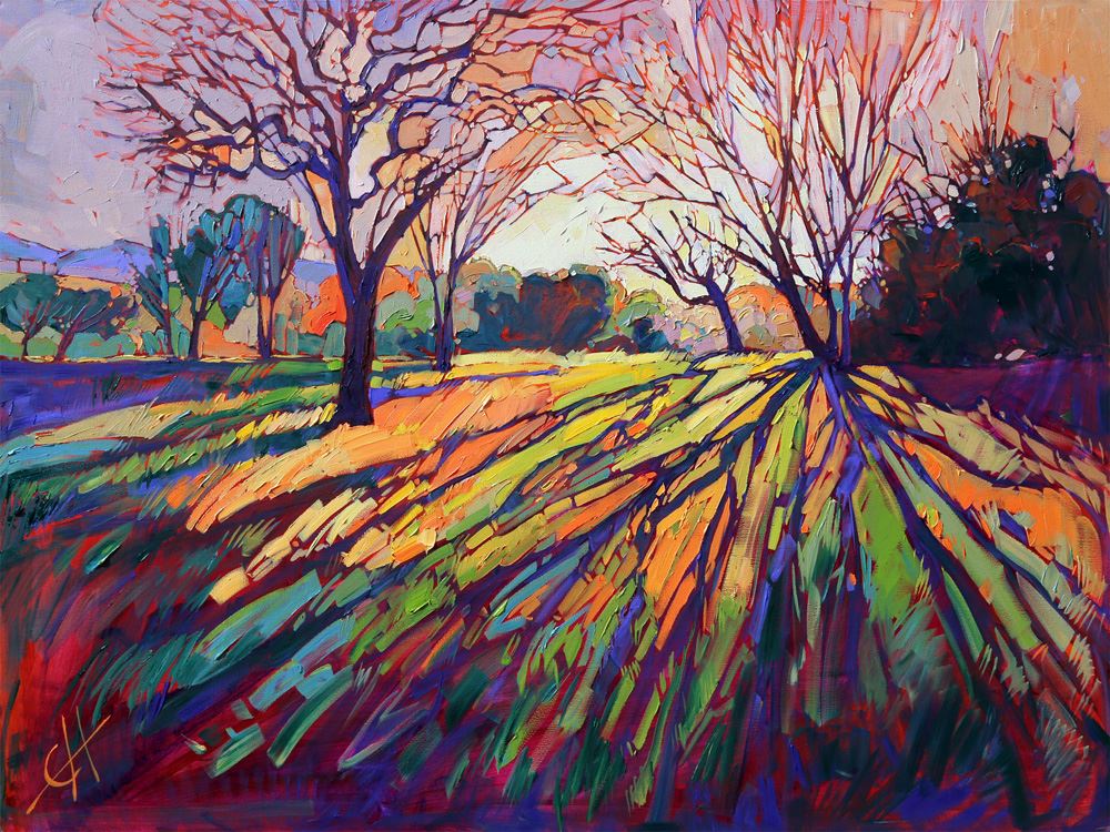
|
The Properties of Crystal LightFind out about the most popular series created by Erin Hanson.Wednesday, February 14, 2018Erin Hanson’s Crystal Light series is one of her most popular collections of works. Each piece features a backlit landscape and seeks to illustrate the drama and beauty that light can bring to the natural world. While all of the Hanson pieces boast a striking understanding of light and shadow, the Crystal Light series really brings this to the fore. Read More → |
|
|
|
The Properties of Crystal Light Find out about the most popular series created by Erin Hanson. Wednesday, February 14, 2018 Erin Hanson’s Crystal Light series is one of her most popular collections of works. Each piece features a backlit landscape and seeks to illustrate the drama and beauty that light can bring to the natural world. While all of the Hanson pieces boast a striking understanding of light and shadow, the Crystal Light series really brings this to the fore. Read More → |
|
The Goddard ShowA 10-Year Retrospective of Open ImpressionismSunday, January 28, 2018Erin Hanson's 10-Year Retrospection is now on display at the Goddard Center. This exhibition is the first comprehensive presentation of Erin Hanson’s career. Organized by the Goddard Center for Fine Arts, this show features a selection of never-before exhibited works from her personal collection as well as paintings highlighting her prolific output over the past decade. Read More → |
|
|
|
The Goddard Show A 10-Year Retrospective of Open Impressionism Sunday, January 28, 2018 Erin Hanson's 10-Year Retrospection is now on display at the Goddard Center. This exhibition is the first comprehensive presentation of Erin Hanson’s career. Organized by the Goddard Center for Fine Arts, this show features a selection of never-before exhibited works from her personal collection as well as paintings highlighting her prolific output over the past decade. Read More → |
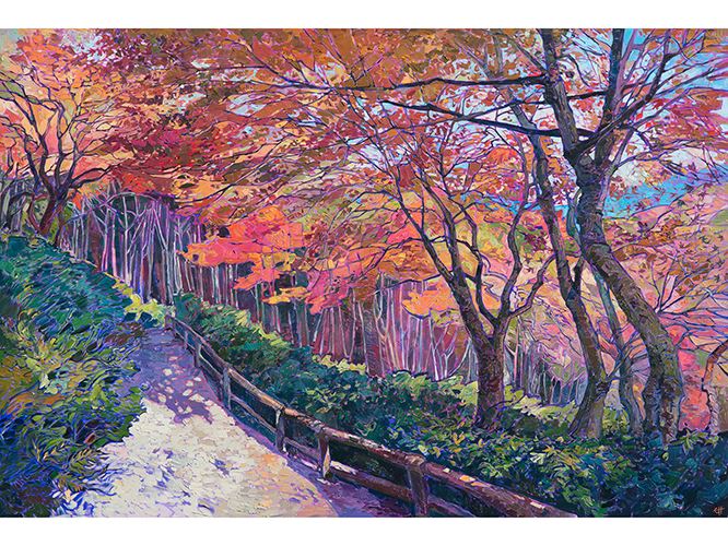
|
Maple Path: An In-Depth LookFriday, January 12, 2018I went to Japan over Thanksgiving to explore the famous fall colors in Kyoto. The mountains surrounding the city are full of Buddhist temples with incredible gardens and maple trees. My favorite part of Kyoto was Arashiyama Park, home to several beautiful temples and wide, expansive grounds of natural beauty. Read More → |
|
|
|
Maple Path: An In-Depth Look Friday, January 12, 2018 I went to Japan over Thanksgiving to explore the famous fall colors in Kyoto. The mountains surrounding the city are full of Buddhist temples with incredible gardens and maple trees. My favorite part of Kyoto was Arashiyama Park, home to several beautiful temples and wide, expansive grounds of natural beauty. Read More → |
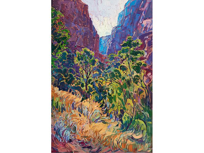
|
Kolob Light: An In-Depth LookFriday, January 5, 2018Zion National Park has been a favorite haunt of mine for almost ten years. The landscape is quite varied, changing from high-altitude plateaus to steep cliffs of changing color, from slot canyons to river-bed scenery. I love visiting at different times of the year, seeing snow in January, yellow cottonwoods in the fall, and golden grass in the summer. Read More → |
|
|
|
Kolob Light: An In-Depth Look Friday, January 5, 2018 Zion National Park has been a favorite haunt of mine for almost ten years. The landscape is quite varied, changing from high-altitude plateaus to steep cliffs of changing color, from slot canyons to river-bed scenery. I love visiting at different times of the year, seeing snow in January, yellow cottonwoods in the fall, and golden grass in the summer. Read More → |
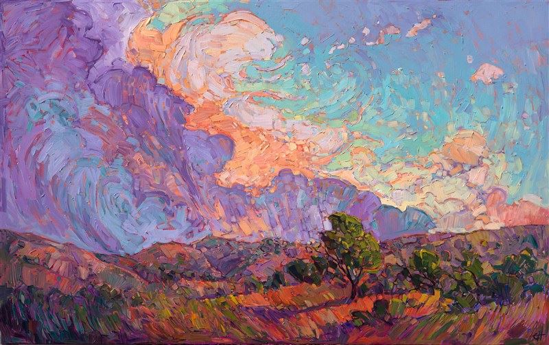
|
Enjoy the World and Art in the New Year!Spend the New Year Engaging with ArtSunday, December 31, 2017Art can bring so much joy to the viewer; it can quench a thirst in one’s soul like few other things in the world. However, it takes some time and energy to engage with a piece, whether it be a painting, a statue, a photograph, or some other type of art. Read More → |
|
|
|
Enjoy the World and Art in the New Year! Spend the New Year Engaging with Art Sunday, December 31, 2017 Art can bring so much joy to the viewer; it can quench a thirst in one’s soul like few other things in the world. However, it takes some time and energy to engage with a piece, whether it be a painting, a statue, a photograph, or some other type of art. Read More → |
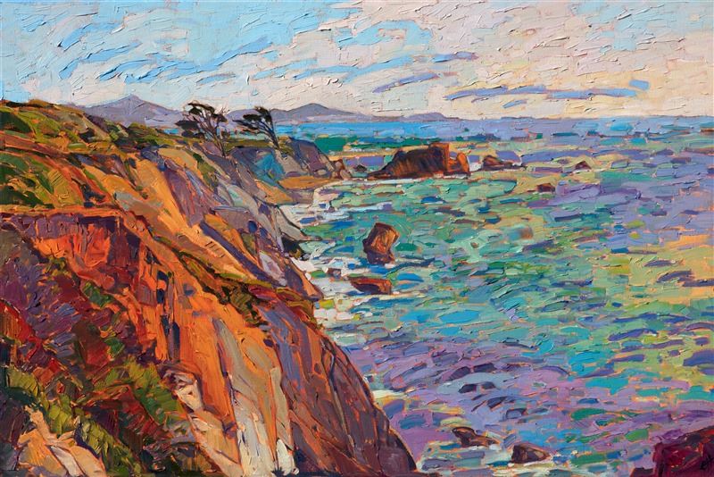
|
How to Show Off Your Art When HostingOffering a "How to" as you share your art with friends and familyThursday, December 14, 2017Displaying your favorite pieces when you are hosting your friends or family in your home can become a large part of your impromptu gathering or scheduled dinner party. Many art collectors curate their pieces, displaying them throughout their homes in the spots that provide the highest impact and which allow them to see pieces as they get ready for work in the morning or relax at home after supper. Read More → |
|
|
|
How to Show Off Your Art When Hosting Offering a "How to" as you share your art with friends and family Thursday, December 14, 2017 Displaying your favorite pieces when you are hosting your friends or family in your home can become a large part of your impromptu gathering or scheduled dinner party. Many art collectors curate their pieces, displaying them throughout their homes in the spots that provide the highest impact and which allow them to see pieces as they get ready for work in the morning or relax at home after supper. Read More → |
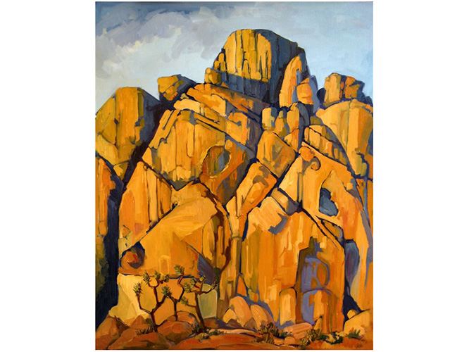
|
A 10-Year Retrospective of Open ImpressionismOpen Impressionism: The Works of Erin HansonSunday, November 26, 2017Erin Hanson (b. 1981) is one of the most important living Impressionists of our time. This retrospective is the first comprehensive presentation of Hanson’s career. Organized by the Goddard Center for Fine Arts, this exhibition features a selection of never-before exhibited works from her personal collection as well as paintings showcasing her prolific output over the past decade and a half. The exhibition will be on display for the winter season 2018. Read More → |
|
|
|
A 10-Year Retrospective of Open Impressionism Open Impressionism: The Works of Erin Hanson Sunday, November 26, 2017 Erin Hanson (b. 1981) is one of the most important living Impressionists of our time. This retrospective is the first comprehensive presentation of Hanson’s career. Organized by the Goddard Center for Fine Arts, this exhibition features a selection of never-before exhibited works from her personal collection as well as paintings showcasing her prolific output over the past decade and a half. The exhibition will be on display for the winter season 2018. Read More → |
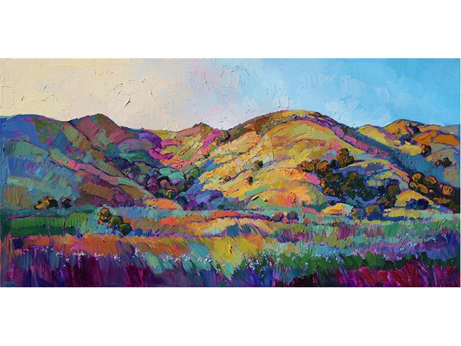
|
How to Clean My Original ArtworkFriday, November 24, 2017One common question we get asked at The Erin Hanson Gallery is “how do I clean my painting?” This is a vital piece of knowledge that every art collector should have in his or her repertoire. Whether you are a serious or casual collector, it’s important to know how to care for the pieces you cherish. Read More → |
|
|
|
How to Clean My Original Artwork Friday, November 24, 2017 One common question we get asked at The Erin Hanson Gallery is “how do I clean my painting?” This is a vital piece of knowledge that every art collector should have in his or her repertoire. Whether you are a serious or casual collector, it’s important to know how to care for the pieces you cherish. Read More → |
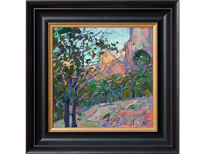
|
San Diego is for Art Lovers - Our Winter Events CalendarSunday, November 19, 2017Besides the exquisite art, there are many reasons to visit San Diego in the winter. The weather is generally warm, the beaches are beautiful, the food is delicious, and the wine is of the finest vintage. So, if you are planning to visit our fair city this winter, be sure to come by The Erin Hanson Gallery as you tour one or more of the below art exhibitions... Read More → |
|
|
|
San Diego is for Art Lovers - Our Winter Events Calendar Sunday, November 19, 2017 Besides the exquisite art, there are many reasons to visit San Diego in the winter. The weather is generally warm, the beaches are beautiful, the food is delicious, and the wine is of the finest vintage. So, if you are planning to visit our fair city this winter, be sure to come by The Erin Hanson Gallery as you tour one or more of the below art exhibitions... Read More → |

|
The History of The Erin Hanson GalleryWednesday, November 1, 2017I thought you would enjoy the story behind the creation of The Erin Hanson Gallery. About 8 years ago I was happily painting in my 3-car garage, located snugly in the Burbank hills with a great view overlooking Downtown Los Angeles.... Read More → |
|
|
|
The History of The Erin Hanson Gallery Wednesday, November 1, 2017 I thought you would enjoy the story behind the creation of The Erin Hanson Gallery. About 8 years ago I was happily painting in my 3-car garage, located snugly in the Burbank hills with a great view overlooking Downtown Los Angeles.... Read More → |
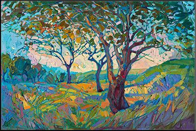
|
The Modernization of ImpressionismA Look at Impressionism and its Influence on Erin Hanson's "Open Impressionism"Thursday, October 19, 2017Since its inception, Impressionism has been an expression of independence from the constraints the world has placed upon art. Van Gogh, Monet, Degas, and the others who helped create this art form were seeking to break away from traditional art and dared to see the world differently. This theme has carried on from the origins of Impressionism in the late 1800’s into present. Read More → |
|
|
|
The Modernization of Impressionism A Look at Impressionism and its Influence on Erin Hanson's "Open Impressionism" Thursday, October 19, 2017 Since its inception, Impressionism has been an expression of independence from the constraints the world has placed upon art. Van Gogh, Monet, Degas, and the others who helped create this art form were seeking to break away from traditional art and dared to see the world differently. This theme has carried on from the origins of Impressionism in the late 1800’s into present. Read More → |
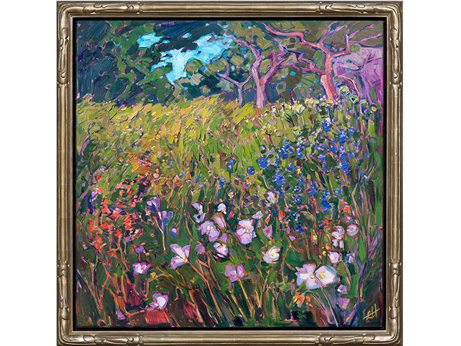
|
"Oaks and Blooms" In-Depth LookErin shares her inspiration behind a recent painting inspired by Texas Hill Country.Monday, October 16, 2017I visit Texas every year in the spring, and I always make sure to spend a few days in the beautiful hill country near Austin and the countryside north of Houston. Texas is full of color in the spring, the trees and meadows bright with new green growth. Read More → |
|
|
|
"Oaks and Blooms" In-Depth Look Erin shares her inspiration behind a recent painting inspired by Texas Hill Country. Monday, October 16, 2017 I visit Texas every year in the spring, and I always make sure to spend a few days in the beautiful hill country near Austin and the countryside north of Houston. Texas is full of color in the spring, the trees and meadows bright with new green growth. Read More → |
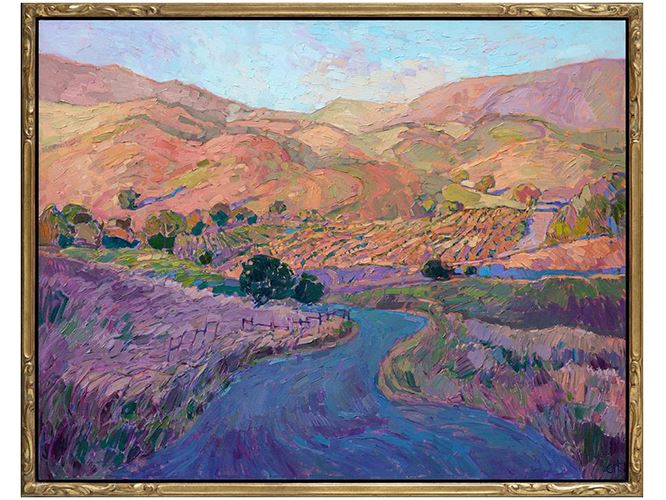
|
Framing OptionsFraming an Erin Hanson Original Oil PaintingThursday, October 12, 2017I have experimented with many framing options over the years: a decade ago I taught myself how to use a miter saw and joining tools, and I was making my own frames out of fine cherry wood molding. I have framed my work in simple floater frames, traditional plein air frames, and elaborate baroque frames. I have hung many paintings without any frame at all, letting the artistically-finished edges stand un-covered for a more contemporary look. Read More → |
|
|
|
Framing Options Framing an Erin Hanson Original Oil Painting Thursday, October 12, 2017 I have experimented with many framing options over the years: a decade ago I taught myself how to use a miter saw and joining tools, and I was making my own frames out of fine cherry wood molding. I have framed my work in simple floater frames, traditional plein air frames, and elaborate baroque frames. I have hung many paintings without any frame at all, letting the artistically-finished edges stand un-covered for a more contemporary look. Read More → |
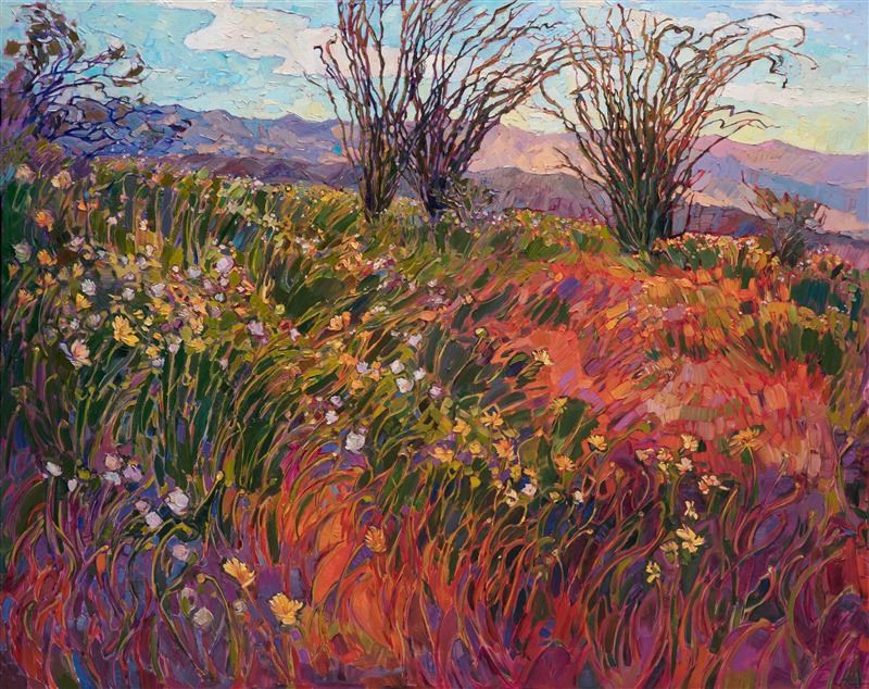
|
The California Super BloomCalifornia Impressionist Captures the Natural PhenomenaFriday, October 6, 2017California experienced a severe drought for several years which finally broke in the winter of 2017 when torrents of rain fell from the sky and turned California the most vivid shade of green we had seen in years. The wildflowers seeds had been waiting latent in the desert floor for several years, multiplying with each year of the drought. When the heavy rains finally arrived, the deserts erupted in a natural phenomena known as the "Super Bloom". Almost overnight the California desert and hills started turning orange, yellow and purple with a Super Bloom of flowers far more abundant than the typical spring bloom. So vibrant and widespread, it was even visible from space. Read More → |
|
|
|
The California Super Bloom California Impressionist Captures the Natural Phenomena Friday, October 6, 2017 California experienced a severe drought for several years which finally broke in the winter of 2017 when torrents of rain fell from the sky and turned California the most vivid shade of green we had seen in years. The wildflowers seeds had been waiting latent in the desert floor for several years, multiplying with each year of the drought. When the heavy rains finally arrived, the deserts erupted in a natural phenomena known as the "Super Bloom". Almost overnight the California desert and hills started turning orange, yellow and purple with a Super Bloom of flowers far more abundant than the typical spring bloom. So vibrant and widespread, it was even visible from space. Read More → |

|
Paso Robles’s Tuscan-Style Oasis Features Erin Hanson Paintings in Their Permanent CollectionTuesday, October 3, 2017The Allegretto Vineyard Resort currently houses eleven orignal oil paintings by California impressionist Erin Hanson. This California collection features paintings of Paso Robles’s iconic rolling hills, local wildflowers, and purple jacarandas. The hotel's vast collection of works by artists from near and far are juxtaposed by vintage furniture, slices of the natural world, and locally curated details. Read More → |
|
|
|
Paso Robles’s Tuscan-Style Oasis Features Erin Hanson Paintings in Their Permanent Collection Tuesday, October 3, 2017 The Allegretto Vineyard Resort currently houses eleven orignal oil paintings by California impressionist Erin Hanson. This California collection features paintings of Paso Robles’s iconic rolling hills, local wildflowers, and purple jacarandas. The hotel's vast collection of works by artists from near and far are juxtaposed by vintage furniture, slices of the natural world, and locally curated details. Read More → |
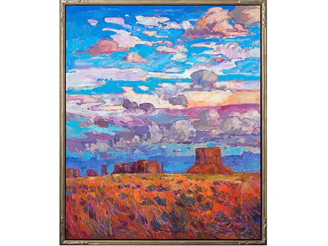
|
What is an Open Impressionism Frame?Wednesday, May 31, 2017What are Open Impressionism frames? These hand-carved and gilded floater frames are a perfect bridge between the classic and the contemporary. Read More → |
|
|
|
What is an Open Impressionism Frame? Wednesday, May 31, 2017 What are Open Impressionism frames? These hand-carved and gilded floater frames are a perfect bridge between the classic and the contemporary. Read More → |

|
Artist Adventure Series, No. 6Monday, May 8, 2017Erin tells her adventures through the Grand Canyon, Big Bend National Park, and Torrey Pines. Follow in the artist's footsteps as she explores landscapes near and far to uncover natural beauty and inspiration for her paintings. Read More → |
|
|
|
Artist Adventure Series, No. 6 Monday, May 8, 2017 Erin tells her adventures through the Grand Canyon, Big Bend National Park, and Torrey Pines. Follow in the artist's footsteps as she explores landscapes near and far to uncover natural beauty and inspiration for her paintings. Read More → |
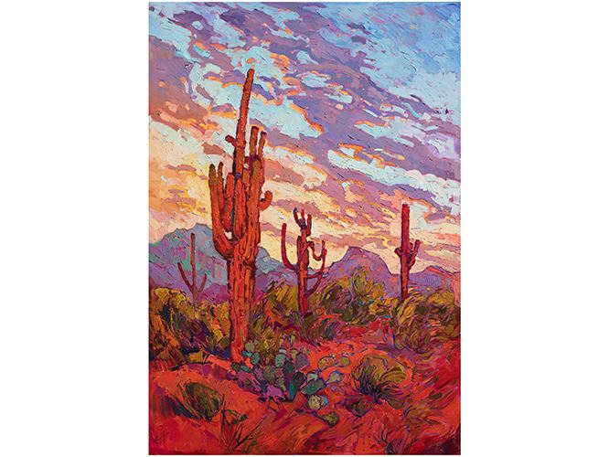
|
How to Commission a Painting - ExampleFriday, April 14, 2017Erin Hanson demonstrates the step-by-step process of commissioning a painting from an artist. Learn how to commission a painting to match the colors and style of your home. Read More → |
|
|
|
How to Commission a Painting - Example Friday, April 14, 2017 Erin Hanson demonstrates the step-by-step process of commissioning a painting from an artist. Learn how to commission a painting to match the colors and style of your home. Read More → |
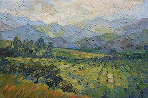
|
Impressionism Series Part Three: Impressionism Around the WorldA series on the development of ImpressionismSaturday, April 8, 2017While artists flocked to France to learn or develop the latest Post-Impressionist style, the love for pure Impressionism never died. In fact, Impressionism spread around the world, heralding the beginning of modern art. Read More → |
|
|
|
Impressionism Series Part Three: Impressionism Around the World A series on the development of Impressionism Saturday, April 8, 2017 While artists flocked to France to learn or develop the latest Post-Impressionist style, the love for pure Impressionism never died. In fact, Impressionism spread around the world, heralding the beginning of modern art. Read More → |
|
San Diego Art Events April 2017Wednesday, April 5, 2017There seems to be an art event almost every day here in San Diego. We have incredible local galleries, art walks, and art museums featuring beautiful pieces that are just waiting to be discovered. Instead of casting a net throughout the internet and hoping to find the best and most enjoyable art events this month, we thought we would find them for you! Here is a roundup of our favorite upcoming art events this April! Read More → |
|
|
|
San Diego Art Events April 2017 Wednesday, April 5, 2017 There seems to be an art event almost every day here in San Diego. We have incredible local galleries, art walks, and art museums featuring beautiful pieces that are just waiting to be discovered. Instead of casting a net throughout the internet and hoping to find the best and most enjoyable art events this month, we thought we would find them for you! Here is a roundup of our favorite upcoming art events this April! Read More → |

|
The Erin Hanson Gallery Opens in San DiegoCollectors and Fans Gather for an Art Evening to be RememberedMonday, March 20, 2017At the grand opening of The Erin Hanson Gallery, we hosted a large number of collectors and fans who enjoyed an evening of live music, fine desserts and Hanson’s most recent collection of paintings. Fine wines were provided by 2 Plank Vineyards and the gallery showroom was filled to the brim with excited San Diegans. Read More → |
|
|
|
The Erin Hanson Gallery Opens in San Diego Collectors and Fans Gather for an Art Evening to be Remembered Monday, March 20, 2017 At the grand opening of The Erin Hanson Gallery, we hosted a large number of collectors and fans who enjoyed an evening of live music, fine desserts and Hanson’s most recent collection of paintings. Fine wines were provided by 2 Plank Vineyards and the gallery showroom was filled to the brim with excited San Diegans. Read More → |
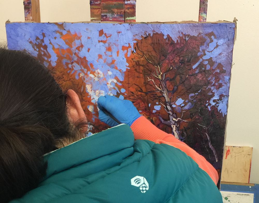
|
How to Commission a Painting - ExampleTuesday, March 14, 2017Erin paints over an antique floral painting from WW2-era, transforming it into a new commemorative painting of a sacred Colorado camp. Read More → |
|
|
|
How to Commission a Painting - Example Tuesday, March 14, 2017 Erin paints over an antique floral painting from WW2-era, transforming it into a new commemorative painting of a sacred Colorado camp. Read More → |
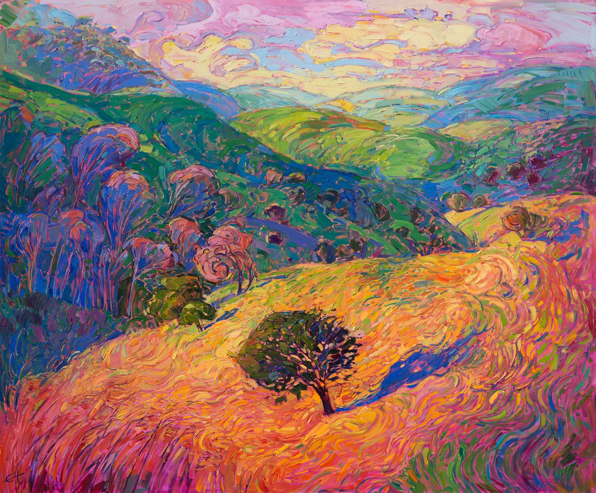
|
Impressionism Series Part Two: The Birth of Modern ArtA series on the development of ImpressionismSunday, March 12, 2017Impressionism is often characterized by its study of light and the vibrant colors used to convey an impression of a scene. The brushwork commonly employed in Impressionist works is loose and layered, with the paint mixing on the canvas rather than being premixed, painted on, and then blended. Read More → |
|
|
|
Impressionism Series Part Two: The Birth of Modern Art A series on the development of Impressionism Sunday, March 12, 2017 Impressionism is often characterized by its study of light and the vibrant colors used to convey an impression of a scene. The brushwork commonly employed in Impressionist works is loose and layered, with the paint mixing on the canvas rather than being premixed, painted on, and then blended. Read More → |
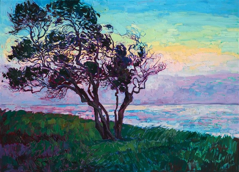
|
Impressionism Series Part One: Capturing Light with PaintA series on the development of ImpressionismFriday, March 3, 2017The artistic movement Impressionism is often credited with moving painting techniques away from the overtly realistic to a modern approach. An impressionist painting is apparent to the eye in several ways, including one of the most important studies: that of how light and shadow affect color in the world around us. Read More → |
|
|
|
Impressionism Series Part One: Capturing Light with Paint A series on the development of Impressionism Friday, March 3, 2017 The artistic movement Impressionism is often credited with moving painting techniques away from the overtly realistic to a modern approach. An impressionist painting is apparent to the eye in several ways, including one of the most important studies: that of how light and shadow affect color in the world around us. Read More → |
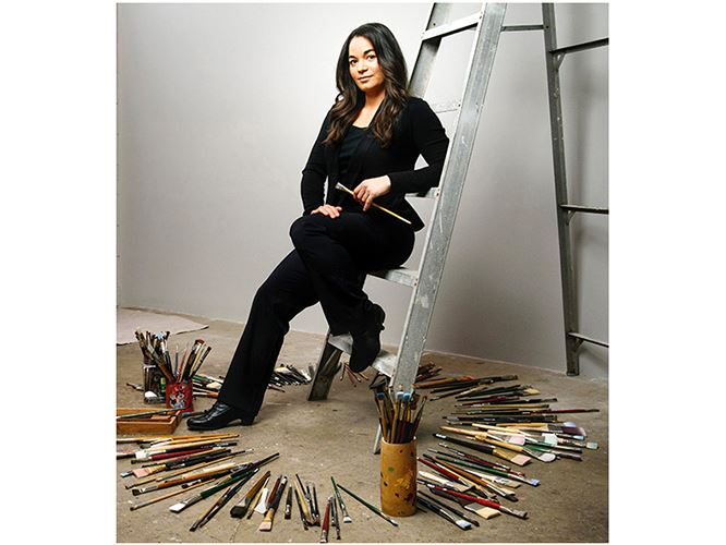
|
Erin Hanson Painting DetailsThings to Know When Buying an Erin Hanson PaintingFriday, December 16, 2016This is an essay that describes the technique and materials used by Erin Hanson, including information about lighting and framing. Read More → |
|
|
|
Erin Hanson Painting Details Things to Know When Buying an Erin Hanson Painting Friday, December 16, 2016 This is an essay that describes the technique and materials used by Erin Hanson, including information about lighting and framing. Read More → |
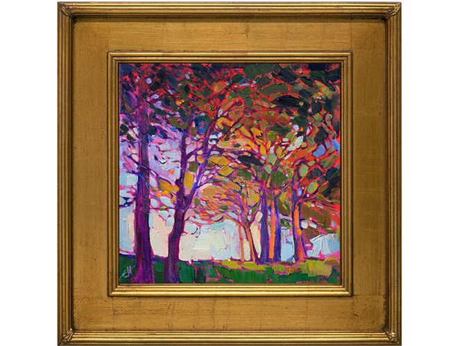
|
2016 Holiday Gift Guide for the Art CollectorFriday, November 25, 2016Are you looking for the quintessential Christmas present for the avid lover of art and culture? These original gift items will bring a wide smile to the face of any connoisseur of fine art. Read More → |
|
|
|
2016 Holiday Gift Guide for the Art Collector Friday, November 25, 2016 Are you looking for the quintessential Christmas present for the avid lover of art and culture? These original gift items will bring a wide smile to the face of any connoisseur of fine art. Read More → |

|
Erin Hanson: The Orange Show Opening ReceptionCelebrating Striking Impressionism in Hues of OrangeWednesday, October 5, 2016On Saturday, October 1st Erin Hanson's anticipated The Orange Show opened with ardent fans and steadfast collectors alike gathering to experience this unique collection. The various hues of orange contrasted beautifully against the midnight blue walls of her Los Angeles-based gallery. Read More → |
|
|
|
Erin Hanson: The Orange Show Opening Reception Celebrating Striking Impressionism in Hues of Orange Wednesday, October 5, 2016 On Saturday, October 1st Erin Hanson's anticipated The Orange Show opened with ardent fans and steadfast collectors alike gathering to experience this unique collection. The various hues of orange contrasted beautifully against the midnight blue walls of her Los Angeles-based gallery. Read More → |
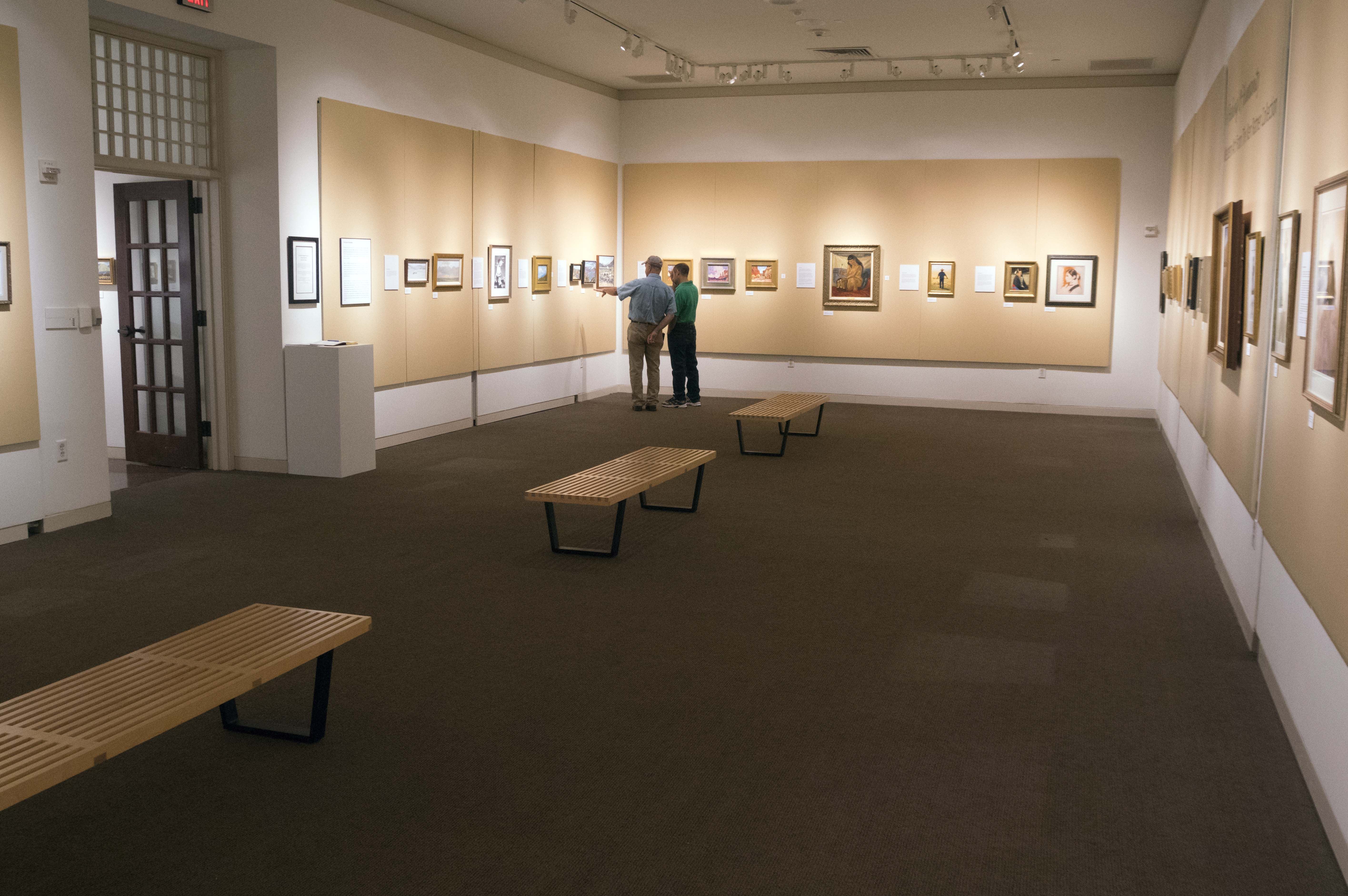
|
Artist Talk: Museum of Big BendInside the Rise of a Modern MasterTuesday, October 4, 2016Erin's talk covered her key sources of inspiration, she also discussed her rise from discovering the red rock canyons surrounding Las Vegas ten years ago through to her current status as a forerunner in an impressionistic resurgence. Read More → |
|
|
|
Artist Talk: Museum of Big Bend Inside the Rise of a Modern Master Tuesday, October 4, 2016 Erin's talk covered her key sources of inspiration, she also discussed her rise from discovering the red rock canyons surrounding Las Vegas ten years ago through to her current status as a forerunner in an impressionistic resurgence. Read More → |
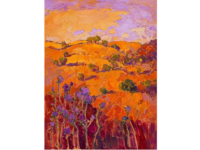
|
An In-Depth Look into Erin Hanson's Anticipated ExhibitionErin Hanson: The Orange ShowWednesday, September 28, 2016In Hanson’s upcoming The Orange Show, she dives deep into this color, capturing every tint of orange from amber to marigold. In this article, we take a closer look at each painting to be featured in the show. Read More → |
|
|
|
An In-Depth Look into Erin Hanson's Anticipated Exhibition Erin Hanson: The Orange Show Wednesday, September 28, 2016 In Hanson’s upcoming The Orange Show, she dives deep into this color, capturing every tint of orange from amber to marigold. In this article, we take a closer look at each painting to be featured in the show. Read More → |
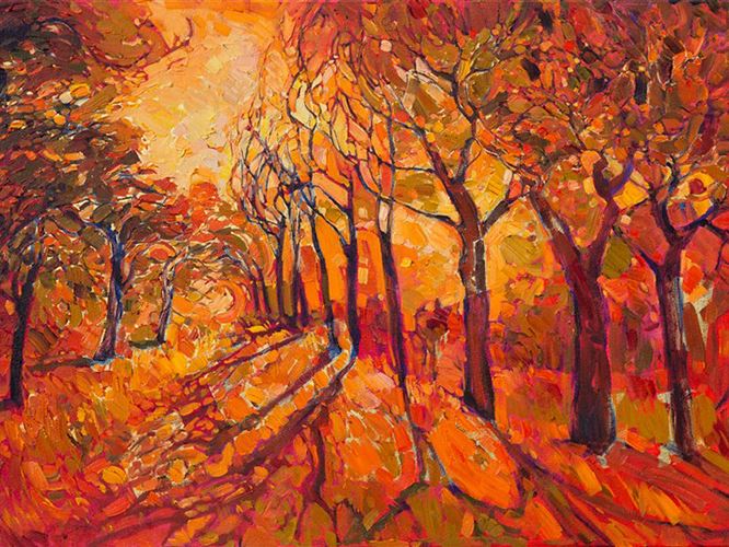
|
A Study in Orange: The Orange Collection by Erin HansonErin Hanson's Orange CollectionFriday, September 16, 2016Erin Hanson has given herself the challenge of creating unique impressionist paintings with orange as the predominant color. From orange rock deserts to flaming sunsets to tangerine flowers, The Orange Show captures the creativity, determination, adventure, and fascination this unique color represents. Read More → |
|
|
|
A Study in Orange: The Orange Collection by Erin Hanson Erin Hanson's Orange Collection Friday, September 16, 2016 Erin Hanson has given herself the challenge of creating unique impressionist paintings with orange as the predominant color. From orange rock deserts to flaming sunsets to tangerine flowers, The Orange Show captures the creativity, determination, adventure, and fascination this unique color represents. Read More → |
|
Erin Hanson: The Orange ShowSouthwest Art Magazine Show PreviewTuesday, September 13, 2016Hanson says the focus on orange deviates from her comfort zone of purples and greens. To prepare, she started visiting new places and hiking in different environments, including Colorado and Utah, where she photographed the aspens at their peak fall colors. She also visited places like Canyon De Chelly National Monument, where the rocks can be nothing but orange. Read More → |
|
|
|
Erin Hanson: The Orange Show Southwest Art Magazine Show Preview Tuesday, September 13, 2016 Hanson says the focus on orange deviates from her comfort zone of purples and greens. To prepare, she started visiting new places and hiking in different environments, including Colorado and Utah, where she photographed the aspens at their peak fall colors. She also visited places like Canyon De Chelly National Monument, where the rocks can be nothing but orange. Read More → |
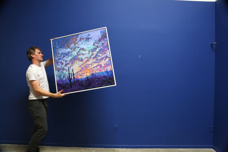
|
What is it Like to Get a Print from ErinHanson.com?Easy, Beautiful, High-Quality and Ready to HangTuesday, September 13, 2016We wanted to show you exactly what happens when you order a fine art print through The Erin Hanson Gallery: two weeks ago the team ordered a print of Erin Hanson's Saguaro Dusk, a spectacular piece focusing on Arizona's iconic landscape. We selected the white frame option to contrast the vibrant purples of the piece and the gallery's midnight blue walls. Read More → |
|
|
|
What is it Like to Get a Print from ErinHanson.com? Easy, Beautiful, High-Quality and Ready to Hang Tuesday, September 13, 2016 We wanted to show you exactly what happens when you order a fine art print through The Erin Hanson Gallery: two weeks ago the team ordered a print of Erin Hanson's Saguaro Dusk, a spectacular piece focusing on Arizona's iconic landscape. We selected the white frame option to contrast the vibrant purples of the piece and the gallery's midnight blue walls. Read More → |
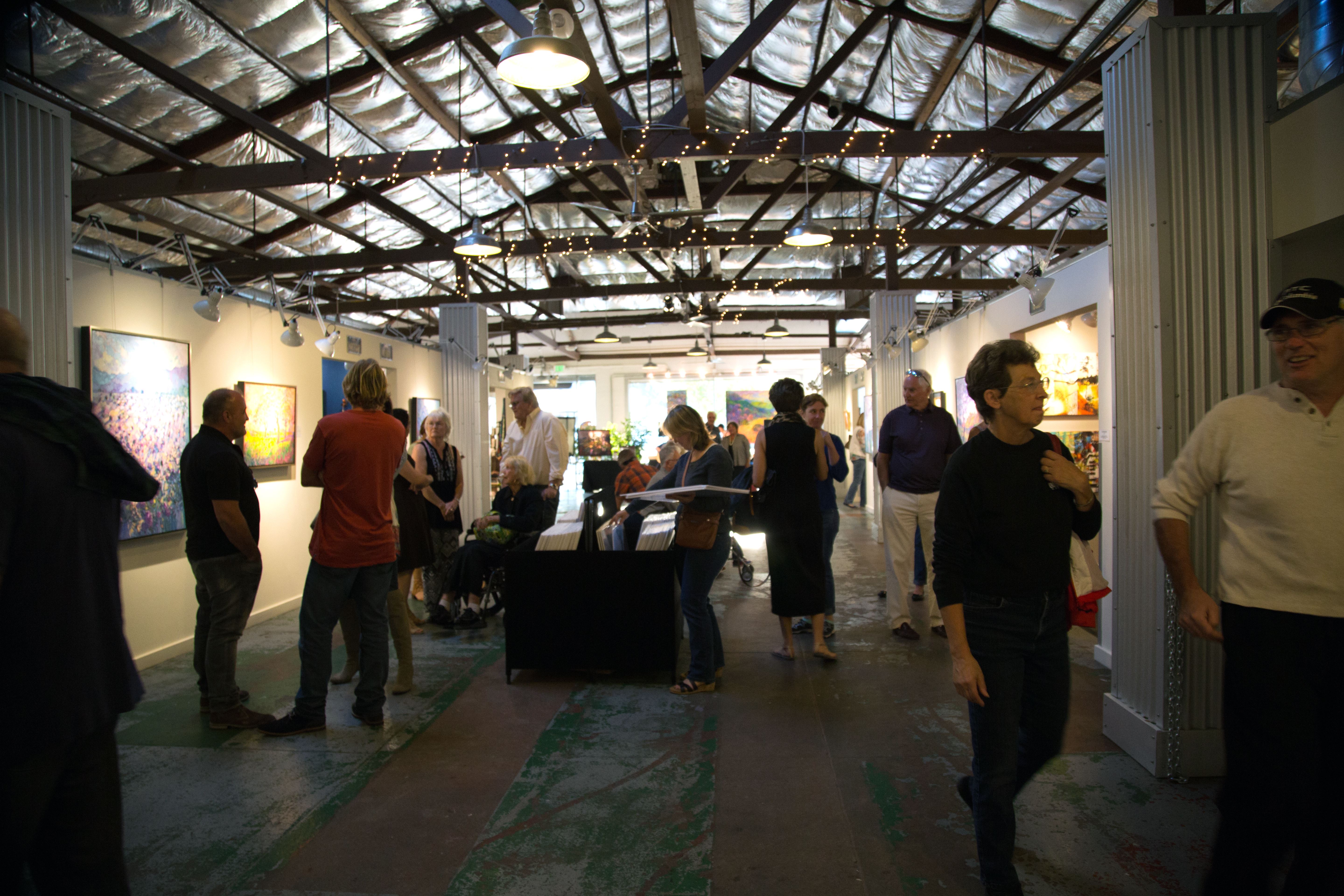
|
Impressions of California Exhibition: Opening ReceptionAn Evening of Art in Paso Robles, CaliforniaSunday, September 4, 2016September 2016 marks the 5th annual return of Erin Hanson to Paso Robles' Studios on the Park. This year's month-long exhibition focuses on the diverse regions of California. Read More → |
|
|
|
Impressions of California Exhibition: Opening Reception An Evening of Art in Paso Robles, California Sunday, September 4, 2016 September 2016 marks the 5th annual return of Erin Hanson to Paso Robles' Studios on the Park. This year's month-long exhibition focuses on the diverse regions of California. Read More → |
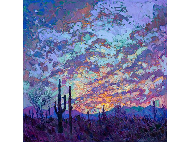
|
How-To: Lighting Your Fine ArtMonday, August 15, 2016Many art collectors have preferences for different types of lighting in their homes. Some prefer ambient lamp light while others would rather have spotlight-like track lights. No matter your preference, it’s important to understand that light affects each painting differently. Read More → |
|
|
|
How-To: Lighting Your Fine Art Monday, August 15, 2016 Many art collectors have preferences for different types of lighting in their homes. Some prefer ambient lamp light while others would rather have spotlight-like track lights. No matter your preference, it’s important to understand that light affects each painting differently. Read More → |
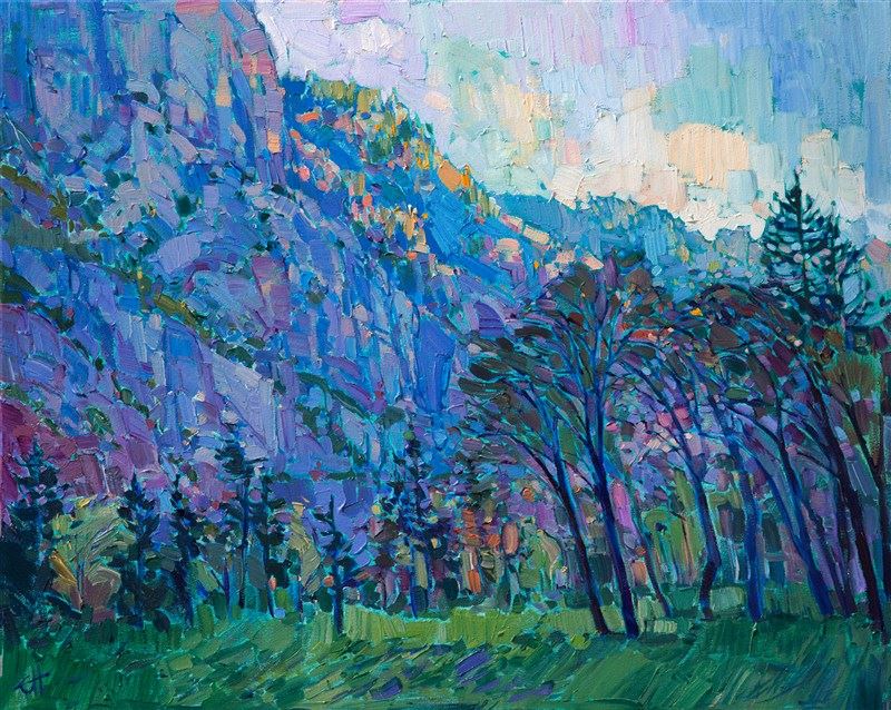
|
Erin Hanson Prepares for her Anticipated Return to Paso RoblesSaturday, August 6, 2016“California appeals to my imagination. Its jutting mountains, sprawling plains, burning deserts, and crystal coasts all co-exist within a stone’s throw of each other. Each morning brings a new vision of light and a new juxtaposition of color, while each region offers its own vibrant colors and varied shapes. My home state has been an ever-present source of inspiration for me as an artist and lover of nature. "This exhibition is a love letter to my California.” Read More → |
|
|
|
Erin Hanson Prepares for her Anticipated Return to Paso Robles Saturday, August 6, 2016 “California appeals to my imagination. Its jutting mountains, sprawling plains, burning deserts, and crystal coasts all co-exist within a stone’s throw of each other. Each morning brings a new vision of light and a new juxtaposition of color, while each region offers its own vibrant colors and varied shapes. My home state has been an ever-present source of inspiration for me as an artist and lover of nature. "This exhibition is a love letter to my California.” Read More → |
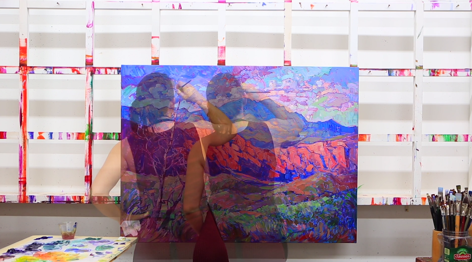
|
Introducing: Open Impressionism Vol IIWhat Inspires Erin Hanson?Thursday, August 4, 2016"As viewers are flipping through my book, I want them to feel a sense of peace and I want to help inspire them to go beyond their everyday life. I hope this book inspires you to bring more color and beauty into your life." Read More → |
|
|
|
Introducing: Open Impressionism Vol II What Inspires Erin Hanson? Thursday, August 4, 2016 "As viewers are flipping through my book, I want them to feel a sense of peace and I want to help inspire them to go beyond their everyday life. I hope this book inspires you to bring more color and beauty into your life." Read More → |
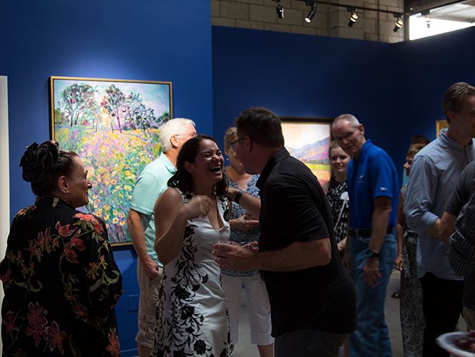
|
Honoring the Release of Open Impressionism Vol. IIFans Gather from Near and Far to CelebrateSunday, July 24, 2016Erin Hanson fans and collectors visited her Los Angeles gallery for an evening of art, microbrews and live music to celebrate her most recently published book, Open Impressionism Volume II. Guests were also able to experience her newest works including the tiered hills of Layered Light and vision of florals in her 13-foot masterpiece, Field of Blooms. Read More → |
|
|
|
Honoring the Release of Open Impressionism Vol. II Fans Gather from Near and Far to Celebrate Sunday, July 24, 2016 Erin Hanson fans and collectors visited her Los Angeles gallery for an evening of art, microbrews and live music to celebrate her most recently published book, Open Impressionism Volume II. Guests were also able to experience her newest works including the tiered hills of Layered Light and vision of florals in her 13-foot masterpiece, Field of Blooms. Read More → |
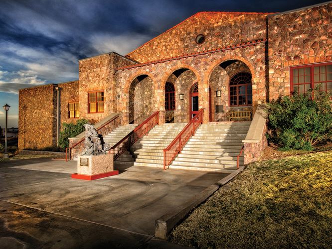
|
A Feeling of Humanity: The Ken Ratner CollectionMuseum of the Big Bend in Alpine, TXWednesday, July 20, 2016A Feeling of Humanity is the result of Ratner’s focused collecting of contemporary Western artists. His collection features thirty-seven artists and sixty-three works of art. Read More → |
|
|
|
A Feeling of Humanity: The Ken Ratner Collection Museum of the Big Bend in Alpine, TX Wednesday, July 20, 2016 A Feeling of Humanity is the result of Ratner’s focused collecting of contemporary Western artists. His collection features thirty-seven artists and sixty-three works of art. Read More → |
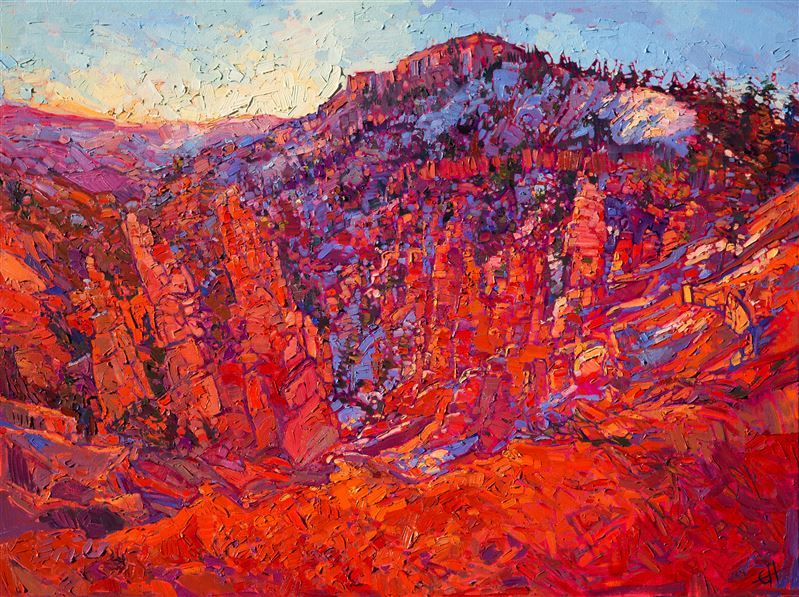
|
Erin Hanson's Painted Parks Exhibition Sells OutCelebrating the National Park Service's CentennialTuesday, May 31, 2016As visitors moved through the large exhibition space, they were transported, moved from an era of cement and metal to a world of sprawling mountain tops, sun-kissed plains and tangerine skies. Read More → |
|
|
|
Erin Hanson's Painted Parks Exhibition Sells Out Celebrating the National Park Service's Centennial Tuesday, May 31, 2016 As visitors moved through the large exhibition space, they were transported, moved from an era of cement and metal to a world of sprawling mountain tops, sun-kissed plains and tangerine skies. Read More → |
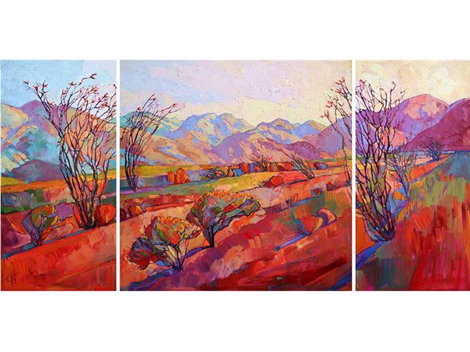
|
A Profile of Borrego SpringsInspiration Comes Easily from this Vast California DesertMonday, April 25, 2016Borrego Springs is a unique town. Surrounded by a 600,000-acre State Park in San Diego County, it is the only desert community in San Diego County. This town lays in a valley and is surrounded by desert. The land stretches out to the surrounding mountains. This makes Borrego Springs an incredible spot for beautiful color combinations. The startling blue skies are a glorious contrast to the sandy desert and wildflowers, which differ from the looming mountains. Read More → |
|
|
|
A Profile of Borrego Springs Inspiration Comes Easily from this Vast California Desert Monday, April 25, 2016 Borrego Springs is a unique town. Surrounded by a 600,000-acre State Park in San Diego County, it is the only desert community in San Diego County. This town lays in a valley and is surrounded by desert. The land stretches out to the surrounding mountains. This makes Borrego Springs an incredible spot for beautiful color combinations. The startling blue skies are a glorious contrast to the sandy desert and wildflowers, which differ from the looming mountains. Read More → |
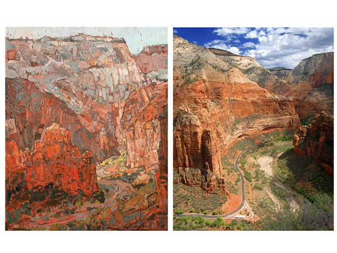
|
The Inspiration of Zion National ParkErin Hanson explores the National Parks for inspiration.Monday, April 4, 2016One of Erin’s favorite National Parks to paint is Zion National Park in Utah. This park features landscape that is truly incredible and worth capturing through brush strokes and photographs. The park features stark panoramas, vibrant rock formations, lush landscapes, and extreme biodiversity. Read More → |
|
|
|
The Inspiration of Zion National Park Erin Hanson explores the National Parks for inspiration. Monday, April 4, 2016 One of Erin’s favorite National Parks to paint is Zion National Park in Utah. This park features landscape that is truly incredible and worth capturing through brush strokes and photographs. The park features stark panoramas, vibrant rock formations, lush landscapes, and extreme biodiversity. Read More → |
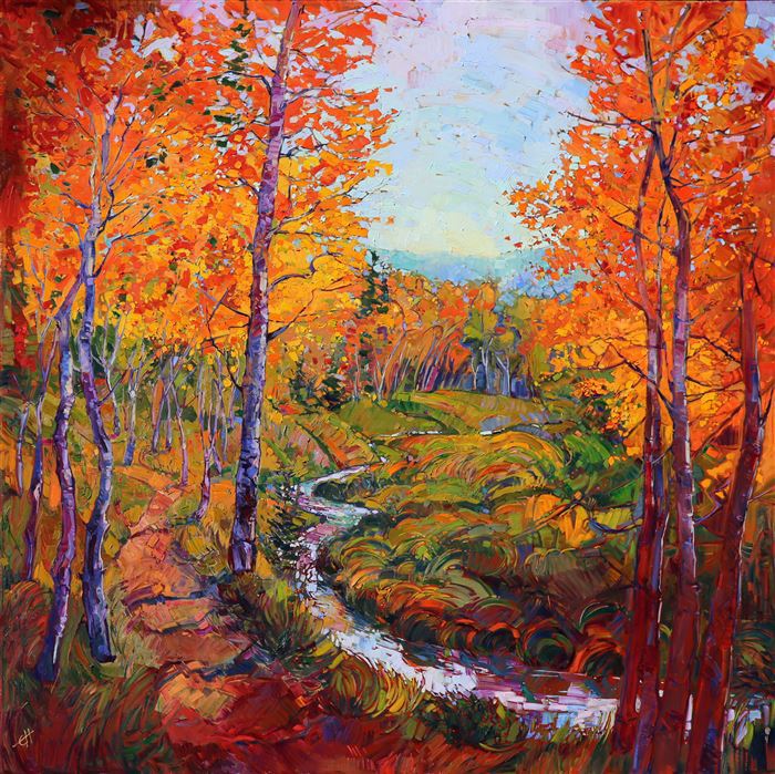
|
Group of Seven Influencing Contemporary Landscape ImpressionismWhat Would the Group of Seven Have Painted if They Visited California?Wednesday, March 23, 2016Erin Hanson’s art has been compared favorably with art created by the Group of Seven and their associates. We can see their influence in her work by comparing many of her paintings with works by Tom Thomson, Lawren Harris, A.Y. Jackson, Franklin Carmichael and others. When looking at these classic Group of Seven works, we can see a certain vibrancy and love of color now mirrored in modern impressionistic works by Erin Hanson. Read More → |
|
|
|
Group of Seven Influencing Contemporary Landscape Impressionism What Would the Group of Seven Have Painted if They Visited California? Wednesday, March 23, 2016 Erin Hanson’s art has been compared favorably with art created by the Group of Seven and their associates. We can see their influence in her work by comparing many of her paintings with works by Tom Thomson, Lawren Harris, A.Y. Jackson, Franklin Carmichael and others. When looking at these classic Group of Seven works, we can see a certain vibrancy and love of color now mirrored in modern impressionistic works by Erin Hanson. Read More → |
|
The Medicine Man Gallery Welcomes Erin HansonMark Sublette Curates 3 Original ArtworksMonday, March 14, 2016Mark Sublette of the Medicine Man Gallery welcomes Erin Hanson and her sublime Western landscapes, curating 3 exclusive original oil paintings. Read More → |
|
|
|
The Medicine Man Gallery Welcomes Erin Hanson Mark Sublette Curates 3 Original Artworks Monday, March 14, 2016 Mark Sublette of the Medicine Man Gallery welcomes Erin Hanson and her sublime Western landscapes, curating 3 exclusive original oil paintings. Read More → |

|
Can You Name Five Women Artists?For Women's History Month, Museums Nationwide Join Forces to Honor Women Artists Past & PresentMonday, March 14, 2016In Honor of Women's History Month, #5WomenThroughHistory: A Study of Some of the Most Influential Artists in History, Who Also Happen to be Women. Read More → |
|
|
|
Can You Name Five Women Artists? For Women's History Month, Museums Nationwide Join Forces to Honor Women Artists Past & Present Monday, March 14, 2016 In Honor of Women's History Month, #5WomenThroughHistory: A Study of Some of the Most Influential Artists in History, Who Also Happen to be Women. Read More → |
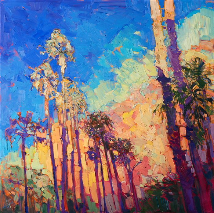
|
Where to View Impressionism in Southern CaliforniaSouthern California Art Scene | Impressionism Stands StrongTuesday, February 23, 2016California is predominately known for its ultra-modern and deeply abstract artwork, which is surprising given its roots in the famed California Impressionism movement. Within the 163,696 square-miles that comprise this sprawling and diverse state are some of the nation's most important museums, galleries and art collections. Thankfully impressionism is alive and well. You just have to know where to look. Read More → |
|
|
|
Where to View Impressionism in Southern California Southern California Art Scene | Impressionism Stands Strong Tuesday, February 23, 2016 California is predominately known for its ultra-modern and deeply abstract artwork, which is surprising given its roots in the famed California Impressionism movement. Within the 163,696 square-miles that comprise this sprawling and diverse state are some of the nation's most important museums, galleries and art collections. Thankfully impressionism is alive and well. You just have to know where to look. Read More → |
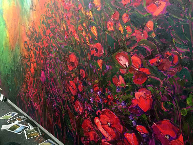
|
Field of Blooms: Erin's Largest Single CanvasThe Work in Progress of Hanson's Field of BloomsSaturday, February 20, 2016A wide expanse of wildflowers sweeps across the canvas in this large oil painting. The expressionist movement of brush strokes captures the vibrancy and color of the poppies, thistles and daisies growing among the grasses. The abstracted shapes of the landscape come together in a harmony of motion and color. Read More → |
|
|
|
Field of Blooms: Erin's Largest Single Canvas The Work in Progress of Hanson's Field of Blooms Saturday, February 20, 2016 A wide expanse of wildflowers sweeps across the canvas in this large oil painting. The expressionist movement of brush strokes captures the vibrancy and color of the poppies, thistles and daisies growing among the grasses. The abstracted shapes of the landscape come together in a harmony of motion and color. Read More → |
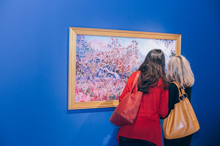
|
Erin Hanson's Romance in Bloom Collection ReleaseWednesday, February 17, 2016These pieces are inspired by Hanson’s many adventures across the United States, traversing National Parks, sprawling countrysides and breathtaking coastal treasures. A larger-than-life 13-foot oil on canvas piece inspired by the masters van Gogh and Monet will be available for first viewing to attendees. Read More → |
|
|
|
Erin Hanson's Romance in Bloom Collection Release Wednesday, February 17, 2016 These pieces are inspired by Hanson’s many adventures across the United States, traversing National Parks, sprawling countrysides and breathtaking coastal treasures. A larger-than-life 13-foot oil on canvas piece inspired by the masters van Gogh and Monet will be available for first viewing to attendees. Read More → |
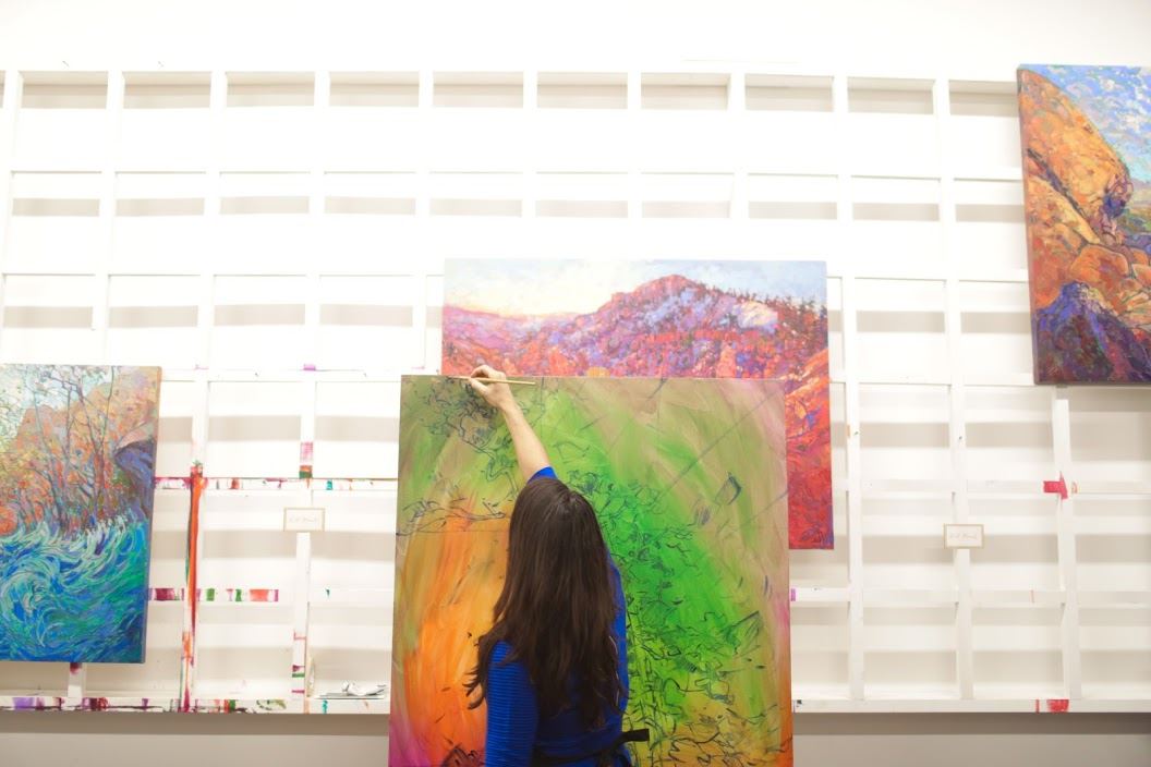
|
Erin Hanson | Contemporary Artist Featured in LA Lady MagazineL.A. Lady Magazine: A realist magazine for the idealist Los Angeles woman.Saturday, January 30, 2016"Luckily it was particularly beautiful driving from Los Angeles to Las Vegas that day, and I decided without reservation that I would paint landscapes." Read More → |
|
|
|
Erin Hanson | Contemporary Artist Featured in LA Lady Magazine L.A. Lady Magazine: A realist magazine for the idealist Los Angeles woman. Saturday, January 30, 2016 "Luckily it was particularly beautiful driving from Los Angeles to Las Vegas that day, and I decided without reservation that I would paint landscapes." Read More → |
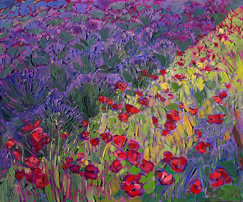
|
Los Angeles Valentine's Day Art EventPreviewing Erin Hanson's ROMANCE IN BLOOM CollectionThursday, January 21, 2016Patrons of the arts are cordially invited to attend a limited viewing of Romance in Bloom by Erin Hanson, a brand new collection inspired by secluded landscapes and romantic wildflowers. Transport yourself through Hanson's textured brush strokes and whimsical landscapes. A very special daytime event for a romantic Valentine's Day in North East Los Angeles. Read More → |
|
|
|
Los Angeles Valentine's Day Art Event Previewing Erin Hanson's ROMANCE IN BLOOM Collection Thursday, January 21, 2016 Patrons of the arts are cordially invited to attend a limited viewing of Romance in Bloom by Erin Hanson, a brand new collection inspired by secluded landscapes and romantic wildflowers. Transport yourself through Hanson's textured brush strokes and whimsical landscapes. A very special daytime event for a romantic Valentine's Day in North East Los Angeles. Read More → |
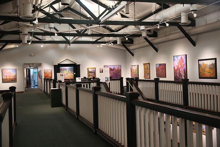
|
Erin Hanson's Painted Parks at the St. George Art MuseumNational Park Service's Centennial Celebration in ArtThursday, January 14, 2016In celebration of the National Park Service's centennial, impressionistic artist Erin Hanson exhibits a collection of vibrant landscapes inspired by parks from Zion to the Oregon Cascades. Read More → |
|
|
|
Erin Hanson's Painted Parks at the St. George Art Museum National Park Service's Centennial Celebration in Art Thursday, January 14, 2016 In celebration of the National Park Service's centennial, impressionistic artist Erin Hanson exhibits a collection of vibrant landscapes inspired by parks from Zion to the Oregon Cascades. Read More → |
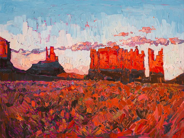
|
California Artist Featured in National Park Centennial ExhibitImpressionist Erin Hanson celebrates 100 years of park preservation at the St. George Art MuseumMonday, December 7, 2015Erin Hanson's Painted Parks collection of landscapes will be displayed in the Main Gallery of the St. George Art Museum from January 16, 2016 through May 28, 2016. Hanson's exhibition kicks off the museum's 2016 NATIONAL PARKS: UNITING AMERICA: 100 Years on Common Ground event. Read More → |
|
|
|
California Artist Featured in National Park Centennial Exhibit Impressionist Erin Hanson celebrates 100 years of park preservation at the St. George Art Museum Monday, December 7, 2015 Erin Hanson's Painted Parks collection of landscapes will be displayed in the Main Gallery of the St. George Art Museum from January 16, 2016 through May 28, 2016. Hanson's exhibition kicks off the museum's 2016 NATIONAL PARKS: UNITING AMERICA: 100 Years on Common Ground event. Read More → |
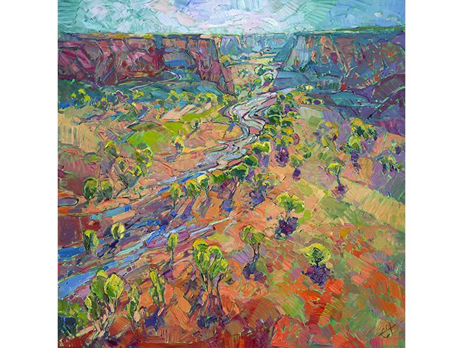
|
Behind the Art: Canyon ColorDaybreak captured at Canyon de ChellySunday, December 6, 2015Canyon de Chelly National Monument as captured by the swift brush of artist Erin Hanson. "Canyon Color" will be on display at the St. George Art Museum until May 28th, 2015 as part of their National Parks Centennial event. Read More → |
|
|
|
Behind the Art: Canyon Color Daybreak captured at Canyon de Chelly Sunday, December 6, 2015 Canyon de Chelly National Monument as captured by the swift brush of artist Erin Hanson. "Canyon Color" will be on display at the St. George Art Museum until May 28th, 2015 as part of their National Parks Centennial event. Read More → |

|
The Works of Erin Hanson Housed in R.M. Schindler's Van Dekker House‘Hidden Gem’ by R.M. Schindler in Woodland Hills RestoredSunday, November 29, 2015Gramwell, an Erin Hanson collector, purchased the landmark Van Dekker House in Woodland Hills a "hidden gem" designed 76 years ago by modernist architect Rudolph M. Schindler. Read More → |
|
|
|
The Works of Erin Hanson Housed in R.M. Schindler's Van Dekker House ‘Hidden Gem’ by R.M. Schindler in Woodland Hills Restored Sunday, November 29, 2015 Gramwell, an Erin Hanson collector, purchased the landmark Van Dekker House in Woodland Hills a "hidden gem" designed 76 years ago by modernist architect Rudolph M. Schindler. Read More → |
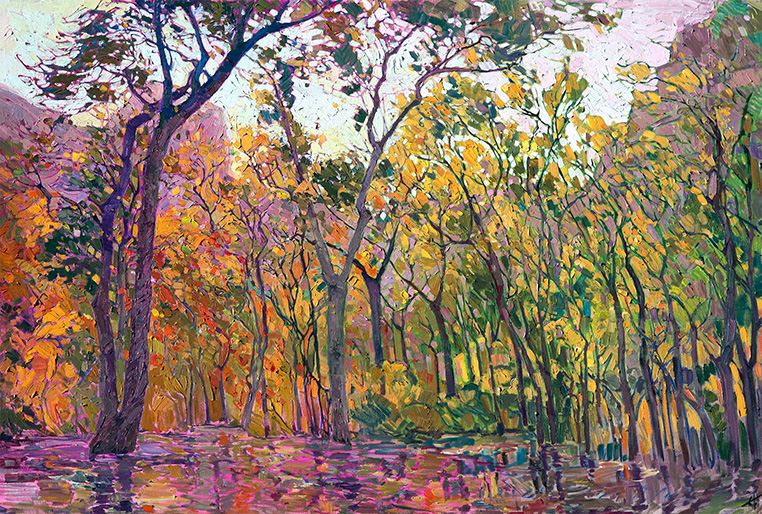
|
Curator Ken Ratner on Erin Hanson's Painted Parks CollectionNATIONAL PARKS: UNITING AMERICA: 100 Years of Common GroundThursday, November 26, 2015Hanson's style of painting has been influenced by, among others, the German Expressionists, the Group of Seven, and the Masters of California Impressionism. Yet, her work is very original. We see the influence of the Group of Seven, and in particular, Tom Thomson, in Woods of Gold, At the Lodge, and Crystal Cottonwoods. Read More → |
|
|
|
Curator Ken Ratner on Erin Hanson's Painted Parks Collection NATIONAL PARKS: UNITING AMERICA: 100 Years of Common Ground Thursday, November 26, 2015 Hanson's style of painting has been influenced by, among others, the German Expressionists, the Group of Seven, and the Masters of California Impressionism. Yet, her work is very original. We see the influence of the Group of Seven, and in particular, Tom Thomson, in Woods of Gold, At the Lodge, and Crystal Cottonwoods. Read More → |
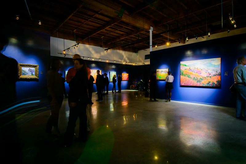
|
New Los Angeles Gallery Opens to a Full HouseArt Fans Flock to View Erin Hanson’s New North East Los Angeles Art GalleryWednesday, November 18, 2015It was a brisk fall evening in North East Los Angeles and hundreds gathered to celebrate artist Erin Hanson’s new 5000-square foot gallery space and studio. A moment Hanson has been planning for nearly two years, the night marked an important milestone in her ongoing objective to reach out to and inspire Los Angeles with her impressionist paintings. Read More → |
|
|
|
New Los Angeles Gallery Opens to a Full House Art Fans Flock to View Erin Hanson’s New North East Los Angeles Art Gallery Wednesday, November 18, 2015 It was a brisk fall evening in North East Los Angeles and hundreds gathered to celebrate artist Erin Hanson’s new 5000-square foot gallery space and studio. A moment Hanson has been planning for nearly two years, the night marked an important milestone in her ongoing objective to reach out to and inspire Los Angeles with her impressionist paintings. Read More → |
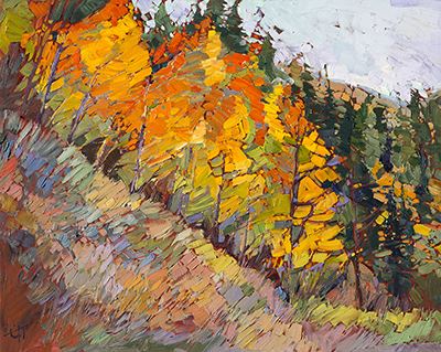
|
Behind the Art: Woods of GoldGolden Aspens at the Cedar Breaks National MonumentFriday, November 13, 2015Part of the 24 Karat Collection, Woods of Gold is a close up of the famous golden aspens of Cedar Breaks National Monument. Featuring a underlying layer of 24 karat gold leaf, it gleams with warmth to brighten any room. Read More → |
|
|
|
Behind the Art: Woods of Gold Golden Aspens at the Cedar Breaks National Monument Friday, November 13, 2015 Part of the 24 Karat Collection, Woods of Gold is a close up of the famous golden aspens of Cedar Breaks National Monument. Featuring a underlying layer of 24 karat gold leaf, it gleams with warmth to brighten any room. Read More → |
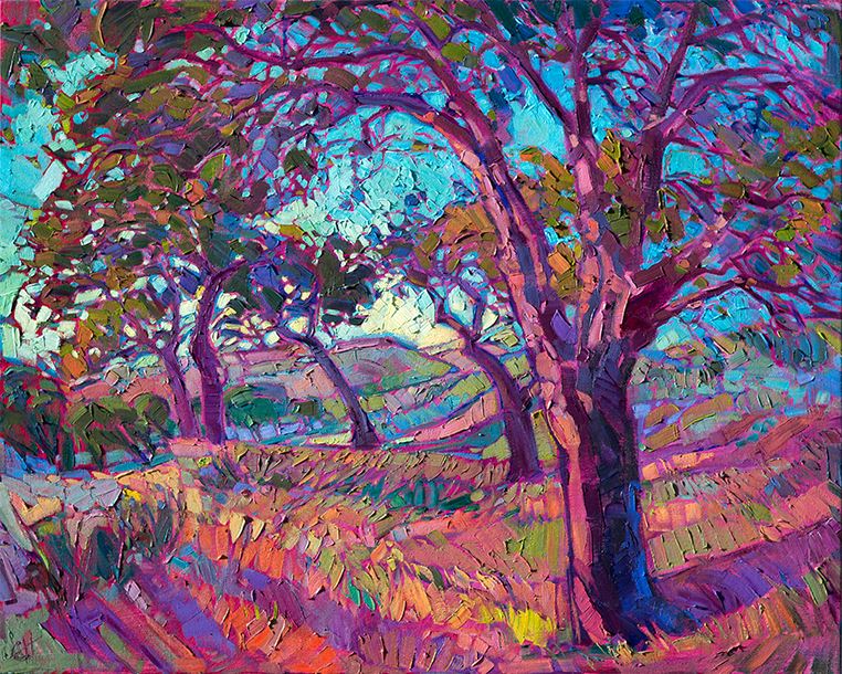
|
Behind the Art: Vineyard of ColorA Slice of Paso Robles Wine CountryMonday, November 2, 2015Paso Robles is shortened from the original name El Paso de Robles, which means 'The Pass of the Oaks.’ Paso Robles is wonderful place to visit - for the stunning landscapes and for a variety of activities. Read More → |
|
|
|
Behind the Art: Vineyard of Color A Slice of Paso Robles Wine Country Monday, November 2, 2015 Paso Robles is shortened from the original name El Paso de Robles, which means 'The Pass of the Oaks.’ Paso Robles is wonderful place to visit - for the stunning landscapes and for a variety of activities. Read More → |
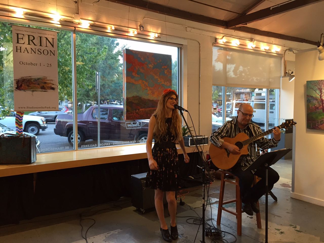
|
Erin Hanson Returns to Paso RoblesJoin Us on the Journey to Launch Hanson's Newest CollectionSaturday, October 3, 2015Erin Hanson's 2015 fall return to California's Paso Robles has been nothing short of spectacular! A series of events marked the commencement of her much anticipated California Wine Country: Impressions in Oil by Erin Hanson collection. Also find out whose paintings are now hanging in the new Ayres hotel resort The Allegretto in Paso Robles! Read More → |
|
|
|
Erin Hanson Returns to Paso Robles Join Us on the Journey to Launch Hanson's Newest Collection Saturday, October 3, 2015 Erin Hanson's 2015 fall return to California's Paso Robles has been nothing short of spectacular! A series of events marked the commencement of her much anticipated California Wine Country: Impressions in Oil by Erin Hanson collection. Also find out whose paintings are now hanging in the new Ayres hotel resort The Allegretto in Paso Robles! Read More → |

|
Artist Erin Hanson Expands to New Los Angeles Gallery!Renowned Impressionist’s New Collection to be Featured at Grand OpeningFriday, September 18, 2015Award-winning artist Erin Hanson unveils her new gallery with a special Grand Opening on Saturday, November 14th, 5pm - 10pm. In addition to meeting the artist, guests at the Grand Opening will enjoy live music, wine, hors d’oeuvres and Hanson’s latest California landscape collection. Read More → |
|
|
|
Artist Erin Hanson Expands to New Los Angeles Gallery! Renowned Impressionist’s New Collection to be Featured at Grand Opening Friday, September 18, 2015 Award-winning artist Erin Hanson unveils her new gallery with a special Grand Opening on Saturday, November 14th, 5pm - 10pm. In addition to meeting the artist, guests at the Grand Opening will enjoy live music, wine, hors d’oeuvres and Hanson’s latest California landscape collection. Read More → |

|
Insider Peek at The Erin Hanson Art and Wine Tour 2015Immerse Yourself in the Wonders of Paso Robles!Sunday, August 30, 2015Fifteen local Paso Robles wineries are participating in The Erin Hanson Art & Wine Tour 2015. Each winery will display original Erin Hanson oil paintings for the duration of the month. Read More → |
|
|
|
Insider Peek at The Erin Hanson Art and Wine Tour 2015 Immerse Yourself in the Wonders of Paso Robles! Sunday, August 30, 2015 Fifteen local Paso Robles wineries are participating in The Erin Hanson Art & Wine Tour 2015. Each winery will display original Erin Hanson oil paintings for the duration of the month. Read More → |
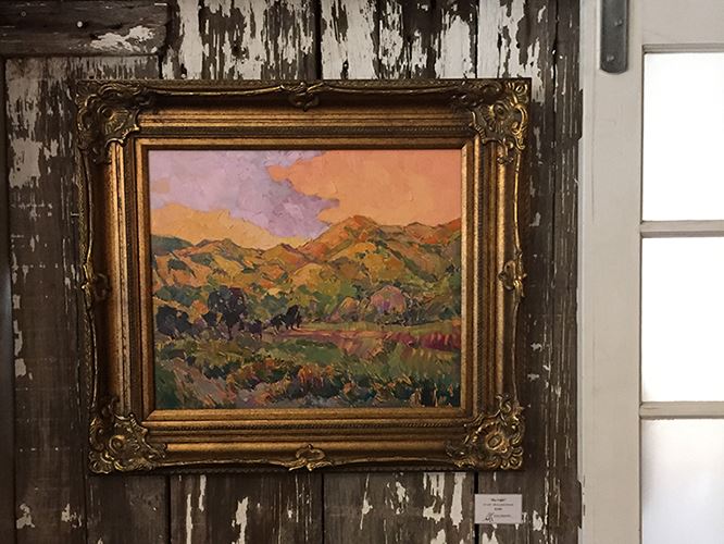
|
Impressionistic Artist Launches an Immersive Paso Art & Wine ExperienceSeptember 1st – October 25th, 2015Wednesday, June 24, 2015Art and wine are perfectly paired to inspire. We invite you to explore the landscapes of California wine country and to experience the paintings they inspired. Read More → |
|
|
|
Impressionistic Artist Launches an Immersive Paso Art & Wine Experience September 1st – October 25th, 2015 Wednesday, June 24, 2015 Art and wine are perfectly paired to inspire. We invite you to explore the landscapes of California wine country and to experience the paintings they inspired. Read More → |
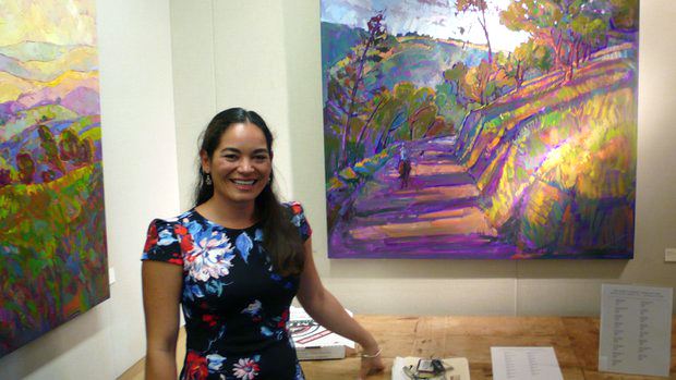
|
Let's Review: Artist Erin Hanson's Work Charms at La Jolla LibrarySaturday, December 13, 2014Artist Erin Hanson welcomes guests at the Nov. 16 opening of her ‘Colors of California’ exhibit at La Jolla Library. Hanson said she paints with an Open Impressionism style using ‘vivid colors, bold brush strokes and a fresh, modern style to capture the beautiful wine countries and coastal regions of California.’ — Will Bowen, La Jolla Light Read More → |
|
|
|
Let's Review: Artist Erin Hanson's Work Charms at La Jolla Library Saturday, December 13, 2014 Artist Erin Hanson welcomes guests at the Nov. 16 opening of her ‘Colors of California’ exhibit at La Jolla Library. Hanson said she paints with an Open Impressionism style using ‘vivid colors, bold brush strokes and a fresh, modern style to capture the beautiful wine countries and coastal regions of California.’ — Will Bowen, La Jolla Light Read More → |
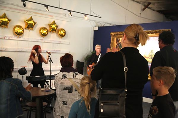
|
Hanson Releases New Line of 24 Karat Paintings at Open House EventSunday, November 23, 2014On November 21st, The Erin Hanson Gallery in Glendale, CA presented a never-before-seen collection of Erin Hanson oil paintings. These original oils were painted over canvas that the artist had applied with 24 karat gold leaf. Magnificently colored and and as texture-rich as one would expect from an Erin Hanson original, these paintings had an additional glow that caught the light in a subtle and intriguing manner. The paintings' baroque gold frames stood out against the midnight blue walls, and a large collection of miniature gold-framed oil paintings complemented the larger pieces. Guests enjoyed the performance of singer songwriter Marina V, while sampling a variety of reserve wines from Paso Robles' Peachy Canyon winery and nibbling on a delectable variety of cheeses. Read More → |
|
|
|
Hanson Releases New Line of 24 Karat Paintings at Open House Event Sunday, November 23, 2014 On November 21st, The Erin Hanson Gallery in Glendale, CA presented a never-before-seen collection of Erin Hanson oil paintings. These original oils were painted over canvas that the artist had applied with 24 karat gold leaf. Magnificently colored and and as texture-rich as one would expect from an Erin Hanson original, these paintings had an additional glow that caught the light in a subtle and intriguing manner. The paintings' baroque gold frames stood out against the midnight blue walls, and a large collection of miniature gold-framed oil paintings complemented the larger pieces. Guests enjoyed the performance of singer songwriter Marina V, while sampling a variety of reserve wines from Paso Robles' Peachy Canyon winery and nibbling on a delectable variety of cheeses. Read More → |
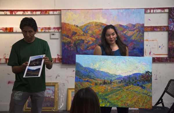
|
Delphi Academy's Art Class Visits the Erin Hanson GallerySaturday, November 15, 2014Art students from Delphi Academy of Los Angeles, Erin Hanson's alma mater, were invited to The Erin Hanson Gallery for a cultural and educational afternoon. A group of middle and high school art students explored the behind-the-scenes life of a successful artist and got to speak with Erin Hanson about her inspiration, technique and business model. Cesar Jimenez was proud to see Hanson's expanding gallery; Jimenez was Hanson's art teacher at Delphi Academy, teaching her everything from pen and ink to oils, and everything in between. Hanson studied under Jimenez from age 6 to 16, at which age she graduated from high school, in 1998. Jimenez is still teaching art at Delphi Academy to this day. As an alumnus of Delphi, Hanson was honored to have an opportunity to help inspire the coming generation of artists. Read More → |
|
|
|
Delphi Academy's Art Class Visits the Erin Hanson Gallery Saturday, November 15, 2014 Art students from Delphi Academy of Los Angeles, Erin Hanson's alma mater, were invited to The Erin Hanson Gallery for a cultural and educational afternoon. A group of middle and high school art students explored the behind-the-scenes life of a successful artist and got to speak with Erin Hanson about her inspiration, technique and business model. Cesar Jimenez was proud to see Hanson's expanding gallery; Jimenez was Hanson's art teacher at Delphi Academy, teaching her everything from pen and ink to oils, and everything in between. Hanson studied under Jimenez from age 6 to 16, at which age she graduated from high school, in 1998. Jimenez is still teaching art at Delphi Academy to this day. As an alumnus of Delphi, Hanson was honored to have an opportunity to help inspire the coming generation of artists. Read More → |
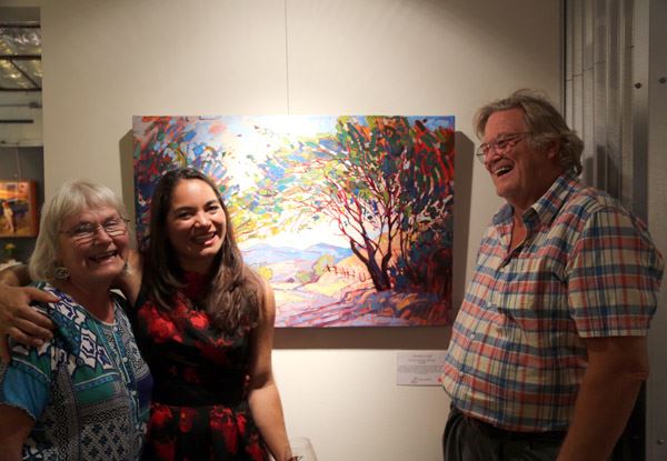
|
Erin Hanson’s Third Annual Return to Studios on the Park is an All-Out SmashFriday, October 31, 2014Collectors and fans came from near and far on Saturday, October 4th to experience "Erin Hanson: Works of Paso Robles." The evening marked Hanson's third annual exhibition at Studios and the reveal of her anticipated 30-piece collection. Read More → |
|
|
|
Erin Hanson’s Third Annual Return to Studios on the Park is an All-Out Smash Friday, October 31, 2014 Collectors and fans came from near and far on Saturday, October 4th to experience "Erin Hanson: Works of Paso Robles." The evening marked Hanson's third annual exhibition at Studios and the reveal of her anticipated 30-piece collection. Read More → |

|
California Wine Country Coffee Table Book Has Fully Funded through KickstarterBook Will Focus on Hanson's California ImpressionismWednesday, October 29, 2014We are proud to announce that the museum quality Extraordinary Landscapes: California Wine Country coffee table book has now been fully funded through crowd-funding site Kickstarter. Read More → |
|
|
|
California Wine Country Coffee Table Book Has Fully Funded through Kickstarter Book Will Focus on Hanson's California Impressionism Wednesday, October 29, 2014 We are proud to announce that the museum quality Extraordinary Landscapes: California Wine Country coffee table book has now been fully funded through crowd-funding site Kickstarter. Read More → |
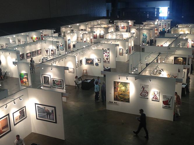
|
Erin Hanson Featured at World Wide Art LA as Winner of 12th Annual ContestSunday, October 19, 2014As the 1st place winner of Artavita’s annual art contest, the works of Erin Hanson were showcased not only at the 4-day show but were selected for use in their promotional billboards found across Northern Los Angeles. Read More → |
|
|
|
Erin Hanson Featured at World Wide Art LA as Winner of 12th Annual Contest Sunday, October 19, 2014 As the 1st place winner of Artavita’s annual art contest, the works of Erin Hanson were showcased not only at the 4-day show but were selected for use in their promotional billboards found across Northern Los Angeles. Read More → |
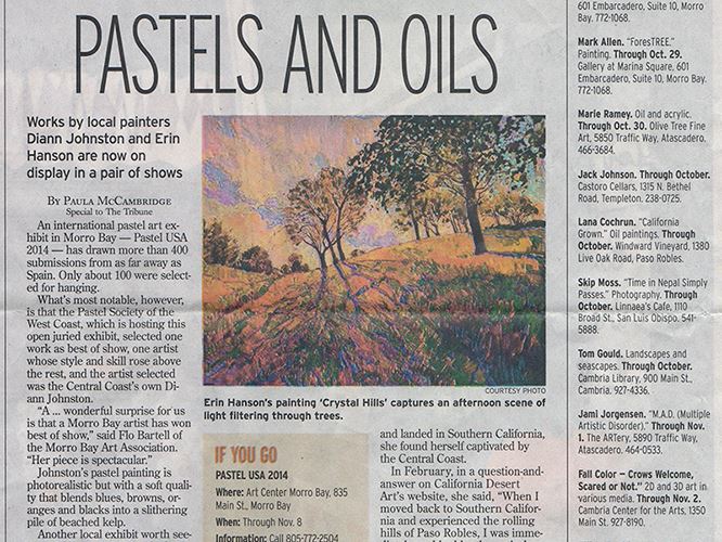
|
"Pastels and Oils" Article in The SLO Tribune"Her landscapes have chunky textures filled with unexpected colors - lavender trees and pumpkin fields."Saturday, October 18, 2014"Her landscapes have chunky textures filled with unexpected colors - lavender trees and pumpkin fields." Read More → |
|
|
|
"Pastels and Oils" Article in The SLO Tribune "Her landscapes have chunky textures filled with unexpected colors - lavender trees and pumpkin fields." Saturday, October 18, 2014 "Her landscapes have chunky textures filled with unexpected colors - lavender trees and pumpkin fields." Read More → |
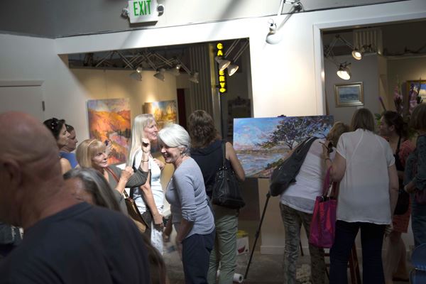
|
Erin Hanson Fans Gather for Intimate Live Painting DemonstrationThursday, October 9, 2014"Her enthusiasm and confidence was as much an inspiration as her artistic ability and unique technique.” Read More → |
|
|
|
Erin Hanson Fans Gather for Intimate Live Painting Demonstration Thursday, October 9, 2014 "Her enthusiasm and confidence was as much an inspiration as her artistic ability and unique technique.” Read More → |
|
Erin Hanson Selected for Sausalito Art Festival | 2014Tuesday, August 19, 2014Erin Hanson has been selected to exhibit at the 62nd Annual Sausalito Art Festival Labor Day Weekend, August 30-September 1. The juried art show is one of the oldest, most prestigious art festivals in the country attracting over 30,000 art enthusiasts who flock to the waterfront village of Sausalito. Read More → |
|
|
|
Erin Hanson Selected for Sausalito Art Festival | 2014 Tuesday, August 19, 2014 Erin Hanson has been selected to exhibit at the 62nd Annual Sausalito Art Festival Labor Day Weekend, August 30-September 1. The juried art show is one of the oldest, most prestigious art festivals in the country attracting over 30,000 art enthusiasts who flock to the waterfront village of Sausalito. Read More → |
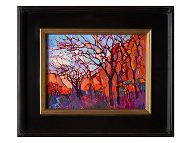
|
How Should I Frame My Original Oil Painting?Framing Ideas for Gallery-Depth PaintingsMonday, June 16, 2014Whether or not you decide to frame your gallery-wrap oil painting, it will be a beautiful and eye-catching addition to your room, bringing in a breath of color that is a joy to design around. Read on to find framing ideas for your original artwork. Read More → |
|
|
|
How Should I Frame My Original Oil Painting? Framing Ideas for Gallery-Depth Paintings Monday, June 16, 2014 Whether or not you decide to frame your gallery-wrap oil painting, it will be a beautiful and eye-catching addition to your room, bringing in a breath of color that is a joy to design around. Read on to find framing ideas for your original artwork. Read More → |
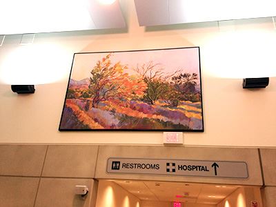
|
Artworks Donated to UCLA Medical Center TustinBringing Joy to the South BayWednesday, May 28, 2014The work of Erin Hanson can now be viewed at the UCLA Medical Center in Tustin, California. Erin is incredibly proud to bring life and color to those that may desperately need to have a reminder of what this magnificent world holds and for the doctors, nurses and staff that work tirelessly for their fellow man. Read More → |
|
|
|
Artworks Donated to UCLA Medical Center Tustin Bringing Joy to the South Bay Wednesday, May 28, 2014 The work of Erin Hanson can now be viewed at the UCLA Medical Center in Tustin, California. Erin is incredibly proud to bring life and color to those that may desperately need to have a reminder of what this magnificent world holds and for the doctors, nurses and staff that work tirelessly for their fellow man. Read More → |

|
Through the Red Rock DoorwayA Q&A with Erin HansonMonday, February 24, 2014"People do laugh to hear that I was a bioengineering major in college. To me science and art were never very separate in my mind. Science is just the art of observation, and the technique of art is certainly a science." Read More → |
|
|
|
Through the Red Rock Doorway A Q&A with Erin Hanson Monday, February 24, 2014 "People do laugh to hear that I was a bioengineering major in college. To me science and art were never very separate in my mind. Science is just the art of observation, and the technique of art is certainly a science." Read More → |
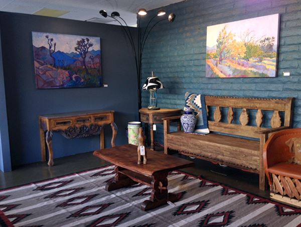
|
ArtWalk Borrego Springs Exhibits Erin HansonNewspaper Feature of Erin Hanson ExhibitTuesday, February 11, 2014“The desert got me back into painting in the first place when I was living as a rock climber in Las Vegas. To me the desert is the perfect landscape to paint since it is so dramatic, with it’s flat plains and sudden buttes and mountains popping out into the sky. I love the wide open skies. I love monsoon season. I love the wind and the sounds of the emptiness of the desert.” Read More → |
|
|
|
ArtWalk Borrego Springs Exhibits Erin Hanson Newspaper Feature of Erin Hanson Exhibit Tuesday, February 11, 2014 “The desert got me back into painting in the first place when I was living as a rock climber in Las Vegas. To me the desert is the perfect landscape to paint since it is so dramatic, with it’s flat plains and sudden buttes and mountains popping out into the sky. I love the wide open skies. I love monsoon season. I love the wind and the sounds of the emptiness of the desert.” Read More → |
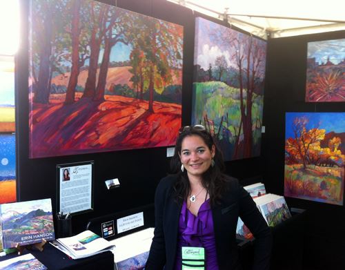
|
Seven Years of Art FestivalsSharing My Experiences with New and Aspiring ArtistsSaturday, February 1, 2014Art festivals are the perfect way to take your art career into your own hands, gradually building your collector base until you can support yourself entirely on your fine art sales. Read More → |
|
|
|
Seven Years of Art Festivals Sharing My Experiences with New and Aspiring Artists Saturday, February 1, 2014 Art festivals are the perfect way to take your art career into your own hands, gradually building your collector base until you can support yourself entirely on your fine art sales. Read More → |
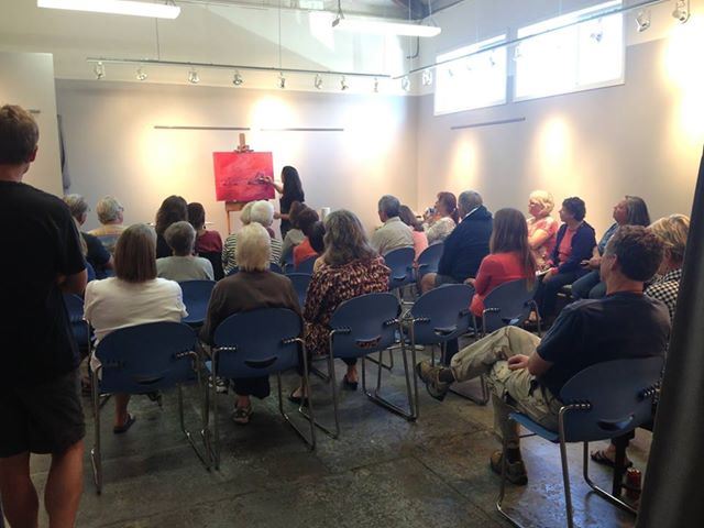
|
Erin Hanson: PasoScapes Demo of Open-ImpressionismReview of a Rare Painting DemonstrationSunday, October 27, 2013"Hanson’s paintings are bold, often times large in scale like the grandeur of her inspirations. Her loose “open” strokes and pure colors represent her singular vision to the beauty of the landscapes that surround her. When asked about her inspiration she says, 'whenever I find myself in a slump, I take a hike.'" Read More → |
|
|
|
Erin Hanson: PasoScapes Demo of Open-Impressionism Review of a Rare Painting Demonstration Sunday, October 27, 2013 "Hanson’s paintings are bold, often times large in scale like the grandeur of her inspirations. Her loose “open” strokes and pure colors represent her singular vision to the beauty of the landscapes that surround her. When asked about her inspiration she says, 'whenever I find myself in a slump, I take a hike.'" Read More → |

|
Artist Adventure Series, No. 5Erin Shares a Few Harrowing AdventuresSunday, October 20, 2013During a lifetime of exploring the outdoors, I've found that the most exciting times are also the most dangerous. The sudden pump of adrenaline you get when you have to act quickly to remain alive makes you feel great, like you are fighting for survival and winning! Read More → |
|
|
|
Artist Adventure Series, No. 5 Erin Shares a Few Harrowing Adventures Sunday, October 20, 2013 During a lifetime of exploring the outdoors, I've found that the most exciting times are also the most dangerous. The sudden pump of adrenaline you get when you have to act quickly to remain alive makes you feel great, like you are fighting for survival and winning! Read More → |
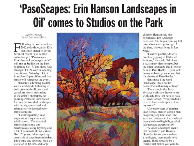
|
"PasoScapes: Erin Hanson Landscapes in Oil" comes to Studios on the ParkPaso Robles Press Spotlights Artist Erin HansonSunday, September 29, 2013"The classical impressionists use tiny brushstrokes, using layers and a lot of paint to build texture. I don't use any layering, but I do use a ton of texture, and large brushstrokes." Read More → |
|
|
|
"PasoScapes: Erin Hanson Landscapes in Oil" comes to Studios on the Park Paso Robles Press Spotlights Artist Erin Hanson Sunday, September 29, 2013 "The classical impressionists use tiny brushstrokes, using layers and a lot of paint to build texture. I don't use any layering, but I do use a ton of texture, and large brushstrokes." Read More → |
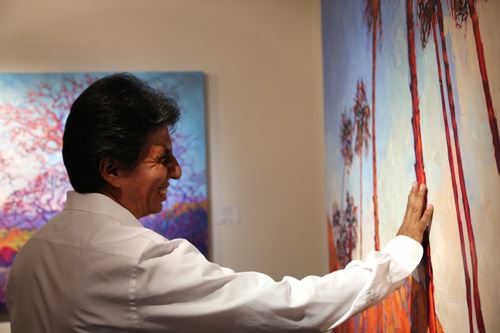
|
The Erin Hanson Gallery - Grand Opening in Los Angeles, CAThe Erin Hanson Gallery Opening Was a Roaring Success!Saturday, July 13, 2013The 2,000 square foot gallery was packed and the mood was electric, with flowing wine, delectable food donated by Granville Cafe and live musicians rocking out. Read More → |
|
|
|
The Erin Hanson Gallery - Grand Opening in Los Angeles, CA The Erin Hanson Gallery Opening Was a Roaring Success! Saturday, July 13, 2013 The 2,000 square foot gallery was packed and the mood was electric, with flowing wine, delectable food donated by Granville Cafe and live musicians rocking out. Read More → |
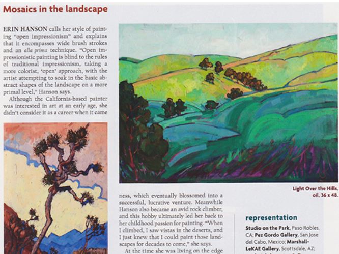
|
Southwest Art Magazine Names Erin a 2013 "Artist to Watch"Erin Hanson: Mosaics in the LandscapeTuesday, May 7, 2013"Erin Hanson calls her style of painting 'open impressionism' and explains that it encompasses wide brush strokes and an alla prima technique. 'Open impressionistic painting is blind to the rules of traditional impressionism, taking a more colorist, 'open' approach, with the artist attempting to soak in the basic abstract shapes of the landscape on a more primal level,' Hanson says. Read More → |
|
|
|
Southwest Art Magazine Names Erin a 2013 "Artist to Watch" Erin Hanson: Mosaics in the Landscape Tuesday, May 7, 2013 "Erin Hanson calls her style of painting 'open impressionism' and explains that it encompasses wide brush strokes and an alla prima technique. 'Open impressionistic painting is blind to the rules of traditional impressionism, taking a more colorist, 'open' approach, with the artist attempting to soak in the basic abstract shapes of the landscape on a more primal level,' Hanson says. Read More → |

|
How to Commission a PaintingSteps to Take When Commissioning a Custom Oil PaintingThursday, May 2, 2013Do you love an artist's work but need a special painting for a certain wall in your home? Here is a how-to that you can follow for connecting with the artist and commissioning the perfect piece. Read More → |
|
|
|
How to Commission a Painting Steps to Take When Commissioning a Custom Oil Painting Thursday, May 2, 2013 Do you love an artist's work but need a special painting for a certain wall in your home? Here is a how-to that you can follow for connecting with the artist and commissioning the perfect piece. Read More → |
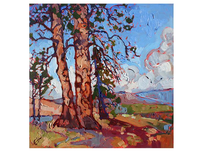
|
New Oil Paintings on BoardErin Hanson Presents a Series of Small Oil PaintingsFriday, January 11, 2013Erin Hanson presents a new series of small oil paintings on board. Inspired by treks across Utah, Nevada and California, Erin transforms desert landscapes into a mosaic of color impressions. Read More → |
|
|
|
New Oil Paintings on Board Erin Hanson Presents a Series of Small Oil Paintings Friday, January 11, 2013 Erin Hanson presents a new series of small oil paintings on board. Inspired by treks across Utah, Nevada and California, Erin transforms desert landscapes into a mosaic of color impressions. Read More → |
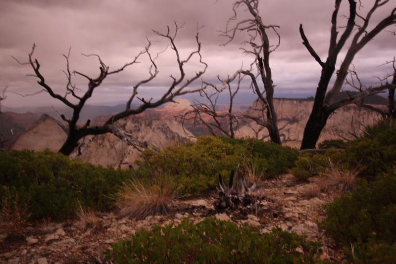
|
Artist Adventure Series, No. 45 Day Trans-Zion Backpacking TrekThursday, November 15, 2012My daily journal during a five-day trek through Zion National Park. This journey included visiting Watchman, Angel's Landing, Kolob Canyon, Wildcat Canyon, The Grotto, and Zion lodge. Read More → |
|
|
|
Artist Adventure Series, No. 4 5 Day Trans-Zion Backpacking Trek Thursday, November 15, 2012 My daily journal during a five-day trek through Zion National Park. This journey included visiting Watchman, Angel's Landing, Kolob Canyon, Wildcat Canyon, The Grotto, and Zion lodge. Read More → |
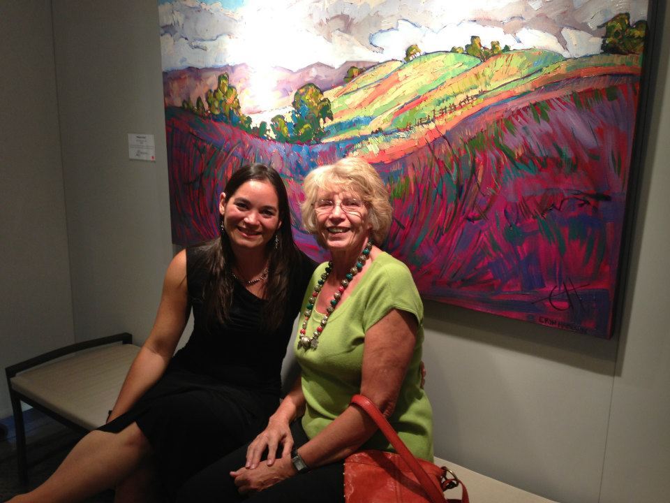
|
Erin Hanson: Colors of PasoExhibition | Paso Robles, CaliforniaSaturday, November 3, 2012Studios on the Park, in downtown Paso Robles, put on a greatly successful solo show titled Erin Hanson: Colors of Paso. Read More → |
|
|
|
Erin Hanson: Colors of Paso Exhibition | Paso Robles, California Saturday, November 3, 2012 Studios on the Park, in downtown Paso Robles, put on a greatly successful solo show titled Erin Hanson: Colors of Paso. Read More → |
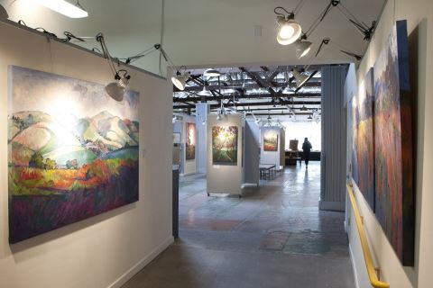
|
"Open Impressions" Exciting Life of Artist Exposed | Erin Hanson in the Newsby Anna Weltner, New TimesWednesday, October 17, 2012You don’t just look at her oil paintings, you experience them, feeling the crisp chill of a North County morning or the arid heat of a late-summer afternoon. Her work reverberates with life and love and energy; in its deliriously bright wildflowers and abstract sunsets, we glimpse a consummate love of the natural world. For a moment, we see what Hanson sees. Read More → |
|
|
|
"Open Impressions" Exciting Life of Artist Exposed | Erin Hanson in the News by Anna Weltner, New Times Wednesday, October 17, 2012 You don’t just look at her oil paintings, you experience them, feeling the crisp chill of a North County morning or the arid heat of a late-summer afternoon. Her work reverberates with life and love and energy; in its deliriously bright wildflowers and abstract sunsets, we glimpse a consummate love of the natural world. For a moment, we see what Hanson sees. Read More → |
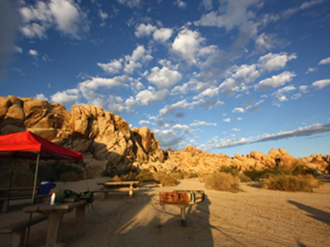
|
Artist Adventure Series, No. 3How My Love of Nature Inspires My ArtMonday, October 15, 2012As the summer heat is slowly shaking itself away, I am shaking myself back into my hiking and rock climbing routine. In August, I went camping and rock scrambling in Joshua Tree National Park, at Indian Cove campground. Read More → |
|
|
|
Artist Adventure Series, No. 3 How My Love of Nature Inspires My Art Monday, October 15, 2012 As the summer heat is slowly shaking itself away, I am shaking myself back into my hiking and rock climbing routine. In August, I went camping and rock scrambling in Joshua Tree National Park, at Indian Cove campground. Read More → |
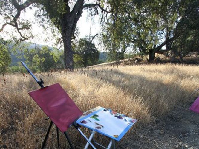
|
Erin Hanson Painting Plein AirPlein Air Painting in the Paso Robles Wine CountryTuesday, October 9, 2012It's always nice to take some time from my busy schedule and observe the landscape around me, concentrating on mixing a new array of beautiful colors from my limited palette and painting en plein air. Read More → |
|
|
|
Erin Hanson Painting Plein Air Plein Air Painting in the Paso Robles Wine Country Tuesday, October 9, 2012 It's always nice to take some time from my busy schedule and observe the landscape around me, concentrating on mixing a new array of beautiful colors from my limited palette and painting en plein air. Read More → |
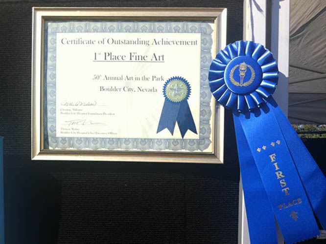
|
1st Place at Art in the ParkBoulder City, NevadaSunday, October 7, 2012Erin Hanson won First Place in Fine Art, at Boulder City's Art in the Park! Read More → |
|
|
|
1st Place at Art in the Park Boulder City, Nevada Sunday, October 7, 2012 Erin Hanson won First Place in Fine Art, at Boulder City's Art in the Park! Read More → |
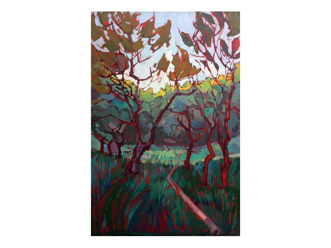
|
What is the Best Lighting for My Painting?Learn lighting ideas from a professional painter.Wednesday, August 29, 2012Natural ambient light will create a nice feel for your painting during the day, the colors subtly changing as the sun rises and sets during the day. At night, however, you will be fully reliant on artificial light. Read More → |
|
|
|
What is the Best Lighting for My Painting? Learn lighting ideas from a professional painter. Wednesday, August 29, 2012 Natural ambient light will create a nice feel for your painting during the day, the colors subtly changing as the sun rises and sets during the day. At night, however, you will be fully reliant on artificial light. Read More → |
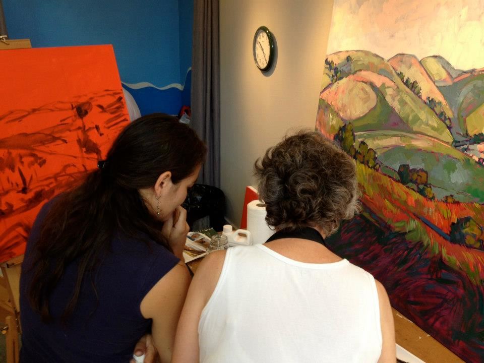
|
Open Impressionism Workshop with Erin HansonStudios on the Park, Paso RoblesMonday, August 27, 2012This one-day workshop includes an in-studio session at Studios on the Park and a plein air session at the beautiful Peachy Canyon vineyards. Read More → |
|
|
|
Open Impressionism Workshop with Erin Hanson Studios on the Park, Paso Robles Monday, August 27, 2012 This one-day workshop includes an in-studio session at Studios on the Park and a plein air session at the beautiful Peachy Canyon vineyards. Read More → |
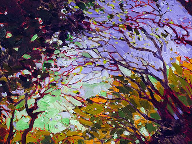
|
What is Open Impressionism?The Inspiration Behind Open ImpressionismWednesday, August 22, 2012Fewer strokes is better in Open-Impressionism. Color choice is secondary. Texture and spontaneity are everything. Read on to find out more about this art movement. Read More → |
|
|
|
What is Open Impressionism? The Inspiration Behind Open Impressionism Wednesday, August 22, 2012 Fewer strokes is better in Open-Impressionism. Color choice is secondary. Texture and spontaneity are everything. Read on to find out more about this art movement. Read More → |
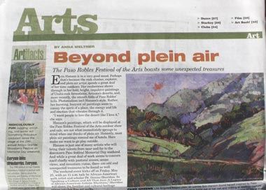
|
Beyond Plein Air | Erin Hanson in the NewsNew Times, Paso Robles, CAWednesday, May 23, 2012"Erin Hanson is in a very good mood. Perhaps that’s because the rock climber, explorer, and plein air artist spends a great deal of her time outdoors. Her exuberance shows through in her bold, bright, impulsive paintings of Utah’s rock formations, Arizona’s deserts, and more recently, the smooth folds of Paso Robles’ hills." Read More → |
|
|
|
Beyond Plein Air | Erin Hanson in the News New Times, Paso Robles, CA Wednesday, May 23, 2012 "Erin Hanson is in a very good mood. Perhaps that’s because the rock climber, explorer, and plein air artist spends a great deal of her time outdoors. Her exuberance shows through in her bold, bright, impulsive paintings of Utah’s rock formations, Arizona’s deserts, and more recently, the smooth folds of Paso Robles’ hills." Read More → |
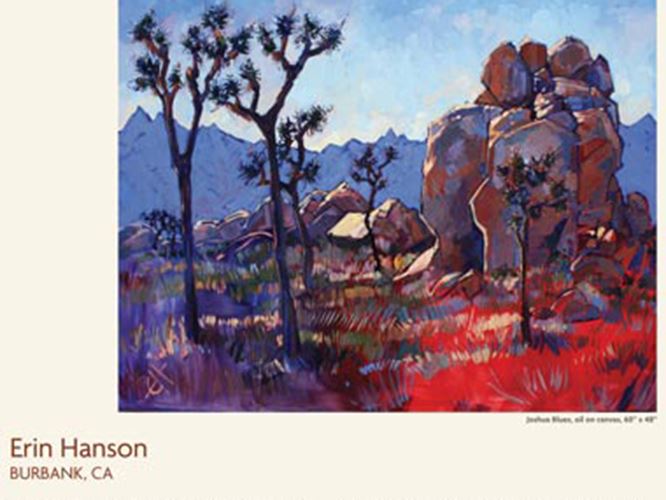
|
Southwest Art Magazine ArticleNationwide, USAWednesday, August 31, 2011"Erin Hanson expresses her love of the desert with a thick, bold application of paint that mirrors the stark lines and shapes unique to the Southwest. An accomplished plein air painter, Erin applies elements of plein air technique to her expressionist style." Read More → |
|
|
|
Southwest Art Magazine Article Nationwide, USA Wednesday, August 31, 2011 "Erin Hanson expresses her love of the desert with a thick, bold application of paint that mirrors the stark lines and shapes unique to the Southwest. An accomplished plein air painter, Erin applies elements of plein air technique to her expressionist style." Read More → |
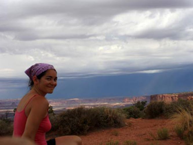
|
Artist Adventure Series, No. 2Adventures that Inspire Erin Hanson's PaintingsSaturday, April 30, 2011It was a dark morning in Ghost Ranch, New Mexico, home and inspiration to Georgia O'Keefe. I awoke at daybreak, ready to search out the perfect scene to paint. The hike was short, only a mile or so, but it climbed straight up to the top of a butte. Storm clouds chased me through the hike, inspiring some truly amazing photos. Read More → |
|
|
|
Artist Adventure Series, No. 2 Adventures that Inspire Erin Hanson's Paintings Saturday, April 30, 2011 It was a dark morning in Ghost Ranch, New Mexico, home and inspiration to Georgia O'Keefe. I awoke at daybreak, ready to search out the perfect scene to paint. The hike was short, only a mile or so, but it climbed straight up to the top of a butte. Storm clouds chased me through the hike, inspiring some truly amazing photos. Read More → |
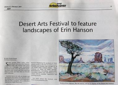
|
Desert Enternainer ArticlePalm Springs, CaliforniaMonday, January 31, 2011"Some people climb rocks; some paint them. Fine artist Erin Hanson does both. She started with giant murals as a teenager and eventually moved on to the rocks. She started climbing them with friends and then painting them in Utah and then later in Nevada and California." Read More → |
|
|
|
Desert Enternainer Article Palm Springs, California Monday, January 31, 2011 "Some people climb rocks; some paint them. Fine artist Erin Hanson does both. She started with giant murals as a teenager and eventually moved on to the rocks. She started climbing them with friends and then painting them in Utah and then later in Nevada and California." Read More → |
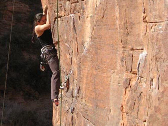
|
Artist Adventure Series, No. 1Erin Hanson's Passion for Adventure Shapes Her ArtThursday, December 31, 2009Climbing in Red Rock Canyon is an addictive sport. The steep overhanging cliffs become a monstrous feat that one must, at all odds, overcome. Day after day, hour after hour, you battle the rock holds, sometimes spending a week just to master one tricky maneuver. Read More → |
|
|
|
Artist Adventure Series, No. 1 Erin Hanson's Passion for Adventure Shapes Her Art Thursday, December 31, 2009 Climbing in Red Rock Canyon is an addictive sport. The steep overhanging cliffs become a monstrous feat that one must, at all odds, overcome. Day after day, hour after hour, you battle the rock holds, sometimes spending a week just to master one tricky maneuver. Read More → |