Subtotal
$0
U.S. Shipping
FREE
Saved for Later
Shop Art
Original Paintings
Textured Replicas
Canvas Prints
16x20 Paper Prints
Gift Shop
Portfolio
Browse All
Available Paintings
List of Subjects
Petite Paintings
Large Paintings
Customer Favorites
Contact Us
View Portfolio
Available Originals
Textured Replicas
Canvas Prints
16x20 Paper Prints
Gift Shop
Learn More >
About The Artist
Erin Hanson Biography
About Open Impressionism
Watch Videos
Press Pickups
Blog
Visit
The Erin Hanson Gallery
Exhibition Schedule
Museum Shows
Visit Erin's Studio
For Collectors
Available Paintings
What Are Textured Replicas?
Collector Testimonials
How to Commission Artwork
Notify Me of New Works
For Artists
Open Impressionism Workshop
Artist Mentorship Program
Follow in Erin's Footsteps
Artist Q & A
Erin's Blog
Questions?
Shopping Cart
Subtotal
$0
U.S. Shipping
FREE
Promo codes and taxes are added at checkout.
Saved for Later
What Art is Best for Color Blind People?
Color blind men and women deserve to see and enjoy art, but this can be tricky because of how they see and experience color. I have seen that paintings with lots of high-contrast color provide the most interest and enjoyment to people with colorblindness since they say they can "see the color."
There are seven different forms of colorblindness. In six of those forms, color shows up differently than normal color vision, and in one of those forms, the individual cannot see color at all.
In this article, we will briefly overview the types of colorblindness and provide art recommendations for all seven of these vision differences.
Types of Colorblindness
As mentioned above, there are seven different types of colorblindness, each affecting the way a colorblind person sees the world and enjoys art.
Some of the most commonly discussed color-blind conditions are on the red/green spectrum. This is usually addressed because it causes difficulty with traffic signals. Four different types of vision anomalies affect the red/green spectrum. These are:
1. Protanopia - this is also called red-blind, and it’s when the individual can’t see any shades of red.
2. Protanomaly - this is also called red-weak, and it’s where the individual can only see some red shades.
3. Deuteranopia - also called green-blind, and it’s where the individual can’t see any shades of green.
4. Deuteranomaly - also called green-weak, and it’s where the individual can see some green shades.
Less common colorblindness is on the blue spectrum. This includes:
5. Tritanopia - also called blue-blind, and it’s where the individual cannot see any shades of blue.
6. Tritanomaly - also called blue-weak, and it’s where the individual can usually see some blue shades.
Finally, there is the least common type of color blindness, monochromacy or achromatopsia. In this type of color blindness, the individual sees no color at all.
Statistically, men are more likely to be colorblind than women because this inherited trait comes through the X chromosome. Since women have two X chromosomes, the trait would have to be replicated on both chromosomes for it to be inherited by a woman. Men have one X chromosome, so if they inherit an affected X chromosome, that’s the only one they have.
Can a Colorblind Man or Woman Still Enjoy Art?
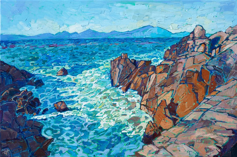
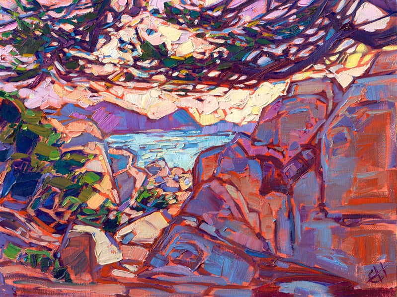
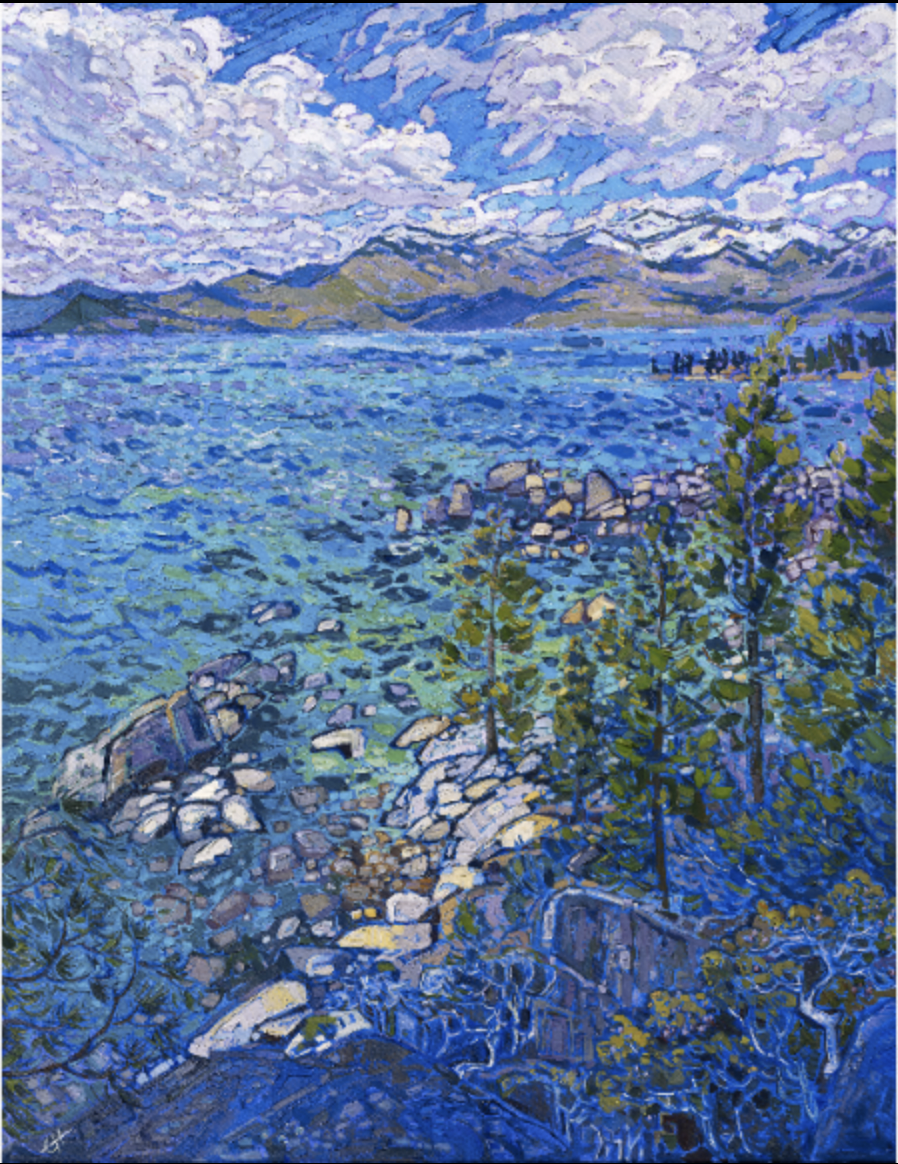
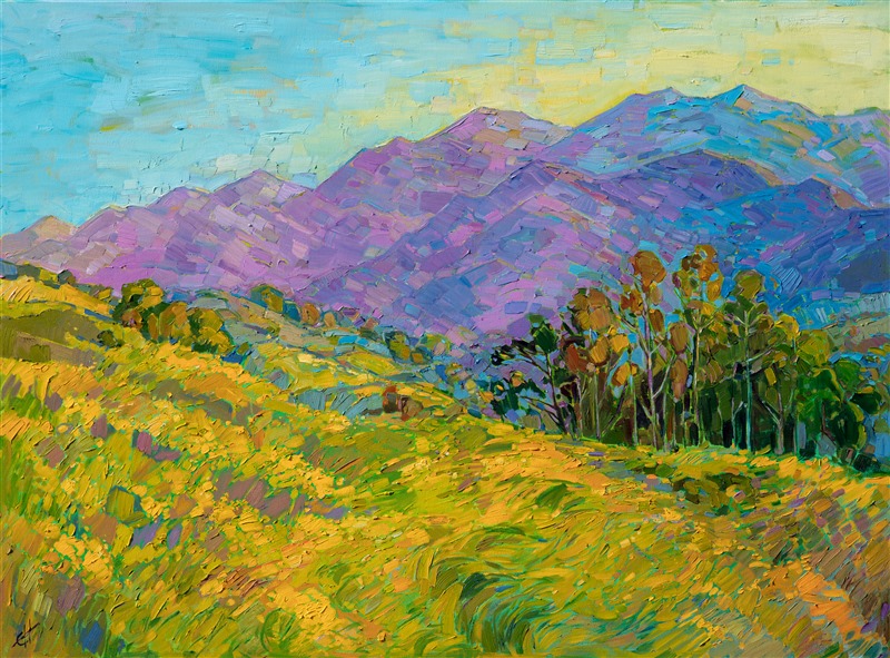
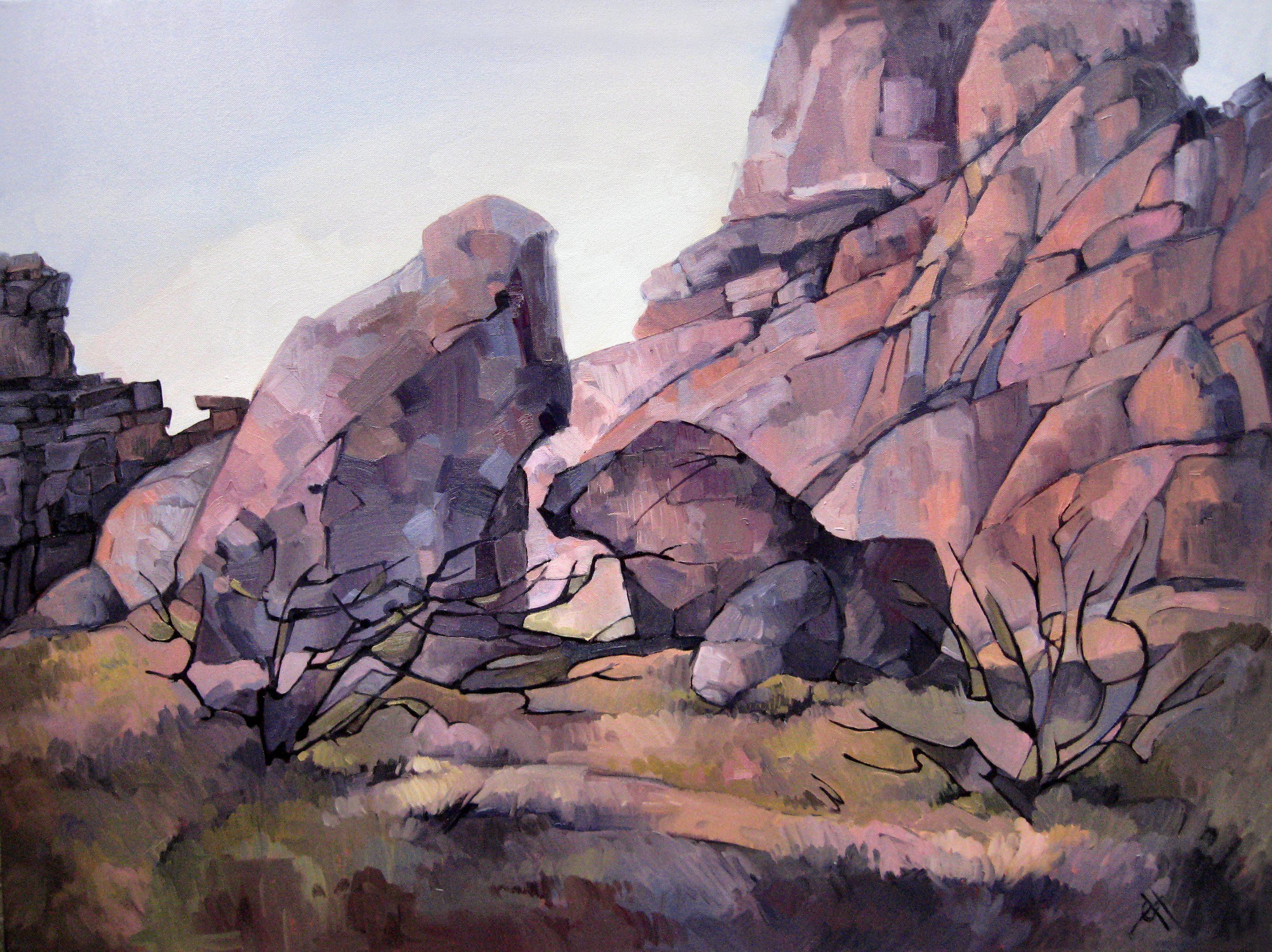
Of course, a colorblind person could limit themselves to art within their visible color spectrum. For example, someone with a red deficiency would still enjoy Monet’s Water Lilies or Erin Hanson’s Alpine Tahoe.
Alpine Tahoe by Erin Hanson
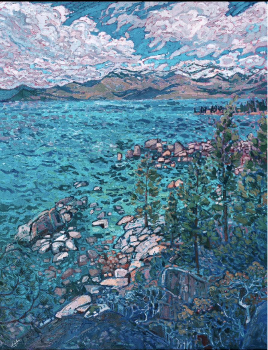
How do colorblind people see artwork?
This is how someone with red-weak/Protanomaly would see the painting above:
This is how someone with blue-weak/Tritanomaly would see this painting:
This is how someone with Blue Cone Monochromy would see this painting:
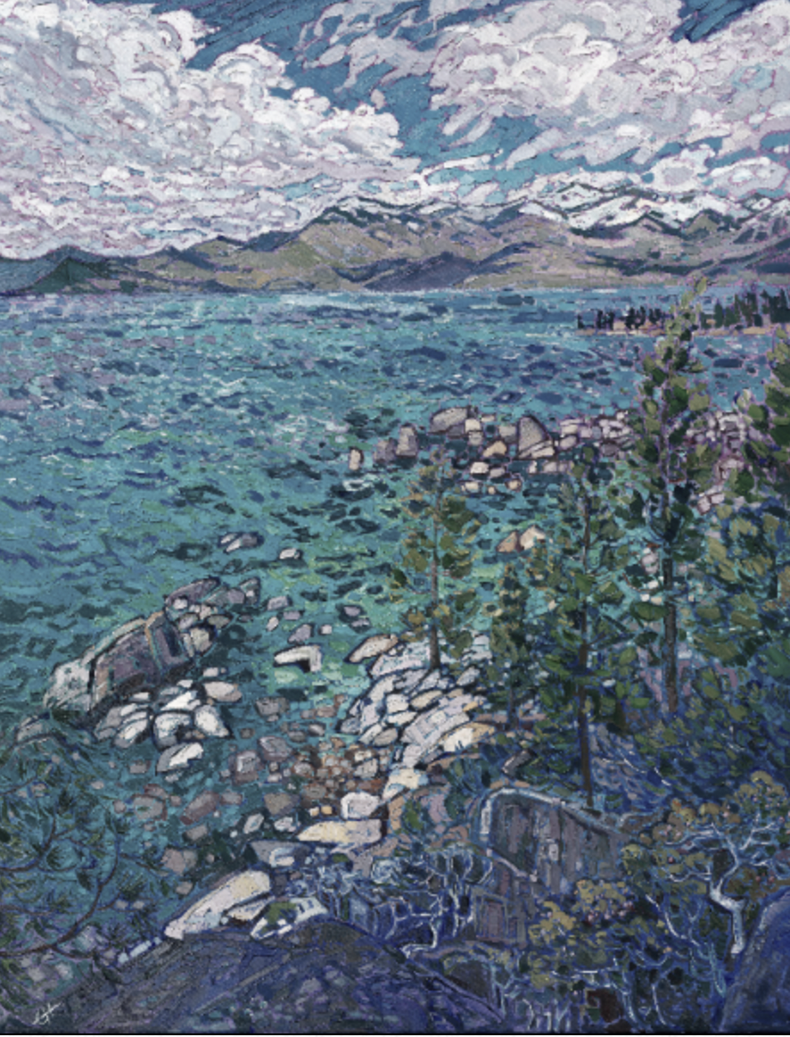
You can see how, as long as the painting has a lot of value contrast, the colorblind viewer can still make out the shapes and enjoy the color changes of the painting.
How do colorblind people see colorful paintings?
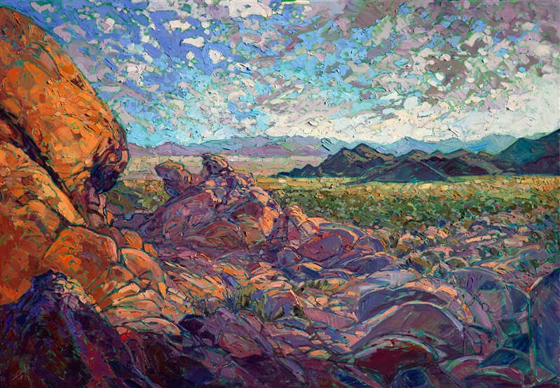
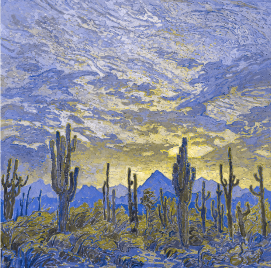
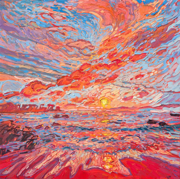
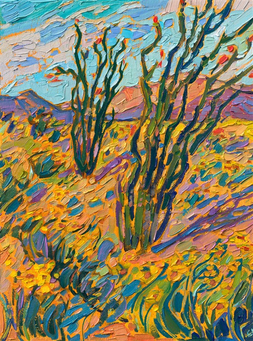
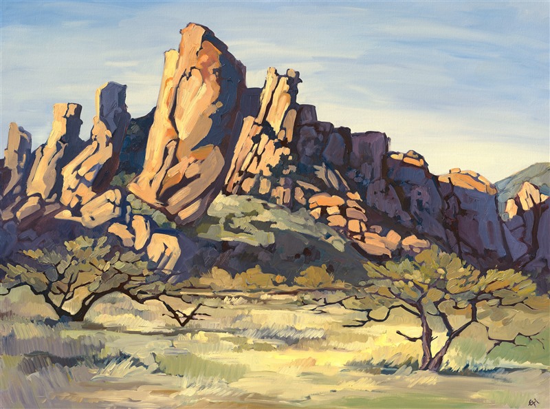
Let's take an example of a more colorful painting, like Saguaro Sky, by Erin Hanson.
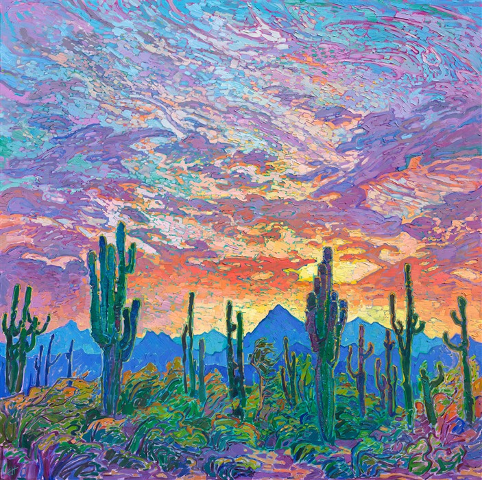
Saguaro Sky by Erin Hanson
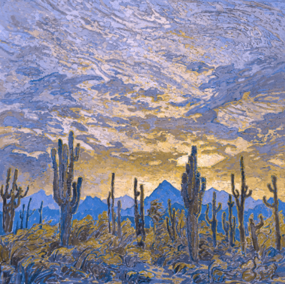
This is how someone with red-blind/Protanopia would see the painting above:
This is how someone with green-blind/Deuteranopia would see this painting:
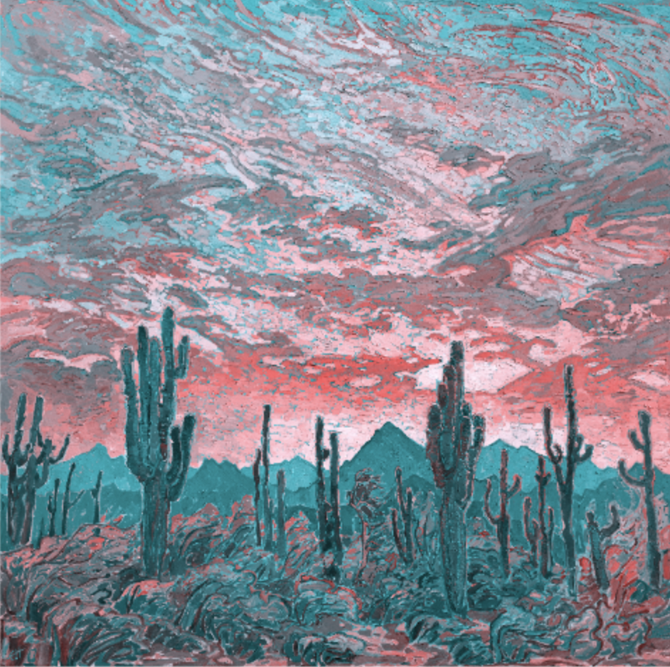
This is how someone with blue-blind/Tritanopia would see this painting:
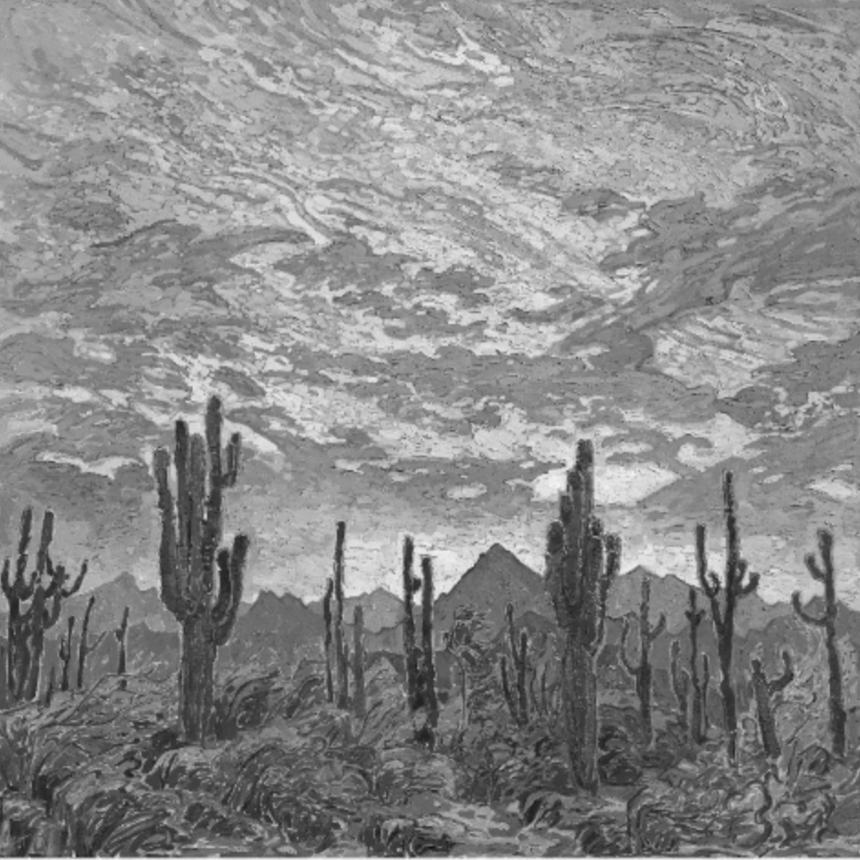
For the most dramatic difference, this is how someone with monochromacy/Achromatopsia would see this colorful oil painting:
How to Find the Best Art for Colorblindness
1st. Use an app.
There are many apps out there that simulate colorblindness so that others can relate to colorblind people. (I used the Coblis color blindness simulator at color-blindness.com to generate the images above.) These apps can be used to the advantage of those who have the most common types of colorblindness (any of the first six listed above).
While it may seem counterintuitive for someone who is colorblind to use an app that simulates colorblindness, this method can work very well in showing a colorblind person how the art looks within a spectrum they can see. So, if you want to view art and you have, for example, a red/green deficiency, you can set the app to view the art from the perspective of someone with a blue deficiency, or someone with just a red deficiency or just a green deficiency. By filtering the art from various perspectives, you can see new aspects of the piece, even if you cannot see the entire color spectrum.
There are also apps that will label colors for the colorblind. This is useful if you are studying art or want to understand another’s perspective as you move through the everyday world.
2nd. Use colorblind glasses.
Colorblind glasses are a less accessible but welcome innovation. While expensive, these glasses allow most people with red, green, or blue colorblindness or red/green confusion to view a more colorful world. However, it is worth reading the reviews and asking questions about these glasses. Those who have full colorblindness in specific rods may not benefit from colorblind glasses, so it’s essential to thoroughly research the type of glasses before buying them.
3rd. Seek out art in a spectrum you can see.
There are ways to enjoy incredible art; one such way is to seek out art created within your visible spectrum. Those with monochromacy may want to seek out artists who deliberately utilize black and white to significant and beautiful effect. Artists like Ansel Adams create stunning masterpieces that are well within the monochromacy color spectrum.
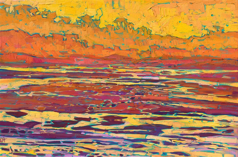
When it comes to colorful art, we have Erin Hanson’s work. Her paintings are often described as bursting with color, but all are created with a limited palette of only a few pure pigments, which she has mixes to produce many vibrant colors.
Because she has a deep understanding of color, her website designer sorted her work by color and made it searchable for anyone hoping to find a particular color scheme. This feature is also helpful for colorblind men and women who wish to find art within their visible spectrum.
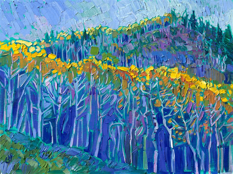
Anyone can search, for example, for predominantly green art if they have a red deficiency, and they will find works like Emerald Oasis and Fjords of Norway.
Here are a few pieces listed in colors commonly visible to colorblind folks:
Red
Color Reflections by Erin Hanson
High Tide by Erin Hanson
Hop Valley Wash by Erin Hanson
Four Corners by Erin Hanson
Green
January Reflections by Erin Hanson
On the Vine by Erin Hanson
Ojai Poppies by Erin Hanson
Coastal Summer by Erin Hanson
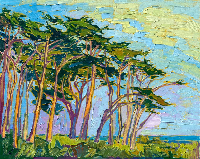
Cypress Grove by Erin Hanson
Blue
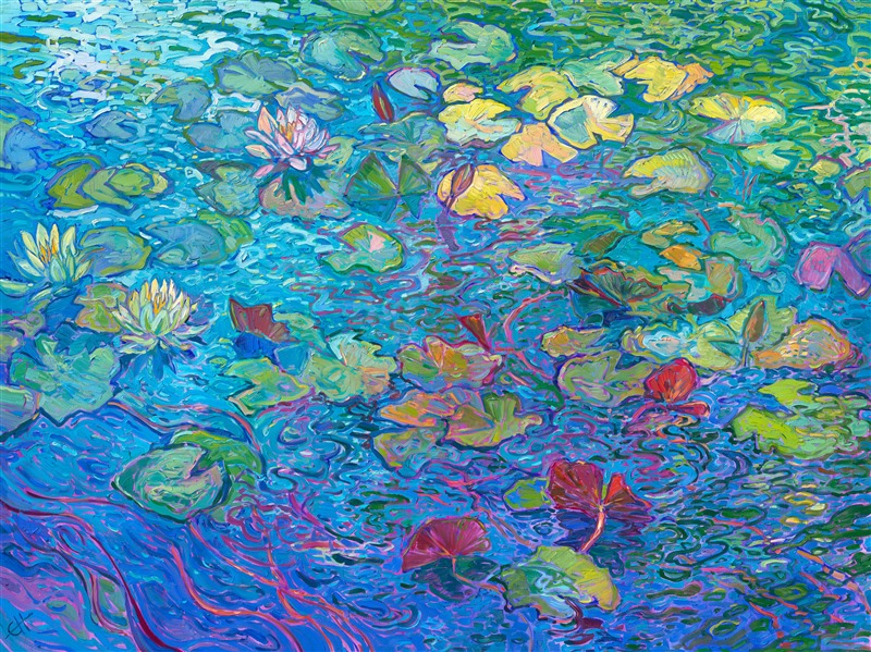
Water Lilies in Bloom by Erin Hanson
Coastal in Blue by Erin Hanson
Fjords of Norway by Erin Hanson
Aspen Dawn by Erin Hanson
Yellow
High Desert Blooms by Erin Hanson
Aspen Boulders by Erin Hanson
Mustard Blooms by Erin Hanson
Saffron Dawn by Erin Hanson
Joshua Trees by Erin Hanson
Oranges
Coastal in Orange by Erin Hanson
Aspen Hues by Erin Hanson
Autumn Dreams by Erin Hanson
Blooming Petals by Erin Hanson
Neutrals
Lone Pine Dusk by Erin Hanson
Golden Hills by Erin Hanson
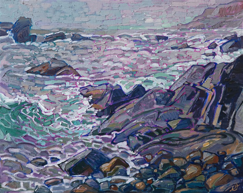
Rocky Waters by Erin Hanson
Last Light at Joshua by Erin Hanson
Death Valley by Erin Hanson
Sunset Oaks by Erin Hanson
Utah Shadows by Erin Hanson
Purple Scrub, by Erin Hanson 2007
Explore more Erin Hanson artwork here and scroll down to browse by color.
References:
https://www.aao.org/eye-health/ask-ophthalmologist-q/why-is-colorblindness-more-common-in-men
https://www.allaboutvision.com/conditions/color-blindness/types-of-color-blindness
https://medlineplus.gov/genetics/condition/color-vision-deficiency/
https://colorblindpal.com/
https://medium.com/learning-how-to-see/exploring-the-secrets-of-a-color-blind-artists-work-cccf6a2f8aa4
https://www.erinhanson.com/portfolio?col=greens
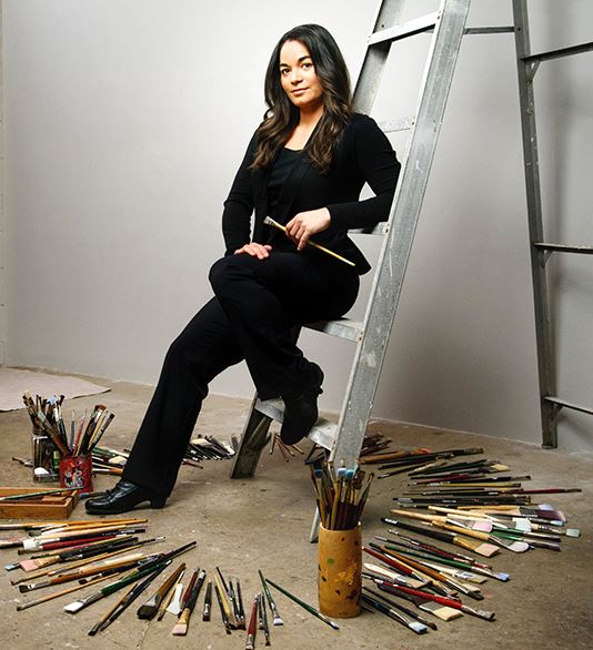
Discover the artist at the forefront of modern impressionism.
About Erin
ERIN HANSON has been painting in oils since she was 8 years old. As a teenager, she apprenticed at a mural studio where she worked on 40-foot-long paintings while selling art commissions on the side. After being told it was too hard to make a living as an artist, she got her degree in Bioengineering from UC Berkeley. Afterward, Erin became a rock climber at Red Rock Canyon, Nevada. Inspired by the colorful scenery she was climbing, she decided to return to her love of painting and create one new painting every week.
She has stuck to that decision, becoming one of the most prolific artists in history, with over 3,000 oil paintings sold to eager collectors. Erin Hanson’s style is known as "Open Impressionism" and is taught in art schools worldwide. With millions of followers, Hanson has become an iconic, driving force in the rebirth of impressionism, inspiring thousands of other artists to pick up the brush.