Subtotal
$0
U.S. Shipping
FREE
'/%3E%3Cpath class='cls-1' d='M312.91,391.44V462h20.18V428c0-16.15,9.78-20.9,16.59-20.9a15.47,15.47,0,0,1,8.63,2.55L362,391a22.84,22.84,0,0,0-9-1.63c-10.37,0-16.89,4.59-21.19,13.93V391.44H312.91' transform='translate(-88.52 -293.05)'/%3E%3Cpath class='cls-1' d='M455.52,389.37c-10.67,0-18.65,6.3-22.8,12.38-3.85-7.85-12-12.38-21.8-12.38-10.66,0-18.05,5.92-21.46,12.74V391.44H370V462H390.2V425.67c0-13,6.83-19.29,13.2-19.29,5.77,0,11.07,3.73,11.07,13.36V462h20.16V425.67c0-13.19,6.66-19.29,13.33-19.29,5.34,0,11,3.88,11,13.22V462h20.16V413.22c0-15.85-10.67-23.85-23.56-23.85' transform='translate(-88.52 -293.05)'/%3E%3Cpath class='cls-1' d='M263.8,391.44H245.52v-7.17c0-9.34,5.33-12,9.92-12a20.18,20.18,0,0,1,9,2.25l6.22-14.23s-6.31-4.12-17.78-4.12c-12.89,0-27.56,7.27-27.56,30.08v5.19H194.77v-7.17c0-9.34,5.32-12,9.92-12a19.12,19.12,0,0,1,9,2.25l6.22-14.23c-3.71-2.17-9.68-4.12-17.77-4.12-12.89,0-27.56,7.27-27.56,30.08v5.19H162.9V407h11.71v55h20.16V407h30.59v55h20.16V407H263.8V391.44' transform='translate(-88.52 -293.05)'/%3E%3Crect class='cls-2' x='187.32' y='98.39' width='20.14' height='70.53'/%3E%3Cpath class='cls-1' d='M276.58,379.45h19.73c11.51-36.19,50.56-68,97-68,56.48,0,105.29,43,105.29,109.94A137.58,137.58,0,0,1,493,462h19.15l.19-.66a162.2,162.2,0,0,0,4.74-39.89c0-74.65-54.4-128.38-123.73-128.38-54.46,0-103,37.8-116.76,86.4Z' transform='translate(-88.52 -293.05)'/%3E%3C/svg%3E)


Saved for Later
Shopping Cart
Subtotal
$0
U.S. Shipping
FREE
Saved for Later
Many would-be oil painters have avoided painting in oils because they believe oil paints are toxic. I am going to share with you how to paint in oils without toxicity.
Are Oil Paints Toxic?
One common misconception is that oil paints are toxic. This is incorrect as long as they are used correctly. Oil paints' beautiful colors come from metallic chemicals such as cadmium, lead, and cobalt. However, as long as you do not inhale or eat the paint, the metallic elements will not enter your body. The molecules of oil paint are too large to be absorbed directly through your skin.
So, how are oil paints toxic?
The toxicity is caused by using turpentine or Turpenoid (odorless turpentine). Many oil painters use turpentine and mineral spirits to thin their paint and clean their brushes. Turpentine is highly volatile (even if you can’t smell it, like with Turpenoid) and affects the digestive and nervous systems.
How I Paint in Oils Without Toxicity
I am going to tell you how I paint with oils without using any volatile substances. First, to thin my oil paints and clean my brush in between paint colors, I use linseed oil. By dipping my brush into a small container of linseed oil and wiping it clean with a paper towel, I can get my brush almost as clean as when it was brand new. Linseed oil can also be used to create washes (thin, transparent layers of paint).
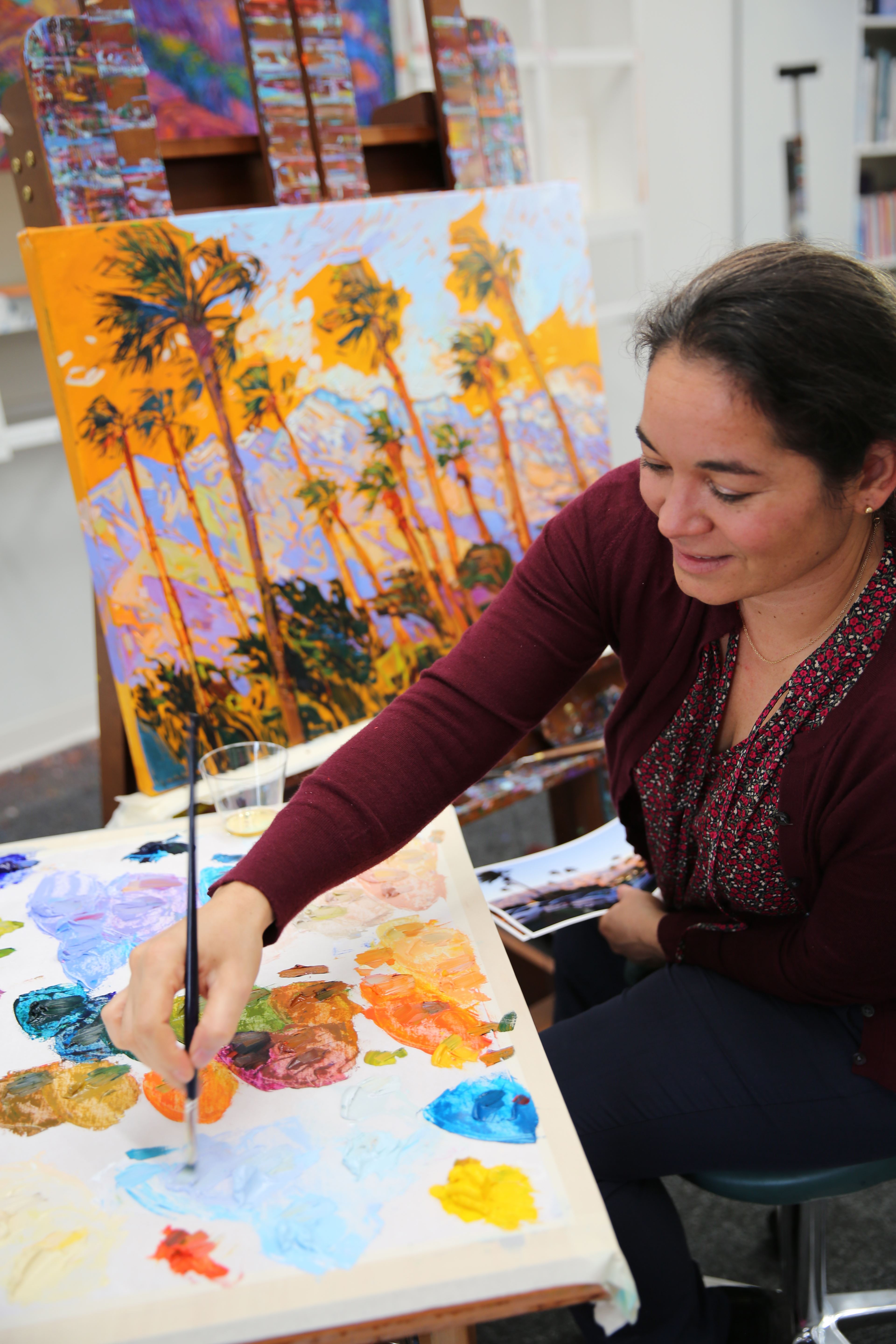
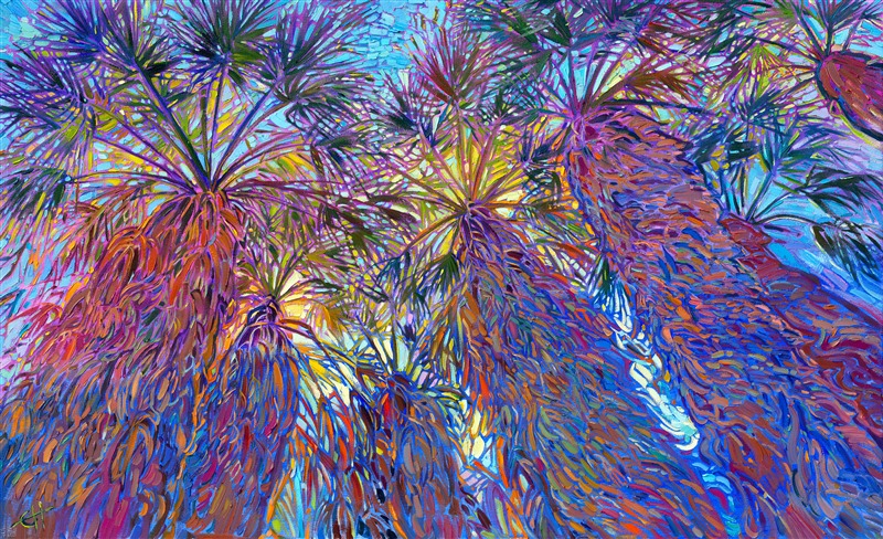
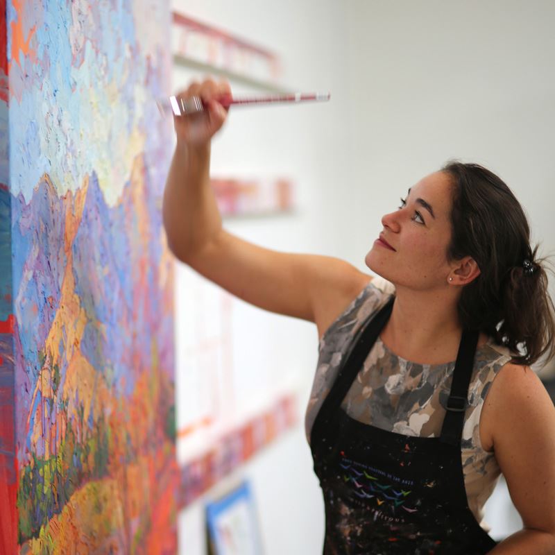
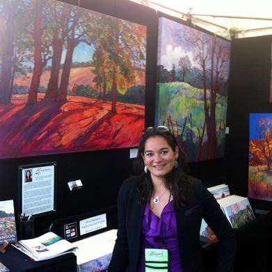
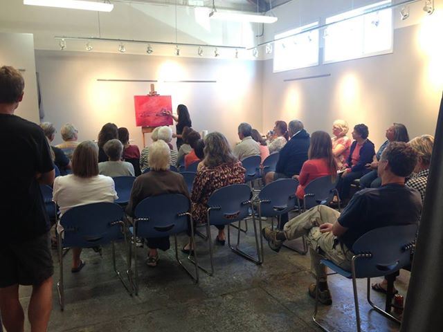
Erin Hanson providing a painting demonstration as she paints "Palm Mountains."
My favorite brand of linseed oil is Rublev Colours’ Pale Drying Oil. I also use Winsor & Newton’s Drying Linseed Oil. If you want your painting to take longer to dry, I recommend Gamblin’s Safflower Oil.
When I am done painting for the day, I wrap my brushes tightly in a paper towel and place them in the freezer, along with my entire paint palette. My brushes last for weeks without cleaning by storing them in the freezer at night.
When I do clean my brushes, I never use turpentine. Instead, I use The Masters Brush Cleaner. This large block of soap comes in a 24 oz classroom tub, and it will last for a year or longer. The same brand also makes a fantastic hand soap that gets every bit of oil paint off your hands without using toxic chemicals. (And if you get oil paint on your clothes, even if it dries, you can get it off with Kiss-Off Stain Remover sticks.)
As an oil painter, the only time I must use toxic chemicals is when I varnish my paintings. Damar varnish is made from tree resin, but it contains volatile hydrocarbons.
My paintings are varnished in a heavily ventilated room next to my painting studio; however, you can varnish at home by taking your painting out of doors or in the garage with all the doors wide open.
To sum up, you don’t have to expose yourself to toxic chemicals when you paint in oils. Avoid turpentine and use linseed oil instead as your painting medium. Clean your brushes with natural soap or store your brushes in the freezer. Use Masters Soap to wash your hands. I hope this opens the door to exploring oil painting as a medium, and I wish you happy painting!
Discover the artist at the forefront of modern impressionism.
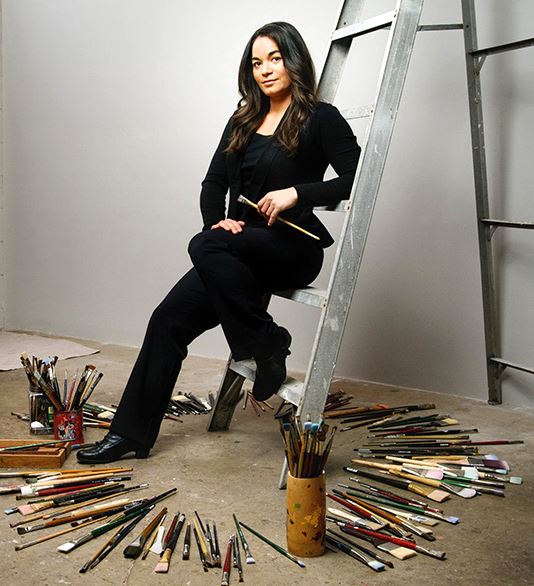
About Erin
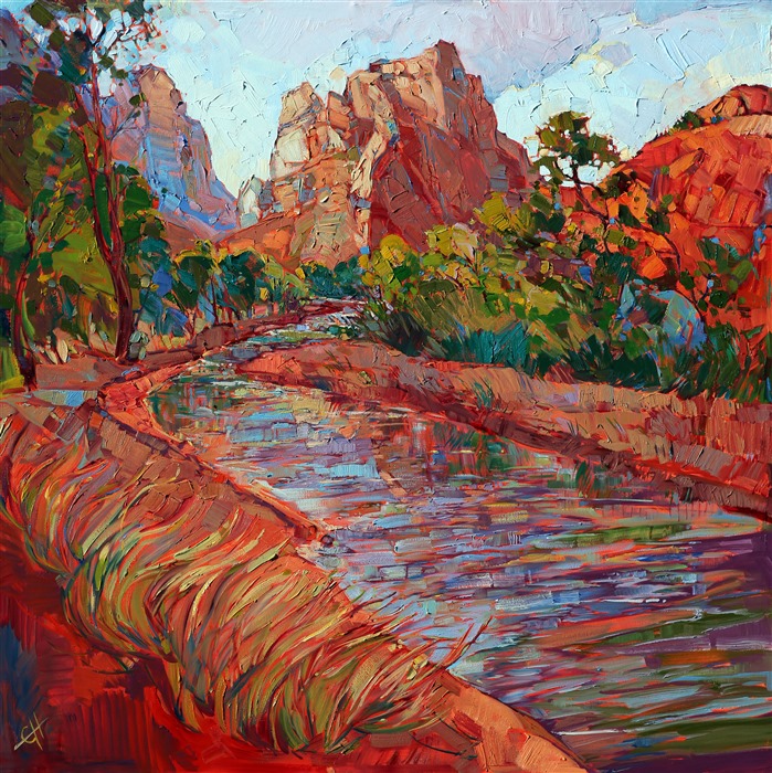
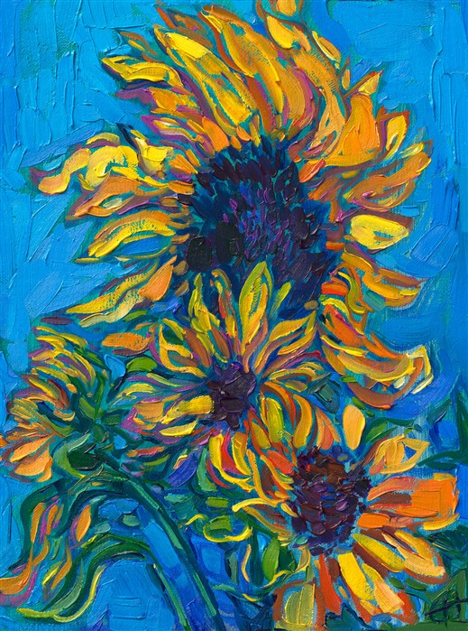
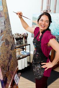
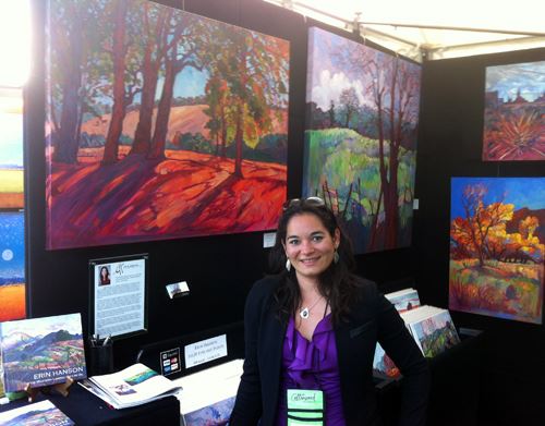
ERIN HANSON has been painting in oils since she was 8 years old. As a teenager, she apprenticed at a mural studio where she worked on 40-foot-long paintings while selling art commissions on the side. After being told it was too hard to make a living as an artist, she got her degree in Bioengineering from UC Berkeley. Afterward, Erin became a rock climber at Red Rock Canyon, Nevada. Inspired by the colorful scenery she was climbing, she decided to return to her love of painting and create one new painting every week.
She has stuck to that decision, becoming one of the most prolific artists in history, with over 3,000 oil paintings sold to eager collectors. Erin Hanson’s style is known as "Open Impressionism" and is taught in art schools worldwide. With millions of followers, Hanson has become an iconic, driving force in the rebirth of impressionism, inspiring thousands of other artists to pick up the brush.

|
How to Photograph LandscapesLearn how I take reference photos for my paintingsWednesday, May 1, 2024After returning from a photo safari in Southern Utah, Erin Hanson explains how she used her camera to capture light and shadow for the reference photos she uses for her landscape paintings. Read More → |
|
|
|
How to Photograph Landscapes Learn how I take reference photos for my paintings Wednesday, May 1, 2024 After returning from a photo safari in Southern Utah, Erin Hanson explains how she used her camera to capture light and shadow for the reference photos she uses for her landscape paintings. Read More → |
|
How I Make My Art Career Work by Erin Hansonin Association with Artists and Illustrators MagazineSaturday, September 2, 2023Erin Hanson shares her journey from bioengineering to a full-time oil painter. She also shares three tips for becoming a full-time artist. Read More → |
|
|
|
How I Make My Art Career Work by Erin Hanson in Association with Artists and Illustrators Magazine Saturday, September 2, 2023 Erin Hanson shares her journey from bioengineering to a full-time oil painter. She also shares three tips for becoming a full-time artist. Read More → |
|
How to Mix Vibrant ColorArtists around the world asked Erin how she mixes such vibrant colorsFriday, September 1, 2023Artists around the world consistently ask Erin Hanson how she gets such vibrant colors using a limited palette of only five pure pigments. This article provides insight into her technique. Read More → |
|
|
|
How to Mix Vibrant Color Artists around the world asked Erin how she mixes such vibrant colors Friday, September 1, 2023 Artists around the world consistently ask Erin Hanson how she gets such vibrant colors using a limited palette of only five pure pigments. This article provides insight into her technique. Read More → |
|
(For Artists) Commonly Asked Questions About Open ImpressionismA Look at Erin Hanson's Technique and Artist's ToolsTuesday, February 28, 2023Here are answers to commonly asked questions about Erin Hanson's painting style, Open Impressionism. Read More → |
|
|
|
(For Artists) Commonly Asked Questions About Open Impressionism A Look at Erin Hanson's Technique and Artist's Tools Tuesday, February 28, 2023 Here are answers to commonly asked questions about Erin Hanson's painting style, Open Impressionism. Read More → |
|
When to Stop PaintingA Note from Erin HansonFriday, January 14, 2022How do you know when a painting is done? How do you stop a painting from becoming overworked and muddy? Learn about how impressionist artist Erin Hanson knows when to stop painting. Read More → |
|
|
|
When to Stop Painting A Note from Erin Hanson Friday, January 14, 2022 How do you know when a painting is done? How do you stop a painting from becoming overworked and muddy? Learn about how impressionist artist Erin Hanson knows when to stop painting. Read More → |
|
What Color Wall Looks Best with My Painting?Thursday, January 14, 2021I want to share with you my experience with using colored accent walls to set off a piece of artwork. Most homes are painted in neutral off-white or pale beige like in the picture above. I want to show you what happens when you paint the wall behind the painting (or the whole room) in a different color, in order to make the room part of the artwork. Read More → |
|
|
|
What Color Wall Looks Best with My Painting? Thursday, January 14, 2021 I want to share with you my experience with using colored accent walls to set off a piece of artwork. Most homes are painted in neutral off-white or pale beige like in the picture above. I want to show you what happens when you paint the wall behind the painting (or the whole room) in a different color, in order to make the room part of the artwork. Read More → |
|
Learn How to Frame a PaintingFriday, September 27, 2019The sad reality is that much of our most interesting and beautiful artwork is stored within our homes, in boxes in the attic, garage or collecting dust on a shelf. Read More → |
|
|
|
Learn How to Frame a Painting Friday, September 27, 2019 The sad reality is that much of our most interesting and beautiful artwork is stored within our homes, in boxes in the attic, garage or collecting dust on a shelf. Read More → |

|
Artist ResourcesThursday, March 14, 2019I have put this collection of resources together as a way to inspire other artists to discover their own painting style and find their own niche in the art world. These resources will guide you on how to become a true master at your own style of painting, how to make a living as an artist, and see what the life of being an artist is really like. Read More → |
|
|
|
Artist Resources Thursday, March 14, 2019 I have put this collection of resources together as a way to inspire other artists to discover their own painting style and find their own niche in the art world. These resources will guide you on how to become a true master at your own style of painting, how to make a living as an artist, and see what the life of being an artist is really like. Read More → |
|
How Does Copyright Work for Artwork?Copyright helps an artist retain ownership for his/her work.Friday, December 14, 2018Copyright is essential protection for artists. The fact that a piece of art is unique makes it valuable, so safeguarding that one-of-a-kind piece is vital to any artist who wants to make a living. Read More → |
|
|
|
How Does Copyright Work for Artwork? Copyright helps an artist retain ownership for his/her work. Friday, December 14, 2018 Copyright is essential protection for artists. The fact that a piece of art is unique makes it valuable, so safeguarding that one-of-a-kind piece is vital to any artist who wants to make a living. Read More → |
|
What is Resale Royalty?Resale royalty right or “droit de suite”Saturday, March 24, 2018While resale royalty right is not universal in America, the state of California implemented the Resale Royalty Act (CRRA) in 1976. This states that a 5% royalty applies to artworks worth over $1,000 that are resold for a gain. Read More → |
|
|
|
What is Resale Royalty? Resale royalty right or “droit de suite” Saturday, March 24, 2018 While resale royalty right is not universal in America, the state of California implemented the Resale Royalty Act (CRRA) in 1976. This states that a 5% royalty applies to artworks worth over $1,000 that are resold for a gain. Read More → |
|
How to Clean My Original ArtworkFriday, November 24, 2017One common question we get asked at The Erin Hanson Gallery is “how do I clean my painting?” This is a vital piece of knowledge that every art collector should have in his or her repertoire. Whether you are a serious or casual collector, it’s important to know how to care for the pieces you cherish. Read More → |
|
|
|
How to Clean My Original Artwork Friday, November 24, 2017 One common question we get asked at The Erin Hanson Gallery is “how do I clean my painting?” This is a vital piece of knowledge that every art collector should have in his or her repertoire. Whether you are a serious or casual collector, it’s important to know how to care for the pieces you cherish. Read More → |

|
The History of The Erin Hanson GalleryWednesday, November 1, 2017I thought you would enjoy the story behind the creation of The Erin Hanson Gallery. About 8 years ago I was happily painting in my 3-car garage, located snugly in the Burbank hills with a great view overlooking Downtown Los Angeles.... Read More → |
|
|
|
The History of The Erin Hanson Gallery Wednesday, November 1, 2017 I thought you would enjoy the story behind the creation of The Erin Hanson Gallery. About 8 years ago I was happily painting in my 3-car garage, located snugly in the Burbank hills with a great view overlooking Downtown Los Angeles.... Read More → |
|
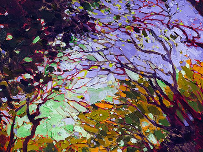
The Role of Impasto in ImpressionismWhy is impasto commonly used in Impressionist paintings?Monday, October 31, 2016Impressionist paintings are distinct because of how the artist applies paint to the canvas. Impasto is a style that many impressionist painters have used since the birth of the art form. Read More → |
|
|
|
The Role of Impasto in Impressionism Why is impasto commonly used in Impressionist paintings? Monday, October 31, 2016 Impressionist paintings are distinct because of how the artist applies paint to the canvas. Impasto is a style that many impressionist painters have used since the birth of the art form. Read More → |
|
How-To: Lighting Your Fine ArtMonday, August 15, 2016Many art collectors have preferences for different types of lighting in their homes. Some prefer ambient lamp light while others would rather have spotlight-like track lights. No matter your preference, it’s important to understand that light affects each painting differently. Read More → |
|
|
|
How-To: Lighting Your Fine Art Monday, August 15, 2016 Many art collectors have preferences for different types of lighting in their homes. Some prefer ambient lamp light while others would rather have spotlight-like track lights. No matter your preference, it’s important to understand that light affects each painting differently. Read More → |
|
Seven Years of Art FestivalsSharing My Experiences with New and Aspiring ArtistsSaturday, February 1, 2014Art festivals are the perfect way to take your art career into your own hands, gradually building your collector base until you can support yourself entirely on your fine art sales. Read More → |
|
|
|
Seven Years of Art Festivals Sharing My Experiences with New and Aspiring Artists Saturday, February 1, 2014 Art festivals are the perfect way to take your art career into your own hands, gradually building your collector base until you can support yourself entirely on your fine art sales. Read More → |
|
Erin Hanson: PasoScapes Demo of Open-ImpressionismReview of a Rare Painting DemonstrationSunday, October 27, 2013"Hanson’s paintings are bold, often times large in scale like the grandeur of her inspirations. Her loose “open” strokes and pure colors represent her singular vision to the beauty of the landscapes that surround her. When asked about her inspiration she says, 'whenever I find myself in a slump, I take a hike.'" Read More → |
|
|
|
Erin Hanson: PasoScapes Demo of Open-Impressionism Review of a Rare Painting Demonstration Sunday, October 27, 2013 "Hanson’s paintings are bold, often times large in scale like the grandeur of her inspirations. Her loose “open” strokes and pure colors represent her singular vision to the beauty of the landscapes that surround her. When asked about her inspiration she says, 'whenever I find myself in a slump, I take a hike.'" Read More → |
|
What is Open Impressionism?The Inspiration Behind Open ImpressionismWednesday, August 22, 2012Fewer strokes is better in Open-Impressionism. Color choice is secondary. Texture and spontaneity are everything. Read on to find out more about this art movement. Read More → |
|
|
|
What is Open Impressionism? The Inspiration Behind Open Impressionism Wednesday, August 22, 2012 Fewer strokes is better in Open-Impressionism. Color choice is secondary. Texture and spontaneity are everything. Read on to find out more about this art movement. Read More → |