Subtotal
$0
U.S. Shipping
FREE
Saved for Later
Shopping Cart
Subtotal
$0
U.S. Shipping
FREE
Saved for Later
Open Impressionism
THE BIRTH OF A MOVEMENT
Erin Hanson created the contemporary painting style Open Impressionism, now taught in art schools and colleges worldwide. Blending classic Impressionism with modern Expressionism—and a touch of plein-air spirit—her approach has inspired thousands of artists to pick up the brush and explore new ways of interpreting light and color.
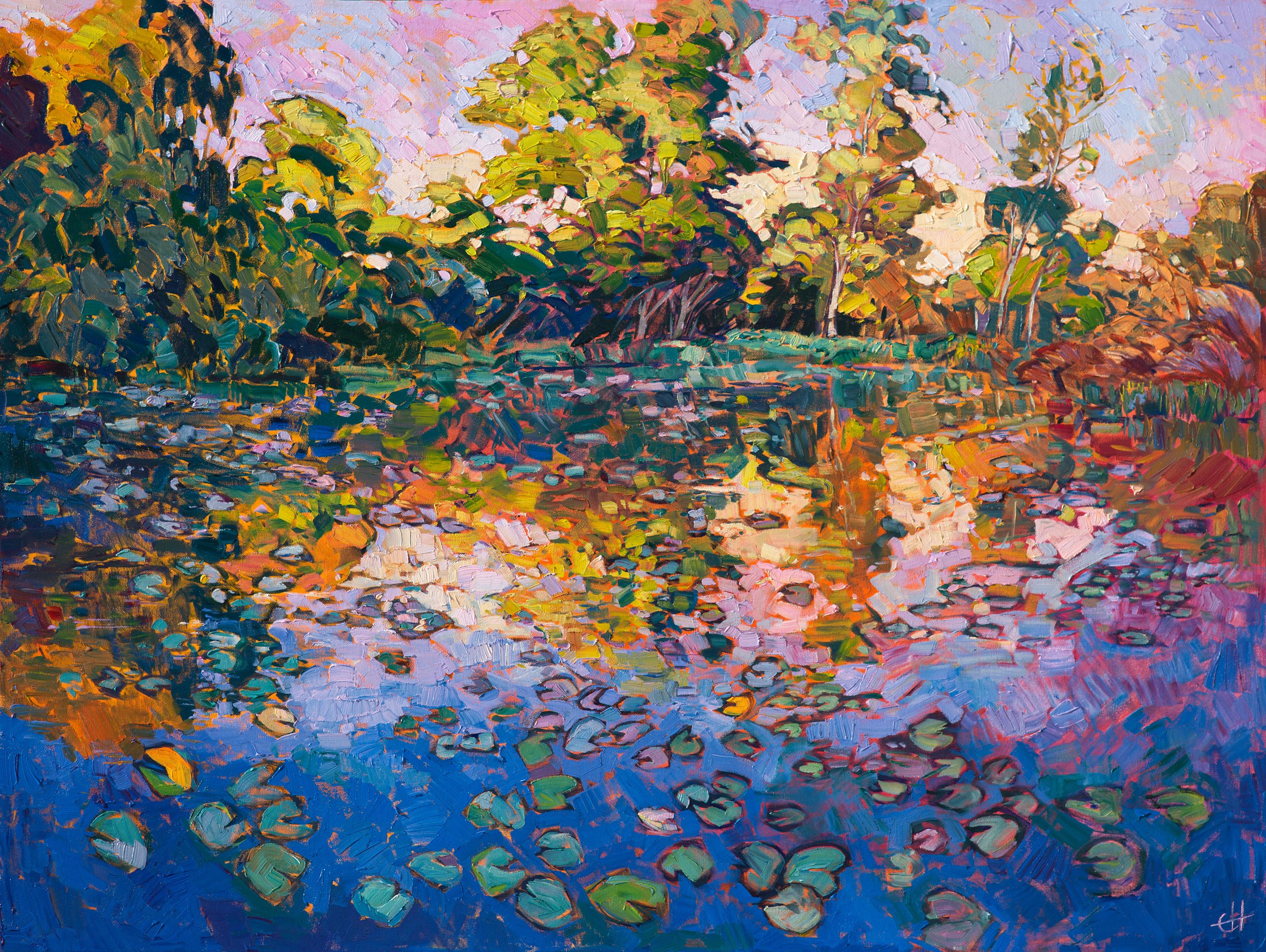
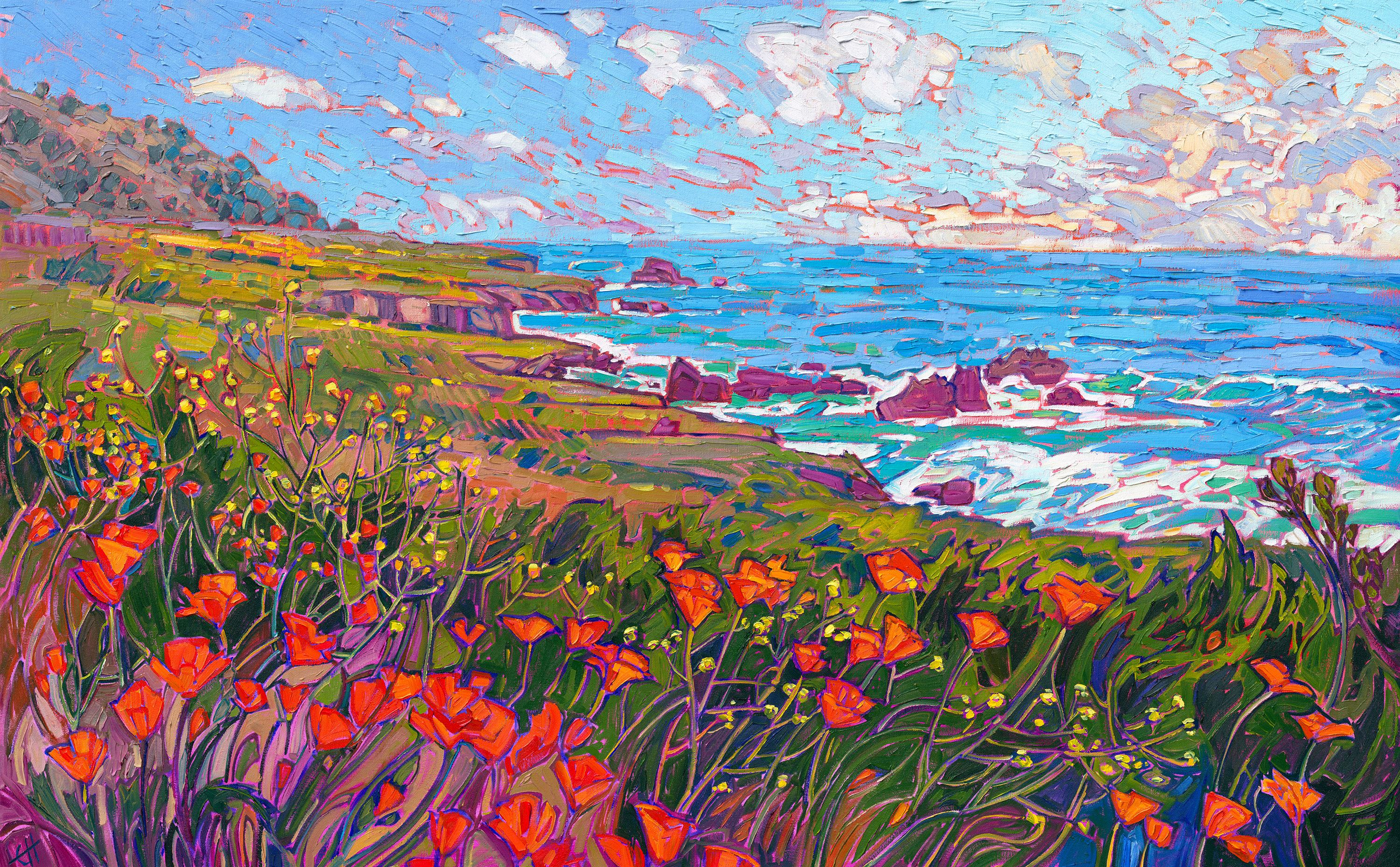
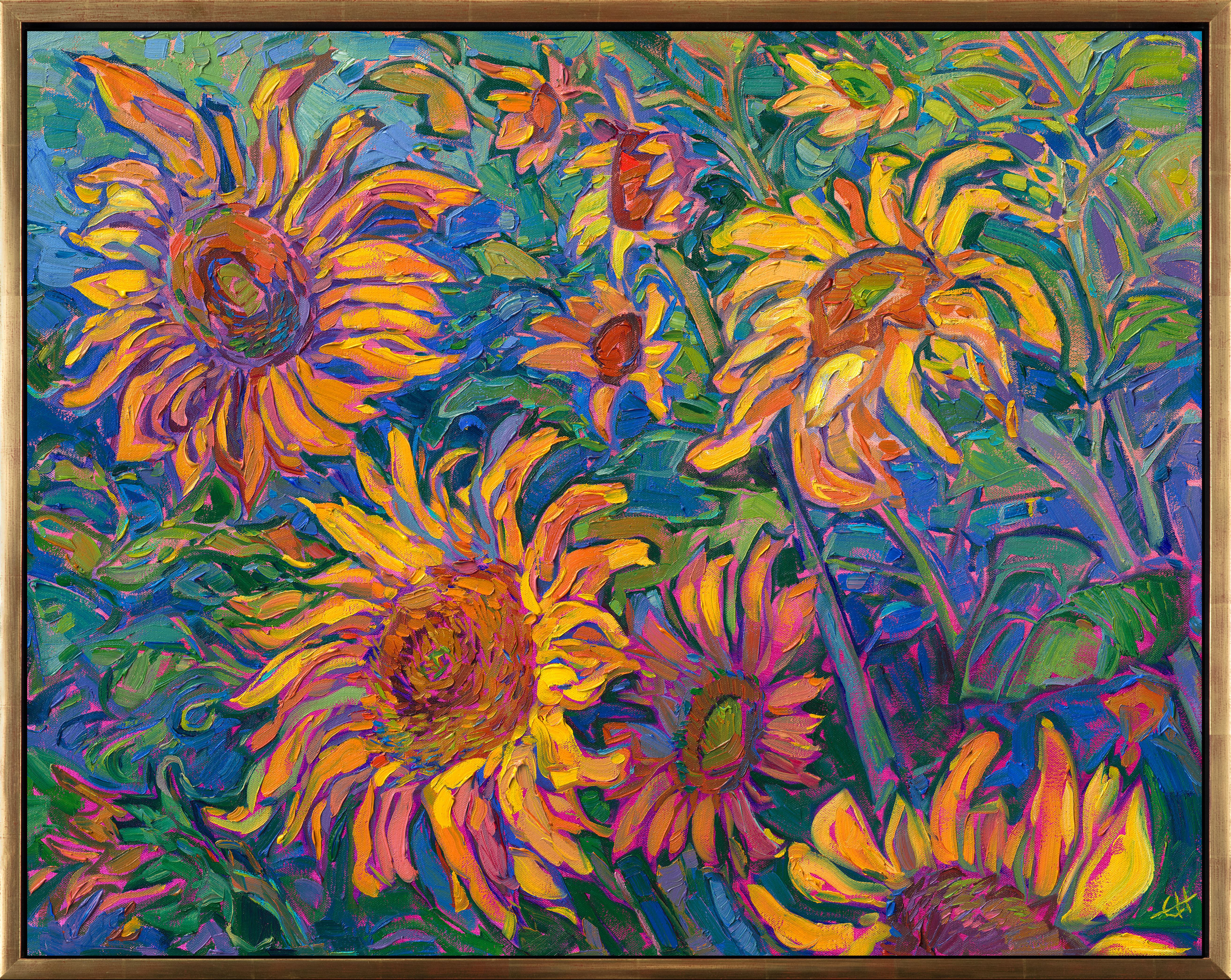
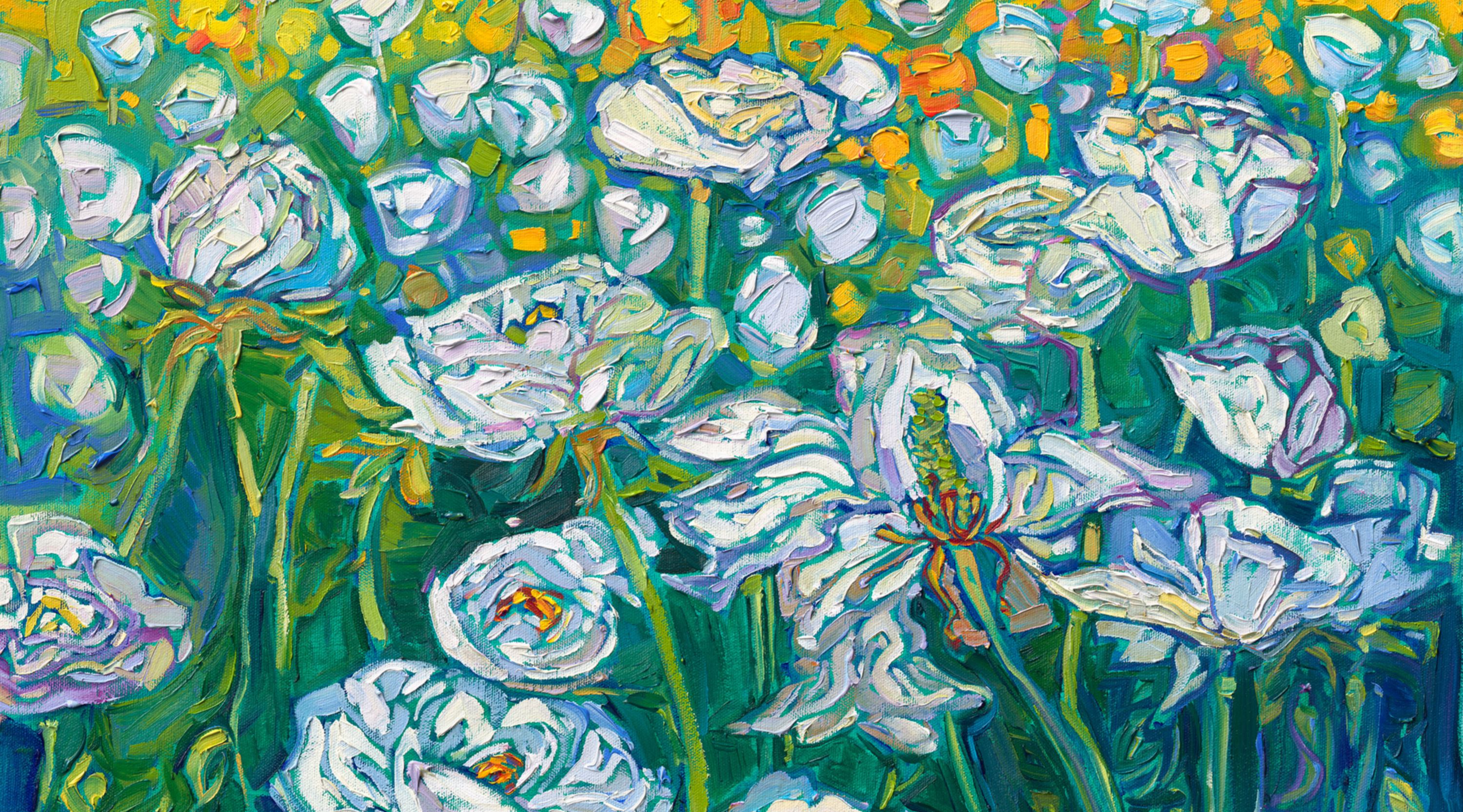
Over the past two decades, Hanson has refined the signature techniques of Open Impressionism, marked by confident, minimal brushwork and a bold impasto application of paint. Rather than building a painting in layered glazes, she lays strokes side by side without overlapping, aiming to make each one “right the first time.” These distinct, separated marks create a mosaic or stained-glass effect while preserving a sense of movement, energy, and spontaneity. Using a limited palette of only five pigments, she achieves vivid, unmuddied color that feels luminous and alive.
The word “Open” reflects a freer, more contemporary interpretation of Impressionism. In Open Impressionism, brushstrokes are wide and expressive, in contrast to the smaller, tighter marks often associated with the French Impressionists. “Open” also speaks to Hanson’s devotion to the outdoors—each painting is inspired by scenes she captures during her many open-air photo safaris, even though she does not paint en plein air.
Open Impressionism carries forward the legacy of the Impressionists and Post-Impressionists, drawing inspiration from Monet’s mastery of light and van Gogh’s intuitive use of color. Each painting seeks to capture the fleeting brilliance of outdoor light, especially at dawn and sunset. Like the great Impressionist works of the past, Hanson’s paintings appear more abstract up close, then sharpen into focus when viewed from a few feet away.
Impressionism vs. Expressionism
The term “impressionism” often conjures images of van Gogh’s sunflowers, Monet’s water lilies, and luncheons with Renoir. On the other hand, the first painting most people think about when hearing “expressionism” is The Scream by Edvard Munch. Other classic expressionist paintings like Der Blaue Reiter by Kandinsky and Large Blue Horses by Marc showcase expressive movement and brilliant color. These expressionist paintings evoke emotion through movement, color, and style.
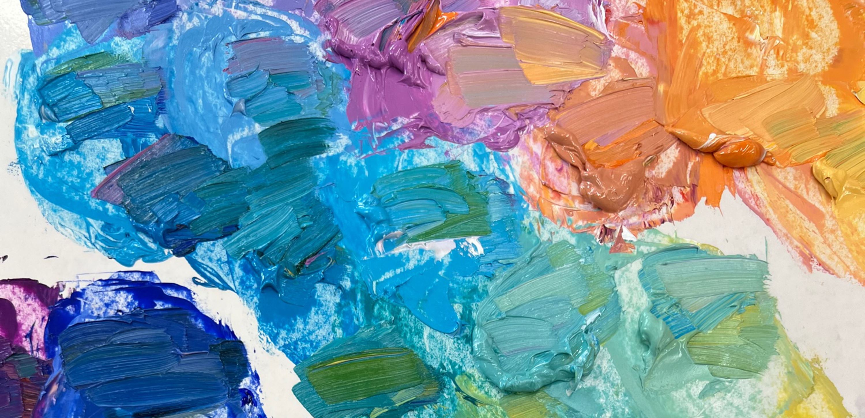
Impressionism has a long history of painters who pushed the boundaries of artistic techniques. The original Impressionists used small, thin brush strokes laid side by side to capture the light and movement of a transient scene. Open Impressionism catches the attention at once as being a new style of painting. The colors are vibrant, pre-mixed, and un-muddied. The thick brush strokes are left to exist as they are placed, which preserves every tiny ridge in the paint left by the brush.
Vibrant Brushstrokes
Open Impressionism uses color to create emotion, thick oil paint strokes to create movement, and separated brushwork to create a stained glass effect.
What makes Open Impressionism paintings look fresh and spontaneous? How do the colors stay so pure? Click here to read a note on the subject by Erin Hanson titled, "When to Stop Painting."
The History of Impressionism
Louis Leroy was outraged. The famous Parisian playwright, who also dabbled at painting and printmaking, was determined to expose an upstart group of artists—who had banded together to show their works in a new exhibition—for what he thought they really were: imposters.
Watch the development of
OPEN IMPRESSIONISM:
What is Open Impressionism?
Watch the video featuring Erin Hanson:
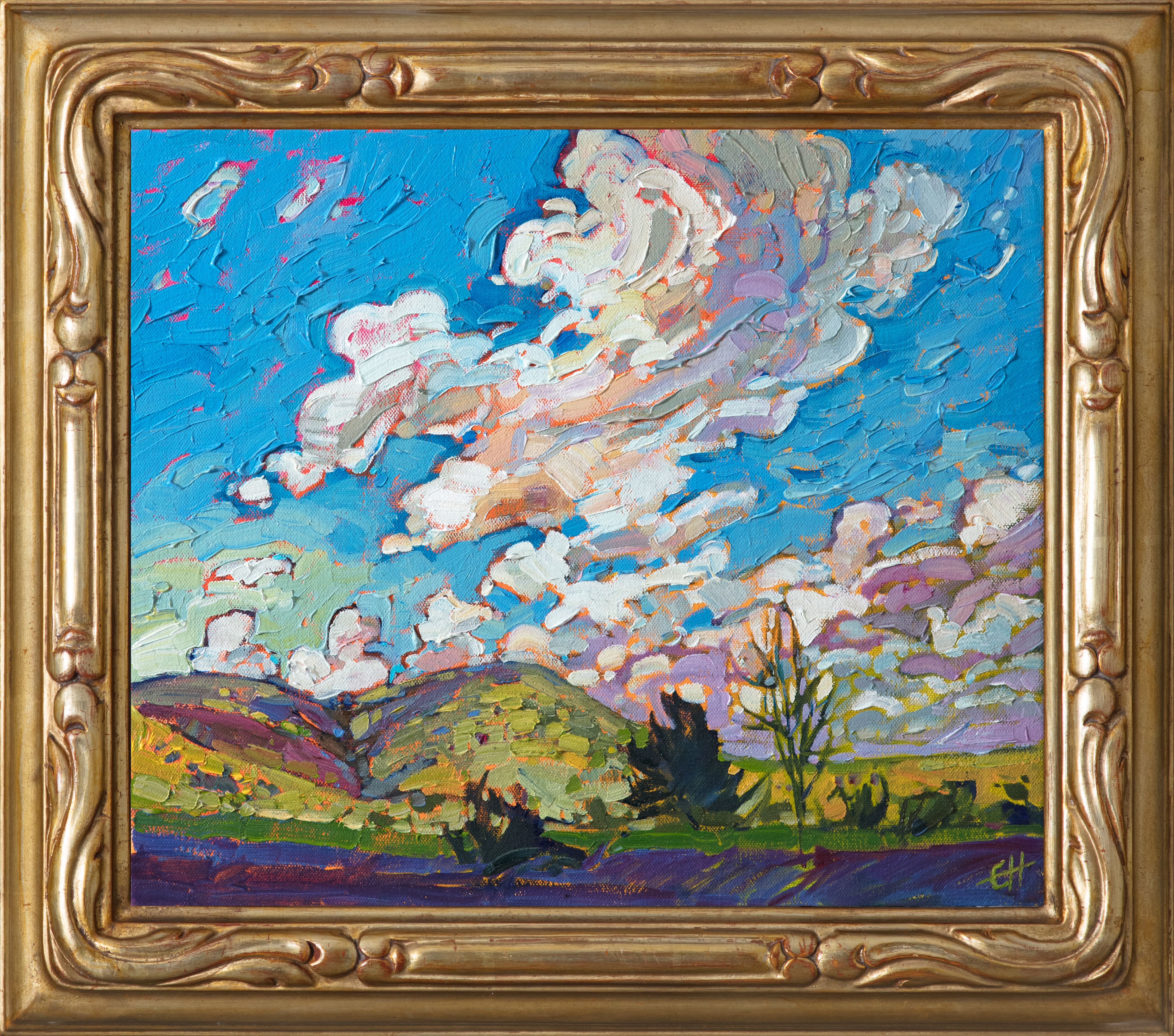
Open Impressionism Paintings
Erin Hanson's Open Impressionism paintings are inspired by the pure colors of nature, especially the vibrant colors of dawn and sunset. Hanson travels around the U.S. searching for inspiration, visiting national parks and other regions of natural beauty to find unique vistas and compositions for her paintings.
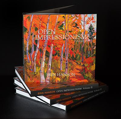
Coffee Table Book
Open Impressionism: Volume II
Explore the development of Erin Hanson's Open Impressionism in her second volume of works. This book contains over 300 impressionist paintings of brightly colored landscapes. Thick texture, confident brushstrokes, and pure color are the emblems of Hanson's style.
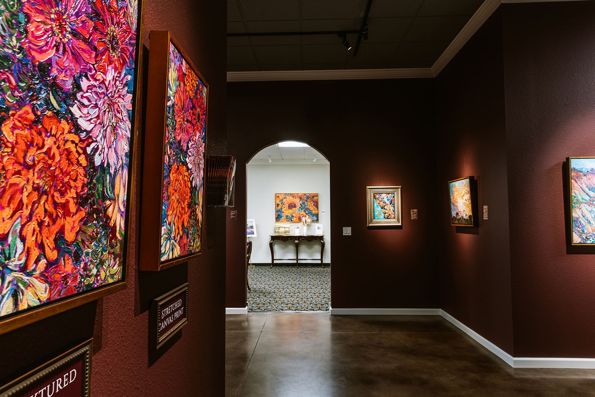
The Erin Hanson Gallery
Visit Erin Hanson's 18,000-square-foot studio and art gallery (and meet Erin in person!) in McMinnville, Oregon. We are located on the wine trail in beautiful Oregon wine country.
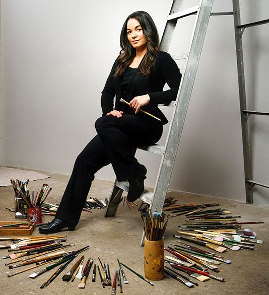
ERIN HANSON
Alchemist of Color
At first glance, Erin Hanson seems to be a study in contradictions. Although she grew up in the city of Los Angeles, her source of inspiration for her paintings is the broad vistas of southwestern natural landscapes. She took a break from painting to obtain a degree in Bioengineering, and then went right back to painting. Yet, on a closer look, there is a particular harmony to be found within those opposites, which serves well to help define her body of work.
I asked Erin recently why she had chosen to major in science when she was already well on her way to becoming a recognized fine artist. “People find it difficult to understand that one can have more than one driving interest in life,” she explained. “It's easy to put someone in a box and label them a 'left side/right side' thinker or personality. This is too limiting a view for me. In my case, although I've always loved art and painting, I've also been fascinated with the natural world on a more scientific level as well. I don't see this as a conflict; I see it as part of the greater whole that defines and sustains my body of work.”
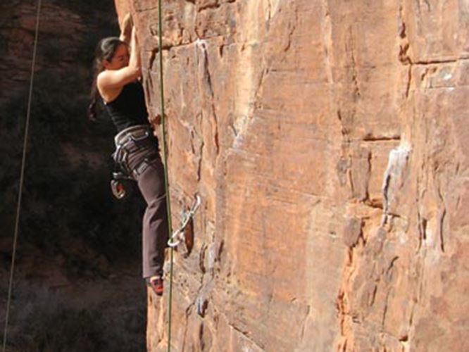
Growing up in the city gave Erin a higher appreciation of the sheer beauty and power of natural landscapes, which she first discovered as a child on family camping trips. Erin has developed a highly trained and discerning eye for finding a perfect combination of perspective, color, composition, and form in the natural world. She is not a spectator when it comes to the landscapes she paints; she is also an avid and accomplished rock climber. It was this hobby that led her to choose those same vistas as her recurring theme for her body of work as a fine artist. “I don't know of a more immediate way to gain appreciation and understanding of the underlying forms and patterns of nature than to be hanging off a cliff and seeking out the next foothold,” she admits, somewhat jokingly. Yet perhaps it could be argued that the intimacy of her experiences in the natural world is what helps give her paintings such a visceral, vibrant quality. “I paint what I see and what I surround myself with,” she told me. “I choose natural landscapes as my theme for my art because it's the most beautiful thing I know.”
Her richly colored and textured paintings, which depict the awe-inspiring scenic landscapes of the American Southwest, show a mastery of form and composition, with colors as vibrant and lavish as stained glass. Magnificent interplays of light and shadow lend additional depth and texture to her paintings. Although she has been compared to Impressionist greats, including the likes of van Gogh, Monet, and Cezanne, with a bold, rich color palette reminiscent of the likes of Matisse and Gauguin, Erin Hanson's style is uniquely her own.
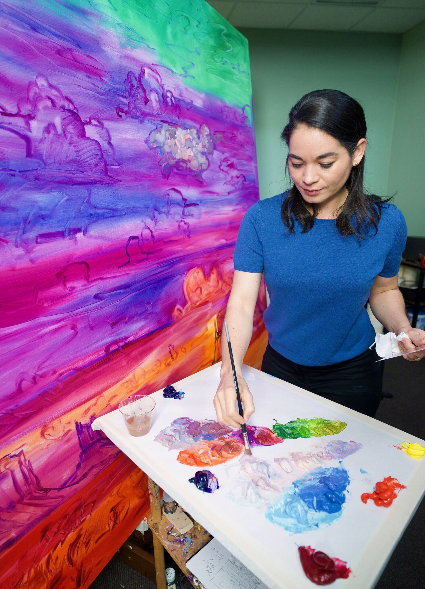
Erin's technique betrays a deep technical mastery of color, which she has spent years studying. Because it is also remarkable in its own right, it is worthy of more than a passing comment. Having sketched out her scene in ultramarine blue, paying due attention to creating a harmonious balance of form and composition, she then pre-mixes her color palette. She limits the number of colors she uses to a rather spartan level, usually not extending it beyond four colors, with minimal blending. She is no shrinking violet when it comes to laying the paint on the canvas. Using a wet-on-wet technique and without layering or diluting her brush strokes with turpentine or other washes, her paint application reveals an extraordinary fearlessness: using a thickly loaded brush and bold impasto strokes, she goes over the canvas only once. This type of sublime confidence expressed can only come as a result of years of an intense and ongoing study of color and form; yet despite this, anyone who has ever picked up a paintbrush can't help but appreciate the bravery and self-reliance it takes as an artist to trust oneself to get it right the first time, every time. And somehow, she always does get it right the first time. Her thick, skillful brush strokes reveal a purity of color, form, and expression; they are the hallmark of a true artist who has learned to communicate her vision directly to the canvas. There is rarefied integrity of character in Erin's paintings that seem to illuminate them from within.
In her own words, Erin describes her style as “Open Impressionism,” in homage to the late 19th-century plein air Impressionists, but also with a nod to the modernist, more subjective Expressionist movement of the early 20th century. Although her landscapes are instantly recognizable as such, she imbues them with an emotional, rather than representational, view. Her colors vibrate with intensity and manage to convey the lush, sensual freedom of the open air while somehow also instilling the viewer with an underlying sense of harmony and balance. There is remarkable synchronicity between freedom and discipline in the sanctuary of her vivid landscapes, which is not easily defined. One does not merely look at her paintings; rather, one experiences them.
Article by Anja Wulf, 2017
Watch the Video:
Erin Hanson: Alchemist of Color
Early Beginnings
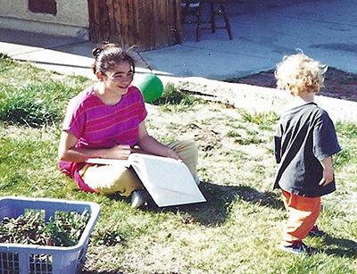
When she was six years old, Erin Hanson planted some iris bulbs with her mother in the garden of their home in Los Angeles’ Silver Lake neighborhood, “I already knew van Gogh’s painting of irises,” she says, recalling her excited anticipation of the flowers that would bloom.
So, she was crestfallen when those bulbs finally blossomed. “The real irises looked nothing like the painting,” she remembers. But even at that tender age, she derived from her disappointment a lesson that continues to inform her pursuits today, as a successful artist who turns 42 this month: “I knew that art could be better, more real, than real life, and definitely more colorful.”
The First
Open Impressionism Painting
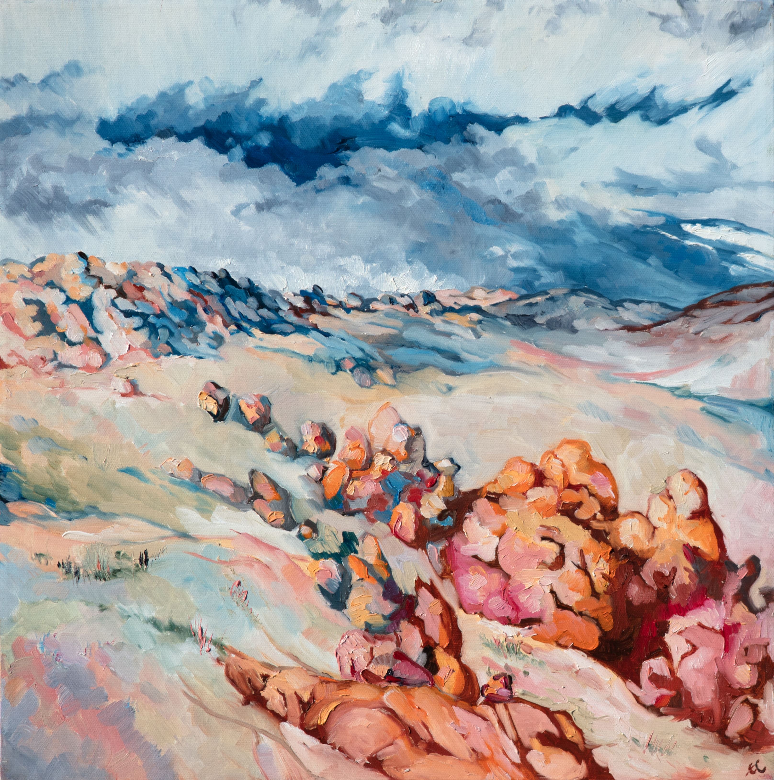
2006: The Beginning of Open Impressionism
The first painting in the Open Impressionism style was created on the day Erin Hanson moved to Las Vegas. She was camping out at Red Rock Canyon, the nearest campsite to the city, since the electricity had not been turned on in her apartment yet. She had arrived at the campsite late at night, and when she woke up the next morning, she glimpsed Red Rock Canyon for the first time – a glorious expanse of red and orange rock formations. She painted a small plein air painting right then and there, and the style of the brush strokes and colors she chose to capture this rocky landscape became the foundation for the entire body of work she would later create. Hanson declares, “If the electricity had been turned on in my apartment like it was supposed to have been, I may never have developed Open Impressionism.”
Later that same morning, Erin Hanson met her camping neighbors, who were professional rock climbers just moved to Las Vegas. The group became fast friends, and Hanson was taught to climb and lead to a 5.12 level. Spending a few days climbing in Red Rock Canyon every week, and making frequent forays into Utah, Mount Charleston, and Valley of Fire, gave Hanson hundreds of opportunities to experience the natural beauty of the desert and provided a never-ending source of inspiration for her landscape paintings.
Experimentations in Impressionism
Early Examples from 2007
Erin Hanson’s first experimentations in painting red rock landscape employed richly colored cadmium hues of red and orange. The bright pigments were diluted with a lot of white paint, creating delicate pastel colors. The brush strokes were small and carefully placed, often overlapping and blending together. There was no underpainting in these first paintings, so the artist had to keep the brush strokes close together in order to cover up all the white canvas underneath. These early examples from 2007 are displayed here on the same wall, framed in dark wood frames.
Her discovery of underpaintings was accidental: one day she decided not to paint over an old painting with white gesso first – instead she just sanded down the painting and went to work directly over the old painting underneath. There was a surprising addition of color and texture to the finished painting, and Hanson has been using a pre-painted underpainting ever since.
Erin Hanson
Continuing the Legacy of Modernist Landscapes
Entering Erin Hanson’s studio is a surprising experience -- coming off the street of an industrial area of the city, you feel a sense of respite once you are in the presence of her landscape oil paintings. Her style continues the legacy of early European modern art, combining influences from Impressionism and Expressionism (her work has been characterized as “Open-Impressionism”). Her vivid landscapes picture the terrain of Utah, Nevada, Arizona, and California, and reflect her deep connection to the outdoors as an avid rock climber and backpacker.
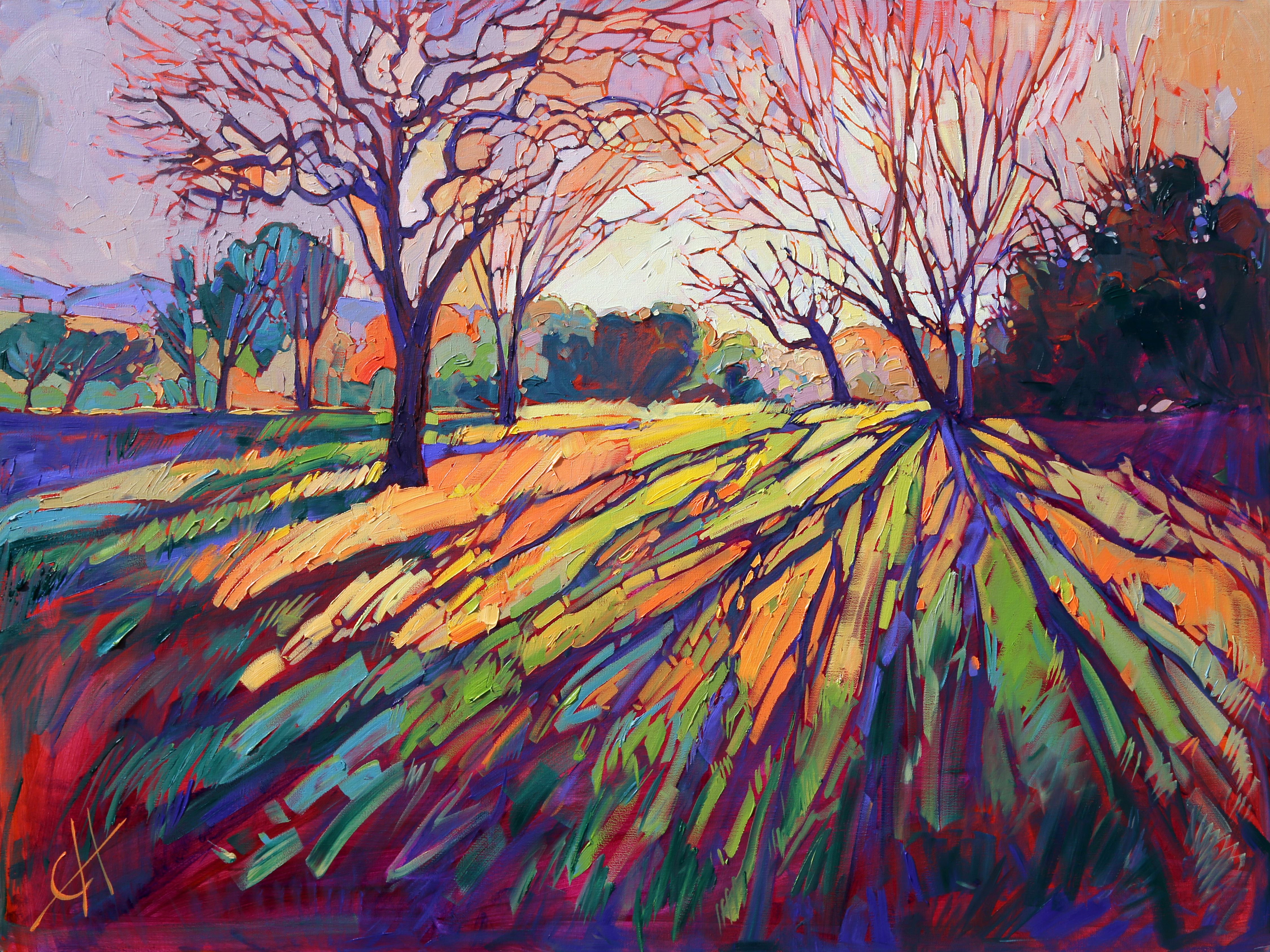
After a period of experimentation with different art materials, styles, and subjects, Hanson discovered her inspiration in nature while climbing in the Red Rock Canyon of Las Vegas. Her particular style is marked by gestural, broad brushstrokes and heavy impasto, which makes for a heavily built-up surface that is reminiscent of 19th-century Impressionism. Her palette has evolved in the last few years from a more muted, cooler palette, to a vivid one of bright pinks, greens, purples, yellows, and blues that is reminiscent of the early 20th-century German Expressionist palettes. Like the Expressionists, hers is a less strictly naturalistic use of color that leans towards the symbolic. Her recent series of paintings on the California landscape of Paso Robles demonstrates this color sensibility and sense of greater abstraction. One of the hallmarks of her style is her treatment of light; she demonstrates its crystalline, dappled quality and changing appearance filtered through the branches and leaves of her trees through a mosaic-like application of paint.
Recent canvases show that Hanson has moved from a more literal approach of form and composition to one that is more highly abstracted and emotional. Recent canvases like The Path have the moving, vibrating character of a van Gogh landscape with the bright, saturated colors of the early German Expressionist landscape, such as those by Karl Schmidt-Rotluff. Her undulating landscapes seem to pulsate with a sense of quiet, inviting life that is both serene and exciting. This sense of movement in her work reflects the reality of her chosen outdoor scenes and the inner attachment that Hanson feels to these sites. This makes for landscapes like Purple Dawn and Spring Fling that are a fusion between a faithful reproduction of an outdoor scene and an emotional reflection on her favorite sites. Hanson makes the landscapes of the western United States come alive with color.
Article by Rachel Bath, 2015