Subtotal
$0
U.S. Shipping
FREE
Saved for Later
Shop Art
Original Paintings
Textured Replicas
Canvas Prints
16x20 Paper Prints
Gift Shop
Portfolio
Browse All
Available Paintings
List of Subjects
Petite Paintings
Large Paintings
Customer Favorites
Contact Us
View Portfolio
Available Originals
Textured Replicas
Canvas Prints
16x20 Paper Prints
Gift Shop
Learn More >
About The Artist
Erin Hanson Biography
About Open Impressionism
Watch Videos
Press Pickups
Blog
Visit
The Erin Hanson Gallery
Exhibition Schedule
Museum Shows
Visit Erin's Studio
For Collectors
Available Paintings
What Are Textured Replicas?
Collector Testimonials
How to Commission Artwork
Notify Me of New Works
For Artists
Open Impressionism Workshop
Artist Mentorship Program
Follow in Erin's Footsteps
Artist Q & A
Erin's Blog
Questions?
Shopping Cart
Subtotal
$0
U.S. Shipping
FREE
Promo codes and taxes are added at checkout.
Saved for Later
Autumn is right around the corner, which means cooler weather is on its way. This time of year always feels like a celebration as the world around us fills with buttery yellow sunflowers, multi-colored pumpkins, and tawny autumn leaves. Your home is likely no exception. If you love autumn, you are probably decorating your home with warm and welcoming decor.
One thing that many people love about fall is the array of colors. Everything about this time of year is customized to keep us feeling warm and cozy on the inside. Fall colors, in particular, are warm and delightful.
Think about the color of apple cider paired with a bright red apple slice positioned on the corner of the cup. That simple image evokes the warmth of cinnamon paired with the sweetness of apple.
Even pumpkin spice, an American staple during the fall, is designed to make you feel warm and cozy inside. The spice itself is better called “pumpkin pie spice,” and your standard spice bottle will contain cinnamon, ginger, nutmeg, allspice, and cloves. All ingredients are warming - and the combination has a cozy orange and brown color.
As we think about the coming cool season, we can’t help but think about what will make a home feel cozy, even as we work to keep our homes physically warm. That is where color theory comes in.
Color theory is a set of rules and guidelines that designers use to evoke specific feelings in others. But one does not need to be an expert in color theory to use it.
For the purposes of this article, we are discussing what makes you feel cozy. So, to contrast that and define what the opposite of "cozy" is, here’s a mental exercise:
Imagine a home or building that you would describe as “cold.” Is it bare? Stark? Perhaps built of concrete or some other gray or white-colored material? Is the art on the wall dark? Does the color palette mainly consist of blues and grays?
Now imagine a home or building that you would describe as “warm.” Is it filled with art, pillows, plants, or other comforting items? Are the walls painted a particular color? Does the color palette consist mainly of browns, oranges, yellows, or reds? Is there wooden furniture, or is the furniture colorful?
These two contrasting spaces likely have very different color palettes. You can evoke the same “warm” and “cold” feelings with your own home by simply updating the artwork! Here are some colors to look for.
Yellow is on the warm side of the color wheel and is associated with energy, happiness, and optimism. It is also the color that most often describes light or the sun.
Here are two yellow-dominant pieces that evoke a warm feel.
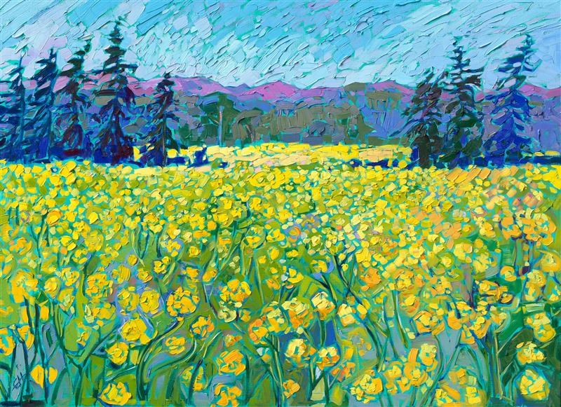
Oregon Mustard by Erin Hanson
Saffron Coast by Erin Hanson
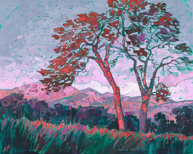
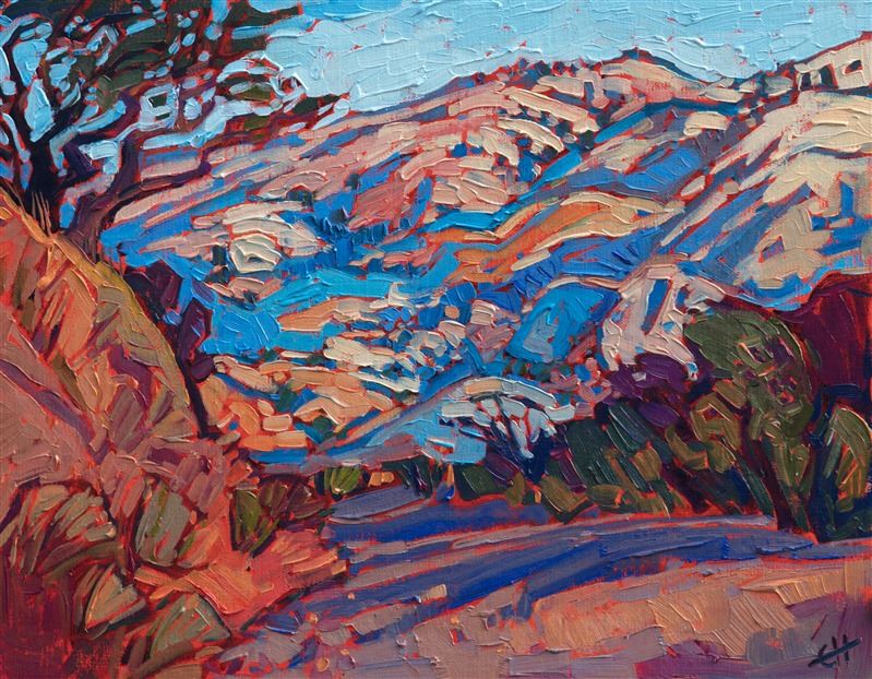
Red is almost always associated with passion, energy, and emotion. It also sits on the warm end of the color wheel - and is a beautiful compliment to any fall decor.
Here are two red-dominant pieces that will add warmth to any autumnal decor.
Vista Buttes by Erin Hanson
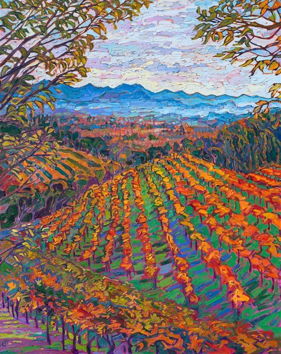
Napa Mist by Erin Hanson
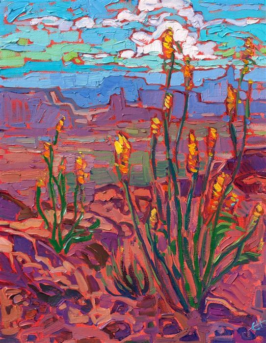
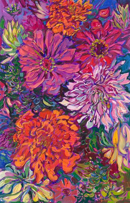
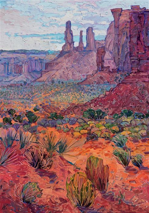
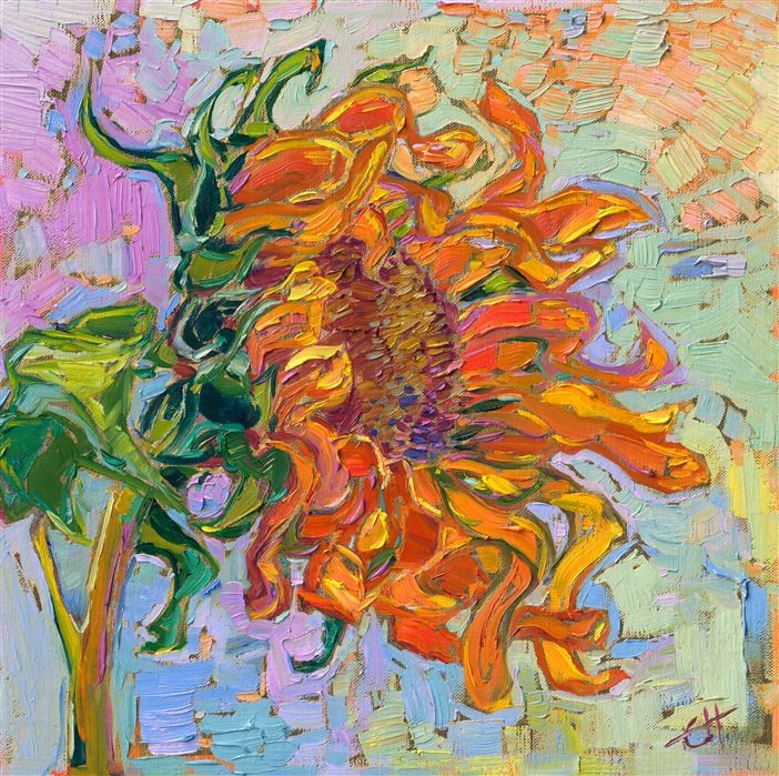
Orange is on the warm end of the color spectrum and evokes energy and enthusiasm. Orange is often seen as a more friendly color than red, allowing viewers to enjoy a more balanced view.
Here are two orange-dominant pieces that make one feel warm.
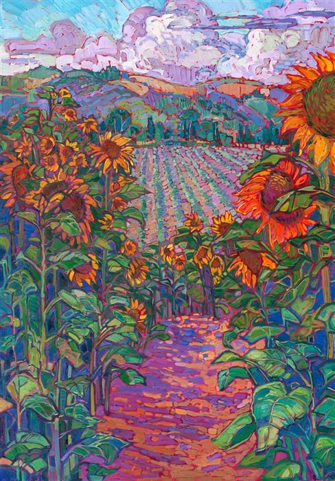
Fields of Sunflowers by Erin Hanson
Desertscape by Erin Hanson
Rose is a lovely, charming color that often makes one think of romance. There is a hopefulness around this color which evokes the idea that fall and winter will pass, and spring will emerge.
Here are two rose-accented paintings that can bring a warm and hopeful feel to any space.
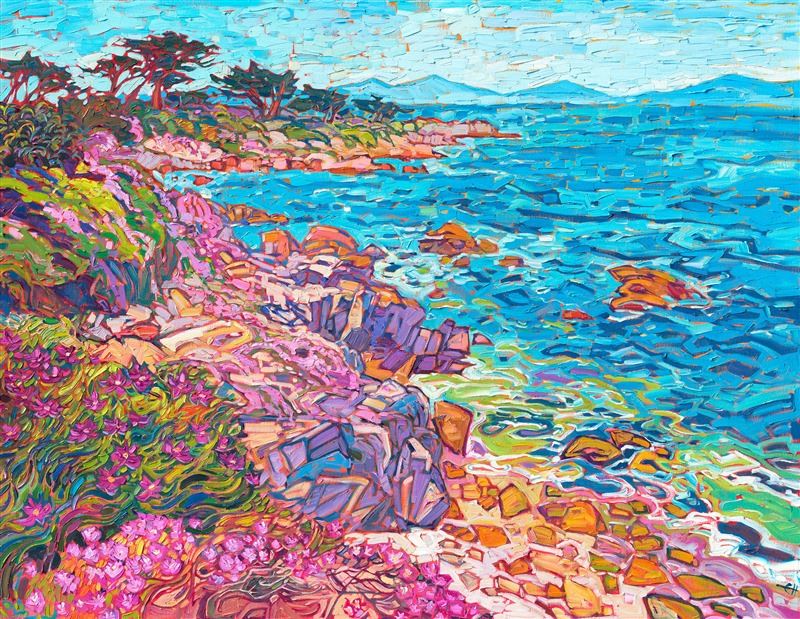
Carmel Ice Plants by Erin Hanson
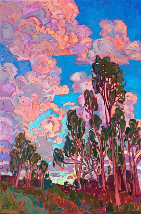
Sunset Clouds by Erin Hanson
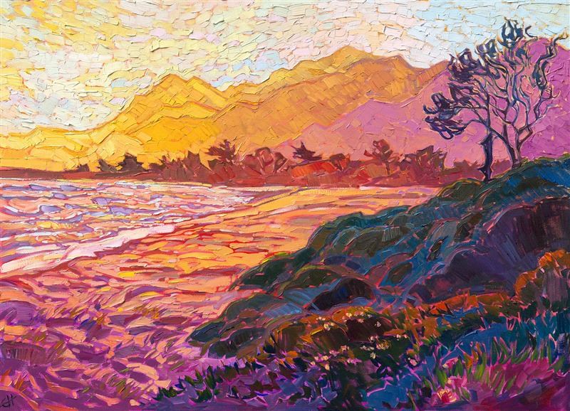
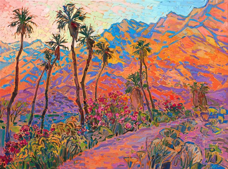
Peach mixes the optimism of pink with the energy of orange to bring a warm hue to any space. When an area has peach highlights, it feels warm and exciting.
Here are two warm paintings with peach highlights:
Blooming Vibrance by Erin Hanson
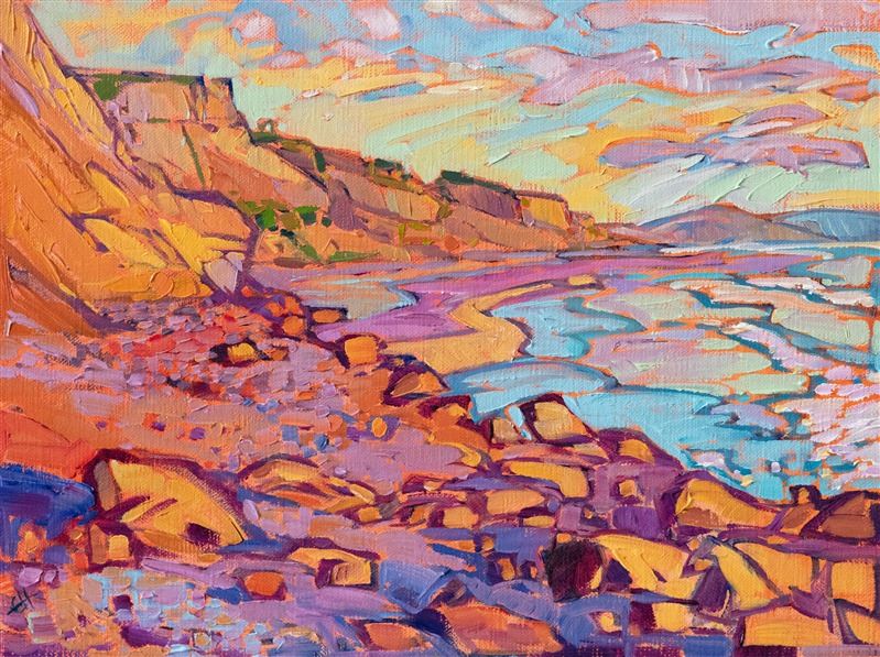
San Diego Shores by Erin Hanson
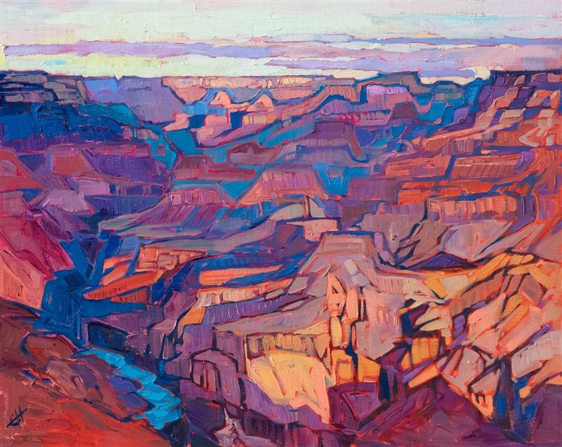
Burgundy is a red-purple color that evokes warm evenings over a nice glass of, well, burgundy. This lovely wine color brings in a nice balance between coolness and warmth, making a space feel cozy and luxurious.
Here are two paintings that highlight the beauty and warmth of burgundy.
Alizarin Dawn by Erin Hanson
Monument Buttes by Erin Hanson
If you’ve ever owned the complete crayon set, you’ll be familiar with burnt sienna. This color is lovely for depicting warm spices - like pumpkin spice. Warm, burnt sienna art is terrific for making one feel cozy on a brisk fall afternoon.
These two burnt-sienna dominant paintings would go far in warming a room.
Canyon Edge by Erin Hanson
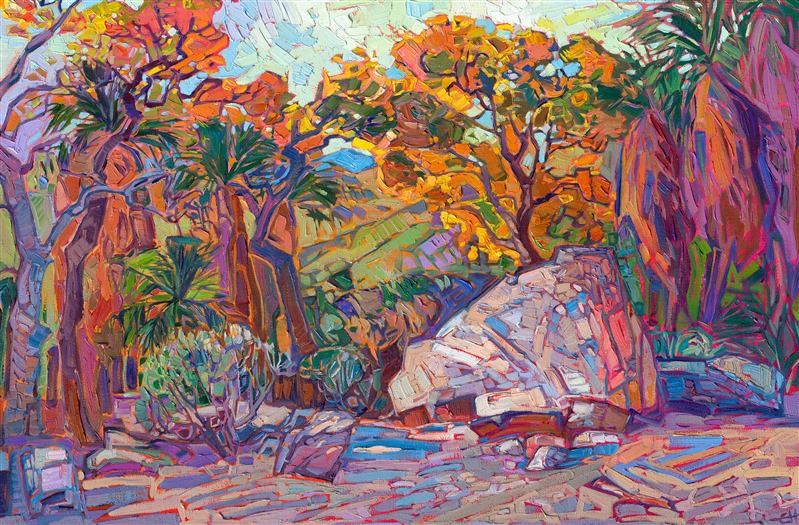
Desert Boulder by Erin Hanson
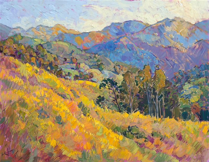
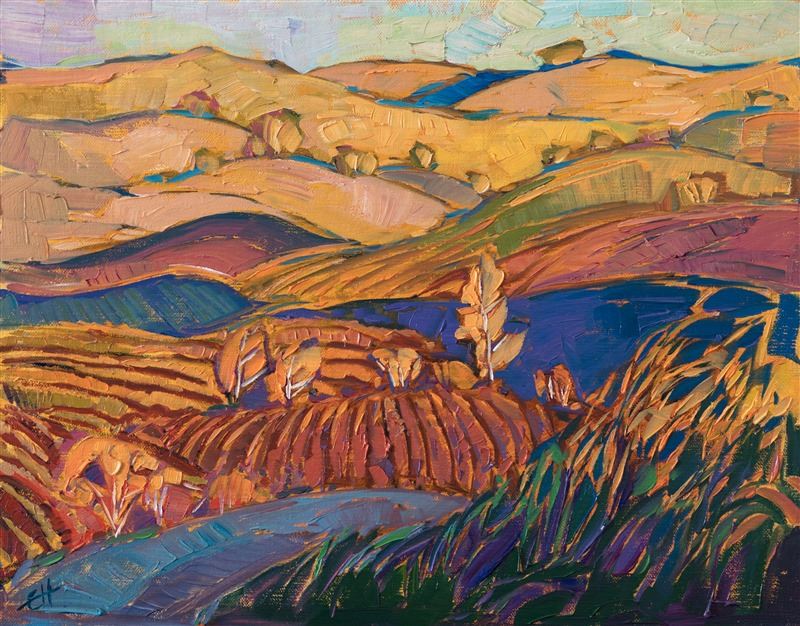
Gold, like yellow, is another descriptor of light and the sun. Gold as a metal may be cold, but as a color, it has lovely, warming characteristics. Erin Hanson has an entire series of paintings dedicated to pointing out the golden highlights one finds at particular times of day, bringing the quality of light into the work using gold leaf.
Here are two paintings that showcase warm, gold tones.
California Gold by Erin Hanson
Sunflower Bloom by Erin Hanson
It’s not brown, it’s not white, it’s not tan, it’s beige! Beige is often considered a boring color, but from a design perspective, it’s the perfect color to warm up a space. Pure white is stark. Beige brings a little warmth into an area.
Here are two paintings with beige highlights that bring warmth and contrast to any room.
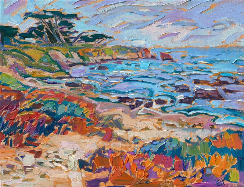
Monterey Cove by Erin Hanson
Carmel Hills by Erin Hanson
Brown is a stabilizing, grounding color that warms up a space. This friendly color is inviting and draws people into an area, whether it’s around a soon-to-be-lit fire, a cup of tea, or a large dining room table.
These two brown-dominant paintings evoke warmth in any viewer.
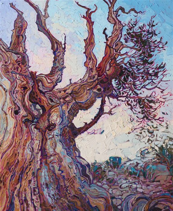
The Ancient by Erin Hanson
Golden Hills by Erin Hanson
Minor updates to your decorations, color scheme, and art can make a huge difference in the warmth and inherent coziness of your home. If you want to explore various colors in Erin Hanson’s open impressionist art, enjoy her portfolio here. You can search for colors warm and cold by selecting “Colors” in the dropdown.
Discover the artist at the forefront of modern impressionism.
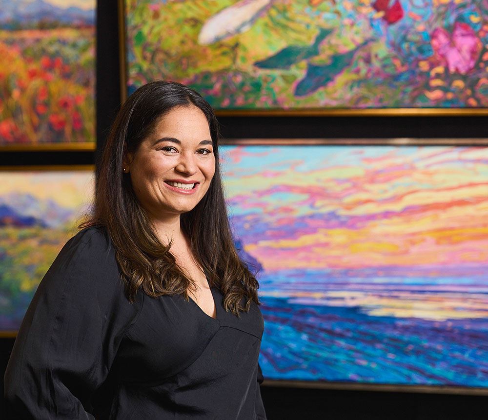
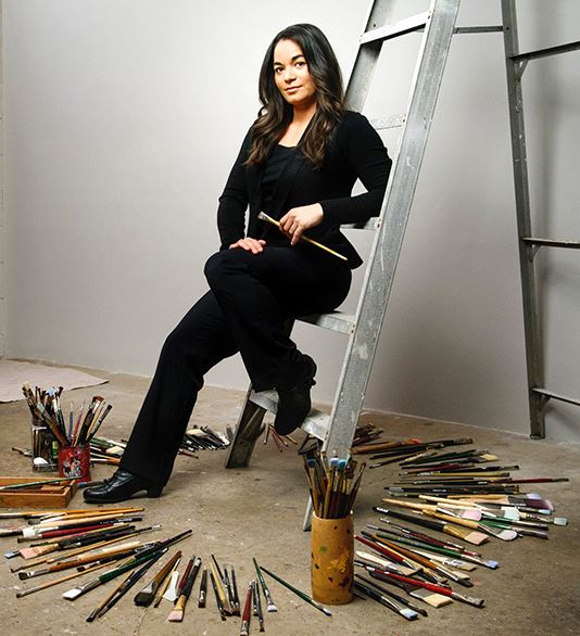
About Erin
ERIN HANSON has been painting in oils since she was 8 years old. As a teenager, she apprenticed at a mural studio where she worked on 40-foot-long paintings while selling art commissions on the side. After being told it was too hard to make a living as an artist, she got her degree in Bioengineering from UC Berkeley. Afterward, Erin became a rock climber at Red Rock Canyon, Nevada. Inspired by the colorful scenery she was climbing, she decided to return to her love of painting and create one new painting every week.
She has stuck to that decision, becoming one of the most prolific artists in history, with over 3,000 oil paintings sold to eager collectors. Erin Hanson’s style is known as "Open Impressionism" and is taught in art schools worldwide. With millions of followers, Hanson has become an iconic, driving force in the rebirth of impressionism, inspiring thousands of other artists to pick up the brush.