
Subtotal
$0
U.S. Shipping
FREE
Saved for Later


Shop Art
Original Paintings
Textured Replicas
Canvas Prints
16x20 Paper Prints
Gift Shop
Portfolio
Browse All
Available Paintings
List of Subjects
Petite Paintings
Large Paintings
Customer Favorites
Contact Us
View Portfolio
Available Originals
Textured Replicas
Canvas Prints
16x20 Paper Prints
Gift Shop
Learn More >
About The Artist
Erin Hanson Biography
About Open Impressionism
Color & Light Articles
Watch Videos
Press Pickups
Blog
Visit
The Erin Hanson Gallery
Exhibition Schedule
Museum Shows
Visit Erin's Studio
For Collectors
Available Paintings
What Are Textured Replicas?
Textured Print Feedback
Collector Testimonials
How to Commission Artwork
Artwork Comparison Guide
Notify Me of New Works
For Artists
Open Impressionism Workshop
Artist Mentorship Program
Follow in Erin's Footsteps
Artist Q & A
Erin's Blog
Questions?
Shopping Cart
Subtotal
$0
U.S. Shipping
FREE
Promo codes and taxes are added at checkout.
Saved for Later
A home is barren without art. Art brings in color and your aesthetic, reflecting a sense of who you are and what you love. I sometimes get asked this question: should I buy a painting to match my home, or should I just buy the paintings I love?
This article will show you how you can buy the artwork you love and adjust the room around it, making it look like the painting was designed especially for that room.
When a painting looks beautiful in a room, and the colors complement, it creates a “WOW” factor. As an artist, I like to think of the room as a large extension of the painting’s frame. Of course, you want the “frame” to complement the painting and not clash with it.
When a piece of art speaks to you and you hang it in your home, it becomes part of who you are, a unique expression of your personality. I know some collectors whose passion for art has them displaying their beauties from the floor to the ceiling, on any available wall space, on easels, on bookshelves, and on mantlepieces.
Each painting tells a story, contains a memory, or recalls an experience.
As an artist, I think it is great fun to decorate around the artwork. An Erin Hanson oil painting has hundreds of subtle color variations and vibrant hues, which provide lots of opportunities to incorporate the painting's colors into the room design.
The first aspect of room décor to discuss is the wall color behind the painting. This is easy to change and has the most dramatic effect on how a viewer perceives the artwork.
The coastal painting in our example has been transformed to look like five different paintings by placing it against five different wall colors.
Warm wall colors will make the cool tones in the painting pop, while cool wall colors will make the warm hues in the painting pop. A colorful painting would benefit from hanging on a white or neutral wall, while a light, airy painting would draw the most attention if hung on a dark, jewel-toned wall.
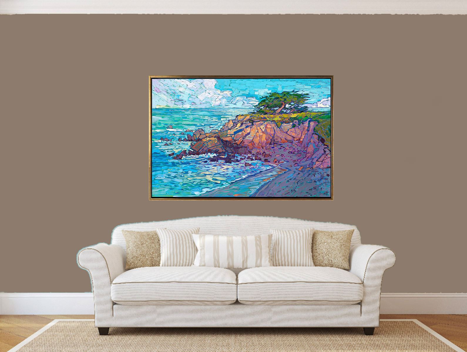
The eye is drawn to contrasts, so when designing around your art, the goal is to create contrasts between the wall color and the painting.
Imagine you had a teal accent chair. You wouldn’t want to place it against a turquoise wall since the colors would be too similar, and the chair would not draw attention. However, if that same teal chair were placed against an earth-toned wall, your eye would be attracted to the color contrast.
Here’s the basic rule of thumb:
Whatever aspect of the painting you want to pop, surround the painting with the opposite.
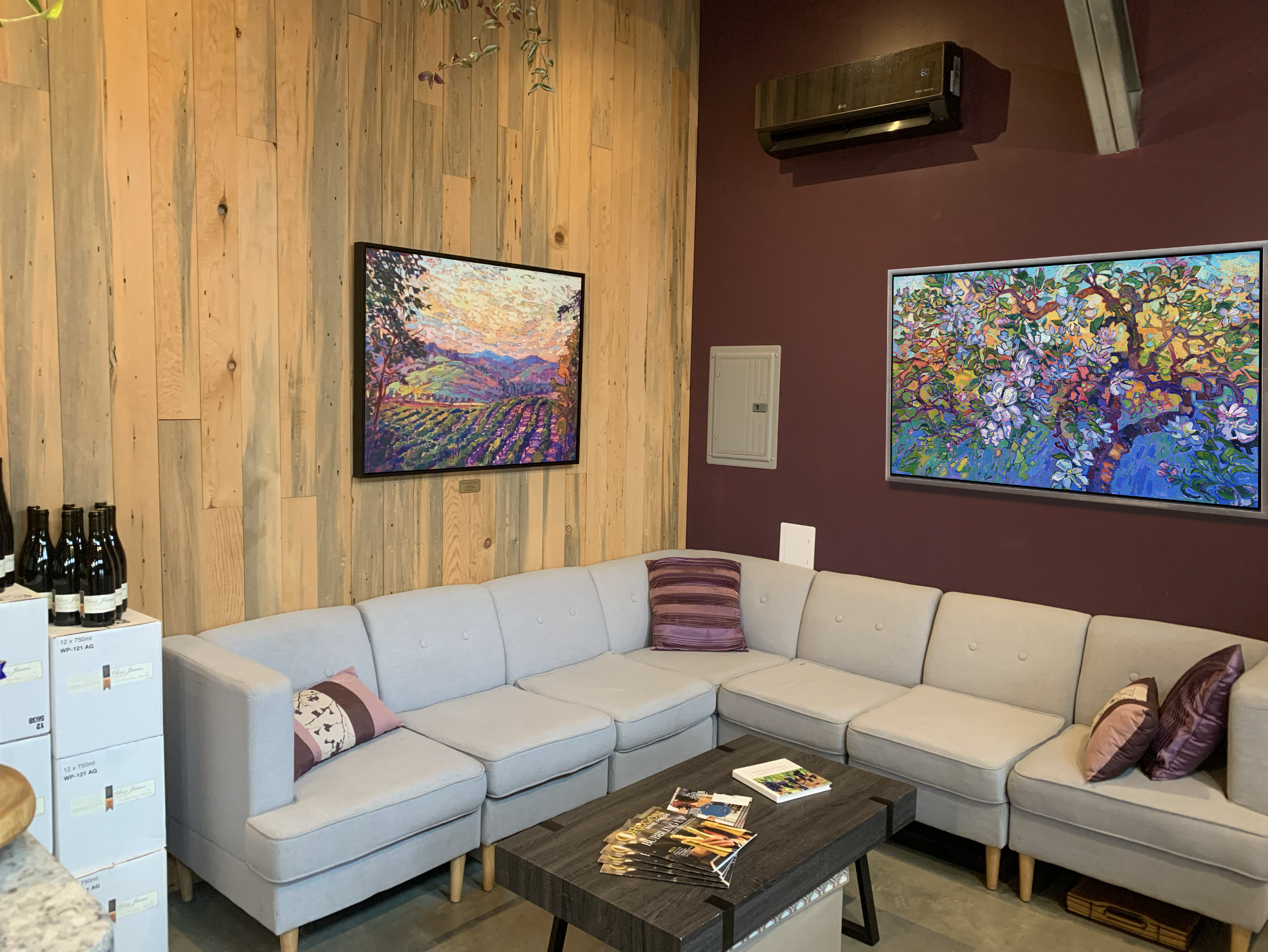
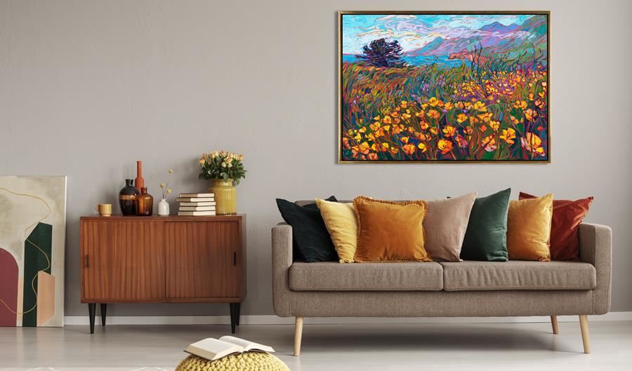
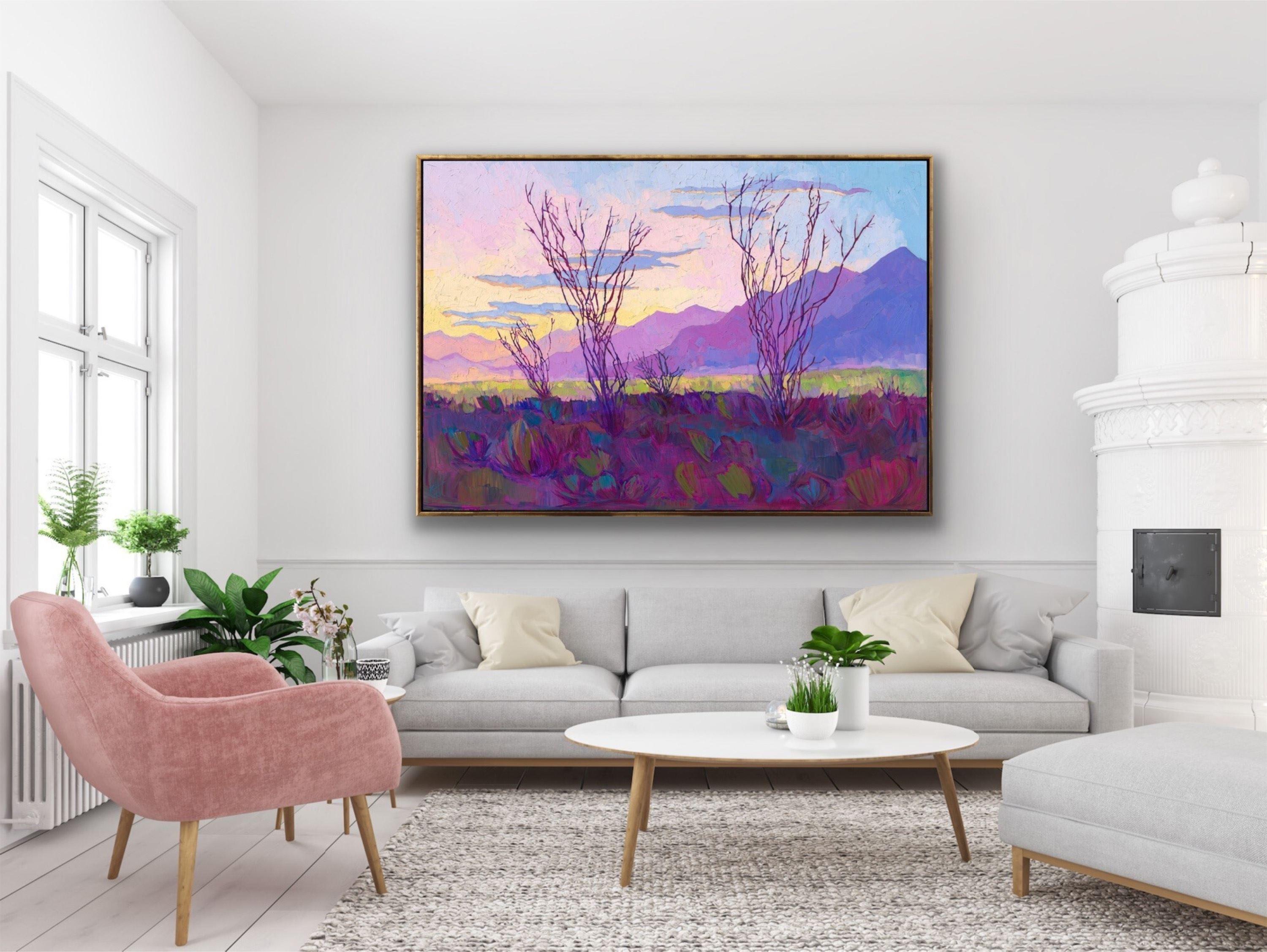
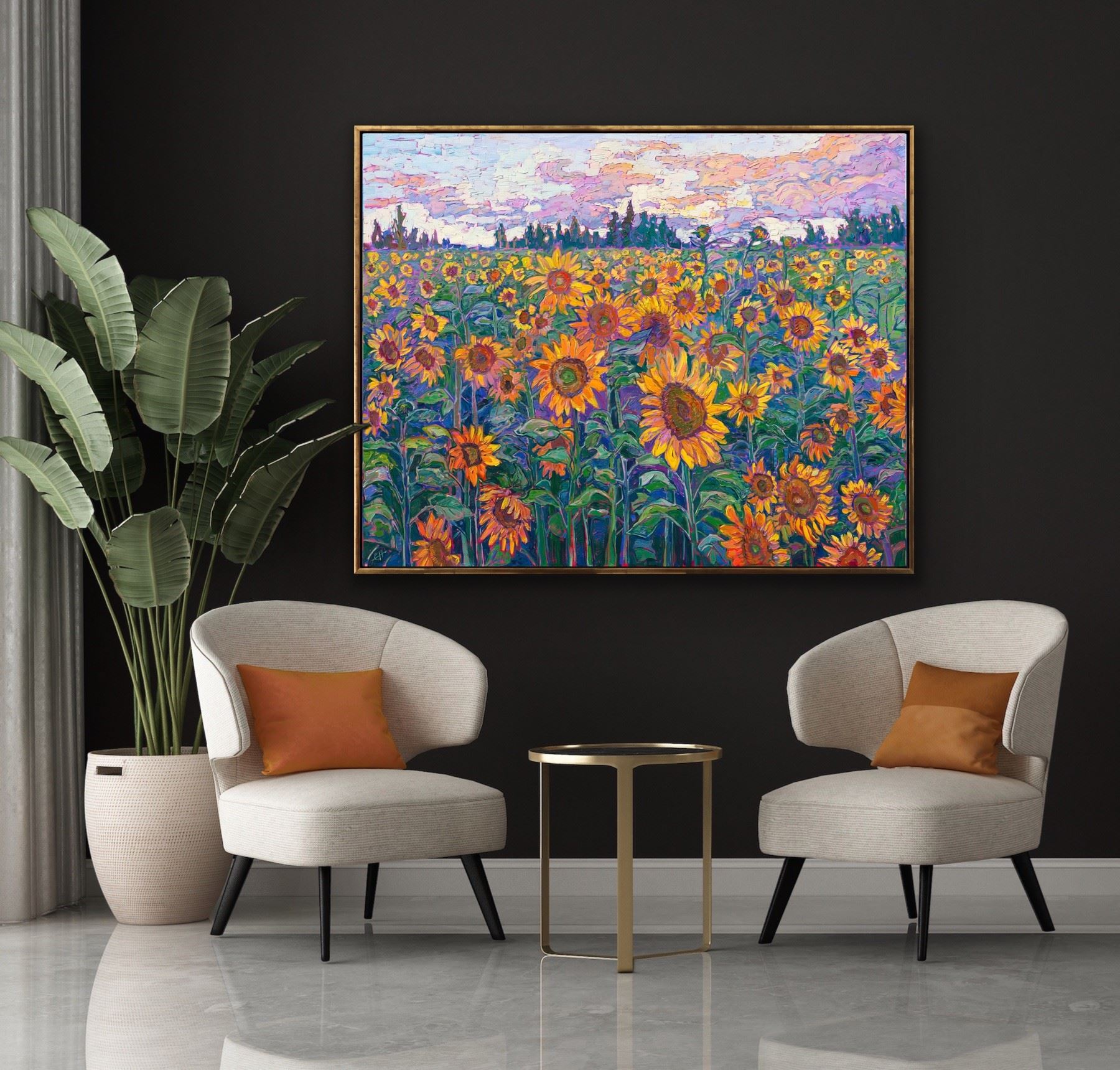
I hope this article inspires you to surround yourself with artwork you really love and then have fun designing and decorating around your art collection.
Discover the artist at the forefront of modern impressionism.

About Erin